
Ant Design prides itself as the second most popular React UI library, with over 90k stars on GitHub as of the time of writing. It’s easy to see why, given its plethora of rich and easy-to-use UI components and other features that make building UIs enjoyable.
In this adoption guide, we’ll explore the key features of Ant Design and how to get started using it in a React project, including setup and customization options. We’ll also cover practical use cases and a comparison with popular alternatives like Material Design and Bootstrap.
The Replay is a weekly newsletter for dev and engineering leaders.
Delivered once a week, it's your curated guide to the most important conversations around frontend dev, emerging AI tools, and the state of modern software.
Ant Design (Antd) was created by the Ant Group (Alibaba’s parent company) and released publicly in July 2015. Since then, the library has expanded to include support for modern UI components, extend its style and customization options, and even adapt to other JavaScript component libraries such as Vue, Angular, and Next.js.
Ant Design works similarly to other UI libraries. It provides high-quality components and design patterns out of the box. To use it in your project, you simply install it for your preferred framework, import the components you want to use, and further customize it to your needs via the component props or the Antd config file.
There are multiple big companies — including Alibaba.com, Baidu (the Chinese search engine), Tencent, and many more — already heavily using Ant Design as their primary UI library.
Ant Design stands out for several key reasons:
However, keep in mind that Ant Design components can be heavy. Additionally, projects with highly unique UI requirements might need extra effort for customization. Despite these cons, Ant Design’s robust features and ease of use often outweigh its drawbacks, making it a strong choice for most projects.
To start using Ant Design in a React project, create a new React application by running the command below:
npm create vite@latest react-antd -- --template react
At this point, it’s a good time to install the default dependencies for your new React-Vite project. Next, add the antd library by running this command:
npm install antd
With this setup completed, you can now import and use Ant Design UI components in your React app, as shown below:
// App.jsx

import "./App.css";
import { Alert } from "antd";

function App() {
  return (
    <>
      <h1>React + Ant Design</h1>
      <Alert
        message="Congratulations!"
        description="You've successfully installed ant design."
        type="success"
        showIcon
      />
    </>
  );
}

export default App;
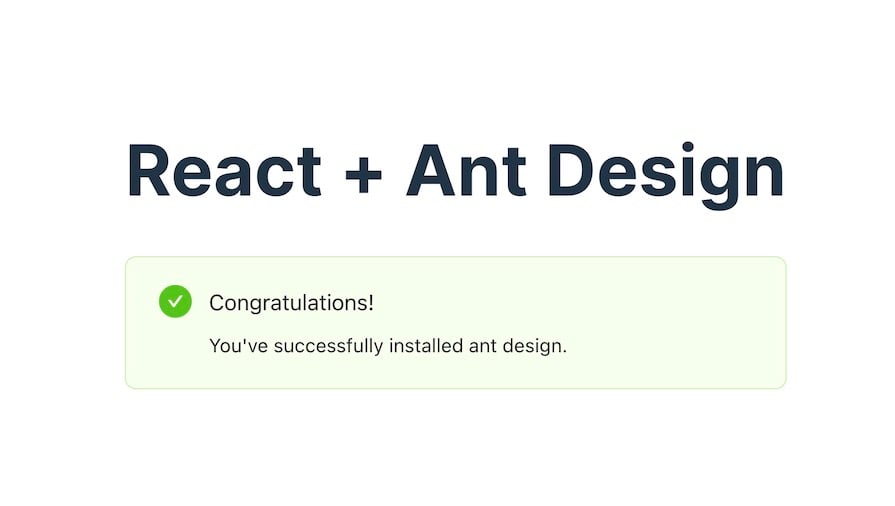
The code above showcases an example of rendering a success alert with Ant Design. Once you run your app, you should get an output similar to the one below:
Ant Design comes with numerous components and features. Let’s briefly examine the most frequently used ones in a typical application.
Ant Design components are organized into the following subgroups: general, layout, navigation, data entry, data display, feedback, and other miscellaneous components. We’ll start by looking at the general group of components.
The general group contains essential components such as buttons, icons, and typography.
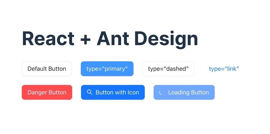
Ant Design’s <Button /> component has multiple variants, which you can easily style by updating the component type prop, extending it with an icon via the icon prop, or updating its loading state via the loading prop, as shown in the code sample below:
import { SearchOutlined } from "@ant-design/icons";
import { Button, Flex } from "antd";

function Buttons() {
  return (
    <>
      {/* <h1>React + Ant Design</h1> */}

      <Flex gap="large">
        <Button>Default Button</Button>
        <Button type="primary">type="primary"</Button>
        <Button type="dashed">type="dashed"</Button>
        <Button type="link">type="link"</Button>
        <Button type="primary" danger>
          Danger Button
        </Button>
        <Button type="primary" icon={<SearchOutlined />}>
          Button with Icon
        </Button>
        <Button type="primary" loading>
          Loading Button
        </Button>
      </Flex>
    </>
  );
}

export default Buttons;
Running this code gives us the following output:
Ant Design icons come preinstalled with Ant Design, providing a wide range of icons that integrate seamlessly with Ant Design components:
![]()
However, you can also install these icons as a standalone package by running the command below:
npm install @ant-design/icons --save
This way, you are able to use the icons in projects that may not require the full Ant Design component library.
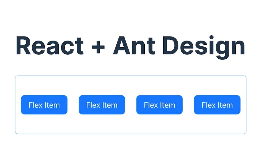
The layout group provides all the necessary components to create basic and complex layouts in your application, including grid and flex layouts. As shown below, you can easily create a flexbox layout with the <Flex /> component and immediately pass in your preferred styling options as props:
import { Button, Flex } from "antd";
const FlexBox = () => {
  return (
    <Flex justify="space-around" align="center">
      {[1, 2, 3, 4].map((item) => (
        <Button type="primary" key={item}>
          Flex Item
        </Button>
      ))}
    </Flex>
  );
};
export default FlexBox;
// Note: We've utilized mapping an array in this code sample to avoid repetition.
Running this code produces the following result:
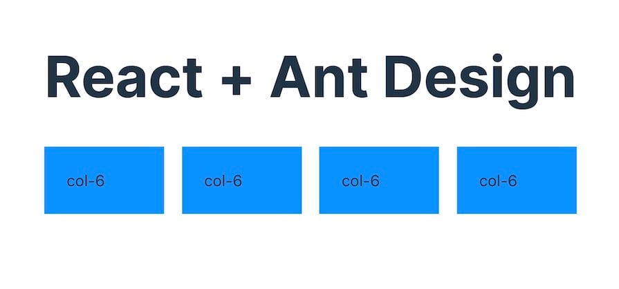
Similarly, you can easily utilize the <Row /> and <Col /> components for grid layouts, as shown below:
import { Col, Row } from "antd";
const style = {
  background: "#0092ff",
  padding: "20px",
};
const GridLayout = () => (
  <>
    <Row gutter={16}>
      {[1, 2, 3, 4].map((item) => (
        <Col className="gutter-row" span={6} key={item}>
          <div style={style}>col-6</div>
        </Col>
      ))}
    </Row>
  </>
);
export default GridLayout;
Here’s the result of the code above:
Ant Design provides multiple customizable components for data entry and data display. This results in beautifully styled and customizable form elements like inputs, color and file pickers, select components, rating components, switches, sliders, and more:
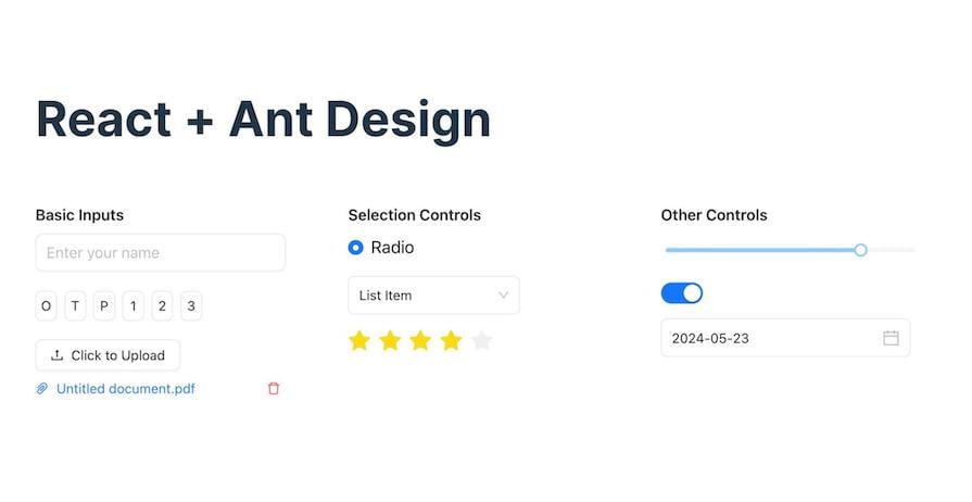
Also, Ant Design provides a <Form /> component that makes it super easy to programmatically access form data and their states and design forms with multiple layouts.
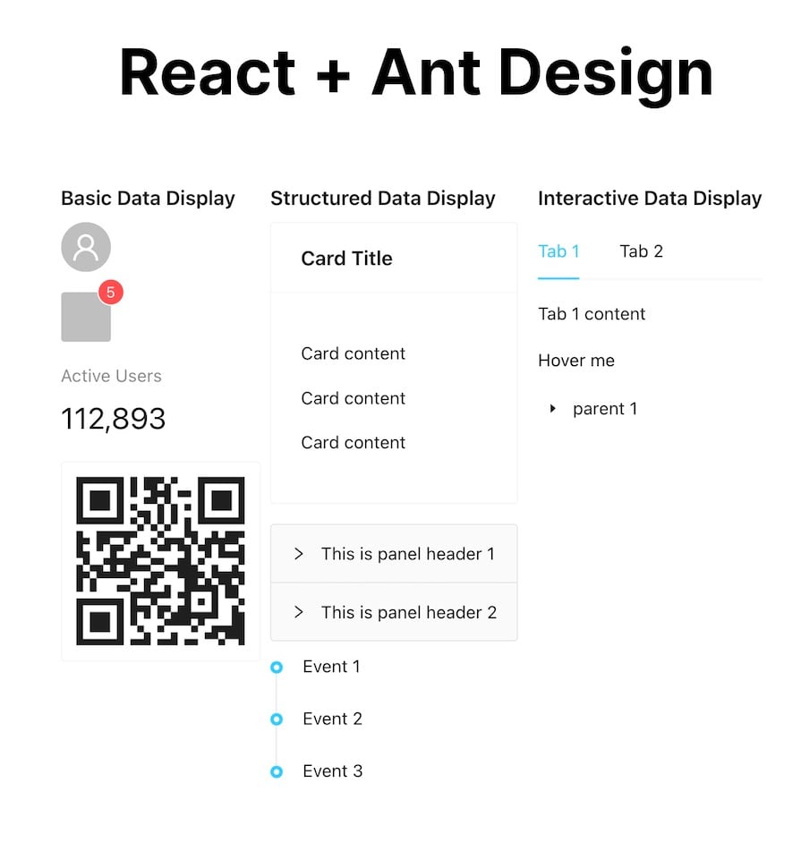
The data display group, on the other hand, features everything from cards, carousels, accordions, tables, tabs, and popovers to even more unique components like QR codes, timelines, and more:
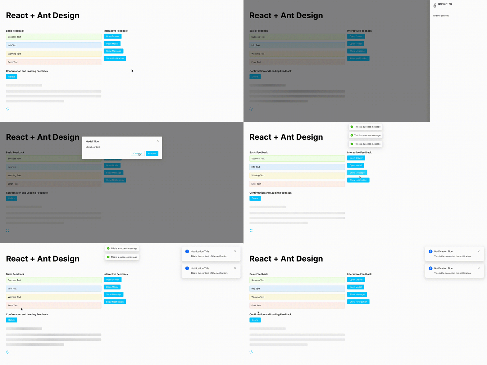
The feedback group contains all the components you need to render different message states to your users. These include alerts, drawer modals, popup confirmation modals, skeleton loaders, and more. Below you can see an example of these components:
Internationalization (i18n) is crucial for creating applications that can reach a global audience. Ant Design provides robust internationalization support for over 50 languages. This makes it easy to adapt your application to different locales.
For example, to change your app language to Spanish, you can import Ant Design’s ConfigProvider along with the language you want to use and wrap your app around it, as shown below:
// main.jsx
import ReactDOM from "react-dom/client";
import App from "./App.jsx";
import "./index.css";

import { ConfigProvider } from "antd";
import esES from "antd/locale/es_ES.js";

ReactDOM.createRoot(document.getElementById("root")).render(
  <ConfigProvider locale={esES}>
    <App />
  </ConfigProvider>
);
Once you wrap your app in the ConfigProvider with the locale set to esES, any text in your components should now change to Spanish, providing a localized user experience.
Ant Design allows you to customize the theme of your application, tailoring the look and feel to match your design taste or project requirements. We can also easily do this with the ConfigProvider, as shown below:
import { ConfigProvider } from "antd";

ReactDOM.createRoot(document.getElementById("root")).render(
  <ConfigProvider
    theme={{
      token: {
        colorPrimary: "#00ccff",
        borderRadius: 3,
      },
    }}
  >
    <App />
  </ConfigProvider>
);
With this change, your application’s primary color should change to #00ccff, and the default border-radius should be 3px.
Ant Design’s feature set makes it suitable for various business applications. Its extensive component library supports enterprise applications, ecommerce platforms, and mobile apps.
Companies like Alibaba and Baidu leverage Ant Design for scalable internal tools and dashboards. At the same time, ecommerce platforms benefit from its customizable components for product listings, user accounts, and payment processing.
Ant Design’s chart and animation libraries also make it ideal for data visualization tools, which are essential for businesses that need to analyze and present data effectively.
When people mention CSS libraries, names like Bootstrap and Material Design often come to mind first. However, Ant Design is just as effective, with its robust set of features and customization options.
While Bootstrap is renowned for its simplicity and ease of use and Material Design for its modern, mobile-first approach, Ant Design excels in providing comprehensive components suitable for complex, enterprise-level applications.
Each library has its unique strengths, making them suitable for different project needs. The table below highlights their major differences:
| Feature | Ant Design | Material Design | Bootstrap |
|---|---|---|---|
| Performance | Optimized components, larger bundle size, requires tree-shaking | Lightweight, fast, mobile-optimized | Fast load times, responsive design, minimal configuration |
| Community | Large, active community, enterprise-level contributions | Vast community, strong Google support | Largest community, extensive third-party plugins and themes |
| Documentation/Resources | Detailed, well-organized, comprehensive examples, extensive API documentation | Extensive guidelines, numerous examples, detailed component API | Straightforward, easy-to-follow, numerous examples, extensive customization documentation |
| Component variety | Advanced data entry/display, charting, animation support | Standard UI components, rich animations | Basic UI components, utility classes, responsive design |
| Customization | Less variables, theme overrides, dynamic theming | CSS variables, theming, adaptable to brand guidelines | Sass variables, theming, wide range of pre-built themes |
| Internationalization | Built-in support, 50+ languages, easy locale switching | Supports internationalization, RTL support | Basic support, community-driven translations |
This table should be a helpful resource as you choose a UI library for your next React project.
In this adoption guide, we’ve explored the key features and advantages of Ant Design, demonstrated its practical use cases, and compared it with other popular UI libraries like Material Design and Bootstrap. We’ve covered how to get started with Ant Design, including setup and customization, and highlighted its performance, community support, and documentation resources.
You can also explore all the code samples used in this article here. Thanks for reading!
Install LogRocket via npm or script tag. LogRocket.init() must be called client-side, not
server-side
$ npm i --save logrocket

// Code:

import LogRocket from 'logrocket';
LogRocket.init('app/id');
// Add to your HTML:

<script src="https://cdn.lr-ingest.com/LogRocket.min.js"></script>
<script>window.LogRocket && window.LogRocket.init('app/id');</script>

A step-by-step guide to building your first MCP server using Node.js, covering core concepts, tool design, and upgrading from file storage to MySQL.

Using security headers in your Next.js apps is a highly effective way to secure websites from common security threats.

A deep dive into May 2026’s AI model and tool rankings. We break down performance, usability, pricing, and real-world capabilities across 50+ features to help you pick the right tools for your development workflow.

A practical guide to Agent Browser CLI. Learn how AI agents navigate, snapshot, and interact with web pages using stable references, enabling efficient automation and exploratory testing.
Would you be interested in joining LogRocket's developer community?
Join LogRocket’s Content Advisory Board. You’ll help inform the type of content we create and get access to exclusive meetups, social accreditation, and swag.
Sign up now