In a discussion about top frontend design languages, Material Design by Google is one of the most popular contenders for the favorite spot, but there is a close, maybe lesser-known, competitor, that is Ant Design. With some of the big players in their respective industries like Alibaba, Tencent, Baidu all using Ant Design, let’s explore some of the key features that make Ant Design special compared to others.
Ant design, according to its own design values page, focusses on a user experience that is:
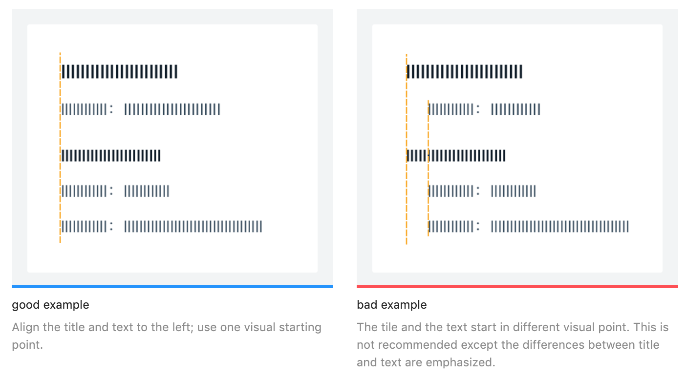
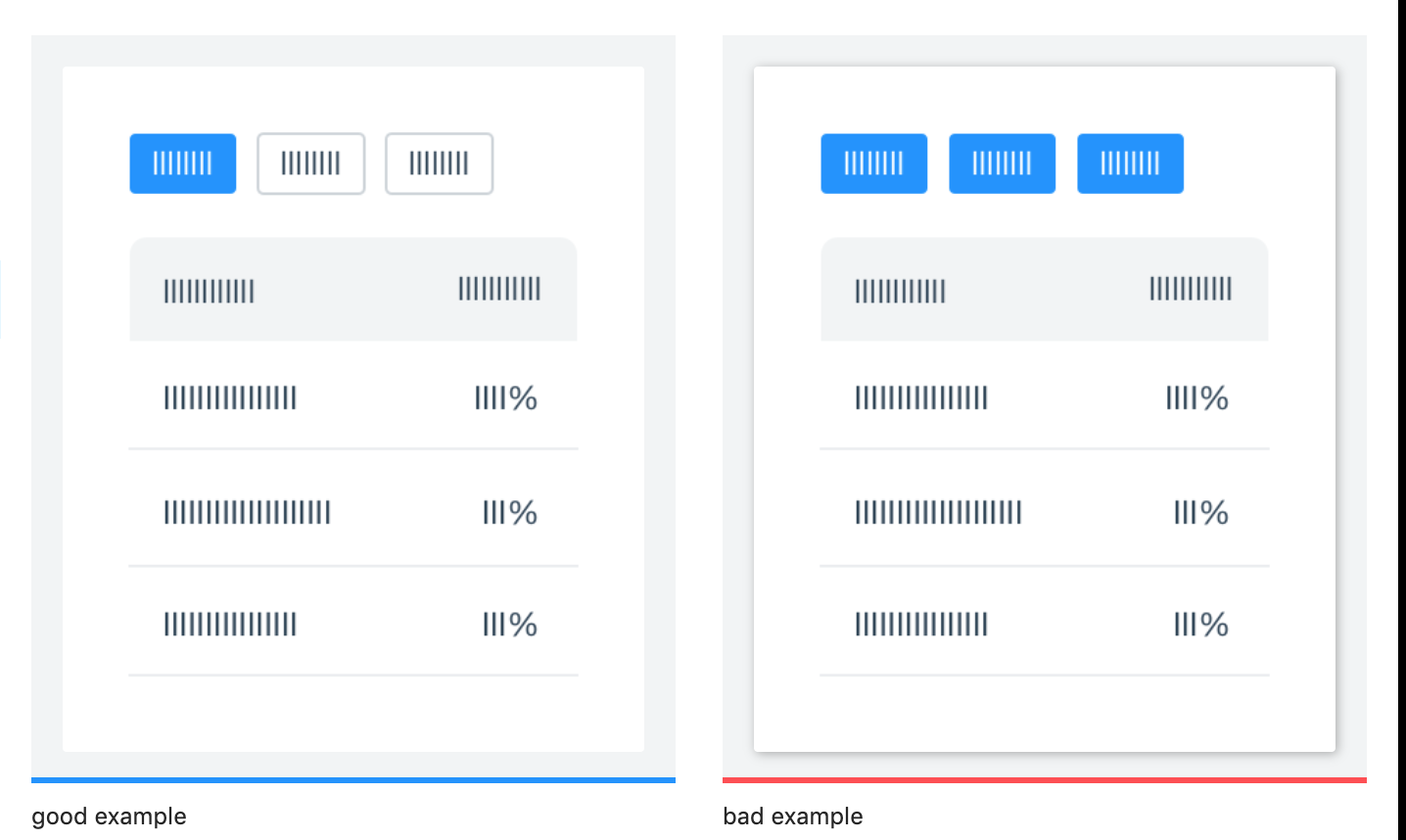
While providing guides on most of the styling needs for user interface design like colors, layout, font, icons, Ant Design also lays down certain best practices with respect to several visual design principles and clearly marks out the good from the bad ones. Here are a couple of examples from their reference docs:
Ant Design also provides full-fledged in-house support for icons and typography and it’s quite easy to incorporate in the project too. For instance, in order to use the provided icons in your project, all that needs to be done is:
npm install --save @ant-design/icons
to install the icon pack:
import { HomeOutlined } from '@ant-design/icons'
ReactDOM.render(<div><HomeOutlined /></div>, mountNode);
Ant Design provides its own alternatives to CSS Flexbox implementation for laying out UI items and to maintain a fluid and responsive user interface. For the same purpose, Ant Design provides row and column components that can be used as alternatives to equivalent divs with flex-direction row and column respectively. For managing size, it accepts a span prop similar to what Bootstrap does:
<Row>
  <Col span={12}>col-12</Col>
  <Col span={12}>col-12</Col>
</Row>
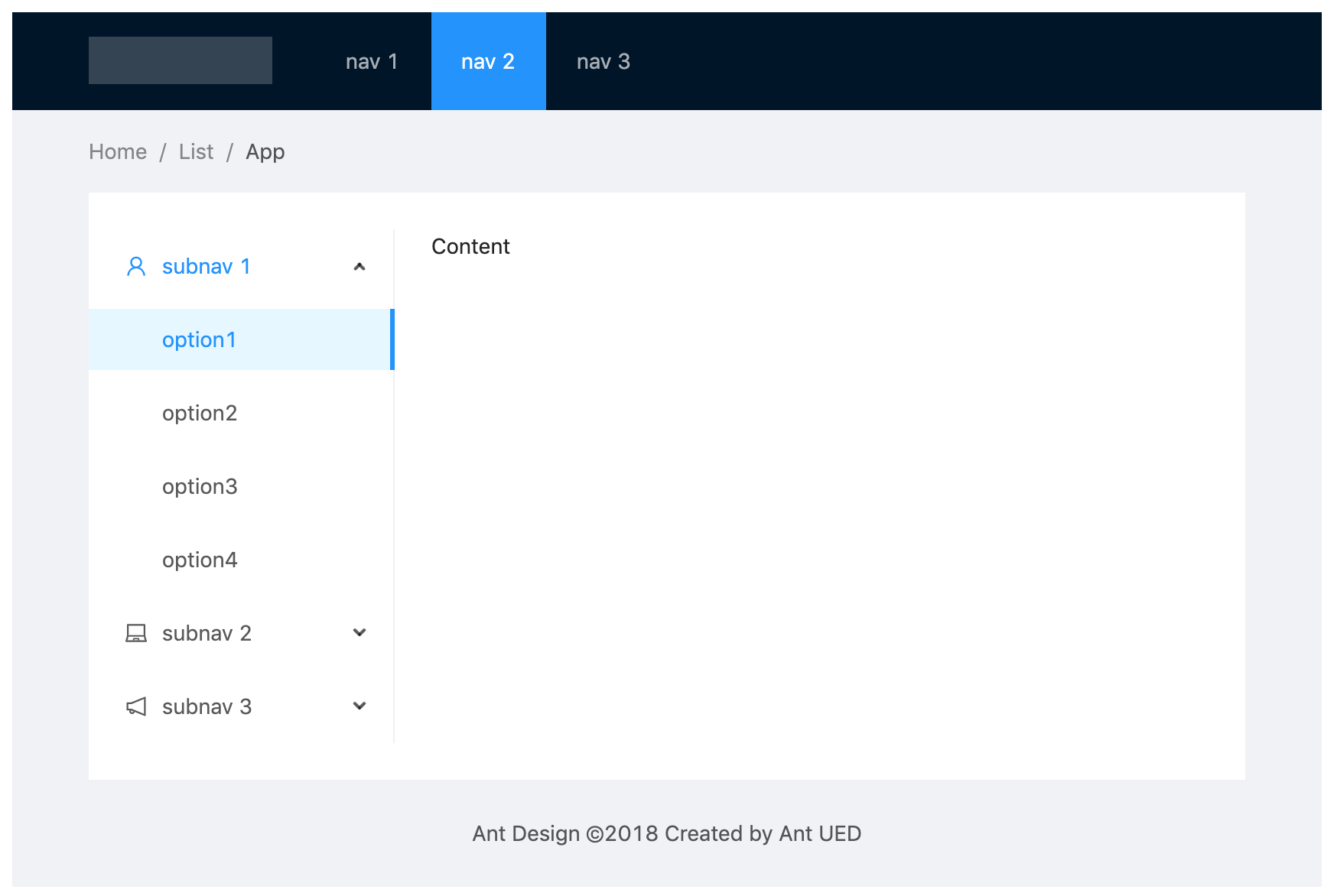
In addition to that, Ant design provides some of the most common layouts, with Navigation Bar, Side Menu, BreadCrumbs, and the main layout area (with different styles) as standard boilerplate that one can use straight away in the project. For example, the layout below can be easily achieved by copying the boilerplate code from their official docs page.
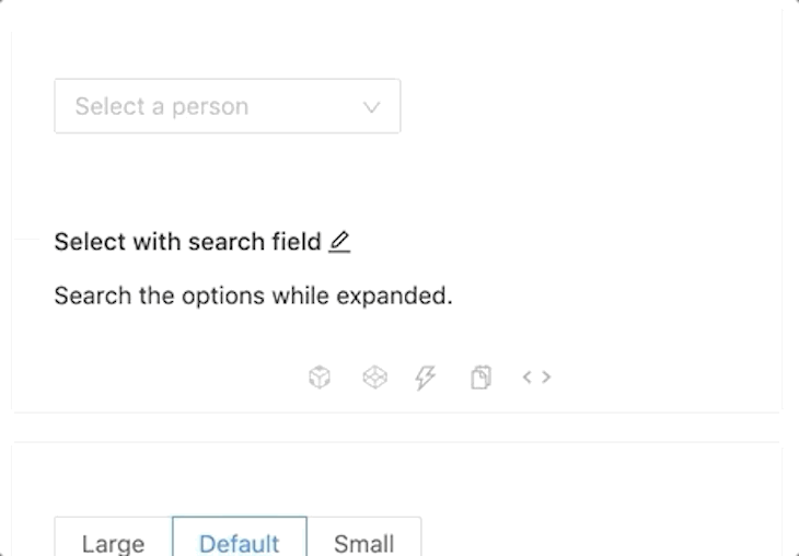
Some of the most widely used form elements are of course available for use with a huge variety of customization options. Here are a few examples along with the code to create generic versions of them.
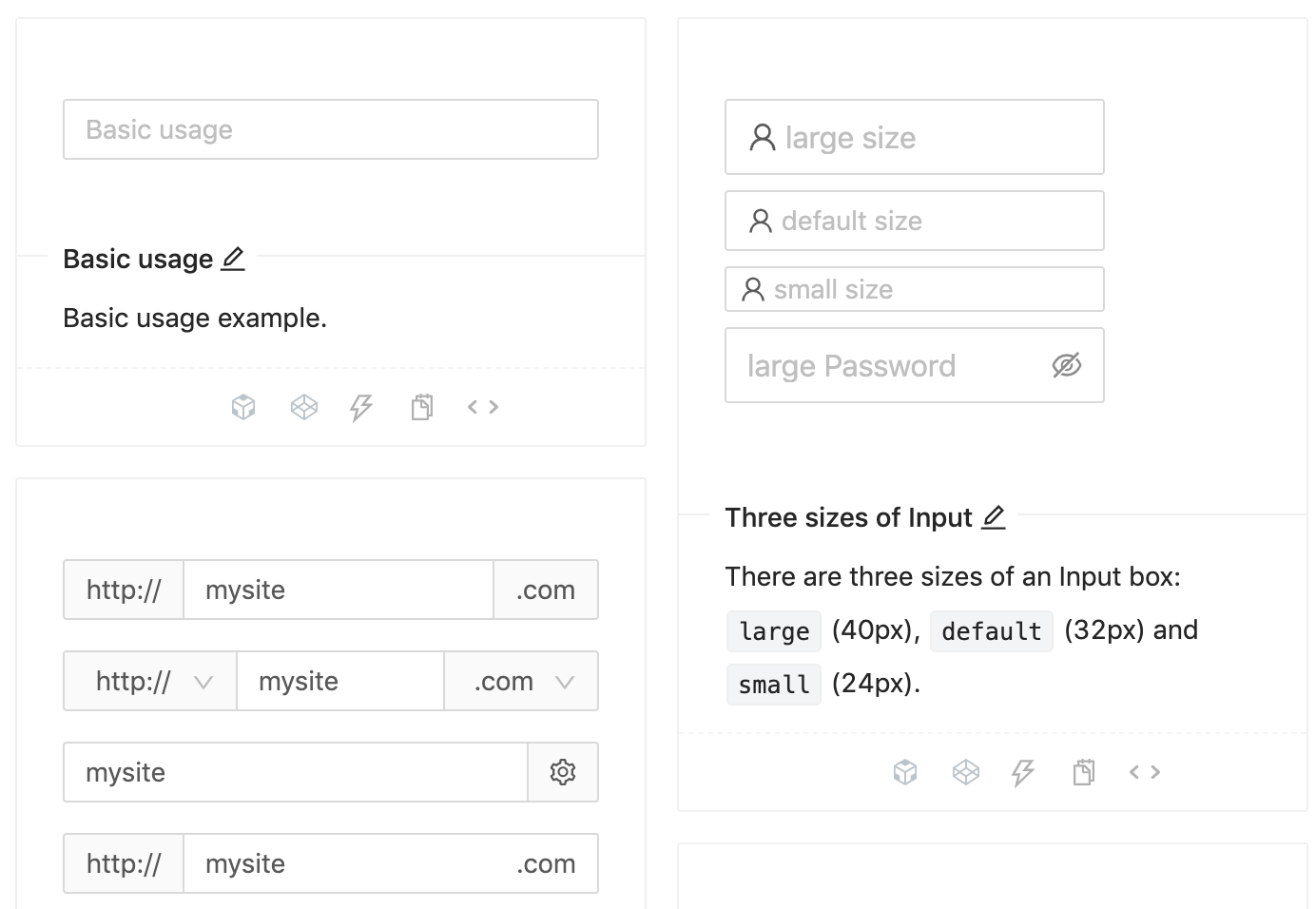
// component code
<Input
  size="large"
  value={this.state.inputVal}
  placeholder="large size"
  onChange={(e) => this.setState({ inputVal: e.target.value })}
  prefix={<UserOutlined />} // prefixes the user image at the beginning
/>
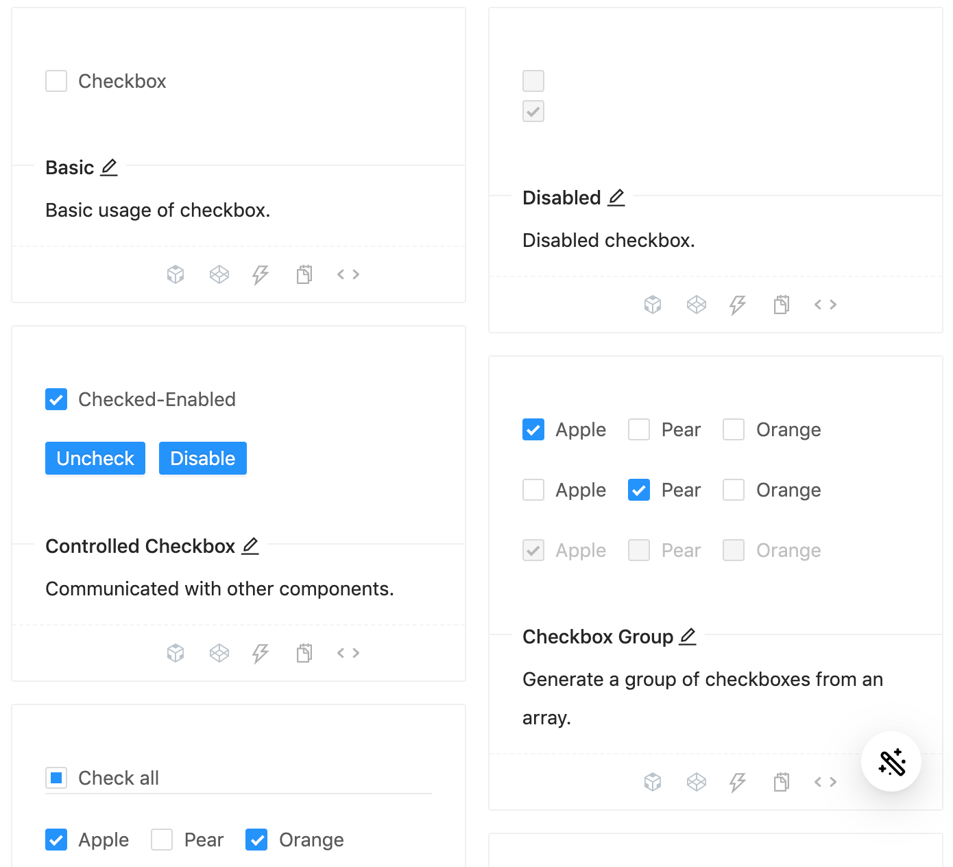
// on change handler
onChange = e => {
  this.setState({
    checked: e.target.checked,
  });
};
// checkbox component
<Checkbox
checked={this.state.checked}
disabled={this.state.disabled} // can be managed via state independently
onChange={this.onChange}
>
{label}
</Checkbox>
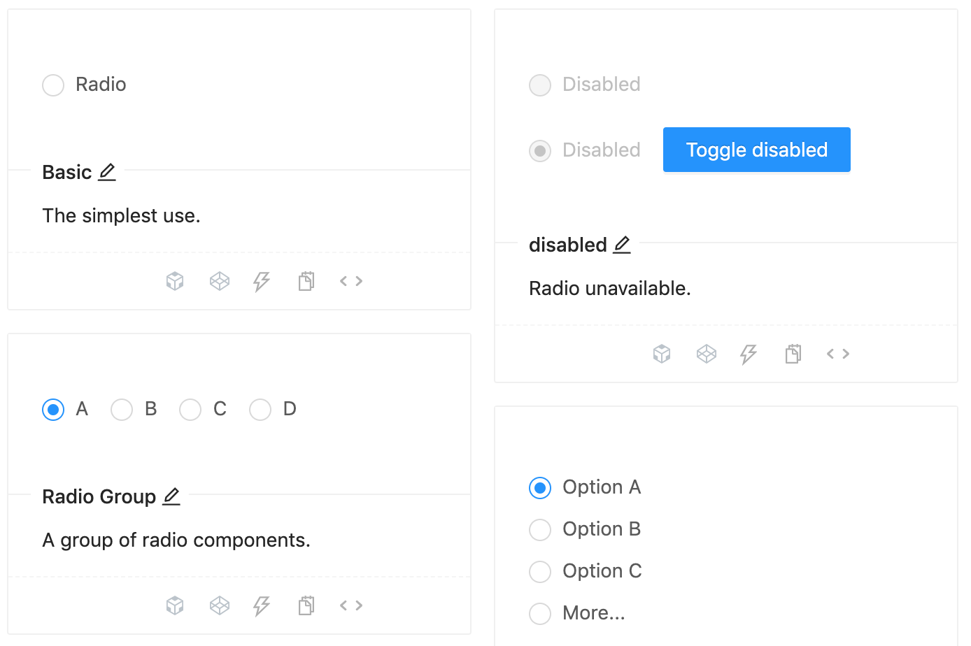
// on change handler
onChange = e => {
  this.setState({
    value: e.target.value,
  });
};

// radio component, manage the ‘disabled’ boolean separately
<>
  <Radio value={1} disabled={this.state.disabled}>
    Value 1
  </Radio>
  <br />
  <Radio value={2} disabled={this.state.disabled}>
    Value 2
  </Radio>
</>
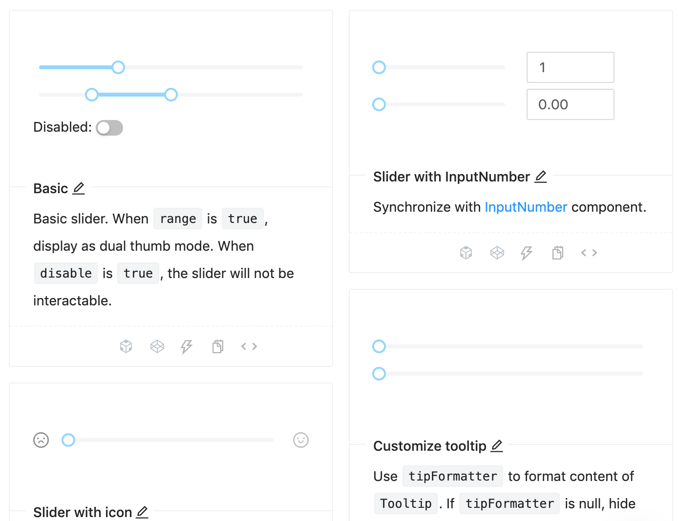
// on change handler
onChange = value => {
  this.setState({
    inputValue: value,
  });
};

// slider component
<Slider
  min={1} // define a range
  max={20}
  disabled={this.state.disabled} // manage ‘disabled’ separately
  onChange={this.onChange}
  value={typeof inputValue === 'number' ? inputValue : 0}
/>
And, the best part is, all the code for using any variation of these components is available on the same page. You can easily access it by clicking the <> button like so:
In addition to the basic components mentioned above, there is also a broad range of compound components that Ant Design provides, which supports rapid prototyping and development. These are the components which are widely used in modern user interfaces but take quite an effort to code from scratch. Here are some examples along with Ant Design equivalent code:
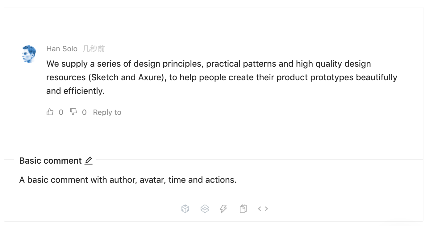
<Comment
  actions={actions} // the action button settings
  author={<a>Han Solo</a>} // the name of comment author
  avatar={
    <Avatar src="source_for_avatar.png" alt="Han Solo"/>
  }
  content={// content here} // main comment
/>
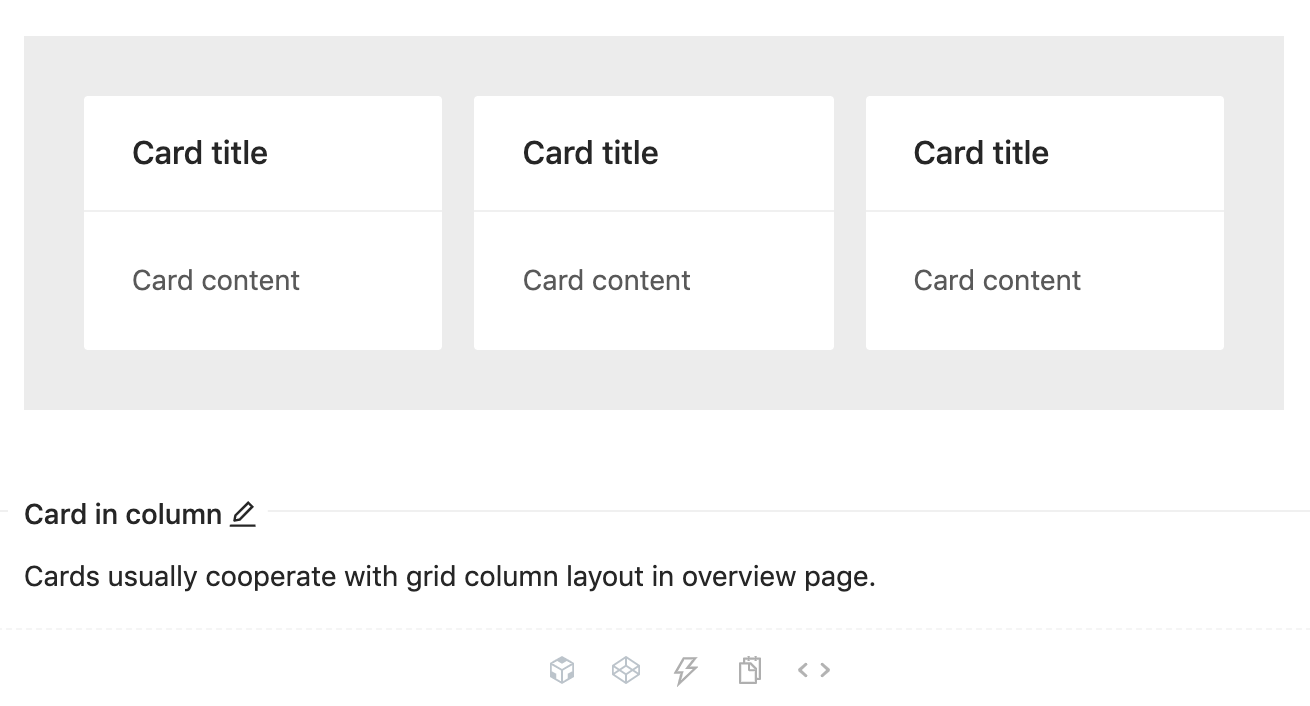
<div className="site-card-border-less-wrapper"> // the css class
  <Card title="Card title" bordered={false} style={{ width: 300 }}>
    <p>Card content</p>
    <p>Card content</p>
    <p>Card content</p>
  </Card>
</div>
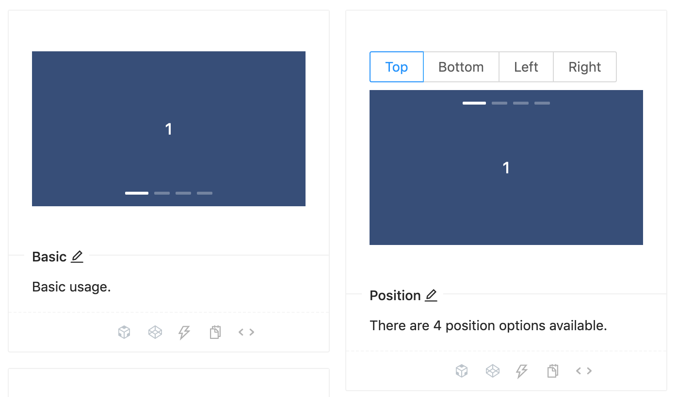
// Carousel with autoplay enabled
<Carousel autoplay>
  <div>
    <h3>1</h3>
  </div>
  <div>
    <h3>2</h3>
  </div>
  <div>
    <h3>2</h3>
  </div>
</Carousel>
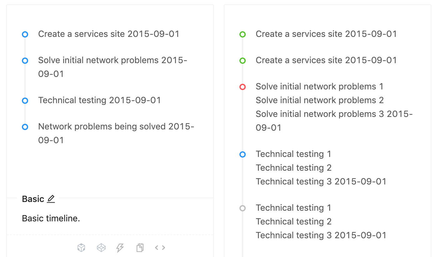
<Timeline>
  <Timeline.Item>Create a services site 2015-09-01</Timeline.Item>
  <Timeline.Item>Solve initial network problems 2015-09-01</Timeline.Item>
  <Timeline.Item>Technical testing 2015-09-01</Timeline.Item>
  <Timeline.Item>Network problems being solved 2015-09-01</Timeline.Item>
</Timeline>
The Ant design framework is designed from the ground up keeping in mind the React methodologies. All the components mentioned above have direct support for incorporation with React components available. Also, support for other popular frameworks like Angular and Vue are being developed by the community.
With a fluid, responsive UI, clean design language, and also visualization support through AntV, Ant Design is surely on the way to grab a huge chunk of the market share when it comes to Industry grade dashboards. Given the extensive list of components, features, and customizations provided by Ant Design, it counts as a worthy candidate when it comes to the selection of your next frontend design framework.
Install LogRocket via npm or script tag. LogRocket.init() must be called client-side, not
server-side
$ npm i --save logrocket

// Code:

import LogRocket from 'logrocket';
LogRocket.init('app/id');
// Add to your HTML:

<script src="https://cdn.lr-ingest.com/LogRocket.min.js"></script>
<script>window.LogRocket && window.LogRocket.init('app/id');</script>

Learn how to use Fallow to analyze AI-generated code, detect dead code, duplicate logic, and complexity issues, and integrate automated code quality checks into your AI-assisted development workflow.

Learn how to protect full-stack projects from NPM supply chain attacks with a practical security checklist.

Explore 15 essential MCP servers for web developers to enhance AI workflows with tools, data, and automation.

Learn how contrast-color() automatically picks accessible text colors using native CSS, without JavaScript.
Would you be interested in joining LogRocket's developer community?
Join LogRocket’s Content Advisory Board. You’ll help inform the type of content we create and get access to exclusive meetups, social accreditation, and swag.
Sign up now

