One of the biggest reasons I pursued a career in design was the satisfaction of seeing my work come to life and impact real people. There’s something incredibly rewarding about designing thoughtful, usable, and aesthetically pleasing products — knowing they help someone complete a task more efficiently or improve their overall experience.
But not every project turns out the way we expect.
I’ve worked on features that, once shipped, didn’t gain much traction. Users weren’t adopting them, and they didn’t have the impact we had anticipated. It was frustrating — pouring hours into something only to see it fall flat.
At first, I thought maybe we just got unlucky. Maybe the feature wasn’t marketed well. Maybe users weren’t ready for it. But after a few similar experiences, I realized we weren’t just dealing with isolated failures. There was a pattern. That’s when I started asking the hard question — What went wrong?
Looking back, I realized the issue wasn’t about bad ideas or poor execution — it was about misalignment in our product development process:
We knew we had to fix these gaps in our product development process to address these recurring issues. It was becoming clear to everyone that stakeholders who should have been responsible, consulted, or informed for a certain stage of the cycle were being left out.
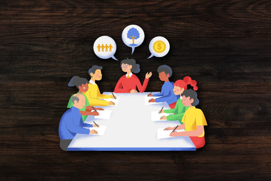
To tackle all those alignment issues, we introduced a design requirements kick-off meeting.
Our goal was to get all the right people in the room, at the right time, to define the problem, align on success metrics, and clarify requirements — before jumping into design.
One of the biggest hurdles in cross-functional collaboration is knowing who to involve and when. To fix this, we created a RACI chart (Responsible, Accountable, Consulted, Informed) to clarify stakeholder roles. And this simple change reduced confusion and made sure the right voices were in the room at the right time:
But structure alone wasn’t enough. We also need a collaborative workspace where everyone could contribute and stay aligned. That’s where FigJam came in.
Our design kick-off board lived in FigJam — it’s just easy for our teams to collaborate and reference while designing: 
We structured the board into four key sections:
By setting up this board BEFORE jumping into design, we ensured everyone had visibility into the project’s why, what, and how — and that significantly reduced miscommunication and reword later on.
Even though the product owner had already kicked off the project, we found that many team members still weren’t fully aligned when it came time to design. So, at the start of the design kick-off, we gave a quick recap of the project’s purpose and user stories:
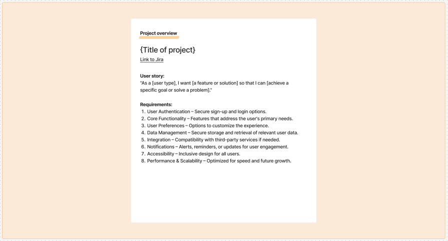
This ensured that every stakeholder — designers, engineers, PMs, QA, and technical writers — had a shared understanding of the goal before diving into the details. At this stage, we encouraged the team to raise any pressing questions, concerns, or objections.
Key takeaway — Never assume everyone is aligned just because a project has been “kicked off.” Taking a few extra minutes to set the context can prevent major misunderstandings down the road.
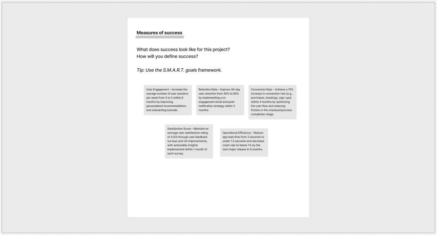
One of the biggest mistakes I used to make was jumping into design without clearly defining success metrics. If you don’t know what success looks like, how do you know whether the design is working?
To avoid this, we used the SMART goals framework:
This way, we could track our progress along the way while enforcing a benchmark to help make decisions:
Key takeaway — Setting clear, measurable goals BEFORE designing helps avoid endless revisions and shifting priorities later on.
Requirements lists, honestly, felt like a lengthy checklist to be included in the designs. And it was excruciatingly difficult for team members to understand how all the requirements fit together.
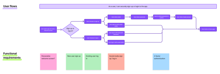
But what better way for designers to help align the team than to visualize these requirements on a user journey map? Instead of just listing features, we mapped how a user moves through the experience — step by step: 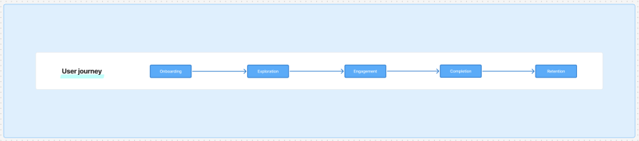
And this gave everyone a clear picture of:
Once we mapped out the overall user journey, we broke down each stage into separate, smaller user flows that are mapped to the requirements. The user journey covered the process at a high level, and these user flows covered the interactions at a more granular level. It looked something like:
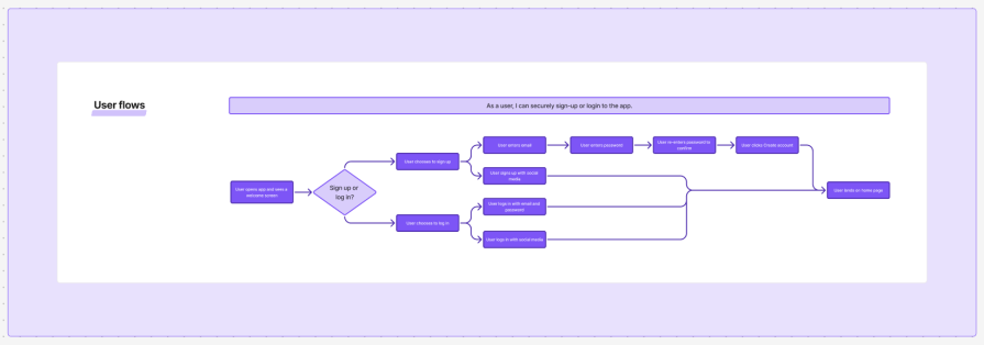
Key takeaway — A well-crafted user journey map makes it easier for stakeholders to connect the dots, ensuring that designs solve real problems instead of just checking off requirements.
As we would outline the user flows, we’d attach stickies with the project requirements below the steps that they map to. That’s because some project requirements were must-haves, and others were nice-to-haves. And this way, all requirements were covered by the user flows — so when we got down to designing, nothing was left out.
We also made sure that we considered all edge cases — loading states, error states, persistent filter settings, and any other different outcomes we could think of. We brought in our PMs and developers, and they were the ones who identified these edge cases and any technical other limitations that could emerge in handling them.
To manage all of those expectations, we color-coded the project requirements based on priority:
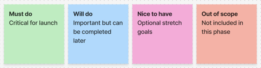
For each requirement sticky, we’d change it to the color that corresponds with its level of prioritization. So, at all times, the team knew what was in scope for that iteration of the project. And we knew this could be adjusted later, once the developers had a more accurate idea of the effort involved. Essentially, though, these stickies served as our baseline before we moved forward:
Key takeaway — Clearly defining priorities BEFORE starting design helps avoid last-minute scope creep and unrealistic expectations.
All through our process of mapping the requirements to the user flows and discussing priority levels, we faced some ambiguity and uncertainty — and that needed to be resolved.
Whether they were potential challenges, questions, or technical unknowns, we would write them down on a sticky note and attach them to the specific stage in the user flow. This way, the team would be thinking about potential roadblocks — and they were prepared early on. Fewer surprises later on:
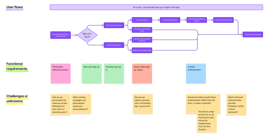
We’d also be sure to discuss and figure out a solution or atleast a method to find a solution. The idea was to have all our questions answered and unknowns figured out by the end of the kick-off.
Key takeaway — Resolving uncertainties before jumping into designs can help avoid unnecessary redirection before it’s too late.
Since implementing the design kick-off meeting in our process of product development, our team has seen huge improvements:
Most importantly, this process has elevated the role of designers — we’re no longer just executors of feature requests. We’re strategic partners who can lead the conversation, facilitate decision-making, and execute a project thoughtfully.
If your team struggles with low UX maturity or a lack of structured processes, I highly recommend trying a design kick-off meeting. It’s a simple but very powerful way to improve collaboration, reduce misalignment, and design products that truly make an impact!

LogRocket's Galileo AI watches sessions and understands user feedback for you, automating the most time-intensive parts of your job and giving you more time to focus on great design.
See how design choices, interactions, and issues affect your users — get a demo of LogRocket today.
A three-week mobile banking project taught me that the “proper” UX process is not always realistic. Sometimes, the better approach is to work with what you know, identify what you still need to learn, and make the strongest decision possible under real constraints.
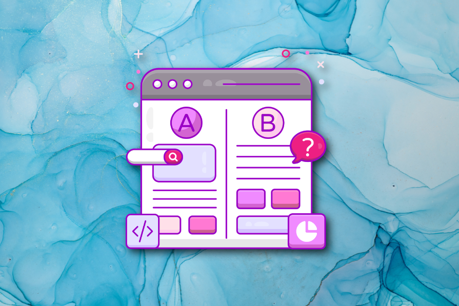
A/B testing compares two versions of a design to see which performs better with real users. Here’s how UX teams can use it to test hypotheses, measure outcomes, and make smarter product decisions.
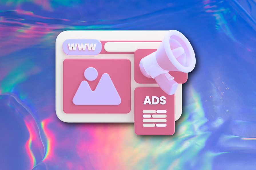
This case study shows how one ad experience redesign increased total ad exposure while lowering perceived friction, proving that timing and context can matter more than raw interruption.
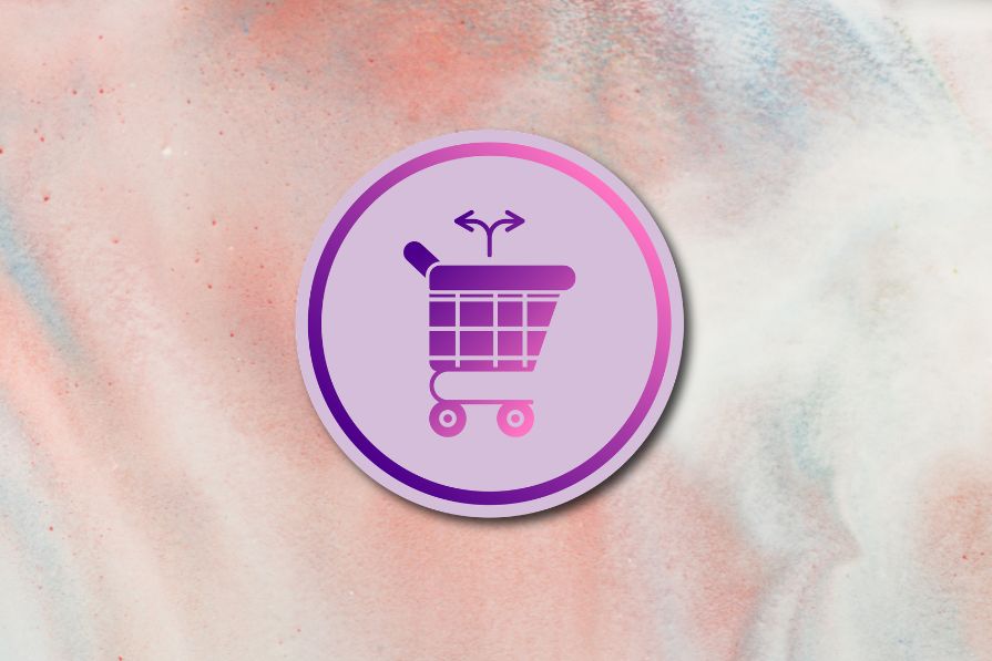
As products evolve into ecosystems, navigation becomes a system-level challenge. This article explores how to align structure, context, and user journeys to create seamless movement across tools without confusion.

 Learn more →
