We are all familiar with home switches to switch on and off our lighting system and other electrical appliances. We are also familiar with toggle buttons; if you have electrical cookware or induction at home, you can toggle between its voltage and cooking functions.

Similarly, our mobile applications have switches and toggles to turn on/off Wi-Fi, Bluetooth, and so on.
Today, we are profoundly diving into understanding the parameters and properties of Flutter switches and toggles.
A switch button is a Flutter widget with only two states, either true/false or on/off. Typically,a switch is a button with a thumb slider for the user to drag it from left to right and vice versa to switch between the states. It does not maintain its state on its own. You must call the onChanged property to keep the button on or off.
Similarly, a toggle widget has only two states: true/false or on/off. But a toggle widget creates multiple buttons arranged in rows, allowing users to toggle between them.
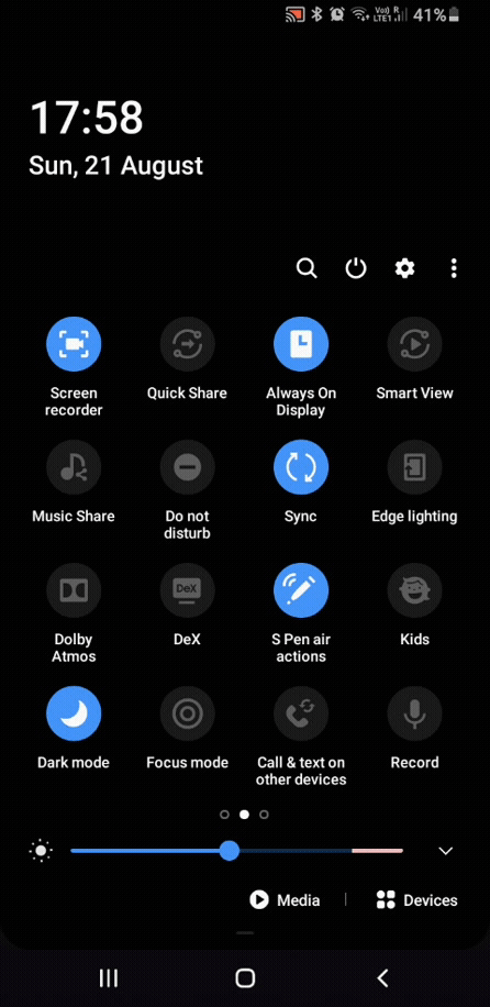
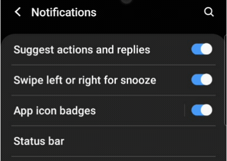
It is a matter of use cases in a mobile application. In most cases, these widgets are used on the settings page. If you drag down the notification panel of your mobile application, you will see a grid of toggle buttons. But when you go to the settings page, those buttons are changed to switches.
You must have understood the difference. In your mobile application, if you have a list of controls requiring only two states, you should be using switches. And if you have more than one control in a row or in a grid, you should use toggles.
Flutter provides three types of switch widgets:
Switch.adaptive (it adapts according to platform)Let’s look at the most common properties used to customize the widget:
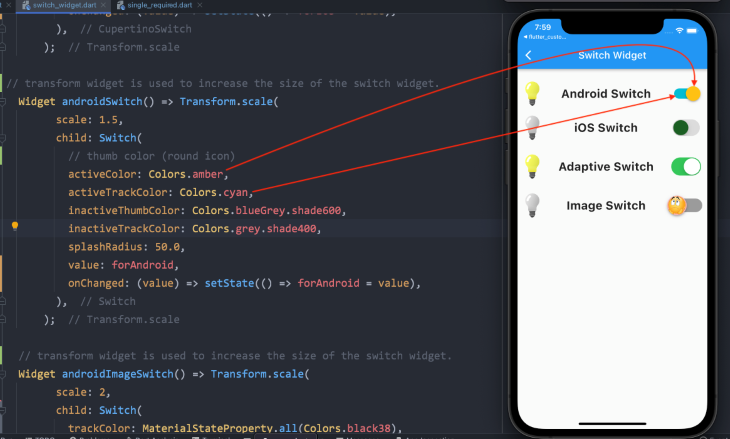
Switch (Android)Switch( // thumb color (round icon) activeColor: Colors.amber, activeTrackColor: Colors.cyan, inactiveThumbColor: Colors.blueGrey.shade600, inactiveTrackColor: Colors.grey.shade400, splashRadius: 50.0, // boolean variable value value: forAndroid, // changes the state of the switch onChanged: (value) => setState(() => forAndroid = value), ),
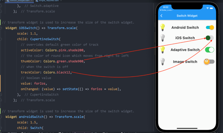
CupertinoSwitch (iOS)CupertinoSwitch( // overrides the default green color of the track activeColor: Colors.pink.shade200, // color of the round icon, which moves from right to left thumbColor: Colors.green.shade900, // when the switch is off trackColor: Colors.black12, // boolean variable value value: forIos, // changes the state of the switch onChanged: (value) => setState(() => forIos = value), ),
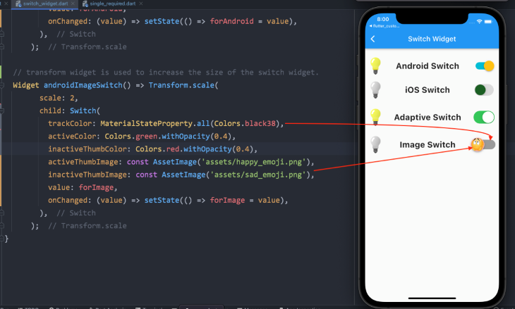
There aren’t any unique or different properties for the adaptive switch widget. But the Android Switch widget can be further customized if you want an image or icon instead of the usual thumb color. You need to define the thumb image property with an asset image. Please look at the code below.
Switch with ImageSwitch(
trackColor: MaterialStateProperty.all(Colors.black38),
activeColor: Colors.green.withOpacity(0.4),
inactiveThumbColor: Colors.red.withOpacity(0.4),
// when the switch is on, this image will be displayed
activeThumbImage: const AssetImage('assets/happy_emoji.png'),
// when the switch is off, this image will be displayed
inactiveThumbImage: const AssetImage('assets/sad_emoji.png'),
value: forImage,
onChanged: (value) => setState(() => forImage = value),
),
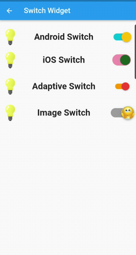
This is how the code looks in action:
Currently, we are not saving the state of the switch widget; we are only changing it. Next is creating a small application, where we will change the theme from light to dark and vice versa, and when you close the application, its state will be saved.
It is a simple one-page application with a switch button in the appBar, which will change the theme.
I have used Flutter Hive to save the state of the app. You can use SharedPreferences, but I have opted for Hive because it is a fast, lightweight, NoSQL database for Flutter and Dart applications. Hive is helpful if you need a straightforward key-value database without numerous relations. It is effortless to utilize and is an offline database (stores data locally).
Let’s look at the code first…
We are using ValueListenableBuilder to update the UI. It builds the particular widget every time the value changes for which it listens. Its values remain synced with listeners; i.e., whenever the values change, the ValueListenable listens to it and updates the UI without using setState() or any other state management technique:
const themeBox = 'hiveThemeBox';
void main() async {
 await Hive.initFlutter();
 await Hive.openBox(themeBox);
 runApp(const MyApp());
}

class MyApp extends StatelessWidget {
 const MyApp({Key? key}) : super(key: key);

 @override
 Widget build(BuildContext context) {
   //to update the UI without using setState()
   return ValueListenableBuilder(
     valueListenable: Hive.box(themeBox).listenable(),
     builder: (context, box, widget) {
       //saving the value inside the hive box,
       var darkMode = Hive.box(themeBox).get('darkMode', defaultValue: false);
       return MaterialApp(
           debugShowCheckedModeBanner: false,
           //switching between light and dark theme,
           themeMode: darkMode ? ThemeMode.dark : ThemeMode.light,
           title: 'Flutter Demo',
           darkTheme: ThemeData.dark(),
           home: HomePage(
             value: darkMode,
           ));
     },
   );
 }
}

class HomePage extends StatelessWidget {
 final bool value;
 const HomePage({Key? key, required this.value}) : super(key: key);

 @override
 Widget build(BuildContext context) {
   return Scaffold(
     appBar: AppBar(
       title: Text(value ? 'Hive Dark Mode' : 'Hive Light Mode'),
       actions: [
         Switch(
           value: value,
           onChanged: (val) {
             Hive.box(themeBox).put('darkMode', !value);
           },
         ),
       ],
     ),
     body: Padding(
       padding: const EdgeInsets.all(8.0),
       child: Column(
         crossAxisAlignment: CrossAxisAlignment.stretch,
         children: [ ],
       ),
     ),
   );
 }
}
Here we will look at four different ways to implement the toggle widget in our application.
First, let’s look at the standard properties of a toggle widget to customize it, and then we will go through the code for each one, along with its illustrated images:
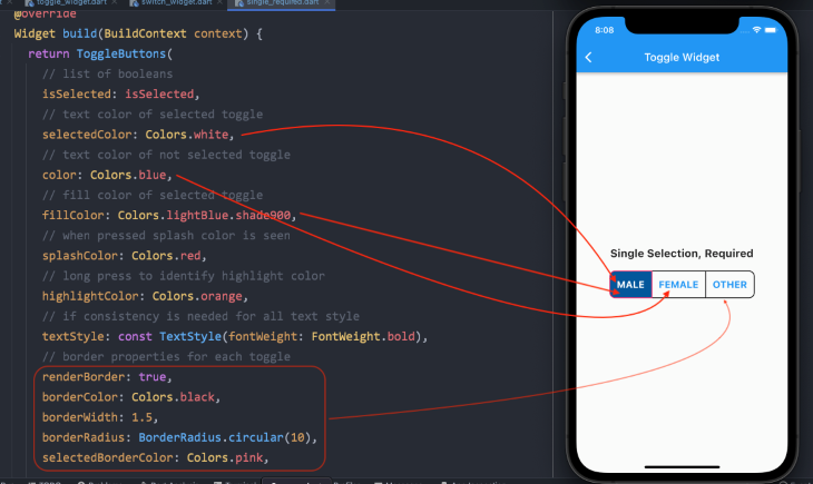
ToggleButtons(
  // list of booleans
  isSelected: isSelected,
  // text color of selected toggle
  selectedColor: Colors.white,
  // text color of not selected toggle
  color: Colors.blue,
  // fill color of selected toggle
  fillColor: Colors.lightBlue.shade900,
  // when pressed, splash color is seen
  splashColor: Colors.red,
  // long press to identify highlight color
  highlightColor: Colors.orange,
  // if consistency is needed for all text style
  textStyle: const TextStyle(fontWeight: FontWeight.bold),
  // border properties for each toggle
  renderBorder: true,
  borderColor: Colors.black,
  borderWidth: 1.5,
  borderRadius: BorderRadius.circular(10),
  selectedBorderColor: Colors.pink,
// add widgets for which the users need to toggle
   children: [ ],
// to select or deselect when pressed
  onPressed: (int newIndex) { }
);
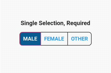
First, we must initialize a list of Boolean variables:
// one must always be true, means selected.
List<bool> isSelected = [true, false, false];
Since we force the system to have at least one option always selected, we have initialized one value as true.
We have already discussed other properties to customize the toggle widget. Now we add child widgets to its children property.
N.B., you have to add the same number of the child widgets as the list of Boolean values. Otherwise, it will throw an error.
// add widgets for which the users need to toggle
children: const [
  Padding(
    padding: EdgeInsets.symmetric(horizontal: 12),
    child: Text('MALE', style: TextStyle(fontSize: 18)),
  ),
  Padding(
    padding: EdgeInsets.symmetric(horizontal: 12),
    child: Text('FEMALE', style: TextStyle(fontSize: 18)),
  ),
  Padding(
    padding: EdgeInsets.symmetric(horizontal: 12),
    child: Text('OTHER', style: TextStyle(fontSize: 18)),
  ),
],
Next, we have to add logic to the onPressed() property of the toggle widget inside the setState() function.
for loop, we will go through the list of Boolean valuesif statement, we will check for the index value and always set it to true. Other buttons will be set to false
onPressed: (int newIndex) {
  setState(() {
    // looping through the list of booleans values
    for (int index = 0; index < isSelected.length; index++) {
      // checking for the index value
      if (index == newIndex) {
        // one button is always set to true
        isSelected[index] = true;
      } else {
        // other two will be set to false and not selected
        isSelected[index] = false;
      }
    }
  });
},
This is how our final product will look.
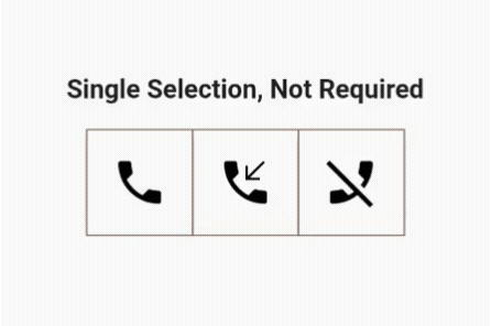
We need to make only two changes for this to work. The user can select only one out of three options but is not required to choose it.
Values inside the list of Boolean variables are all initialized as false:
// all values are false
List<bool> isSelected = [false, false, false];
Inside the if statement in the onPressed() function, we only toggle between buttons to set it to true:
onPressed: (int newIndex) {
  setState(() {
    // looping through the list of booleans values
    for (int index = 0; index < isSelected.length; index++) {
      if (index == newIndex) {
        // toggling between the button to set it to true
        isSelected[index] = !isSelected[index];
      } else {
        // other two buttons will not be selected and are set to false
        isSelected[index] = false;
      }
    }
  });
},
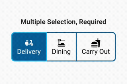
As mentioned earlier, the user can select multiple options, but the system will keep at least one option always selected.
Yes, you guessed correctly that one of the values in the list of Booleans will be true:
List<bool> isSelected = [true, false, false];
Things get a little interesting inside the onPressed function.
First, we add a variable to loop through the list of Booleans and ensure that the value is true; therefore, at least one button is always selected:
final isOneSelected = isSelected.where((element) => element).length == 1;
If only one button is selected, the user cannot toggle it to false until another option is selected:
if (isOneSelected && isSelected[newIndex]) return;
Next, inside the setState() function, we loop through our list again, check for the new index value, and toggle between the old and new indexes:
setState(() {
  // looping through the list of booleans
  for (int index = 0; index < isSelected.length; index++) {
    // checking for the index value
    if (index == newIndex) {
      // toggle between the old index and new index value
      isSelected[index] = !isSelected[index];
    }
  }
});
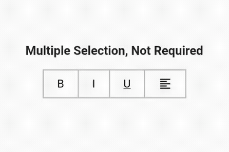
This is pretty straightforward. I have made a row of text editing options you usually see in any text editor to format the written text. There are four options, so we have four values inside our list, and all are set to false:
List<bool> isSelected = [false, false, false, false];
In our onPressed() function, we simply toggle between true and false values:
onPressed: (int index) {
  setState(() {
    // simply toggling buttons between true and false state
    isSelected[index] = !isSelected[index];
  });
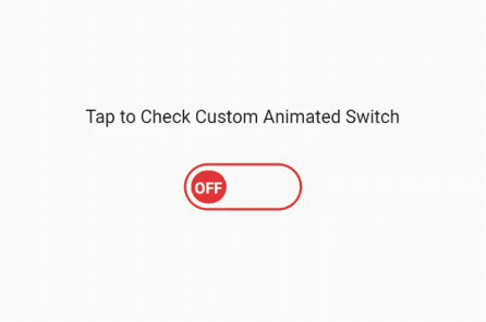
We have finished explaining the switch and toggle widget and how to use it the usual way. Now, let’s get into little complex programming by creating a custom animated switch button, which will look something like the image below after implementing the next code set.
We have divided this button into two parts. The first is a stateless widget that I have named as CustomAnimatedSwitch. In this stateless widget, we will create the custom switch. Later, we will add it to the stateful widget to use the setState() function to switch on and off.
simple_animations: ^5.0.0+2
First, we will define our named constant variables using an enum and a Boolean:
enum _CustomSwitchParams { paddingLeft, color, text, rotation }

final bool toggle;
Secondly, since we are using the simple animation package with the cascade notation (double dot operator), we are calling functions on the MovieTween object we created to access its properties. Basically, we are adding animations to the enums that we added earlier:
var customTween = MovieTween()
  ..scene(duration: const Duration(seconds: 1))
      .tween(_CustomSwitchParams.paddingLeft, 0.0.tweenTo(60.0))
  ..scene(duration: const Duration(seconds: 1))
      .tween(_CustomSwitchParams.color, Colors.red.tweenTo(Colors.green))
  ..scene(duration: const Duration(milliseconds: 500))
      .tween(_CustomSwitchParams.text, ConstantTween('OFF'))
      .thenTween(_CustomSwitchParams.text, ConstantTween('ON'),
          duration: const Duration(milliseconds: 500))
  ..scene(duration: const Duration(seconds: 1))
      .tween(_CustomSwitchParams.rotation, (-2 * pi).tweenTo(0.0));
CustomAnimationBuilderNext, we will build our CustomAnimationBuilder widget and define its required properties to assemble the switch animation:
CustomAnimationBuilder<Movie>(
   // control of the animation
   control: toggle ? Control.play : Control.playReverse,
   // the relative position where animation will start
   startPosition: toggle ? 1.0 : 0.0,
   // define unique key
   key: const Key('0'),
   duration: customTween.duration * 1.2,
   // movie tween object
   tween: customTween,
   curve: Curves.easeInOut,
   builder: (context, value, child) {
     return Container(
       decoration:
           _outerDecoration(color: value.get(_CustomSwitchParams.color)),
       width: 100.0,
       height: 40.0,
       padding: const EdgeInsets.all(4.0),
       child: Stack(
         children: [
           Positioned(
             child: Padding(
               padding: EdgeInsets.only(
                 left: value.get(_CustomSwitchParams.paddingLeft),
               ),
               child: Transform.rotate(
                 angle: value.get(_CustomSwitchParams.rotation),
                 child: Container(
                   decoration: _innerDecoration(
                     color: value.get(_CustomSwitchParams.color),
                   ),
                   width: 30.0,
                   child: Center(
                     child: Text(
                       value.get(_CustomSwitchParams.text),
                       style: const TextStyle(
                           height: 1.5,
                           fontSize: 12,
                           fontWeight: FontWeight.bold,
                           color: Colors.white),
                     ),
                   ),
                 ),
               ),
             ),
           ),
         ],
       ),
     );
   },
 );
}
CustomSwitchButton (stateful widget)Coming to the second part of creating our custom switch button, we have to add another Dart file containing a stateful widget, which we will call CustomSwitchButton.
First, define a Boolean variable and set its value to false:
bool _switched = false;
Secondly, create a method with the setState() function to toggle between true and false:
void toggleSwitch() {
  setState(() {
    _switched = !_switched;
  });
}
Lastly, we are adding our CustomAnimatedSwitch to this Dart file wrapped with GestureDetector, adding the toggleSwitch method to the onTap() function.
That’s it! We have our fully functional, custom-made, animated switch button. Please look at the code below and the images along with it:
@override
 Widget build(BuildContext context) {
   return Scaffold(
     appBar: AppBar(
       title: const Text('Custom Animated Switch'),
     ),
     body: GestureDetector(
       onTap: toggleSwitch,
       child: Center(
         child: Column(
           crossAxisAlignment: CrossAxisAlignment.center,
           mainAxisAlignment: MainAxisAlignment.center,
           children: [
             const Padding(
               padding: EdgeInsets.all(10.0),
               child: Text('Tap to Check Custom Animated Switch'),
             ),
             const SizedBox(
               height: 20.0,
             ),
             CustomAnimatedSwitch(toggle: _switched),
           ],
         ),
       ),
     ),
   );
 }
}
If you do not want to create your own switch button, you can always use any of the below packages that do the exact same as we did to make our own custom animated switch.
AnimatedToggleSwitch: Simple and animated toggle switch for multiple choices. It’s a good alternative if you don’t want to use something like a dropdown menu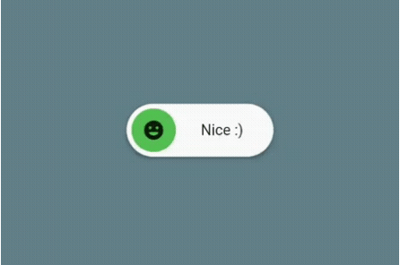
FlutterSwitch: An easy-to-implement custom switch created for Flutter. Give it a custom height and width, border for the switch and toggle, border radius, colors, toggle size, a choice to display an On and Off text, and be able to add an icon inside the toggleToggleSwitch: A simple toggle switch widget. It can be fully customized with desired icons, width, colors, text, corner radius, animation, etc. It also maintains a selection stateI’m leaving the link to the whole project that you can find on my GitHub page. If there are any issues or you can improve the code, let me know, and I will give you access to my project.
Thank you very much and stay safe!
Install LogRocket via npm or script tag. LogRocket.init() must be called client-side, not
server-side
$ npm i --save logrocket

// Code:

import LogRocket from 'logrocket';
LogRocket.init('app/id');
// Add to your HTML:

<script src="https://cdn.lr-ingest.com/LogRocket.min.js"></script>
<script>window.LogRocket && window.LogRocket.init('app/id');</script>

A guide for using JWT authentication to prevent basic security issues while understanding the shortcomings of JWTs.

Discover how to build, render, and automate product demo videos with Remotion, replacing traditional screen recordings with reusable React code.

Chrome’s Modern Web Guidance embeds modern web platform skills into AI coding agents, helping them choose native HTML, CSS, and browser APIs over legacy patterns.

Learn how to use Fallow to analyze AI-generated code, detect dead code, duplicate logic, and complexity issues, and integrate automated code quality checks into your AI-assisted development workflow.
Would you be interested in joining LogRocket's developer community?
Join LogRocket’s Content Advisory Board. You’ll help inform the type of content we create and get access to exclusive meetups, social accreditation, and swag.
Sign up now

 Learn more →
