AlertDialog with Jetpack Compose to Android apps
Jetpack Compose is a great new declarative UI kit for Android that enables UI creation in Kotlin, replacing cumbersome XML layouts.

This article presents a simple example using Jetpack Compose in a project and how to create an alert dialog that can come in handy when asking users to confirm or cancel important actions.
The Replay is a weekly newsletter for dev and engineering leaders.
Delivered once a week, it's your curated guide to the most important conversations around frontend dev, emerging AI tools, and the state of modern software.
You can follow this tutorial if you already have an XML layout-based Android app and want to start integrating Compose UI elements into it or if you are simply starting a new app and want to build the UI in Compose from the start.
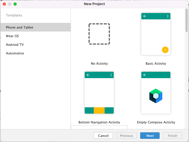
To have an optimal experience developing in Jetpack Compose, you need Android Studio Arctic Fox, which enables you to use the built-in preview of the UI you build. It also provides a wizard to easily create a new Compose project.
To create a new app, open Android Studio, select File > New > New Project, and in the wizard select Empty Compose Activity. Then, click Finish, and a new Jetpack Compose project will be created.
If you’re completely new to Jetpack Compose, I recommend reading this excellent introductory article. It provides a great overview of available components and describes the principles behind Jetpack Compose. However, I will also explain everything as we go through this article.
This post also assumes you are familiar with ViewModel (from Android architecture components), and providing the UI state from a ViewModel via StateFlow from Kotlin coroutines.
If you have an existing Android project, you must add some configuration to use Jetpack Compose.
In your main project’s build.gradle.kts, ensure you have the Android Gradle Plugin 7.0.0 and Kotlin version 1.5.31:
buildscript {
    // ...
    dependencies {
        classpath("com.android.tools.build:gradle:7.0.0")
        classpath("org.jetbrains.kotlin:kotlin-gradle-plugin:1.5.31")
        // ...
    }
}
Note that because Jetpack Compose uses its own Kotlin compiler plugin (and their API is currently unstable) it is tightly coupled to a specific Kotlin version. So, you cannot update Kotlin to a newer version unless you also update Jetpack Compose to a compatible version.
app moduleIn the build.gradle.kts of the actual app module where
android {
    buildFeatures {
        compose = true
    }
    composeOptions {
        kotlinCompilerExtensionVersion = "1.0.5"
    }
}
Then, you can add the dependencies needed. Note that compose-theme-adapter has versioning independent from other Compose dependencies (this is just a coincidence that it’s also on version 1.0.5 in this example):
dependencies {
  val composeVersion = 1.0.5
  implementation("androidx.compose.ui:ui:$composeVersion")
  implementation("androidx.compose.ui:ui-tooling:$composeVersion")
  implementation("androidx.compose.material:material:$composeVersion")
  implementation("com.google.android.material:compose-theme-adapter:1.0.5")
}
Their functionality is as follows:
compose.ui:ui provides the core functionalitycompose.ui:ui-tooling enables preview in the Android Studiocompose.material provides material components like AlertDialog or TextButtoncompose-theme-adapter provides a wrapper to reuse an existing material theme for Compose UI elements (defined in themes.xml)AlertDialogJetpack Compose provides a domain-specific language (DSL) for developing UIs in Kotlin. Every UI element is defined using a function annotated with @Composable, which may or may not take arguments but always returns Unit.
This means that this function only modifies the UI composition as a side effect and doesn’t return anything. By convention, these functions are written starting with a capital letter, so it can be easy to confuse them with classes.
So, let’s look at the documentation for a material AlertDialog composable (I omitted the parameters, which are not needed right now):
@Composable
public fun AlertDialog(
    onDismissRequest: () → Unit,
    confirmButton: @Composable () → Unit,
    dismissButton: @Composable (() → Unit)?,
    title: @Composable (() → Unit)?,
    text: @Composable (() → Unit)?,
    // ...
): Unit
What we see at first glance is that its parameters are other @Composable functions. This is a common pattern when building a UI in Compose: passing simpler composables as arguments to build more complex UI elements.
The AlertDialog parameters that interest us here are onDismissRequest, confirmButton, dismissButton, title, and text.
With onDismissRequest, we can pass a callback function that should execute when a user taps outside of the dialog or taps the device’s back button (but not when they click the dialog’s Cancel button).
Other parameters are:
confirmButton, which is a composable that provides the OK button UI and functionalitydismissButton, which is the same for the Cancel button as confirmButtontitle, which is a composable that provides the layout for the dialog titleAnd finally, text is a composable that provides the layout for the dialog message. Note that, although it’s named text, it doesn’t need to consist of a static text message only.
Because text takes a @Composable function as a parameter, you can provide a more complex layout there as well.
AlertDialogLet’s create a new file in our project for the alert dialog we want to construct. Let’s call the file SimpleAlertDialog.kt and inside it, let’s write a composable function called SimpleAlertDialog().
Inside this function, we’ll create the AlertDialog; we’ll also explore the arguments we pass one by one.
onDismissRequest callbackThe first argument is an empty lambda as a callback for the dismiss request (we will fill it in later):
@Composable
fun SimpleAlertDialog() {
    AlertDialog(
        onDismissRequest = { },
    )
}
For the Confirm button, let’s provide a TextButton with the “OK” text and an empty callback. Let’s take a look at an excerpt from the TextButton documentation (in the code example below) to see what a TextButton actually needs (I again omitted the parameters that are not used):
@Composable
public fun TextButton(
    onClick: () → Unit,
    // ...
    content: @Composable RowScope.() → Unit
): Unit
This looks simple: a TextButton needs an onClick listener and a content composable as its UI.
However, you cannot simply pass a raw string to the TextButton to display it; the string must wrap into a Text composable.
Now, we want the button to display the word “OK.” So, the content argument for the Confirm button UI layout will look like this:
{ Text(text = "OK") }
Since the content lambda is the last argument of the TextButton, according to Kotlin convention, we can pull it out of the parentheses.
After finishing the above steps, the Confirm button added to our AlertDialog looks like this:
@Composable
fun SimpleAlertDialog() {
    AlertDialog(
        onDismissRequest = { },
        confirmButton = {
            TextButton(onClick = {})
            { Text(text = "OK") }
        },
    )
}
We can now similarly define the dismissButton that will say “Cancel”:
@Composable
fun SimpleAlertDialog() {
    AlertDialog(
        onDismissRequest = { },
        confirmButton = {
            TextButton(onClick = {})
            { Text(text = "OK") }
        },
        dismissButton = {
            TextButton(onClick = {})
            { Text(text = "Cancel") }
        }
    )
}
Let’s also add a title and text that will provide our message as simple Text elements. The title will say “Please confirm” and the message will say “Should I continue with the requested action?”:
@Composable
fun SimpleAlertDialog() {
    AlertDialog(
        onDismissRequest = { },
        confirmButton = {
            TextButton(onClick = {})
            { Text(text = "OK") }
        },
        dismissButton = {
            TextButton(onClick = {})
            { Text(text = "Cancel") }
        },
        title = { Text(text = "Please confirm") },
        text = { Text(text = "Should I continue with the requested action?") }
    )
}
AlertDialog to the layoutOur dialog does not yet provide any functionality, but let’s try to see what it looks like on the screen. For that, we must add it to our layout. This is done in two different ways.
If you built a fresh Compose project using the project wizard, inside the MainActivity.onCreate() method you will find a call to setContent{}. This is where all your composables for the screen go.
To add the SimpleAlertDialog composable to your MainActivity just place it inside the MyApplicationTheme (the theme name will be different if you named your application something other than MyApplication).
Your code should look as follows:
class MainActivity : ComponentActivity() {

    override fun onCreate(savedInstanceState: Bundle?) {
        super.onCreate(savedInstanceState)

        setContent {
            MyApplicationTheme {
                SimpleAlertDialog()
            }
        }
    }
}
If you have an existing project with an XML-based layout, you must add a ComposeView to your XML layout:
<...>
    <androidx.compose.ui.platform.ComposeView
        android:id="@+id/compose_view"
        android:layout_width="wrap_content"
        android:layout_height="wrap_content"/>
</...>
Now, in your Activity, you can access this compose_view, through view binding, for example, and it will have a setContent{} method where you can set all your composables.
Note that for the composables to use your existing material app theme, you must wrap them in MdcTheme (the Material Design components theme wrapper).
So, in your Activity, you will have something like this:
class MainActivity : AppCompatActivity() {

    override fun onCreate(savedInstanceState: Bundle?) {
        super.onCreate(savedInstanceState)
        // Inflate your existing layout as usual, e.g. using view binding
        val binding = ActivityMainBinding.inflate(layoutInflater)
        setContentView(binding.root)

        // Access the added composeView through view binding and set the content
        binding.composeView.setContent {
            // Wrap all the composables in your app's XML material theme
            MdcTheme {
                SimpleAlertDialog()
            }
        }
    }
}
SampleAlertDialogLet’s run the project and see what we’ve achieved so far!
The dialog looks as expected, with the title, message, and two buttons.
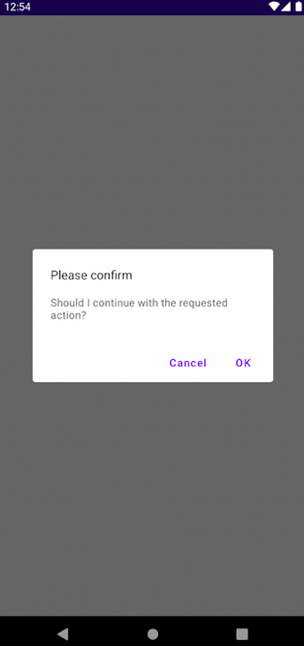
However… the alert cannot be dismissed! It doesn’t matter if you press the Cancel or OK button, tap on the screen outside the dialog, or press the device back button; it doesn’t go away.
This is a big change from the old XML-based layout system. There, the UI components “took care of themselves” and an AlertDialog automatically disappeared once you tapped one of the buttons (or perform another action to dismiss it).
While Jetpack Compose gives you great power, with great power comes great responsibility; you have complete control over your UI, but you are also completely responsible for its behavior.
ViewModelTo control showing and dismissing the AlertDialog, we will attach it to a ViewModel. While assuming you already use ViewModels in your app, if you don’t, you can easily adapt the following logic to whatever presentation layer architecture you use.
MainViewModel to show/hide SimpleAlertDialogFirst, add the following dependency to your build.gradle.kts:
implementation("androidx.lifecycle:lifecycle-viewmodel-ktx:2.4.0")
We can now create a MainViewModel that provides UI state for the MainActivity. By adding a showDialog property, you can emit the dialog visible/invisible state as a Kotlin coroutine StateFlow containing a Boolean.
A true value means the dialog should be shown; false means it should be hidden.
This showDialog state can change by the following callbacks:
onOpenDialogClicked(), which shows the dialog when requiredonDialogConfirm(), which is called whenever a user presses OK in the dialogonDialogDismiss(), which is called whenever a user presses Cancel in the dialogLet’s see these in action:
class MainViewModel : ViewModel() {
    // Initial value is false so the dialog is hidden
    private val _showDialog = MutableStateFlow(false)
    val showDialog: StateFlow<Boolean> = _showDialog.asStateFlow()

    fun onOpenDialogClicked() {
      _showDialog.value = true
    }

    fun onDialogConfirm() {
        _showDialog.value = false
        // Continue with executing the confirmed action
    }

    fun onDialogDismiss() {
        _showDialog.value = false
    }

    // The rest of your screen's logic...
}
SimpleAlertDialogNow we must modify our dialog a little bit. Let’s go back to the SimpleAlertDialog.kt file.
There we must make a few changes. First, let’s add a parameter for the show state to the SimpleAlertDialog() composable function.
Then, inside the function, we can wrap the whole AlertDialog in a big if (show) statement so it only shows when the ViewModel tells it to.
We also need to add the onConfirm and onDismiss callbacks as parameters to SimpleAlertDialog() so the dialog can communicate back to ViewModel when the user dismissed or confirmed the dialog.
Finally, set the onConfirm callback as the click listener for the OK button and the onDismiss callback as the click listener for the Cancel button and as a callback for the onDismissRequest (a tap outside the dialog/a press of the device back button).
Altogether it looks like this:
@Composable
fun SimpleAlertDialog(
    show: Boolean,
    onDismiss: () -> Unit,
    onConfirm: () -> Unit
) {
    if (show) {
        AlertDialog(
            onDismissRequest = onDismiss,
            confirmButton = {
                TextButton(onClick = onConfirm)
                { Text(text = "OK") }
            },
            dismissButton = {
                TextButton(onClick = onDismiss)
                { Text(text = "Cancel") }
            },
            title = { Text(text = "Please confirm") },
            text = { Text(text = "Should I continue with the requested action?") }
        )
    }
}
SimpleAlertDialog to MainViewModelNow, we can attach the SimpleAlertDialog to MainViewModel inside our MainActivity so they can communicate with each other in both directions.
For this, we need three things. First, the MainActivity needs a reference to the MainViewModel instance (using the by viewModels() delegate).
Secondly, inside the setContent scope, we must create a local showDialogState variable so the SimpleAlertDialog can observe the showDialog state from the viewModel.
We can do this using the delegate syntax (using the by keyword). The delegate then uses collectAsState() to wrap the showDialog into a special Compose wrapper, State.
State is used in Compose to observe changes to the value that is collected inside it. Whenever this value changes, the view is recomposed (that is, all UI elements check if their state changed and if so, they must be redrawn).
This showDialogState variable can now be passed as an argument to the show parameter of the SimpleAlertDialog. If its value changes, the dialog appears or hides accordingly.
However, our SimpleAlertDialog needs two more arguments: the onDismiss and onConfirm callbacks. Here, we will simply pass the references to the appropriate viewModel methods: viewModel::onDialogDismiss and viewModel::onDialogConfirm.
After finishing the above steps, our MainActivity looks like this:
class MainActivity : ComponentActivity() {

    // Reference to our MainViewModel instance using the delegate
    private val viewModel: MainViewModel by viewModels()

    override fun onCreate(savedInstanceState: Bundle?) {
        super.onCreate(savedInstanceState)

        // Opens the dialog immediately when the Activity is created
        // Of course in a real app you might want to change it
        viewModel.onOpenDialogClicked()

        setContent {
            // Delegate to observe the showDialog state in viewModel
            val showDialogState: Boolean by viewModel.showDialog.collectAsState()

            MyApplicationComposeTheme {
                SimpleAlertDialog(
                    show = showDialogState,
                    onDismiss = viewModel::onDialogDismiss,
                    onConfirm = viewModel::onDialogConfirm
                )
            }
        }
    }
}
Note that we’re calling viewModel.onOpenDialogClicked() in onCreate() here; in a real app, we should call it in response to a user’s action, like pressing a button on the screen.
SimpleAlertDialog in the appLet’s run our app again. Now, we see that we can easily dismiss the dialog by pressing the OK or Cancel buttons, tapping anywhere on the screen outside the dialog, or pressing the device back button.
We also have a confirmation callback in the ViewModel that can continue executing the desired action.
Now you’ve experienced how Jetpack Compose’s philosophy is different from the old XML layout-based UI development. Compose gives you more control and integration of the UI logic into your ViewModels but also requires you to define all the UI behaviors yourself (even the ones you’ve taken for granted, like dismissing a dialog).
However, having all the logic inside of the ViewModel means you can easily write unit tests for it and change it when needed in the future.
The fact that Compose UI elements are implemented as Kotlin functions means that you have much less yet readable UI code compared to XML layouts. You also have direct access to IDE support while writing code like code completion, one-button documentation, compile time checks, or type safety.
The ability to construct more complex UI elements out of simpler ones by passing composable functions as arguments to other functions increases code reuse and modularity of your UI.
It can also be easily customizable, for example, in the SimpleAlertDialog, you can add a parameter to pass a custom layout to edit text instead of the confirmation message, creating a RenameDialog.
LogRocket is an Android monitoring solution that helps you reproduce issues instantly, prioritize bugs, and understand performance in your Android apps.
LogRocket's Galileo AI watches sessions for you, instantly identifying and explaining user struggles with automated monitoring of your entire product experience.
LogRocket also helps you increase conversion rates and product usage by showing you exactly how users are interacting with your app. LogRocket's product analytics features surface the reasons why users don't complete a particular flow or don't adopt a new feature.
Start proactively monitoring your Android apps — try LogRocket for free.
Install LogRocket via npm or script tag. LogRocket.init() must be called client-side, not
server-side
$ npm i --save logrocket

// Code:

import LogRocket from 'logrocket';
LogRocket.init('app/id');
// Add to your HTML:

<script src="https://cdn.lr-ingest.com/LogRocket.min.js"></script>
<script>window.LogRocket && window.LogRocket.init('app/id');</script>

When should you move API logic out of Next.js? Learn when Route Handlers stop scaling and how ElysiaJS helps.

Explore how Dokploy streamlines app deployment with Docker, automated builds, and simpler infrastructure compared to traditional CI/CD workflows.

A side-by-side look at Astro and Next.js for content-heavy sites, breaking down performance, JavaScript payload, and when each framework actually makes sense.

AI-generated tests can speed up React testing, but they also create hidden risks. Here’s what broke in a real app.re
Hey there, want to help make our blog better?
Join LogRocket’s Content Advisory Board. You’ll help inform the type of content we create and get access to exclusive meetups, social accreditation, and swag.
Sign up now

 Learn more →
