
Trust signals are the visible and invisible cues that reassure users when buying a digital product or service. They range from security icons to customer reviews, money-back guarantees, and the presence of well-known payment methods. In ecommerce and SaaS products, where hesitation at checkout is common, these signals often make the difference between abandonment and purchase.

From personal experience, when it comes to startups, trust signals have a tremendous impact on conversions. When no one knows your product or who you are as a company, trust signals act like a reference from a market leader — people are more likely to buy your product if they see familiar names. Unfortunately, since they do not recognize your brand, you must ensure that at least something on the screen is familiar to your customer. This is why trust signals are extremely useful for getting things started in the early stages.
In this piece, I’ll examine trust signals in products like Airbnb, Shopify, and PayPal, and what designers can learn from them. These are interface examples and design interpretations, not controlled experiments proving conversion gains. The screenshots document the original examples; interfaces and policies can change.
Editor’s note: This article was updated on October 27, 2026 to correct Dropbox’s refund example, clarify the limits of review badges and payment protections, and add review-authenticity safeguards. The original interface examples are retained for context; they are not evidence of measured conversion gains.
Key Takeaways
Users often hesitate to enter payment details or commit to subscriptions because of loss aversion (the fear that losing money or time outweighs potential benefits) and status quo bias (the tendency to stick with free trials or familiar options instead of switching). These biases are amplified by perceived risks such as security breaches, fraud, or unreliable services, which can easily trigger cart abandonment or stalled sign-ups.
Social proof, recognizable brands, and clear policies can help users assess uncertainty, but their effectiveness depends on whether the underlying claims are true and relevant. A free trial can reduce commitment risk; it does not automatically create reciprocity. Emotional design can support a calm, understandable experience, while clear pricing and refund terms let users judge the actual tradeoffs.
A recognizable payment logo or subscriber count may reassure users, but it is not proof of security or suitability. Claims such as “Trusted by 10,000+ subscribers” need a defensible definition and current evidence. Test whether people understand the signal and make informed decisions, rather than assuming it will increase conversions.
Airbnb’s core challenge was psychological: overcoming loss aversion (fear of wasting money or risking safety) and status quo bias (hesitation to stay with strangers instead of booking a hotel). Their breakthrough was a two-way review system, where both hosts and guests leave feedback. This transparency tapped into Cialdini’s principle of social proof and created a sense of reciprocity and unity, making it easier for users to take the leap.
Crucially, Airbnb embedded reviews into its UI hierarchy in ways that reduce hesitation at decision-making moments:
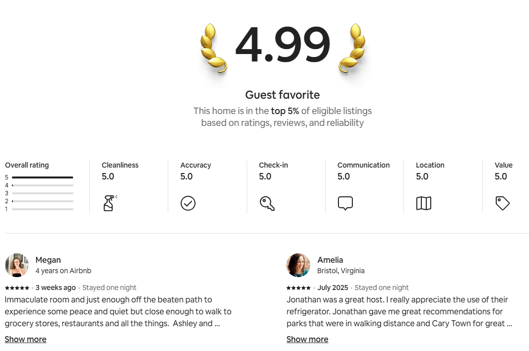
Ratings and review counts appear above the fold, carrying more visual weight than body text, and reviews are filterable and sortable to mitigate choice overload or negativity bias:
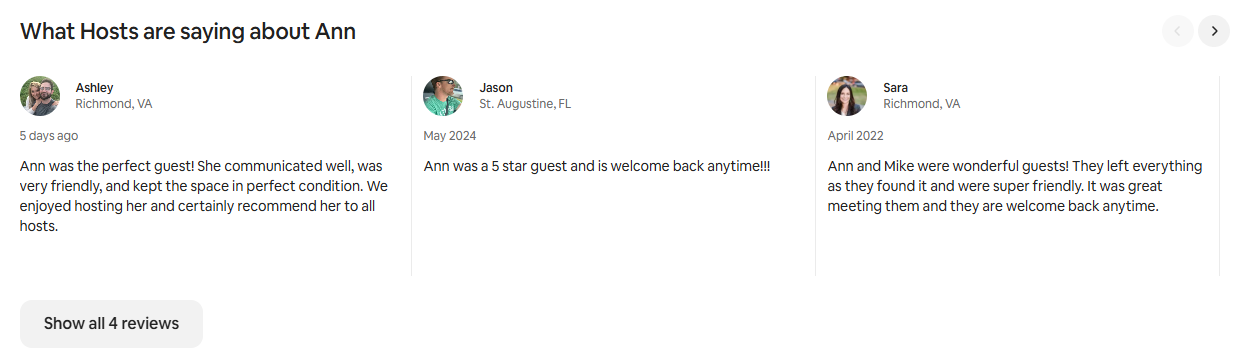
Readable review summaries and clear controls can help people inspect feedback. Do not rely on hover-only interactions: equivalent information needs to be accessible on touchscreens and with a keyboard.
The same psychology applies across SaaS purchase flows. For example:
Over time, Airbnb’s review system became more than reassurance; it evolved into a long-term reputation architecture. Reviews motivate hosts to maintain consistent quality, and they serve as a discovery mechanism for guests searching by ratings. This mirrors how SaaS platforms use verified feedback loops (customer ratings, NPS scores, or case studies) to build durable trust and drive adoption.
The useful lesson from Airbnb is to make feedback visible and inspectable. For SaaS, place relevant customer evidence near decisions, while letting users see the source, context, and less favorable experiences. Measure the effect in your own flow.
Security cues should explain protections a product actually provides. A badge can draw attention to a claim, but it cannot establish that a merchant will deliver an order or honor a refund.
Shopify provides TLS certificates for domains added to its platform. TLS protects the connection; merchant-added security badges are separate claims that need their own evidence. The original illustrations below show badge presentation, not an endorsement or a mandatory Shopify checkout layout:

Place relevant assurances where users need to evaluate them, but do not assume everyone follows an F-shaped scan path. Layout, device, task, and accessibility needs change how people inspect a checkout. This original badge example illustrates a placement choice to test:
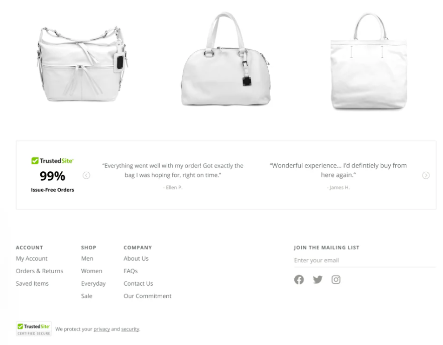
HTTPS does not establish a website’s trustworthiness. Chrome replaced its address-bar lock with a tune icon to reduce that misunderstanding. Do not tell users to look for a universal padlock, or present a decorative lock in a page as evidence of merchant verification.
For SaaS, use precise, substantiated security statements and link to documentation explaining their scope. Avoid decorative “compliant” seals or isolated encryption claims that imply a broader guarantee than the evidence supports. Give users a clear route to security information and support when they need more detail.
Useful reassurance is specific and checkable. The interface should accurately communicate protections and limitations, rather than making a risky transaction feel safe through styling alone.
In the early days of e-commerce, one of the biggest barriers was loss aversion. Users feared losing money to fraud or exposing sensitive card data to unknown merchants. PayPal addressed this by acting as a trusted intermediary — letting people complete transactions without sharing credit card details directly. The brand itself carried weight, signaling authority and consumer protection, offering a familiar route for payment and dispute handling. PayPal’s US Purchase Protection terms cover eligible purchases subject to exclusions, deadlines, and claim requirements; the logo is not an unconditional refund guarantee. Check the applicable market’s policy before describing coverage.
But PayPal’s impact wasn’t just about brand reputation. It was also about interface integration. Placement of the PayPal option near the primary checkout button made a familiar payment option immediately visible at the moment of hesitation. Using the recognizable blue-and-gold PayPal badge introduced familiar visual cues into unfamiliar merchant flows, borrowing not only brand trust but also design trust:
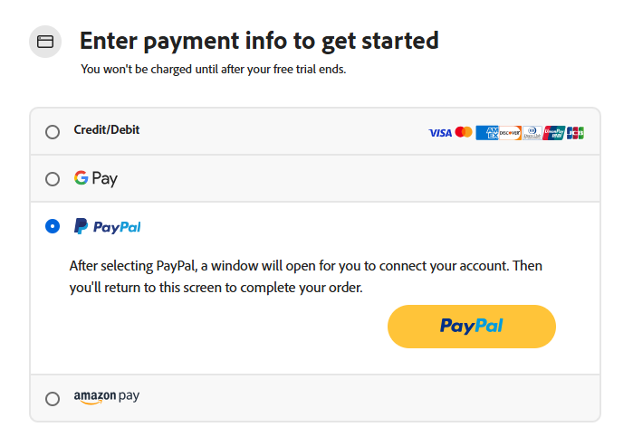
On mobile, a familiar payment flow can reduce effort. Evaluate actual authentication and recovery steps before describing it as one-click or faster.
For SaaS and subscription flows, these design choices are equally powerful. A PayPal button placed alongside credit card fields reduces checkout friction and gives risk-averse users an “escape hatch” at the commitment stage. Combined with reinforcing UI elements — such as secure iconography, consistent brand colors, and progress indicators in the checkout flow — PayPal’s integration helps counter status quo bias (“I’d rather not enter my card here”) and lowers abandonment rates.
So, trust isn’t just borrowed from third-party brands. It’s amplified by how those trust signals are placed, styled, and sequenced within the interaction flow. SaaS companies can learn from PayPal’s role in checkout design — position reassurance at the exact point of decision, make it visually prominent, and pair it with smooth microinteractions to turn hesitation into conversion.
On mobile, friction is one of the biggest killers of conversions. Filling out forms on small screens is tedious, and any extra effort increases drop-off. Apple Pay and Google Pay can reduce manual entry through saved payment details and device-supported authentication. The steps vary by device and setup; avoid promising a universal one-click or biometric-only flow. Wallet support does not certify the merchant’s reliability.
Google Pay, in particular, reduces friction further through progressive disclosure. Stored cards and payment methods remain hidden until the user actually needs to make a choice. This avoids overwhelming the interface while surfacing relevant options only at the decision point. Combined with material design guidelines (consistent spacing, elevation, shadows, and motion cues), the flow feels both familiar and trustworthy across devices, reinforcing user confidence:
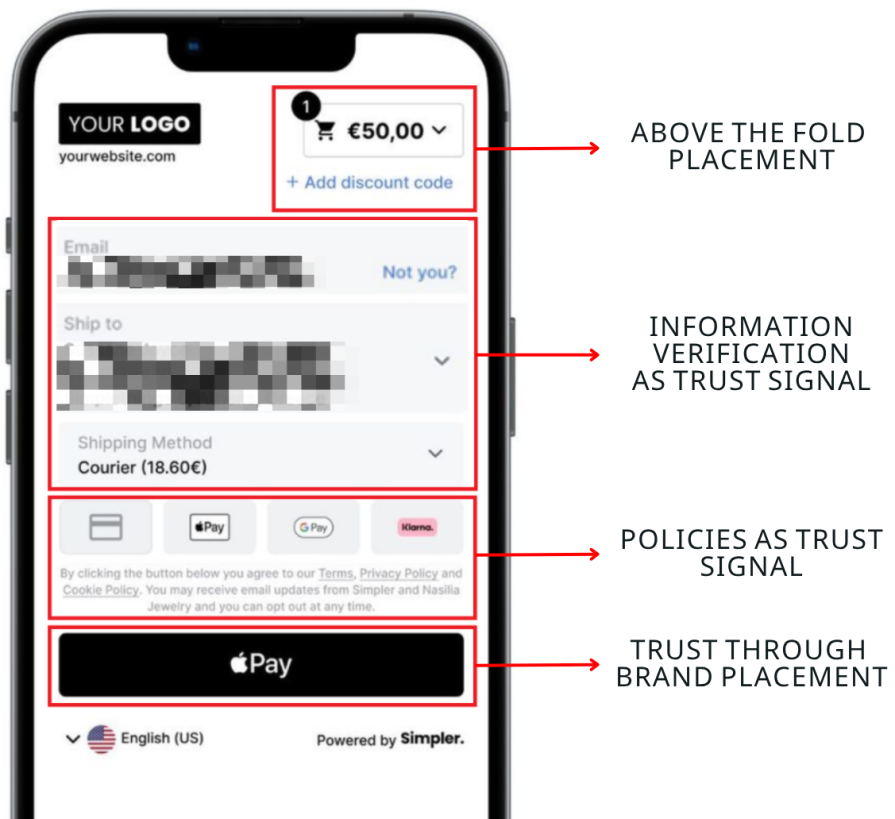
Offer payment methods that fit your audience, region, and supported devices, with a usable fallback. The absence of Apple Pay or Google Pay is not evidence that a merchant lacks bank approval or fails security standards. Test the full flow, including declined payments and recovery.
The original Slack example uses recognizable company logos as social proof. A customer relationship is not the same as a partnership or endorsement. When using logos in your own product, describe the relationship accurately, confirm permission, and keep the claim current.
This type of partner validation is especially powerful for SaaS, where buyers are wary of downtime, data security, or wasted investment. The placement of these logos near call-to-action buttons reinforces the decision-making process, helping users feel they are in good company:

The lesson is to make customer evidence relevant and verifiable. A recognizable logo may support a decision, but does not prove that your product suits another organization.
Dropbox illustrates why policy accuracy matters more than reassuring language. Its refund policy says subscription payments are generally non-refundable, with exceptions. For example, it lists a 14-day cancellation refund for specified personal plans in the EU, UK, and Turkey; purchases through device storefronts have separate request routes. Do not describe Dropbox as offering a standard 30-day money-back guarantee.
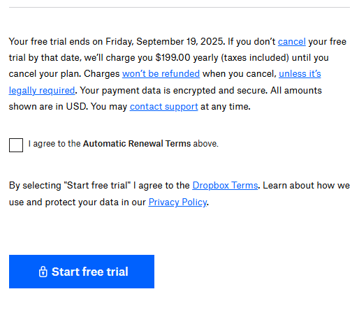
For a subscription interface, show the amount due, billing cadence, renewal terms, cancellation route, and refund conditions before commitment. Cancellation and a refund are different outcomes: explain both. The design lesson is to make the actual terms easy to understand, even when they are less reassuring than a guarantee.
The original examples below show companies displaying Trustpilot or G2 ratings. Third-party platforms can add useful context, but a rating or badge does not establish that every review is genuine, representative, or relevant to the buyer’s needs. Moderation and verification are safeguards, not guarantees.
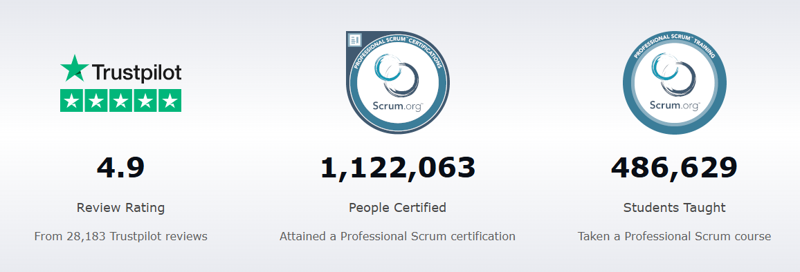
When using a review badge on pricing or demo pages, show the source and review count, and provide a direct route to the underlying reviews. Distinguish an individual testimonial from a platform-wide score. A selected positive quote should not be presented as the complete picture:
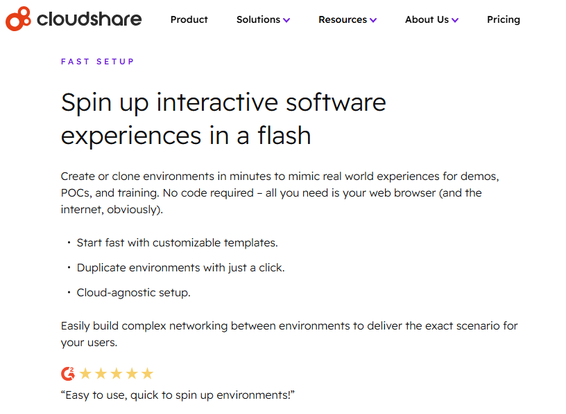
Trustpilot reports removing 7.8 million reviews detected as fake in 2025. That is a platform-reported moderation figure, not a measure of how many fake reviews remain. It demonstrates why a familiar review logo cannot replace provenance and scrutiny.
Use third-party feedback to help users investigate, not to ask them to suspend judgment. Show recent and critical feedback alongside favorable evidence, and make the business’s responses easy to inspect.
A star rating should be the start of an investigation, not its conclusion. Build these checks into the component and the process that supplies it:
The US FTC’s review-rule guidance distinguishes hosting reviews from using them as marketing testimonials. It explains that incentives cannot depend on a particular sentiment, and that undisclosed incentives can violate the FTC Act. Merely hosting reviews does not create a general duty under this rule to investigate each one. These UX safeguards help people judge evidence; they should not be described as a universal legal checklist.
Test with a concrete task: “What does this rating tell you, and what would you check before buying?” If users interpret it as a guarantee of safety, refunds, or universal satisfaction, revise the component.
| User hesitation type | UX design approach | Example implementation |
| Security | Explain actual security protections and refund conditions, with links to evidence and policy details. | Shopify, Dropbox |
| Credibility | Use authentic social proof such as verified reviews, customer stories, or contextual testimonials near key decision points. | Airbnb, Trustpilot |
| Authority | Use permitted logos with an accurate description of the relationship or supported payment method. | Slack, PayPal |
| Effort | Offer supported express payment options and clear recovery paths, with an accessible fallback. | Apple Pay, PayPal |
Across all the cases, one pattern is clear — trust is not built through a single signal but through a system of reinforcements that address different buyer fears:
A trust signal is useful when it answers a real question with accurate evidence. Adding more badges can also create clutter or false confidence; test what users actually understand.
For digital businesses, the lesson is to meet uncertainty with checkable information. That might mean linking to relevant reviews, explaining a security control, making refund limits visible, or simplifying payment recovery. Identify the concern, match the evidence to it, and test comprehension alongside conversion.
Personally, I’ve found that the usefulness of trust signals depends on the audience and the decision, not just the company’s stage. A review platform can remain useful as a business grows. Keep assessing the relevance and quality of the evidence rather than assuming reviews are only valuable early on.
But, when it comes to personal reviews and authority signals, I realized that sometimes some reviews, like the one I found on Instagram, might work against you:

An average rating can hide important context. Give users a way to inspect recent reviews, recurring complaints, and the company’s responses. A low rating alone is not evidence of competitor manipulation; investigate suspicious activity without dismissing legitimate criticism.
Additionally, when it comes to authority, logos of some brands that you think everyone should know might not be recognizable by newcomers, and that might actually drive them away. “I don’t know any of those, this feels sketchy” is another response that you might start seeing in those questionnaires you send to your target audience.
Revisit trust signals as your audience and product change. Replace stale or irrelevant claims, but do not remove unfavorable feedback simply to make the business look better. A useful interface helps customers judge the evidence themselves.
The goal is to help people make informed decisions about their money, data, and time. A higher conversion rate is not enough if customers later discover conditions they did not understand. Durable trust depends on whether the experience delivers on the promise.
Trust me, this is how UX really converts!

LogRocket's Galileo AI watches sessions and understands user feedback for you, automating the most time-intensive parts of your job and giving you more time to focus on great design.
See how design choices, interactions, and issues affect your users — get a demo of LogRocket today.
How four Figma AI plugins fit into a UX workflow, from ideation and wireframing to UX writing and design critique. Compare free limits, account requirements, and data handling.

Learn how to size usability tests, interviews, surveys, and experiments based on the decision, the users you need to cover, and the evidence you need.
Design critiques help teams predict outcomes. UX postmortems connect those predictions with what happened after launch. Learn a six-step framework for reviewing assumptions, combining evidence, identifying surprises, and sharing lessons without adding a heavy process.

Learn how to crop shapes and images in Figma with square and circle crops, frame clipping, boolean subtraction, vector masks, and AI cutouts, with practical examples and troubleshooting tips.

 Learn more →