
The Replay is a weekly newsletter for dev and engineering leaders.
Delivered once a week, it's your curated guide to the most important conversations around frontend dev, emerging AI tools, and the state of modern software.
Design systems are made up of UI components such as checkboxes, buttons, textfields and so on, and incorporate many design scaffolding ideologies. However, one important aspect of these systems that receives little attention is spacing.

Every design system’s essential characteristic is space, which determines whether or not other components can be accommodated and where they are placed. The concept of spacing and the standardization of UI component spacing are grouped under a design ideology called the spacial system.
In this article, we will look at how the spatial system affects design systems, how to standardize spacing using spatial system principles, and some best practices for spacing components in design systems.
The only thing you will need to understand this tutorial is working knowledge of HTML and CSS.
A spatial system is a collection of design guidelines that coordinate the spacing, sizing, and measurement of UI components in white space. Prioritizing the spatial system ensures uniformity and consistency, and enhances the user experience.
The following are four examples of spatial systems that can be used and suggested:
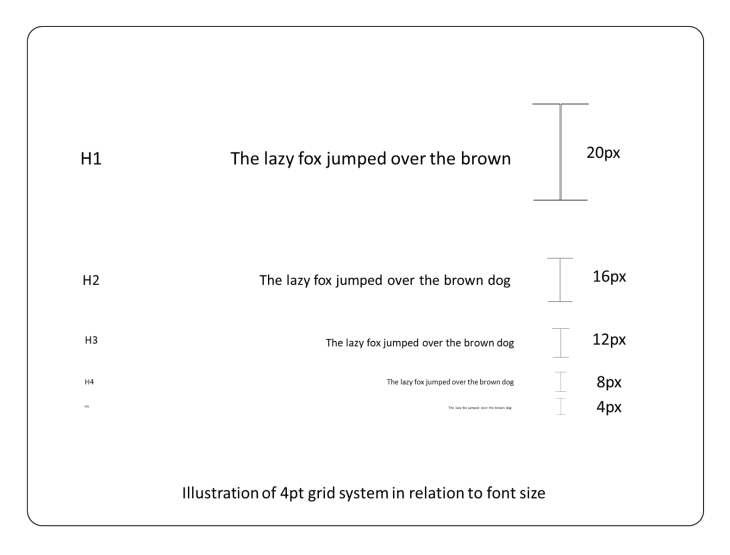
The 4-point grid system is a rigid grid layout based on incrementing space values by multiples of four.
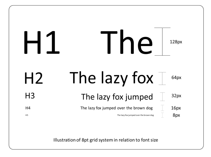
This spatial system, like the 4-point grid system, is based on increments of space values by multiples of eight.
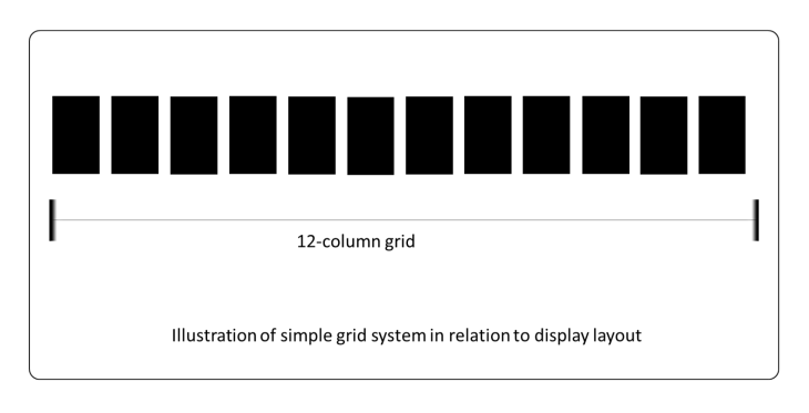
This spatial system is built on a 12 column rule offered by the standard CSS style guide. Every row with a 100vw of media has these 12 columns.
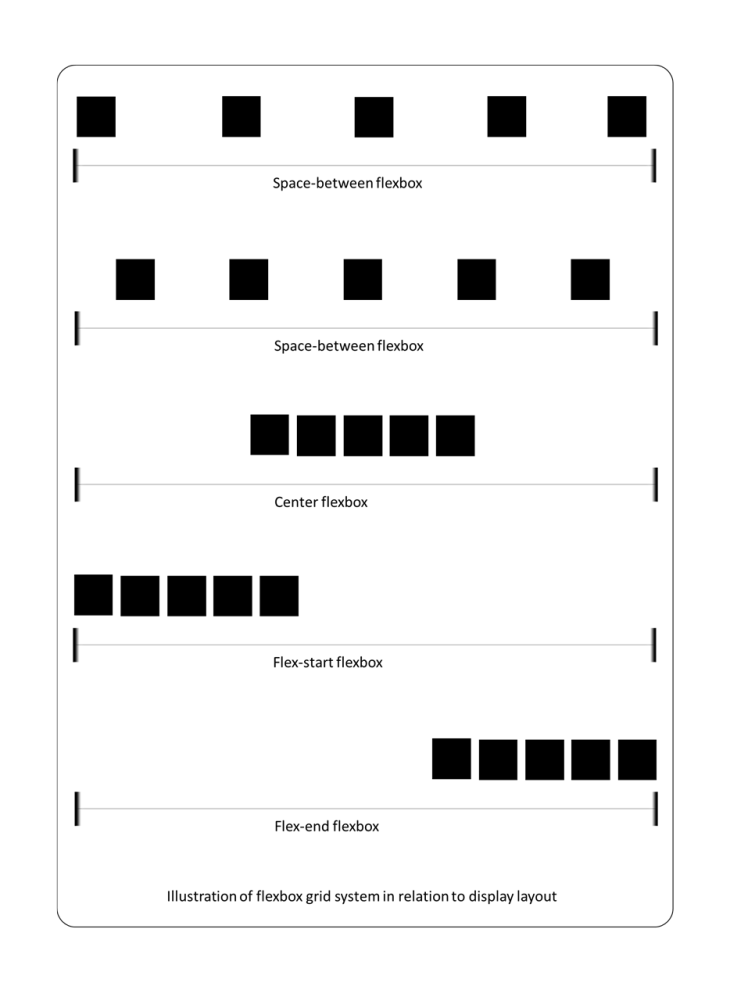
The flexbox grid system is derived from the basic CSS flex display property.
Spatial systems may be applied to UI attributes such as margins, paddings, z-indexes, and borders, among many others.
You should always specify a base unit before adding spatial systems to a design. This will help you to evaluate which spatial system you will use in your design. You’ll notice certain differences in the pattern of size increments in different designs. Some designs employ 4pt, 5pt, 6pt, 8-point, 10pt increment schemes, as well as irregular increments. There’s nothing wrong with picking a different system to use, as long as it’s defined and there’s a good rationale for it.
There are several variables to assess when selecting a spatial system to decide whether it is appropriate for the use case. The following are some of these variables:
Consider how users will interact with your design when considering spatial systems. Do they require larger typography to access information, or do they require less space to access a feature? Before deciding which spatial system is appropriate, user testing and surveys should be conducted for how users will interact with a design.
This is a feature of a design that allows it to be displayed in any format, including landscape or portrait in small and large devices. When constructing a design with this attribute, the spatial system’s flexibility and size alternatives are critical.
A responsive design is flexible and adaptable to changing circumstances. Choosing a spatial system for this sort of design will also necessitate a great deal of size flexibility and control.
This design is difficult to adapt to changes and is difficult to fit into a variety of layouts or media sizes. As a result, it’s critical to choose a spatial system that will maintain the design acceptable on every layout it’s displayed on.
These variables are also influenced by the units used to measure the design dimension’s points. As stated previously, there are designs that allow for flexibility or rigidity in both the units and the designs.
The three most common design units are em, rem, and pixels. Pixels are rigid and precise, but ems and rems are variable and based on the parent element’s font size.
Em is the em value multiplied by the parent element’s font size’s pixel value. As a result, if an element’s parent has a font size of 32px, the element’s 10em will look like $latex 32px*10=320px$.
Rem is the pixel value of the root element’s font size of an HTML page multiplied by the rem value. As a result, if an element’s root font size is 64px, the element’s 5rem will be $latex 64px * 5=320px$.
The pixel value of the element size is the actual pixel value. If the element’s size is 1px, so is the pixel value.
Let us look at some instances of how to apply a spatial system design now that we have a better understanding of the elements that decide which spatial system to employ, and the units of spatial systems in design.
Because it is a fairly popular and suggested system to adopt, I have picked the 8-point grid system to show how spatial systems might be used in design in this article. We’ll talk about how to apply this approach to the following spatial properties.
First, let’s discuss the margin. The margin is an empty space between UI components that is offset from the component’s border. Here’s an example of how to use margins in an 8-point grid system.
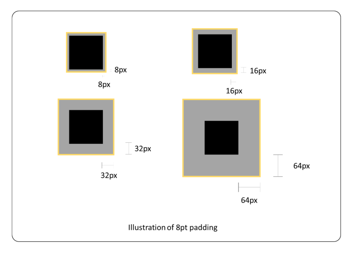
The padding is the empty space between a UI component’s border and its content; it is inset to the component’s border and outset to the component’s content. Here’s an example of how to use paddings in an 8-point grid system.
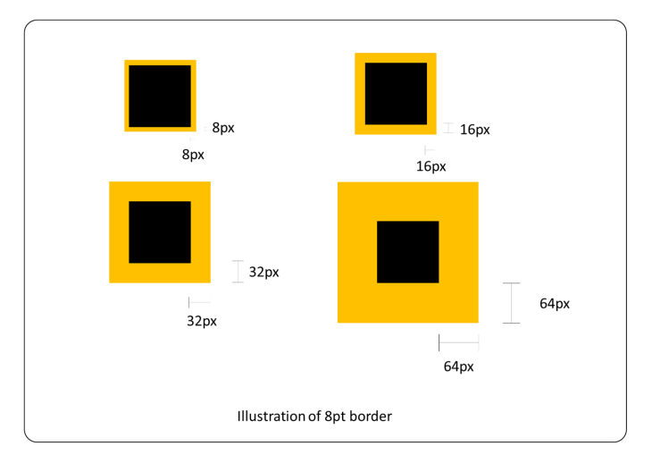
The border is a visibly spaced line in around the boundaries of a component. Here’s an example of how to use borders in an 8-point grid system.
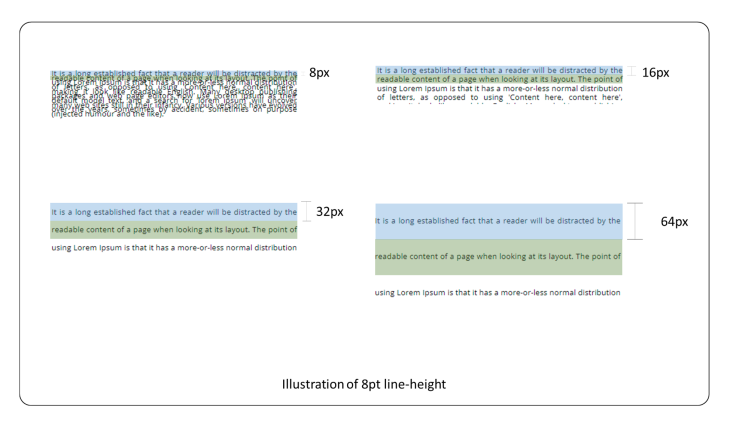
The line height is the gap that contains the content of a line of text. The size of the text that may be handled in one line is determined by the line height. Here’s an example of how to use line height in an 8-point grid system.
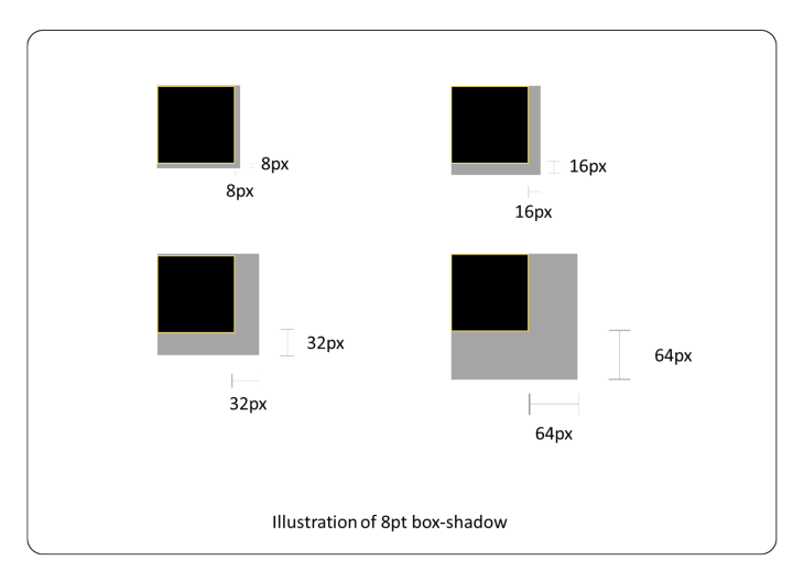
Shadows are a visual effect that uses space slightly out or inside an element to project the light’s perspective on it. Depending on the shadow style, shadows have either a margin or padding overlay (inset or outset). Here’s an example of how to use shadow in an 8-point grid system.
When designing, using the best or most suggested spatial system is insufficient. There are a number of other practices that can help to improve a design’s outcome. Let’s take a look at some of the best practices for spacing components in design systems.
First is to create a wireframe for your white space design. Before commencing the real design, it’s critical to map out the information hierarchy and how to handle white space. This will limit the number of extraneous edits or modifications.
Second, try adopting the Gestalt principle of proximity. Using the Gestalt principle helps us learn how to quickly communicate information to our audience through the utilization of space. This will aid in maximizing existing resources for information transmission, even if they are insufficient.
Third, set memorable base numbers and expectations. Most people are familiar with a base 10 number system, so this makes predicting the next value in a sequence easy.
Fourth, try scaling with fixed increments. When working with components of varying sizes, remembering the next level of measurement might be challenging. It will be easy to figure out which value comes next in succession if the measurement has a set pattern of increments.
Fifth, name dimensions for easy reuse. Sizes and measurements named for easy memorization and reusability by others, as embraced by design systems like as Bootstrap and Material UI, are helpful.
A collection of dimensions, for example, may be called as follows:
margin: 8px; // m-sm
margin: 16px; // m-md
margin: 32px; // m-lg
margin: 64px; // m-xlg
People will be able to read meaningful names to the measurements instead of remembering figures, or having to do a calculation every time the dimensions are needed, if standard size naming is used, such as sm (small), md (medium), and lg (large).
Sixth, use the grid as a component and not as space. Grid is a component that utilizes space, yet it is frequently misunderstood as a space itself. Even when utilizing grids, it’s still vital to manage space (margin, padding, gutter, and so on).
Seventh, handle overwriting the default line height. When dealing with textual content, many individuals overlook the amount of space that the text takes up. There will be inconsistent line height, especially in circumstances where the font size fluctuates, which will affect the design by creating disordered whitespace or even clusters.
Finally, organize content and visual hierarchy. Prioritizing the arrangement of information is critical when using space. Communication may not be effective if content is not organized logically according to its importance.
After reading this article, readers should have a better understanding of the importance of spacing in design systems and how to use spatial systems. There are a number of other design system aspects that were not covered in depth in this article. To discover more about design systems, visit https://www.designsystems.com/.
If you have any more questions or comments, please leave them in the comments section below.
Install LogRocket via npm or script tag. LogRocket.init() must be called client-side, not
server-side
$ npm i --save logrocket

// Code:

import LogRocket from 'logrocket';
LogRocket.init('app/id');
// Add to your HTML:

<script src="https://cdn.lr-ingest.com/LogRocket.min.js"></script>
<script>window.LogRocket && window.LogRocket.init('app/id');</script>

Learn how AI-assisted development governance uses rules, agents, hooks, and protocols to help AI coding tools produce safer, more consistent code.

A step-by-step guide to building your first MCP server using Node.js, covering core concepts, tool design, and upgrading from file storage to MySQL.

Using security headers in your Next.js apps is a highly effective way to secure websites from common security threats.

A deep dive into May 2026’s AI model and tool rankings. We break down performance, usability, pricing, and real-world capabilities across 50+ features to help you pick the right tools for your development workflow.
Would you be interested in joining LogRocket's developer community?
Join LogRocket’s Content Advisory Board. You’ll help inform the type of content we create and get access to exclusive meetups, social accreditation, and swag.
Sign up now