In the old days, CSS animations were handled by a handful of magicians and tricksters, often referred to as CSS Wizards. These wizards knew the ways of CSS and how to make elements go up and down, disappear, fly out, glow, jump, and hide. Their tale was spoken in all known realms, and their arcane magic was feared by many – and sought after by even more.

As their fame grew, so did the number of apprentices – people who also wanted to use those arcane spells that made a page transition so smoothly, or gave pleasing loader screens. But the magic was difficult, it took time to master, and when it went bad, it went bad – apps crashed, pages jumped into each other, users couldn’t figure out what was what, and why it was so. These were the difficult times.
Fortunately, as time passed, magicians, apprentices, and new wizards slowly but surely collected their own knowledge, classified it, and put it into large libraries – collections of spells that would bring about powerful wizardry even in the hands of a mere apprentice. These are today referred to as CSS animation libraries.
In this article, we will go over six of these powerful libraries to help wizards and apprentices from all over the globe get their spells up and running quickly, without getting lost deep in scrolls (a.k.a documentation) and making devastating errors.
Our collection tries to present you with the best, easiest, most configurable, and convenient CSS animation libraries out there.
Here are the CSS animation libraries we will cover in this article:
| Name | Best Use Case | Compatibility |
|---|---|---|
| Animista | Ideal for small projects or when developers want to quickly animate elements without adding new npm packages | Compatible with almost any JavaScript framework due to its use of native CSS and keyframes |
| Animate CSS | Suitable for small and large animation-heavy projects due to its high customizability and flexible implementation (npm or CDN) | Works with practically any framework, requiring minor adjustments |
| AnimXYZ | Ideal for both large and small projects due to its extensive customization capabilities and straightforward use | Offers direct support for React and Vue, and can be used with any other framework |
| Whirl | Best for creating seamless and beautiful loading animations to enhance user experience | Compatible with pretty much any JS framework as it uses vanilla CSS, requiring minor adjustments for framework-specific quirks |
| Moving Letters | Best suited for animating text | Easily portable to any JS framework |
| LDRS | Best suited for loaders and spinner animations | Comes with ReactJS support and can be implemented with pretty much any JavaScript framework |
Animista is a handy and easy-to-use on-demand CSS animations library. The library provides ready-made animations for various parts of the app development workflow. No installation is required.
In order to implement a particular animation, all you need to do is visit its playground, choose the animation you want to implement, and get the relevant class and keyframes for it. All its content is in native CSS: no external dependencies required.
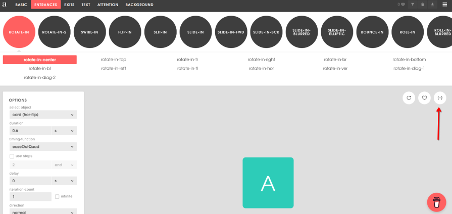
Available animations are grouped in different sections: Basic, Entrances, Exits, Text, Attention, and Background.
Each section contains animations corresponding to its group. For instance, in the Entrances section, you’ll find animations like Bounce-in or Roll-in that’ll animate the element coming into the page, while the Attention section will present animations that create a jello or wobble effect.
Let’s say we want to use a rotate-in animation in the Entrances section. We have to get the code from the respective section on the right (pointed with red arrow):
For this example, we’ll be using a React app created with Vite, but you’re free to choose your own setup. First, we need to get the code given by Animista and paste it into our CSS file:
.rotate-in-center {
  -webkit-animation: rotate-in-center 0.6s cubic-bezier(0.25, 0.46, 0.45, 0.94)
    both;
  animation: rotate-in-center 0.6s cubic-bezier(0.25, 0.46, 0.45, 0.94) both;
}

@-webkit-keyframes rotate-in-center {
  0% {
    -webkit-transform: rotate(-360deg);
    transform: rotate(-360deg);
    opacity: 0;
  }
  100% {
    -webkit-transform: rotate(0);
    transform: rotate(0);
    opacity: 1;
  }
}
@keyframes rotate-in-center {
  0% {
    -webkit-transform: rotate(-360deg);
    transform: rotate(-360deg);
    opacity: 0;
  }
  100% {
    -webkit-transform: rotate(0);
    transform: rotate(0);
    opacity: 1;
  }
}
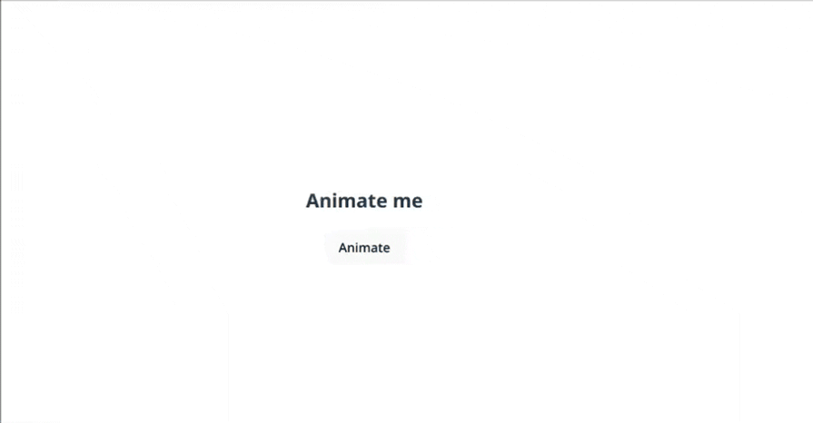
As you can see, we have only one class and the appropriate keyframes for it. Since we’re dealing with a simple class, if we wanted to create a basic React app that would animate an element on button click, we could do something like the following:
import { useState } from "react";
import "./App.css";

function App() {
  const [animate, setAnimate] = useState(false);

  const handleClick = () => {
    setAnimate(true);
    setTimeout(() => setAnimate(false), 1000); // match animation duration
  };

  return (
    <>
    <h2 className={animate ? "rotate-in-center" : ""}>Animate me</h2>
    <button onClick={handleClick}>Animate</button>
    </>
  );
}

export default App;
With its variety of animation capabilities, Animista can be used in many different applications. The lack of installation and ability to use it with native CSS opens up the possibility for developers working on smaller projects who want to get things up and running quickly. It also applies for devs with bigger codebases who do not want to add yet another npm package, but still want to immediately animate an element.
Since Animista uses native CSS and keyframes, it can be used with almost any JavaScript framework.
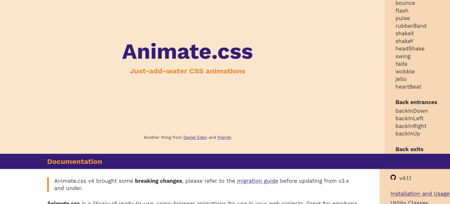
Animate CSS is a highly customizable CSS animation library. It can be used as an npm package, or accessed directly via CDN. On the main page of the Animate CSS website, we have both the documentation and on the right, the animation classes:
 Adding an animation using Animate CSS is as easy as:
animate__animated command as a base to the element you want to animateanimate__bounceConsider that we’re going to use Animate CSS on a ReactJS app built with Vite. After installing the npm package, we need to add import 'animate.css'; on main.jsx.
Now we can just start using the animations on our elements. Add the following code and run the app:
import { useState } from "react";
import "./App.css";

function App() {
  const [animate, setAnimate] = useState(false);

  const handleClick = () => {
    setAnimate(true);
    setTimeout(() => setAnimate(false), 1000); // match animation duration
  };

  return (
    <>
    <h2 className={animate ? "animate__animated animate__bounce" : ""}>
        Animate me
    </h2>
    <button onClick={handleClick}>Animate</button>
    </>
  );
}

export default App;
You’ll see that on button click, the desired animation is fired: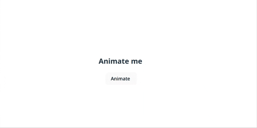
Animate CSS can be employed by both small and larger projects. Since it supports both package installation and CDN, it gives freedom to the dev team on how they’d like to implement the library. Animate CSS allows a lot of configuration and customization, which makes it suitable for animation-heavy projects.
Animate CSS can be used with practically any framework. In the documentation, you’ll see class is used. But considering that we used a React app in our example, you’ll notice that we changed class to className. As long as we’re taking such things into account, Animate CSS should work with any popular framework out there.
AnimXYZ is a highly customizable and composable CSS animation framework. It also has direct support for major JavaScript frameworks like React and Vue. They have a great website showcasing the library’s capabilities and an animated documentation section: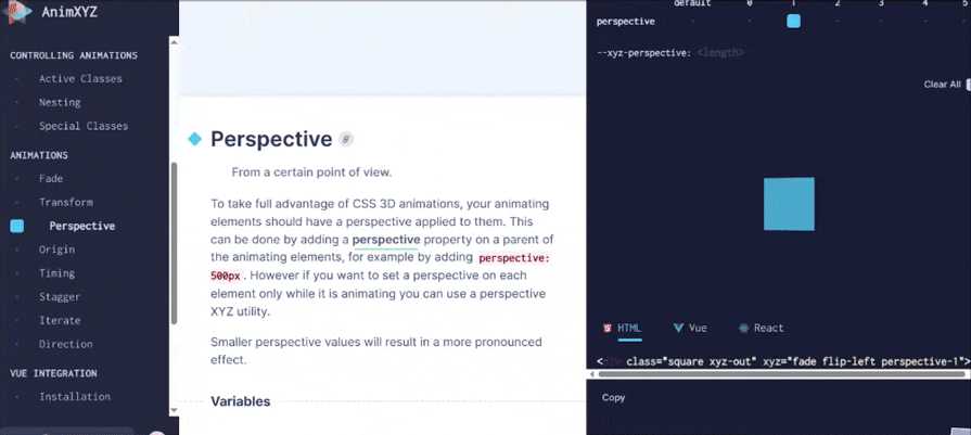
As you’d expect from an animation library, it allows developers to create many different animation sequences. AnimXYZ leverages CSS variables to customize a base @keyframes animation. These xyz variables control both the timing and animated properties like opacity and transform. Depending on whether an element enters or exits, these values animate accordingly between defined states.
AnimXYZ has a specified installation process for React and Vue. We’ll use a React project built with Vite and will follow the standard installation for this section to experiment with AnimXYZ in the most generic way.
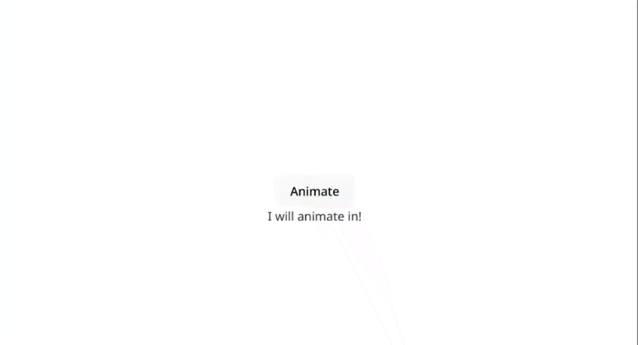
So, after installing the core package via npm, we will add import "@animxyz/core"; to main.jsx and then, paste the following in: App.jsx:
import { useState } from "react";
import "./App.css";

function App() {
  const [key, setKey] = useState(0);

  const handleClick = () => {
    setKey((prev) => prev + 1); // trigger re-render with new key
  };

  return (
    <>
    <button onClick={handleClick}>Animate</button>
    <div key={key} className="xyz-in" xyz="fade up big">
        I will animate in!
    </div>
    </>
  );
}

export default App;
 Best use cases
AnimXYZ is suited for both worlds: large and small projects alike.
For large projects, it has extensive customization that enables developers to create pretty much any animation they can imagine. It’s also suitable for small projects because the library itself is fairly straightforward to use, so there’s not a steep learning curve. You or your team can get started with AnimXYZ really quickly.
AnimXYZ offers support for two popular frameworks directly: React and Vue. But it can be used with pretty much any other framework, since it has a core package that works with vanilla JavaScript. As long as the dev team knows JavaScript and its ecosystem, they can effectively use AnimXYZ as a CSS animation library in their projects.
Whirl is a simple library that offers a collection of loading animations. Every little touch is important for the user experience, and adding a well-thought-out, aesthetically pleasing loading animation to a web app greatly enhances the perception of the app’s quality and the team’s seriousness.
I’ve always enjoyed a nice loading animation, and Whirl has an extensive collection of beautifully designed, fully functional loading animations ready to use.
Here’s what the main page of the library looks like: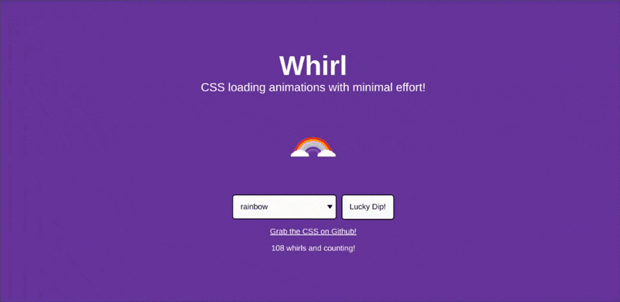
You’ll see a collection of loading animations. You can look around and try different animations. The Lucky Dip! button gives a random animation.
No installation is required; everything is done with CSS directly, and if you click on Grab the CSS on Github! link, it’ll provide you with the required code.
So, let’s say we create a React app with Vite. The only thing we need to do is to copy the code given:
Then you’ll paste it into the App.css file. From here, we can just create a simple component with the className rainbow, and enjoy our loading animation:
import "./App.css";

function App() {
  return (
    <>
    <div className="rainbow"></div>
    </>
  );
}

export default App;
Whirl is a small library that targets one niche: loading animations. It is not intended as a full library for complex animations. It does one thing, and it does it well. It’s best for teams or devs who want a better UX by creating seamless, beautiful loading animations.
Since Whirl uses vanilla CSS, it should be compatible with pretty much any JS framework. One thing to note is that, for instance, in our example, we had to take into account that React doesn’t work with the class keyword, but requires className to be used. You’ll need to account for these little quirks in the framework of your choice, and you’ll be good to go.
Moving Letters is a CSS animations library that focuses on text animations. It uses Anime JS in the background. In principle, you can use the animations in any other element you wish, but it works best with text animations.
No installation is required. For this section, we will use vanilla JS, so go ahead and set up a Vanilla JS project using Vite.
On the webpage, we can see and choose what kind of animation we want to use: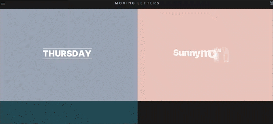
Once you click, the animation and the code next to it will be presented: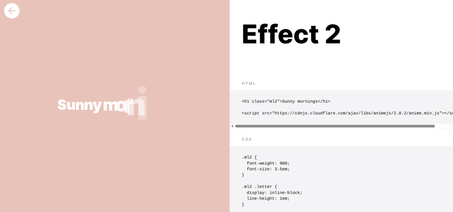
The only thing we need to do is to use this code: no npm packages required. Notice that we’re importing the Anime JS library.
If implemented correctly, this will be the end result:
Moving Letters is best suited for animating text. You can use it for different purposes, but that would require some tweaking. It’s better to use the tool for what it’s specifically designed for.
Moving Letters gives its examples on vanilla JS, but it can easily be ported to any JS framework. At the core, we’re just using vanilla JS and CSS. So, compatibility, while it is not natively supported, shouldn’t be that difficult.
LDRS is a great CSS animations library for loaders and spinners. It can be used by installing an npm package or directly with CDN. It has a nice collection of simple yet elegant spinners and loaders, and offers direct support for HTML/CSS and React.
On the main page, you can choose the loader you want to use: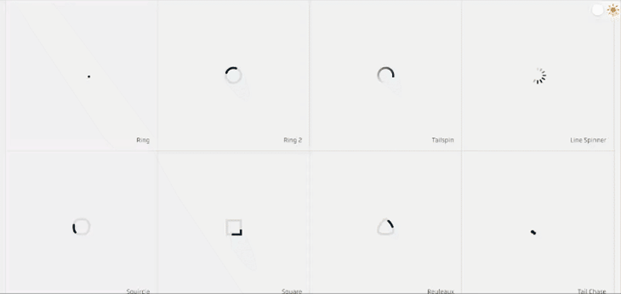
When clicked, a separate component opens which shows the chosen loader, its source code, and some customization on the side: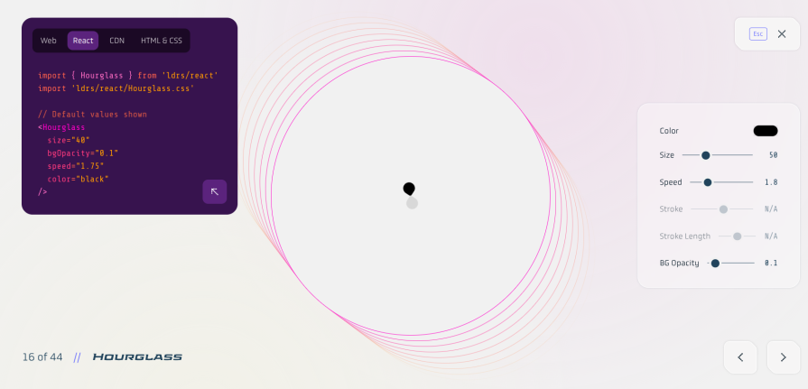
You can change properties like size, speed, and background, and copy the code directly.
After creating a React-vite application, this is the App.jsx we want to have:
import React from "react";
import { Hourglass } from "ldrs/react";
import "ldrs/react/Hourglass.css";
import "./App.css";

const App = () => {
  return (
    <div>
    {/* // Default values shown */}
    <Hourglass size="40" bgOpacity="0.1" speed="1.75" color="blue" />
    </div>
  );
};

export default App;
This will render the following page: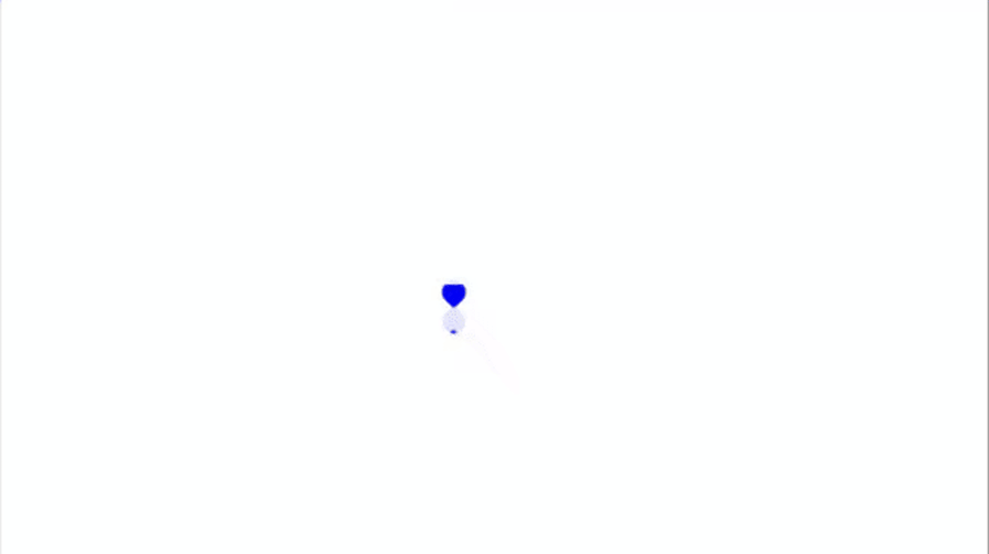
LDRS is best suited for loaders and spinner animations.
LDRS comes with ReactJS support, but it can be implemented with pretty much any JavaScript framework.
Our journey through the modern landscape of CSS animation libraries reveals that the “arcane magic” of web motion is more accessible than ever. We’ve moved beyond the days when complex animations were the exclusive domain of CSS wizards.
As demonstrated, libraries like Animista, Animate CSS, AnimXYZ, Whirl, Moving Letters, and LDRS offer powerful, pre-built solutions to common animation challenges.
Each library streamlines the process of adding engaging microinteractions, smooth transitions, informative loading states, and eye-catching text effects, ultimately enhancing user experience and perceived performance. While their implementation methods and customization options differ, they all share the goal of empowering developers to bring interfaces to life more efficiently.
The true power lies in choosing the right tool for the job. Consider the scope of your project, your team’s familiarity with different approaches (CSS vs. JS integration), and the specific types of animations you need.
Don’t hesitate to experiment! The best way to master this modern magic is to try these libraries yourself. Dive into their documentation, play with the examples, and see how easily you can elevate your next web project with dynamic and delightful animations.
As web frontends get increasingly complex, resource-greedy features demand more and more from the browser. If you’re interested in monitoring and tracking client-side CPU usage, memory usage, and more for all of your users in production, try LogRocket.

LogRocket lets you replay user sessions, eliminating guesswork around why bugs happen by showing exactly what users experienced. It captures console logs, errors, network requests, and pixel-perfect DOM recordings — compatible with all frameworks.
LogRocket's Galileo AI watches sessions for you, instantly identifying and explaining user struggles with automated monitoring of your entire product experience.
Modernize how you debug web and mobile apps — start monitoring for free.

From RSC vulnerabilities and the Vercel breach to TypeScript 7.0 Beta and AI agents — the nine frontend storylines that defined H1 2026, ranked.

AI tools generate working React code fast, but miss race conditions, empty states, debouncing, and accessibility. Here’s how to catch bugs before production.

Learn how to use Gemini CLI subagents to delegate frontend, backend, testing, and docs tasks to specialized agents with guardrails and clear ownership.

Learn how next-browser gives AI agents runtime context for debugging Next.js apps, including React props, hydration, PPR, forms, and performance.
Would you be interested in joining LogRocket's developer community?
Join LogRocket’s Content Advisory Board. You’ll help inform the type of content we create and get access to exclusive meetups, social accreditation, and swag.
Sign up now

 Learn more →
