If you’re having trouble designing CSS text styles or looking for some creative ideas, popular media can be a great source of inspiration. For example, in the Spider-Verse films, there is a unique approach to animation that’s heavily influenced by comic books.

In this post, you’ll learn how to style text with CSS inspired by some of the graphics and characters in the Spider-Verse movies. There are many stunning visuals and interesting characters to pick from, but we’re sticking with five. We’ll create some static text styles and see some animated ones.
The Replay is a weekly newsletter for dev and engineering leaders.
Delivered once a week, it's your curated guide to the most important conversations around frontend dev, emerging AI tools, and the state of modern software.
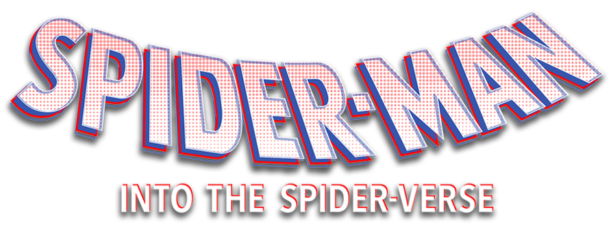
What better place is there to start than the title card? Although there are variations of each movie’s title card, they typically feature the SPIDER-MAN text displayed with multiple layers of text, where each layer features a different style. Here’s the version Netflix uses for Into the Spider-Verse:

Let’s create a simple version of this with CSS. Here’s a screenshot of what we’re creating:

We’ll start with some h1 text:
<body>
  <h1 data-text="HELLO!">HELLO!</h1>
</body>
It has a data-text attribute that contains the same text as the h1. We’ll use this to create the layers of text.
Next up, some CSS. We’ll start by styling the h1:
h1{
  position: relative;
  font-family: "Poppins", sans-serif;
  color: #f6d8d5;
  font-size: 150px;
}
For this CSS text styling exercise, it’s best to use a font that’s already visually “bold” even before you set the style to bold.
To create the additional layers, you’ll need the :before and :after pseudo-elements:
h1::before{
  content: attr(data-text);
  position: absolute;
  top: 0.04em;
  left: 0.04em;
  color: #313f97;
  z-index: -1;
}
h1::after{
  content: attr(data-text);
  position: absolute;
  color: transparent;
  top: -0.04em;
  left: -0.04em;
  -webkit-background-clip: text;
  background-clip: text;
  -webkit-text-stroke: 1px #ec2225;
}
We’re adding small offsets to move them away from the main text and a z-index on the :before element to move it to the back. Now we have three layers of text.
We can go further by animating the offsets. As a result, the text will look normal at first. Then, you reveal the multiple layers with :hover.
Here’s a CodePen demonstrating the final result:
See the Pen Styling multi-layered text with CSS by Oscar Jite-Orimiono (@oscar-jite)
on CodePen.
If you look closely at the SPIDER-MAN text from the title card, you’ll see that it has dots all over. This is a drawing technique that utilizes spots called stippling. You can replicate this with CSS using the background property and a radial-gradient.
We’re adding the stippling effect on the top layer, which is the :after pseudo-element:
h1::after{
  content: attr(data-text);
  position: absolute;
  color: transparent;
  top: 0em;
  left: 0em;
  background-image: radial-gradient(circle, rgba(236, 34, 37, 0.5) 0.0125em, transparent 0.0125em);
  background-size: 8px 8px;
  -webkit-background-clip: text;
  background-clip: text;
  -webkit-text-stroke: 1px #ec2225;
  transition: 0.2s;
}
First, make the text transparent or semi-transparent. Then, add a background-image to the text, which has a radial-gradient that transitions from color to transparency in a short distance. Next, reduce the background-size, and add a background-clip. Because it repeats by default, the dots will appear.
Here’s a screenshot of the multi-layered text with stippling:

Glitches are a recurring theme in the Spider-Verse movies. When the Spider-People from different dimensions first appeared in Miles’ universe, they glitched because they didn’t belong there. In Across the Spider-Verse, the “much cooler than a watch” device allows them to travel to other universes without glitching.
There are several ways we can approach creating a glitch animation with CSS when applying it to text. We’ll do something simple to start and have some fun later on.
For the first example, we’ll use a similar approach to the multi-layered text by using the data-text attribute and some pseudo-elements. We’ll also be using the text-shadow property.
Using the same text from the previous example, add a text-shadow with two contrasting solid colors at four stops that will appear on :hover:
h1:hover{
  text-shadow: 0px -5px #ec2225,
               0px 5px #00c2cb,
               -5px 0px #ec2225,
               5px 0px #00c2cb;
}
We have a red shadow to the top-left side of the text and a blue shadow to the bottom-right side.
Here’s a screenshot of how it should look:

It looks glitchy even as a still image, but we can take it further with some CSS animation — simply add a pseudo-element hidden behind the header. The main text will remain stationary while we animate the position and opacity of the pseudo-element, creating the glitching effect:
h1::before{
  content: attr(data-text);
  position: absolute;
  top: 0;
  left: 0;
  color: #e0ffff;
  z-index: -1;
}
h1:hover::before{
  animation: animate 12ms ease-in-out infinite;
  z-index: 1;
}
@keyframes animate{
  0%, 100%{
    top: -7px;
    left: 0;
    opacity: 1;
  }
  20%{
    top: 0;
    left: -10px;
    opacity: 0.7;
  }
  40%{
    top: 7px;
    left: 0;
    opacity: 0.2;
  }
  60%{
    top: 0;
    left: 10px;
    opacity: 0.3;
  }
  80%{
    top: 0;
    left: 0;
    opacity: 0.9;
  }
}
Here’s a CodePen you can interact with. Hover over the text to see the glitch:
See the Pen Styling text with a CSS glitch animation – Version 1 by Oscar Jite-Orimiono (@oscar-jite)
on CodePen.
You can change the pattern of the glitch by adding more colors to the text-shadow or the text:
In the @keyframes, you can also add more stop points. This is what we’re going to create in the next example. We’ll use the same text with the pseudo-elements and data-text attribute. This time, we’re using more CSS properties, like clip-path and transform.
Note that you don’t have to use CSS pseudo-elements to create the glitch animation. You can also use another element, like a span — as long as you hide it behind the main text, it’ll work just fine when you apply the same CSS rules. Using the pseudo-element with the data-text attribute just makes the HTML simpler.
Now for the fun part!
Start by adding a text-shadow to the h1. For this example, we’re still using :hover to trigger the glitch animation on the text:
h1 {
  position: relative;
  font-family: "Poppins", sans-serif;
  color: #f6d8d5;
  font-size: 150px;
}
h1:hover {
  text-shadow: 0.05em 0 0 #ec2225,
               -0.025em -0.05em 0 #313f97,
               0.025em 0.05em 0 #50c878;
}
Note that we’re using a shadow with three layers.
Next up, we add the :before and :after elements, then use a combination of clip-path and transform to create the distortion:
h1:before,
h1:after {
  content: attr(data-text);
  position: absolute;
  top: 0;
  left: 0;
  opacity: 0.8;
}
h1:hover::before {
  animation: glitch 650ms infinite;
  clip-path: polygon(0 0, 100% 0, 100% 45%, 0 45%);
  transform: translate(-0.025em, -0.0125em);
}
h1:hover::after {
  animation: glitch 375ms infinite;
  clip-path: polygon(0 65%, 100% 20%, 100% 100%, 0 70%);
  transform: translate(0.0125em, 0.025em);
}
Here’s a screenshot of what the header should look like at this point:

Now, let’s add the @keyframes:
@keyframes glitch {
  0% {
    color: #ec2225;
    text-shadow: 0.05em 0 0 #ec2225, -0.025em -0.05em 0 #313f97,
      0.025em 0.05em 0 #50c878;
  }
  14% {
    text-shadow: 0.05em 0 0 #ec2225, -0.025em -0.05em 0 #313f97,
      0.025em 0.05em 0 #50c878;
  }
  15% {
    color: #50c878;
    text-shadow: -0.05em -0.025em 0 #ec2225, 0.025em -0.025em 0 #313f97,
      -0.05em -0.05em 0 #50c878;
  }
  49% {
    text-shadow: -0.05em -0.025em 0 #ec2225, 0.025em -0.025em 0 #313f97,
      -0.05em -0.05em 0 #50c878;
  }
  50% {
    text-shadow: 0.025em 0.05em 0 #ec2225, -0.025em 0.05em 0 #313f97,
      0 -0.05em 0 #50c878;
  }
  99% {
    color: #313f97;
    text-shadow: 0.025em 0.05em 0 #ec2225, -0.025em 0.05em 0 #313f97,
      0 -0.05em 0 #50c878;
  }
  100% {
    text-shadow: -0.025em 0 0 #ec2225, -0.025em -0.025em 0 #313f97,
      -0.025em -0.05em 0 #50c878;
  }
}
In the animation, we’re changing the offset values on the original text-shadow. With the random colors thrown in plus the clip-path of the pseudo-elements, we have a colorful glitch effect.
Here’s a CodePen with the text glitch animation. Hover over the header to start the chaos:
See the Pen Styling text with a CSS glitch animation – Version 2 by Oscar Jite-Orimiono (@oscar-jite)
on CodePen.
To create this CSS glitch animation, we used the clip-path property. You can use Bennett Feely’s Clippy tool to generate clip-path properties in any of the preset shapes or to make a custom clip-path. Ours had only four points — what if yours has eight points like a spider?
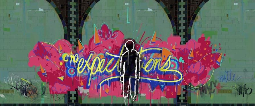
Miles is a talented graffiti artist, and we saw glimpses of several striking works of his art in the movies. To create graffiti text with CSS, you have two options:
We’re using a handwriting font from Google called Freehand. For the first example, we’re going to create a simple version of the “no expectations” graffiti from the first Spider-Verse movie:

Here’s the HTML:
<body>
  <h1><span>no</span>expectations</h1>
</body>
Now for the CSS:
h1 {
  position: relative;
  font-family: "Freehand", cursive;
  color: #d8dc20;
  font-size: 8rem;
  font-weight: 100;
  letter-spacing: -0.05em;
  text-shadow:
    -0.02em 0.02em 0 #5575b3,
    0.02em 0.02em 0 #5575b3,
    0.02em -0.02em 0 #5575b3,
    -0.02em -0.02em 0 #5575b3;
    z-index: 1;
}
Next, we’ll style the text in the span tag:
span {
  font-size: 0.45em;
  top: -0.7em; /* Moves the span upwards */
  left: 0.15em;
  vertical-align: baseline;
}
Here’s a screenshot of what you should have at this point:

Note in the CSS above that we used the text-shadow property to create an outline around the text. We can also do this with text-stroke, but in this case, the cursive nature of the font would be an issue because the letters overlap.
Here’s how the text would look if the text-stroke property was used to create the outline:

You have to be careful when styling fancy fonts because a lot of them have default features you can’t overwrite. Even the text-shadow doesn’t work well with some of these fonts, so make sure you adjust your strategy based on the font’s features and your styling goals.
Let’s move on. Graffiti art usually has paint splatter and drips, but that’s going to be difficult to create with CSS. Luckily, there’s a solution!
We want a paint splatter and drip background. If you double as a designer, you’d probably have no issues creating a transparent PNG of a splatter on Photoshop or any other graphics applications. The rest of us can head over to a source like Canva and grab one — you might need a Pro account to get the good stuff.
Here’s the image we’re using in this demo:

Once you have the image, you have two options. First, you could apply it directly to the header as a background. However, using it as a background means you can’t change the color or design.
Second, you can use a CSS mask and a pseudo-element. Here’s how to add a mask-image to the text:
h1:before{
  content: '';
  position: absolute;
  top: -0.01em;
  left: 0em;
  width: 100%;
  height: 120%;
  background: linear-gradient(to bottom,#a81443, #5575b3 90%);
  mask-image: url(splatter.png);
  mask-repeat: no-repeat;
  mask-size: 100%;
  mask-position: center;
  z-index: -1;
}
The CSS mask property can be styled like the background property. The pseudo-element will take the shape of the image and you can use any color you like for the background.
Here’s a screenshot of the text at this point:

Working with irregular fonts can be tricky, so you might need a few tweaks and adjustments to get everything into position perfectly.
You can run a search for libraries that have graffiti fonts and get several options to choose from. For example, CDNFonts has a great collection.
When you find the font you like, you can import it to your stylesheet or link it through your HTML. Then you set it as the font-family.
Let’s see another quick example of styling text to look like graffiti with CSS. We’ll go back to our Hello! text:
<body>
  <h1>Hello!</h1>
</body>
Here’s the CSS:
h1 {
  position: relative;
  font-family: 'Fresh Marker', sans-serif;
  color: #d8dc20;
  font-size: 8rem;
  font-weight: 100;
  -webkit-text-stroke: 0.02em #5575b3;
  letter-spacing: 0.6rem;
  text-shadow:
    0.02em 0.02em 0 #5575b3,
    0.04em 0.04em 0 #a81443,
    0.06em 0.06em 0 #5f355c,
    0.02em 0.02em 0 #5575b3;
}
This time, we’re using the text-stroke property to add an outline to the text and a multi-layer text-shadow to add more color. The result should look like so:

And that’s how you can create graffiti text with CSS. To take this basic example further, you can add a background image or highlight the text with a pseudo-element.
Hobie Brown, or Spider-Punk, had a rather dramatic entrance featuring a newspaper cutout text effect.
Just like the graffiti font, some libraries offer this type of font but there’s not a lot of room for customization. You can make it more personalized by making every letter a separate HTML element and using different fonts. Let’s see this in action.
Here’s the HTML:
<h1>
    <span>H</span>
    <span>E</span>
    <span>L</span>
    <span>L</span>
    <span>O</span>
  </h1>
Here’s the CSS:
h1 {
  position: relative;
  font-family: 'Poppins', sans-serif;
  color: #ffc863;
  font-size: 8rem;
  letter-spacing: -0.3rem;
  z-index: 1;
}
h1 span:nth-child(1){
  font-family: 'Proclamate Light', sans-serif;
  text-transform: lowercase;
}
h1 span:nth-child(2){
  font-style: italic;
  font-family: "Playfair Display", serif;
}
h1 span:nth-child(3){
  font-family: "Satisfy", cursive;
  font-weight: 400;
  font-style: normal;
}
h1 span:nth-child(4){
  font-family: "Love Ya Like A Sister", cursive;
}
h1 span:nth-child(5){
  font-family: "Poppins", serif;
}
The fonts we’re using are from Google Fonts and CDNFonts. Here’s a screenshot of how the text looks:

To make this text look more like newspaper cutouts, we’ll need a few more CSS properties, like background, text-stroke, clip-path, and more.
First, we need a background that’s properly sized and aligned to each letter. Applying a background directly to the letters will cause some issues. The solution is to use a pseudo-element to serve as a background for each letter:
h1 span:before {
  content: "";
  position: absolute;
  top: -0.2em;
  left: -0.2em;
  width: 100%;
  height: 100%;
  padding: 0.2em;
  z-index: -1;
}
Now you can have fun styling the letters:
h1 span:nth-child(1) {
  font-family: "Proclamate Light", sans-serif;
  text-transform: lowercase;
  color: #ffc863;
}
h1 span:nth-child(1)::before {
  background: #332929;
  clip-path: polygon(0 0, 100% 0%, 100% 100%, 0 83%);
}
h1 span:nth-child(2) {
  font-style: italic;
  font-family: "Playfair Display", serif;
  color: #023020;
  text-shadow: 0.02em 0.02em 0 #a52a2a, 0.03em 0.03em 0 #a52a2a;
}
h1 span:nth-child(2)::before {
  background: #f5deb3;
}
h1 span:nth-child(3) {
  font-family: "Satisfy", cursive;
  font-weight: 400;
  font-style: normal;
  color: #28282B;
}
h1 span:nth-child(3)::before {
  background: #a52a2a;
  clip-path: polygon(20% 0%, 99% 0, 100% 100%, 0% 100%);
}
h1 span:nth-child(4) {
  font-family: "Love Ya Like A Sister", cursive;
  color: #22232e;
}
h1 span:nth-child(4)::before {
  background-image: radial-gradient(rgba(0, 194, 203, 0.7) 3px, transparent 3px);
  background-color: #e0ffff;
  background-size: 10px 10px;
  clip-path: polygon(20% 0%, 99% 0, 100% 100%, 0% 100%);
}
h1 span:nth-child(5) {
  font-family: "Poppins", serif;
  color: #00c2cb;
  -webkit-background-clip: text;
  background-clip: text;
  -webkit-text-stroke: 0.07em rgba(237, 10, 139, 0.7);
}
h1 span:nth-child(5)::before {
  background: rgba(0, 194, 203, 0.7);
  clip-path: polygon(0 24%, 100% 20%, 100% 86%, 0 82%);
}
Here’s a CodePen of the newspaper cutout text:
See the Pen Styling newspaper cutout text with CSS by Oscar Jite-Orimiono (@oscar-jite)
on CodePen.
You can customize the fonts, colors, and cutout shapes to your liking.
The Spot was the villain in Across the Spider-Verse. His skin is covered with several inky portals that give him the power to travel across the multiverse.
Our goal here is to replicate the spots and their swirling movement. You can replicate this effect on text using the SVG filter primitives feTurbulence and feDisplacementMap.
We’ll start with the HTML:
<div class="text">
  <h1>HELLO!</h1>
</div>
Next, here’s the CSS:
.text {
  position: relative;
  width: 100%;
  text-align: center;
}
.text h1 {
  position: relative;
  color: #000;
  font-weight: 600;
  font-size: 8rem;
  text-shadow: 0 0 20px #fff, 0 0 40px #fff;
}
The Spot is black and white, so we’re sticking with his color scheme. The text is black with a white text-shadow property.
Now, we can create the SVG:
<filter id="spot">
  <feTurbulence id="turbulence" type="turbulence" numOctaves="1" result="NOISE" seed="3"></feTurbulence>
  <feDisplacementMap in="SourceGraphic" in2="NOISE" scale="25" />
  <animate xlink:href="#turbulence" attributeName="baseFrequency" dur="10s" values="0.1 0.1;0.12 0.12" repeatCount="indefinite"></animate>
</filter>
The feTurbulence filter primitive creates a noise effect on the text. It has two attributes that define the amount of distortion that’ll be on the text. The feDisplacementMap primitive applies the “texture” of the noise to a SourceGraphic , which is the text.
Finally, we used the <animate> element to animate the attributes of the feTurbulence primitive. The animated attribute is the baseFrequency.
We applied the animation to the text with the CSS filter property containing a URL pointing to the filter’s id .
Here’s a CodePen showing the SVG text animation:
See the Pen Creating SVG text animation with CSS by Oscar Jite-Orimiono (@oscar-jite)
on CodePen.
In this post, we covered five ways you can style text inspired by the Spider-Verse. We used a lot of CSS properties, including text-shadow, text-stroke, background, and clip-path. We also leveraged some fancy fonts and SVGs.
If you decide to try styling text creatively with CSS, here are a few tips to keep in mind:
box-shadowTo conclude, I’ll paraphrase Uncle Ben’s iconic quote: With great imagination comes endless possibilities. There’s so much you can do with CSS, and the inspiration can come from anywhere. Of course, that can get overwhelming — so a good place to start finding inspiration is with a favorite movie or show!
As web frontends get increasingly complex, resource-greedy features demand more and more from the browser. If you’re interested in monitoring and tracking client-side CPU usage, memory usage, and more for all of your users in production, try LogRocket.

LogRocket lets you replay user sessions, eliminating guesswork around why bugs happen by showing exactly what users experienced. It captures console logs, errors, network requests, and pixel-perfect DOM recordings — compatible with all frameworks.
LogRocket's Galileo AI watches sessions for you, instantly identifying and explaining user struggles with automated monitoring of your entire product experience.
Modernize how you debug web and mobile apps — start monitoring for free.

Learn what vinext is, how Cloudflare rebuilt Next.js on Vite, and whether this experimental framework is worth watching.

Memory leaks in React don’t crash your app instantly, they quietly slow it down. Learn how to spot them, what causes them, and how to fix them before they impact performance.

Build agent-ready websites with Google Web MCP. Learn how to expose reliable site actions for AI agents with HTML and JavaScript.

Build a CRUD REST API with Node.js, Express, and PostgreSQL, then modernize it with ES modules, async/await, built-in Express middleware, and safer config handling.
Would you be interested in joining LogRocket's developer community?
Join LogRocket’s Content Advisory Board. You’ll help inform the type of content we create and get access to exclusive meetups, social accreditation, and swag.
Sign up now