
React Motion is a library that makes it easy to create realistic animations within components using the laws of physics. An endless possibilities of realistic animations can be explored by simply specifying values for stiffness and dampness within one of the exported components.

At first, these terms might not make so much sense to a person who’s just learning about this library, but at the end of this article, we will have discussed the meaning of these terms and looked at several use-cases where this library will prove applicable.
The Replay is a weekly newsletter for dev and engineering leaders.
Delivered once a week, it's your curated guide to the most important conversations around frontend dev, emerging AI tools, and the state of modern software.
To follow along with the flow of this article, it is necessary that you have these tools installed on your computer:
npm install -g create-react-app)We will be showing all the use cases using the create-react-app tool.
Since this article focuses on showing how to use the react-motion library in React projects, it is assumed that the reader has at least a basic knowledge of React and a general understanding of JavaScript.
By the end of this article, we will have created several simple animation projects including this animated jumbotron revealer:

Before we start writing code and exploring any use cases, it is imperative that we first discuss some of the basic properties of the react-motion library, so we understand it to a significant extent.
react-motion exports three main components: Motion, StaggeredMotion, and TransitionMotion.
Throughout this article, we will be working with the Motion component and we will see how to import it into our development environment and design creative animations. The kind of animations we will be making are called spring animations because they start at a defined value and spring towards the destination value.
Besides the start and finish values we just discussed, there are two other values we will set when creating animations. These values (variables) are: stiffness and damping. When starting out with creating these animations, it might not be visible what impact changing these values bring about, but these variables control the overall feel and structure of each animation.
That being said, let’s briefly define them below:
stiffness defines how forcefully the object in an animation is pulled towards its final valuedamping is the simulated friction the object will be subject to as it approaches its targetTweaking these values can bring about an overwhelming or subtle change to the entire animation.
Now that we have defined these terms, we can proceed to building a few projects to demonstrate relatable use cases.
The first project we will be integrating react-motion into is a hamburger menu. This project isn’t difficult to build at all and can be built without writing a single line of JavaScript code.
However, this tutorial aims at demonstrating how components can easily be animated in React.
Let’s begin by creating a new project using create-react-app:
create-react-app react-motion-hamburger-menu
Now let’s navigate into the newly created directory and pull in the dependencies we need:
cd react-motion-hamburger-menu
npm install --save react-motion styled-components
We are installing react-motion because we need it to animate the movement of the side section that swings into the screen when the drawer is clicked upon.
We need styled-components to create styled components within our application. Another perk with creating a styled component is that we are able to easily use props values from that component while styling, this already creates infinite possibilities in animation since we can dynamically use the values of props to update the style of that component.
Let’s update the App.js file, we will import the styled components package and use it to create a Wrapper component. Lastly, we will render the wrapper component and a hamburger component that we are yet to define:
// App.js

import React, { Component } from 'react';
import styled from 'styled-components';
import Hamburger from './Hamburger';
const Wrapper = styled.div`
  width: 100vw;
  height: 100vh;
`;

class App extends Component {
  render() {
    return (
      <Wrapper>
        <Hamburger />
      </Wrapper>
    );
  }
}
export default App;
Neatly done! Now let’s create a Hamburger.js file in the src directory:
cd src
touch Hamburger.js
In the Hamburger.js file, let’s start laying out the general structure, we will start by importing the styled-components and react-motion packages. We also want to create two components using the styled components package. These components are Drawer and Links, the former will be the drawer section that slides into the focal region of the screen when we click the hamburger icon, while the latter will hold the links on the drawer:
//Hamburger.js

import React, { Component } from 'react';
import styled from 'styled-components';
import { Motion, spring } from 'react-motion';
import './App.css';

const Drawer = styled.div`
  position: absolute;
  height: 90%;
  background: black;
  width: 40vh;
  left: ${props => props.left}vh;
`;

const Link = styled.div`
  cursor: pointer;
  padding: 1em 1em 1em 3em;
  color: white;
  font-weight: bold;
`;
// ...
You might have noticed that we wrote ${(props) => props.left}vh while writing the styles for the Drawer component, we did this so that the value of the left property can be dynamic and updated as it updates in the component.
Now we can move further to defining and exporting the Hamburger component. Within the Hamburger component, we want to register a constructor and call the super() function. We also register a single state toggleState, which we will use to keep track of the state of the hamburger menu at any time. We will also include a method to handle the clicks on the hamburger icon.
// ...
class Hamburger extends Component {
  constructor(props) {
    super(props);
    this.state = {
      toggleState: 0
    };
    this.handleClick = this.handleClick.bind(this);
  }

  handleClick() {
    this.refs.container.classList.toggle('change');
    this.setState({
      toggleState: this.state.toggleState ? 0 : 1
    });
  }
}
// ...
Now in the render function, we will write some JSX code to define the structure of the application on the DOM. For the best part, we will register a Motion component from react-motion. The Motion component adopts the render prop pattern, so it accepts some props and a function as its children and we pass in our Drawer component to that function:
// ...
class Hamburger extends Component {
  constructor(props) {
    super(props);
    this.state = {
      toggleState: 0
    };
    this.handleClick = this.handleClick.bind(this);
  }

  handleClick() {
    this.refs.container.classList.toggle('change');
    this.setState({
      toggleState: this.state.toggleState ? 0 : 1
    });
  }

  render() {
    return (
      <div id="parent">
        <div id="nav-bar">
          <div className="container" ref="container" onClick={this.handleClick}>
            <div className="bar1" />
            <div className="bar2" />
            <div className="bar3" />
          </div>
        </div>

        <Motion
          defaultStyle={{ left: -40 }}
          style={{
            left: spring(this.state.toggleState ? 0 : -40, {
              stiffness: 210,
              damping: 10
            })
          }}
        >
          {style => (
            <Drawer left={style.left}>
              <Link>Home</Link>
              <Link>Contact</Link>
              <Link>Exit</Link>
            </Drawer>
          )}
        </Motion>
      </div>
    );
  }
}
export default Hamburger;
It can be observed from the code above that in the Motion component, we set an optional defaultStyle to left: -40 and then we set the style to this long expression:
left: spring(this.state.toggleState ? 0 : -40, {
  stiffness: 210,
  damping: 10
})
These two expressions mean:
left property (that automatically updates within the styled component) of this component to -40vh.toggleState variable is set, then animate the component from its current left value (-40vh) to one of 0vh while applying a stiffness of 210 and a damping of 10. However, when it isn’t set, let it continue being equals to -40 (hence no animation)We can run this application now to see just what we’ve built, but we might be startled by its hideousness! Let’s add some CSS to the App.css file to give it a nice look:
#parent {
  background-color: rgb(225, 223, 223);
  height: 100vh;
}
.container {
  display: inline-block;
  cursor: pointer;
}
.bar1,
.bar2,
.bar3 {
  width: 35px;
  height: 5px;
  background-color: rgb(187, 187, 187);
  margin: 6px 0;
  transition: 0.4s;
}

.change .bar1 {
  -webkit-transform: rotate(-45deg) translate(-9px, 6px);
  transform: rotate(-45deg) translate(-9px, 6px);
}

.change .bar2 {
  opacity: 0;
}

.change .bar3 {
  -webkit-transform: rotate(45deg) translate(-8px, -8px);
  transform: rotate(45deg) translate(-8px, -8px);
}

#nav-bar {
  background: black;
  padding: 0.2em;
}
Awesome stuff! We can run the application now by typing this command in the root directory of the project:
npm start
We will point our browser to http://localhost:3000 and get this screen:
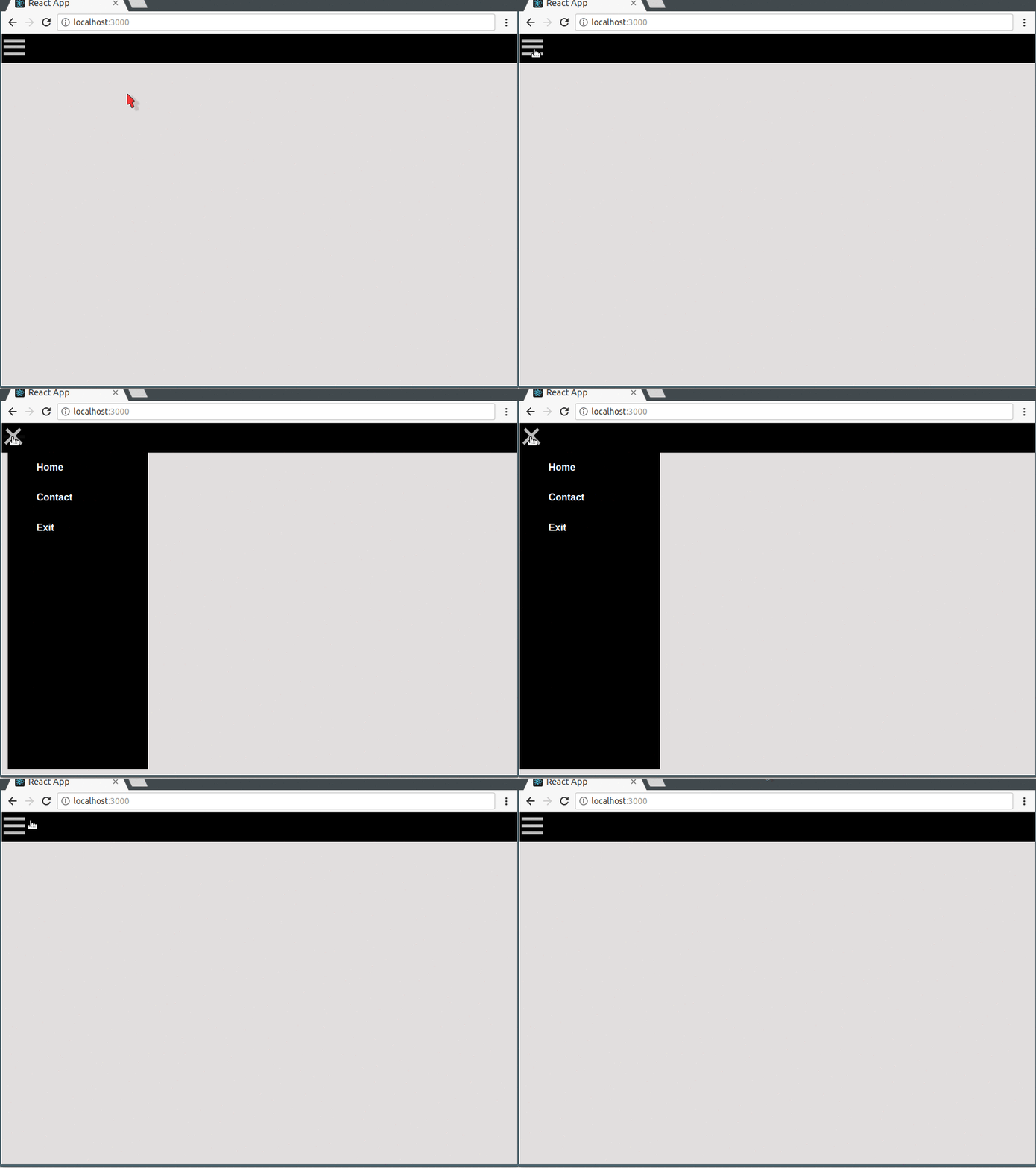
The source code for this project is available here on GitHub.
Under this section, we will simulate the spinning of a preloader when some other action is running and needs time to complete before the user can get output. However, this is just a simulation so we wouldn’t tie the spinner to any larger application or process. We begin.
We can create a new application with this command:
create-react-app react-motion-preloader
Let’s navigate into the working directory and install dependencies using these commands:
cd react-motion-preloader
npm install --save react-motion styled-components bootstrap
We will be using styled-components in all of our projects because it makes everything easier.
Now we want to update the App.js file, we will import the styled components package and use it to create a Wrapper component. Lastly, we will render the Wrapper component and a Preloader component that we are yet to define:
//App.js

import React, { Component } from 'react';
import styled from 'styled-components';
import Preloader from './Preloader';
const Wrapper = styled.div`
  width: 100vw;
  height: 100vh;
`;

class App extends Component {
  render() {
    return (
      <Wrapper>
        <Preloader />
      </Wrapper>
    );
  }
}
export default App;
We also need to give our application some information on how to reference the bootstrap package that we just pulled in, so we open the index.js file and include this line to the list of imports: import '../node_modules/bootstrap/dist/css/bootstrap.min.css' so it looks like this:
//Index.js

import React from 'react';
import ReactDOM from 'react-dom';
import './index.css';
import App from './App';
import '../node_modules/bootstrap/dist/css/bootstrap.min.css';
import registerServiceWorker from './registerServiceWorker';

ReactDOM.render(<App />, document.getElementById('root'));
registerServiceWorker();
We will create the Preloader.js file in the src directory:
cd src
touch Preloader.js
In the Preloader.js file, let’s start laying out the general structure, we will start by importing the styled-components and react-motion packages. We also want to create a component — Loader — using styled-components.
This components will be the actual loader/spinner:
//Preloader.js

import React, { Component } from 'react';
import styled from 'styled-components';
import { Motion, spring } from 'react-motion';
import './App.css';

const Loader = styled.div`
  border: 16px solid #f3f3f3;
  border-radius: 50%;
  border-top: 16px solid #3498db;
  margin: 0 auto;
  width: 180px;
  height: 180px;
  transform: rotate(${props => props.transform}deg);
}
`;
// ...
We wrote (${props => props.transform}deg) while writing the styles for the Loader component, we did this so that the value of the transform property can be dynamic and updated as it updates in the component itself.
Now we can move further to defining and exporting the Preloader component. Within the Preloader component, we want to register a constructor and call the super() function. We also register a two state variables:
startLoadernumberOfSpinsThe application will use the startLoader in deciding when to start the Loader, while the numberOfSpins determines how many full circles the spinner does, for this project, we will set it to 5 by multiplying 360 by 5. Lastly we will include a simple function to switch the value of startLoader from 0 to 1 to indicate that it should start the spinner on the click of a button:
//Preloader.js

// ...
class Preloader extends Component {
  constructor(props) {
    super(props);
    this.state = {
      startLoader: 0,
      numberOfSpins: 360 * 5
    };
    this.handleClick = this.handleClick.bind(this);
  }
  handleClick(e) {
    this.setState({
      startLoader: 1
    });
  }
}
// ...
Now in the render function, we will write some JSX code to define the structure of the application on the DOM. We will register a Motion component from react-motion. Motion accepts some props and a function as its children and we pass in the Loader component to that function:
//Preloader.js
// ...
class Preloader extends Component {
  constructor(props) {
    super(props);
    this.state = {
      startLoader: 0,
      numberOfSpins: 360 * 5
    };
    this.handleClick = this.handleClick.bind(this);
  }

  handleClick(e) {
    this.setState({
      startLoader: 1
    });
  }

  render() {
    return (
      <div id="parent">
        <div className="container">
          <div id="preloader-holder">
            <p id="preloader-text">
              {' '}
              Spin that loader! <button
                onClick={this.handleClick}
                className="btn btn-lg btn-primary"
              >
                Click
              </button>
            </p>
            <div id="preloader-wrapper">
              <Motion
                defaultStyle={{ transform: 0 }}
                style={{
                  transform: spring(
                    this.state.startLoader ? this.state.numberOfSpins : 0,
                    { stiffness: 10, damping: 10 }
                  )
                }}
              >
                {style => <Loader transform={style.transform} />}
              </Motion>
            </div>
          </div>
        </div>
      </div>
    );
  }
}
export default Preloader;
The magic of this application lies in the section where we set an optimal defaultStyle to transform: 0 and then set style to:
transform: spring(
  this.state.startLoader ? this.state.numberOfSpins : 0,
  { stiffness: 10, damping: 10 }
)
In very basic terms, what these mean are:
transform property (that is bound to the Loader component) to 0startLoader state variable is set, do a transform to the set number of spinsBefore we run this application, we need to include some styles in the App.css file:
// App.css
#parent {
  padding-top: 5em;
  padding-bottom: 40px;
  background-color: rgb(225, 223, 223);
  height: 100vh;
}

#preloader-holder {
  border: 1px solid grey;
  border-radius: 5px;
  padding: 4em;
  text-align: center;
}

#preloader-text {
  font-size: 2em;
  font-weight: bold;
}

#preloader-wrapper {
  padding: 0.5em;
}
We can run the application now by typing this command in the root directory of the project:
npm start
We will point our browser to http://localhost:3000 and get this screen:
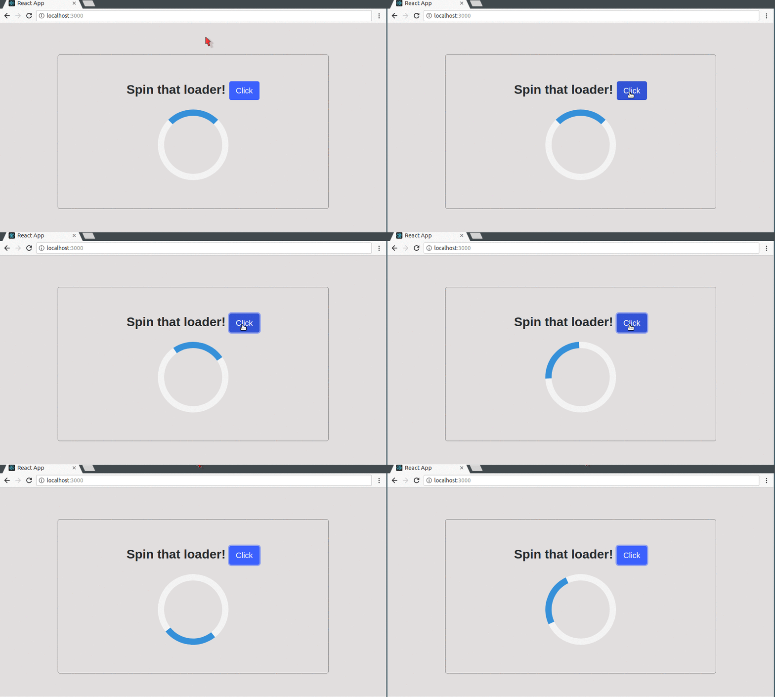
Note: The spinner spins this way because we have set the
stiffnessanddampingto 10, you can tweak the animation to your taste by understanding the behavior of thestiffnessanddampingproperties from the earlier discussion and updating them adequately.
The source code for this project is available here on GitHub.
There’s hardly a person who has been on a mobile smart-phone or computer that would say he/she hasn’t seen a progress bar before. Progress bars are very important because they can communicate the status of a process to a user by showing the current length of the progress against the full-length of the bar.
Let’s build our own simple progress bar using react-motion:
create-react-app react-motion-progress-bar
Let’s navigate into the working directory and install dependencies using these commands:
cd react-motion-progress-bar
npm install --save react-motion styled-components bootstrap
Now we want to update the App.js file, we will import the styled components package and use it to create a Wrapper component. Lastly, we will render the wrapper component and a Progress component that we are yet to define:
//App.js
import React, { Component } from 'react';
import styled from 'styled-components';
import Progress from './Progress';

const Wrapper = styled.div`
  width: 100vw;
  height: 100vh;
`;

class App extends Component {
  render() {
    return (
      <Wrapper>
        <Progress />
      </Wrapper>
    );
  }
}

export default App;
We also need to give our application some information on how to reference the bootstrap package that we just pulled in, so we open the index.js file and include this line to the list of imports so it looks like this:
//index.js
import React from 'react';
import ReactDOM from 'react-dom';
import './index.css';
import App from './App';
import '../node_modules/bootstrap/dist/css/bootstrap.min.css';
import registerServiceWorker from './registerServiceWorker';

ReactDOM.render(<App />, document.getElementById('root'));
registerServiceWorker();
We will go further and create the Progress.js file in the src directory:
cd src
touch Progress.js
In the Progress.js file, we will start by importing the styled-components and react-motion packages. We also want to create a component — ProgressBar — using the styled components package.
This component will be the actual ProgressBar, we will start the progress bar based on the state of a startProgress state variable. We’d also set the stiffness and damping of the Motion component to 10:
//Progress.js
import React, { Component } from 'react';
import styled from 'styled-components';
import { Motion, spring } from 'react-motion';
import './App.css';

const ProgressBar = styled.div`
  background: green;
  width: 100%;
  height: 100%;
  margin: 0;
  width: ${props => props.width}%;
`;

class Progress extends Component {
  constructor(props) {
    super(props);
    this.state = {
      startProgress: 0
    };
    this.handleClick = this.handleClick.bind(this);
  }

  handleClick(e) {
    this.setState({
      startProgress: 1
    });
  }

  truncate(x) {
    return Math.trunc(x);
  }

  render() {
    return (
      <div id="parent">
        <div className="container">
          <div id="progress-holder">
            <p id="progress-text">
              {' '}
              Start the progress! <button
                onClick={this.handleClick}
                className="btn btn-lg btn-primary"
              >
                Click
              </button>
            </p>
            <div id="progress-bar-wrapper">
              <Motion
                defaultStyle={{ width: 0 }}
                style={{
                  width: spring(this.state.startProgress ? 100 : 0, {
                    stiffness: 10,
                    damping: 10
                  })
                }}
              >
                {style => (
                  <ProgressBar width={style.width}>
                    {' '}
                    {this.truncate(style.width)}%
                  </ProgressBar>
                )}
              </Motion>
            </div>
          </div>
        </div>
      </div>
    );
  }
}
export default Progress;
We used the Math.trunc function here to return the springed width as an integer by removing the fractional digits.
Before we run this application, let’s add these styles to the App.css file:
// App.css
    #parent {
      padding-top: 5em;
      padding-bottom: 40px;
      background-color: rgb(225, 223, 223);
      height: 100vh;
    }

    #progress-holder{
    border: 1px solid grey;
    border-radius: 5px;
    padding: 4em;
    text-align: center;
    }

    #progress-text{
      font-size: 2em;
      font-weight: bold;
    }

    #progress-bar-wrapper{
    border: 2px solid black;
    border-radius: 5px;
    height: 40px;
    color:white;
    }
We can run the application now by typing this command in the root directory of the project:
npm start
We will point our browser to http://localhost:3000 and get this screen:
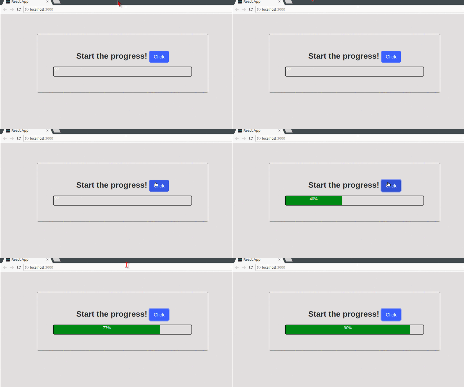
The source code for this project is available here on GitHub.
What’s better than being notified about the last interaction between a user and an application? You guessed it right! Being notified with a sliding animated notification in real-time. We will build a small login system that takes in a username and password then notifies the user on the status of his validation when he clicks on the Sign in button.
create-react-app react-motion-login-notification
Let’s navigate into the working directory and install dependencies using these commands:
cd react-motion-login-notification
npm install --save react-motion styled-components bootstrap
Now we want to update the App.js file, we will import the styled components package and use it to create a Wrapper component. Lastly, we will render the Wrapper component and a Form component that we are yet to define:
//App.js
import React, { Component } from 'react';
import styled from 'styled-components';
import Form from './Form';

const Wrapper = styled.div`
  width: 100vw;
  height: 100vh;
`;

class App extends Component {
  render() {
    return (
      <Wrapper>
        <Form />
      </Wrapper>
    );
  }
}
export default App;
We also need to give our application some information on how to reference the bootstrap package that we just pulled in, so we open the index.js file and include this line to the list of imports: import '../node_modules/bootstrap/dist/css/bootstrap.min.css' so it looks like this:
//index.js
import React from 'react';
import ReactDOM from 'react-dom';
import './index.css';
import App from './App';
import '../node_modules/bootstrap/dist/css/bootstrap.min.css';
import registerServiceWorker from './registerServiceWorker';

ReactDOM.render(<App />, document.getElementById('root'));
registerServiceWorker();
Now let’s create a Form.js file in the src directory:
cd src
touch Form.js
In the Form.js file, we will start by importing the styled-components and react-motion packages. We will define a single component using styled component, this component would be called NotificationBox. We will register a state — startAnimation — that will decide when the animation starts and we will register two functions:
handleClick: This function will handle click events on the sign up button and call the other function so it resets the state of startAnimation to 1resetValue : This function will reset the state of the startAnimation variable.//Form.js
import React, { Component } from 'react';
import styled from 'styled-components';
import { Motion, spring } from 'react-motion';
import './App.css';
const NotificationBox = styled.div`
position: absolute;
padding: 1.5em;
left: 5%;
top: ${(props) => props.top}%;
opacity: ${(props) => props.opacity};
font-size: 0.8em;
font-weight: bold;
border-radius: 5px;
background: #81C784;
color: white;
`;
class Form extends Component {
constructor(props) {
super(props);
this.state = {
startAnimation: 1
};
this.handleClick = this.handleClick.bind(this);
this.resetValue = this.resetValue.bind(this);
}
handleClick (e){
e.preventDefault();
this.setState({
startAnimation: 0
})
setTimeout(this.resetValue, 2500);
}
resetValue (){
this.setState({
startAnimation: 1
})
}
Within the render function, we write some JSX code that defines the structure of the form then we register a Motion component to animate the NotificationBox component:
//Form.js
    ...

    class Form extends Component {

      constructor(props) {
        super(props);
        this.state = {
          startAnimation: 1
        };
        this.handleClick = this.handleClick.bind(this);
        this.resetValue = this.resetValue.bind(this);
      }

      handleClick (e){
        e.preventDefault();
        this.setState({
          startAnimation: 0
        })
        setTimeout(this.resetValue, 2500);
      }

      resetValue (){
        this.setState({
          startAnimation: 1
        })
      }

        render() {
      return(
    <div id="parent">
    <div className="container">
      <form onSubmit={this.handleClick} className="form-signin">
        <h2 className="form-signin-heading">BATCAVE</h2>
        <label className="sr-only">Email address</label>
        <input type="email" id="inputEmail" className="form-control" placeholder="Email address" required=""  />
        <label  className="sr-only">Password</label>
        <input type="password" id="inputPassword" className="form-control" placeholder="Password" required="" />
        <div className="checkbox">
          <label>
            <input type="checkbox" value="remember-me" /> Remember me
          </label>
        </div>
        <button className="btn btn-lg btn-primary btn-block" type="submit">Sign in</button>
      </form>

      <Motion
        defaultStyle={{ top: 0, opacity: 0 }}
        style={{ top: spring(this.state.startAnimation ? 80 : 1), opacity: spring(this.state.startAnimation ? 0 : 1) }}
       >
      {(style) => (
        <NotificationBox
        top={style.top}
        opacity={style.opacity}
         >
           Welcome Batman
      </NotificationBox>
      )}
      </Motion>

    </div>
    </div>
            )
        }
    }
    export default Form;
As before, we have bound top and opacity properties of the component with it’s style so we get nice animations when the submit button is clicked. Let’s add the styles to the App.css file:
//App.css
#parent {
  padding-top: 40px;
  padding-bottom: 40px;
  background-color: #eee;
  height: 100vh;
}

.form-signin {
  max-width: 330px;
  padding: 15px;
  margin: 0 auto;
}

.form-signin .form-signin-heading,
.form-signin .checkbox {
  margin-bottom: 10px;
}

.form-signin-heading {
  text-align: center;
}

.form-signin .checkbox {
  font-weight: 400;
}

.form-signin .form-control {
  position: relative;
  box-sizing: border-box;
  height: auto;
  padding: 10px;
  font-size: 16px;
}

.form-signin .form-control:focus {
  z-index: 2;
}

.form-signin input[type='email'] {
  margin-bottom: -1px;
  border-bottom-right-radius: 0;
  border-bottom-left-radius: 0;
}

.form-signin input[type='password'] {
  margin-bottom: 10px;
  border-top-left-radius: 0;
  border-top-right-radius: 0;
}
We can run the application now by typing this command in the root directory of the project:
npm start
We will point our browser to http://localhost:3000 and get this screen:
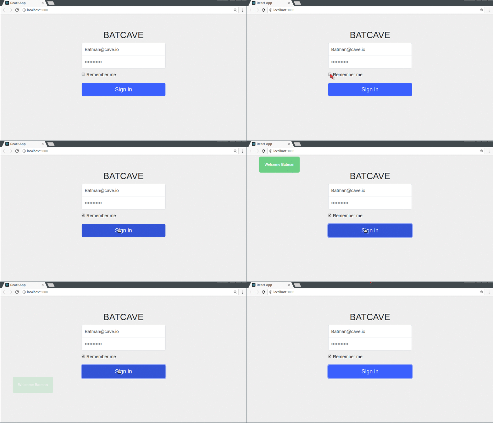
The source code for this project is available here on GitHub.
We’ve looked at some basic examples so far, but now we’d look at something more complex, we are going to create an animated “jumbotron revealer.” In simpler terms, this is an application that displays a black screen on initial load, then gradually reveals the jumbotron using react-motion. Let’s get started.
We will create a new project:
create-react-app react-motion-jumbotron-revealer
We can navigate into this directory and install the dependencies:
cd react-motion-jumbotron-revealer
npm install --save react-motion styled-components
Let’s make a quick edit to the App.js file, we want to import styled-components and also import ImageBoxAnimation (which is a component we’d create very soon):
import React, { Component } from 'react';
import styled from 'styled-components';
import ImageBoxAnimation from './ImageBoxAnimated';

const Wrapper = styled.div``;

class App extends Component {
  render() {
    return (
      <Wrapper>
        <ImageBoxAnimation />
      </Wrapper>
    );
  }
}
export default App;
We need to create two separate files for two components so let’s navigate into the src directory and create them:
cd src
touch ImageBoxAnimated.js
touch BlackBoxAnimated.js
Awesome! Now let’s open up the ImageBoxAnimated.js file in our favorite editor and begin writing some code, the first thing we want to do is import the dependencies and the BlackBoxAnimated component (though the file is currently empty) then create a new component using the styled components. The ImageBox component will basically be a div that loads a picture as its background image from the internet:
// ImageBox component

import React from 'react';
import styled from 'styled-components';
import BlackBoxAnimated from './BlackBoxAnimated';

const ImageBox = styled.div`
  width: 100vw;
  height: 100vh;
  background: url('http://4khdwallpapers.net/wp-content/uploads/2018/01/wonder-woman-hd-wallpaper.jpg');
  background-size: cover;
  background-position: center;
`;
// ...
The next thing we will do is create the ImageBoxAnimation component and set a single state variable — animationNumber<>/code> — we need this state variable to decide when the black boxes that will initially cover the jumbotron will start to slide away.
We will also define a function — startNextAnimation — which serves the purpose of augmenting the animationNumber that decides which box slides.
We will use the setTimeout() function to call the startNextAnimation function that increments the animationNumber. Whenever a timeout runs, a new black box will slide (there will be about 10 of them by the completion of this project) across the jumbotron’s image.
In the render function, we will start by initializing an object { animationNumber } to our application’s current state so that we can refer to it directly within the render function without having to call this.
Next, we will register 10 instances of the BlackBoxAnimated component and pass down three props to each one of them, these props are:
heightPercentage: This props is responsible for setting the height of each black box relative to the total height of the jumbotron. We will set it to 10 percent so that we have space for exactly 10 boxesreverseDirection: This props takes a boolean value to decide in which direction the box should slide, because if all the boxes slide in one direction, then it would be visually boring. We will alternate between truth and false to give it a zigzag feel.startAnimation: This props is very important because it is responsible for the cascading behavior of the animation. It makes sure that the black boxes leave one at a time (because the setTimeout function gives a space of half a second before calling the setNextAnimation function, which is responsible for increasing the value of animationNumber by 1) by comparing its value against a number and returning a boolean value to the BlackBoxAnimated component. A false does nothing while a true starts the animation.Finally, we will export the application:
//ImageBoxAnimated.js
// ...
class ImageBoxAnimation extends React.Component {
  componentWillMount() {
    this.setState({
      animationNumber: 1
    });

    setTimeout(this.startNextAnimation, 500);
    setTimeout(this.startNextAnimation, 1000);
    setTimeout(this.startNextAnimation, 1500);
    setTimeout(this.startNextAnimation, 2000);
    setTimeout(this.startNextAnimation, 2500);
    setTimeout(this.startNextAnimation, 3000);
    setTimeout(this.startNextAnimation, 3500);
    setTimeout(this.startNextAnimation, 4000);
    setTimeout(this.startNextAnimation, 4500);
  }

  startNextAnimation = () => {
    this.setState({
      animationNumber: this.state.animationNumber + 1
    });
  };
  render() {
    const { animationNumber } = this.state;

    return (
      <ImageBox>
        <BlackBoxAnimated
          heightPercentage={10}
          reverseDirection={false}
          startAnimation={animationNumber >= 1}
        />

        <BlackBoxAnimated
          heightPercentage={10}
          reverseDirection={true}
          startAnimation={animationNumber >= 2}
        />

        <BlackBoxAnimated
          heightPercentage={10}
          reverseDirection={false}
          startAnimation={animationNumber >= 3}
        />

        <BlackBoxAnimated
          heightPercentage={10}
          reverseDirection={true}
          startAnimation={animationNumber >= 4}
        />

        <BlackBoxAnimated
          heightPercentage={10}
          reverseDirection={false}
          startAnimation={animationNumber >= 5}
        />

        <BlackBoxAnimated
          heightPercentage={10}
          reverseDirection={true}
          startAnimation={animationNumber >= 6}
        />

        <BlackBoxAnimated
          heightPercentage={10}
          reverseDirection={false}
          startAnimation={animationNumber >= 7}
        />

        <BlackBoxAnimated
          heightPercentage={10}
          reverseDirection={true}
          startAnimation={animationNumber >= 8}
        />

        <BlackBoxAnimated
          heightPercentage={10}
          reverseDirection={false}
          startAnimation={animationNumber >= 9}
        />

        <BlackBoxAnimated
          heightPercentage={10}
          reverseDirection={true}
          startAnimation={animationNumber >= 10}
        />
      </ImageBox>
    );
  }
}

export default ImageBoxAnimation;
Now that that’s done, let’s open the BlackBoxAnimated.js file we created a while ago and prepare it for the data that is being passed down by ImageBox. We will start by importing the dependencies we’ll need, but this time we will also import PropTypes from 'prop-types' and this would help us confirm that our props are what we want them to be when they are being received. We will also define a Blackbox component using styled components and populate it with some styles:
//BlackBoxAnimated.js

import React, { Component } from 'react';
import styled from 'styled-components';
import PropTypes from 'prop-types';
import { Motion, spring } from 'react-motion';

const BlackBox = styled.div`
  height: ${props => props.heightPercentage}%;
  width: 100%;
  background: #000;
  transform-origin: ${props => props.xDirection} center;
`;
// ...
We are using ${(props) => props.heightPercentage}% and ${(props) => props.xDirection} center because we want to bind these props from the component with the style properties.
Next, we will create the BlackBoxAnimated component (you can define a component as a function in React) and define the props it should expect. We will register the Motion component and trigger the animation only when startAnimation has the value if true.
Lastly, we will check that the props we received in the component are of the type we expected:
//BlackBoxAnimated.js
import React, { Component } from 'react';
import styled from 'styled-components';
import PropTypes from 'prop-types';
import { Motion, spring } from 'react-motion';

const BlackBox = styled.div`
  height: ${props => props.heightPercentage}%;
  width: 100%;
  background: #000;
  transform-origin: ${props => props.xDirection} center;
`;

const BlackBoxAnimated = ({
  startAnimation = false,
  heightPercentage,
  reverseDirection = false
}) => (
  <Motion
    defaultStyle={{ scaleX: 1 }}
    style={{ scaleX: spring(startAnimation ? 0 : 1) }}
  >
    {style => (
      <BlackBox
        heightPercentage={heightPercentage}
        xDirection={reverseDirection ? `left` : `right`}
        style={{
          transform: `scaleX(${style.scaleX})`
        }}
      />
    )}
  </Motion>
);

BlackBoxAnimated.propTypes = {
  startAnimation: PropTypes.bool,
  heightPercentage: PropTypes.number.isRequired,
  reverseDirection: PropTypes.bool
};
Great, we can run the application now by typing this command in the root directory of the project:
npm start
We will point our browser to http://localhost:3000 and get this screen:
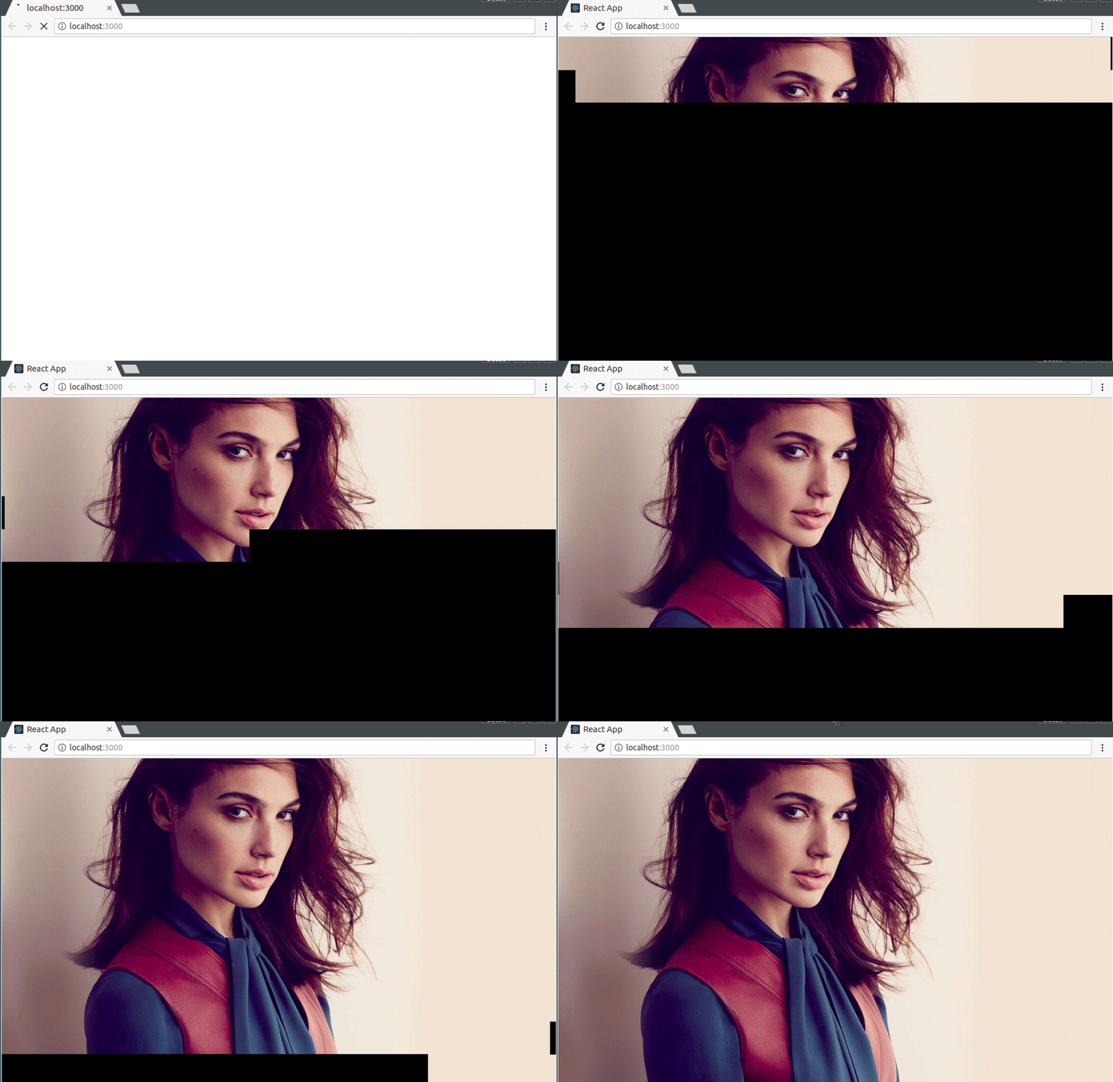
The source code for this project is available here on GitHub.
In this article, we have seen how to use React Motion to tweak animations with React components. We have also come to understand the ideas behind the stiffness and damping variables that are available to us when using the library.
Though the examples we have looked at in this tutorial mainly covered the basic sides to the library, it’s a good start for anyone who hopes to build really complex and nice-looking web animations with components.
Install LogRocket via npm or script tag. LogRocket.init() must be called client-side, not
server-side
$ npm i --save logrocket

// Code:

import LogRocket from 'logrocket';
LogRocket.init('app/id');
// Add to your HTML:

<script src="https://cdn.lr-ingest.com/LogRocket.min.js"></script>
<script>window.LogRocket && window.LogRocket.init('app/id');</script>

Learn how Vite+ unifies Vite, Vitest, Oxlint, Oxfmt, Rolldown, and Node.js management in one CLI.

AI companies are buying developer tools as coding agents turn runtimes, package managers, and linters into strategic infrastructure.

Learn how AI-assisted development governance uses rules, agents, hooks, and protocols to help AI coding tools produce safer, more consistent code.

A step-by-step guide to building your first MCP server using Node.js, covering core concepts, tool design, and upgrading from file storage to MySQL.
Would you be interested in joining LogRocket's developer community?
Join LogRocket’s Content Advisory Board. You’ll help inform the type of content we create and get access to exclusive meetups, social accreditation, and swag.
Sign up now