corner-shape
Editor’s note: This blog was updated by Daniel Schwarz in November 2025 to account for CSS’s new native property for fancy corners. The original post was written by Supun Kavinda.
Ever wanted to create a squircle, like today’s app icons are doing, using only CSS? Or maybe an arrow or another shape that would normally require a background hack, an SVG, or a tricky technique involving masking or clipping?
Well, now you can, using the corner-shape CSS property — no hacks, no SVGs, no masking, and no clipping — just one line of CSS. It doesn’t enable us to create literally any shape. But could you accomplish your goal by using border-radius if it were just a bit more advanced?
Well, now you can, by combining it with corner-shape:
See the Pen
CSS corner-shape demo by Daniel Schwarz (@mrdanielschwarz)
on CodePen.
Web browser support is limited to Chrome 139 and above, as well as other Chromium-based browsers such as Edge and Opera. But support in other browsers shouldn’t be too far behind.
In this article you’ll learn about corner-shape and how to use it, as well as the more advanced side of border-radius and why it’s crucial to using corner-shape effectively.
border-radiusThere’s more to border-radius than meets the eye, but let’s start with the basics.
border-radius has four longhand properties, one for each corner:
border-top-left-radiusborder-top-right-radiusborder-bottom-right-radiusborder-bottom-left-radiusBut did you know that they each have two axes, and that we can specify a different value for each one? Let’s use border-top-left-radius as an example:
/* Syntax */
border-top-left-radius: <x-axis-length> <y-axis-length>;

/* Usage */
border-top-left-radius: 25px 50px;
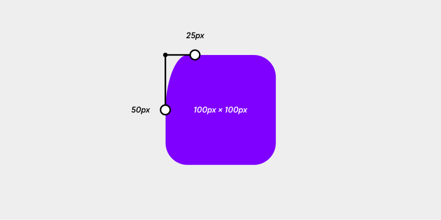
Obviously, this looks odd, and in most scenarios, you wouldn’t want this, but if you’re using corner-shape to convert those rounded corners into different shapes, this syntax can be quite useful.
Then of course, there’s the shorthand border-radius property with the following syntax, followed by the shorthand syntax for specifying each axis individually:
/* Shorthand syntax (clockwise from the top-left) */
border-radius: <top-left-radius> <top-right-radius> <bottom-right-radius> <bottom-left-radius>;

/* Shorthand syntax with both axis lengths specified */
border-radius: <top-left-x-axis-length> <top-right-x-axis-length> <bottom-right-x-axis-length> <bottom-left-x-axis-length> / <top-left-y-axis-length> <top-right-y-axis-length> <bottom-right-y-axis-length> <bottom-left-y-axis-length>;
The latter syntax is a bit complicated at first, but manageable once you’re used to it. Having said that, there’s nothing wrong with using the longhand properties. Just use whatever’s most readable to you.
We can still omit certain corners using the shorthand syntax, but this makes the code look even more confusing and negatively impacts code readability. If you’re still keen to understand it, MDN explains it well. If not, let’s move on to the corner-shape property.
corner-shapeLet’s start with the syntax, which is the same as border-radius (one shorthand property and four longhand properties):
corner-shapecorner-top-left-shapecorner-top-right-shapecorner-bottom-right-shapecorner-bottom-left-shapeThe only difference is that with corner-shape, we don’t have axes to deal with. So with that out of the way, let’s move on to the values.
corner-shape accepts six keyword values:
/* Don’t forget this */
border-radius: 3rem;

/* Keyword values */
corner-shape: square;
corner-shape: squircle;
corner-shape: round;
corner-shape: bevel;
corner-shape: scoop;
corner-shape: notch;
See the Pen
CSS corner-shape demo by Daniel Schwarz (@mrdanielschwarz)
on CodePen.
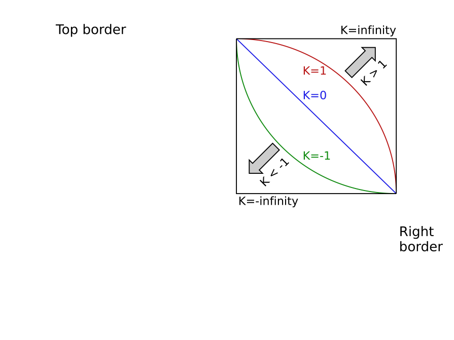
corner-shape also accepts a superellipse() function as a value, which basically enables us to recreate the outcomes of those keywords or specify a more custom ellipse curvature. I won’t bore you with the math side of things. Let’s just say that superellipse() takes a parameter that can range from -infinity to infinity (inclusive):
corner-shape: superellipse(0) doesn’t add any curvature at all, and is equivalent to corner-shape: bevel, where a direct line is drawn between the x-axis and y-axis points defined by border-radius.
corner-shape: superellipse(1) is equivalent to corner-shape: round, which in turn is equivalent to not declaring corner-shape at all. If you’ve declared border-radius, it’ll look the same as it always has.
The higher the value after 1, the squarer the rounded corners will be. corner-shape: superellipse(2) is equivalent to corner-shape: squircle (a squarish circle).
While corner-shape: superellipse(infinity) is equivalent to corner-shape: square, corner-shape: square doesn’t create true squares, as the superellipse equation can only return a curve. The corners will be extremely sharp but not have 90-degree angles exactly. Although frankly a value of 10 or higher will certainly create a corner that’s indistinguishable from that of a square. This option enables us to transition between a square and some other superellipse shape — something that’s otherwise impossible because of how CSS transitions and animations work.
When its parameter value is negative, the superellipse() function returns what’s called a concave (inward curve). corner-shape: superellipse(-1) specifically is equivalent to corner-shape: scoop.
If we dial that negative value all the way down to corner-shape: superellipse(-infinity), we wind up with the complete opposite of corner-shape: square and corner-shape: superellipse(infinity), an inward technically-not-a-square better known as corner-shape: notch.
Here’s all of them together (remember, though, the point of the superellipse() function is to specify bespoke values for which there’s no keyword equivalent):
See the Pen
CSS superellipse() demo by Daniel Schwarz (@mrdanielschwarz)
on CodePen.
Note: diagonally-opposite corners with negative-value superellipse()s (concaves) can overlap each other. When this happens, web browsers will intelligently constrain the border-radius until both shapes are individually visible.
corner-shape use-casesThere’s nothing wrong with vanilla border-radius, but if you’re looking to nail down a certain aesthetic and you don’t want to leverage hacks and tricky techniques, corner-shape can really save the day. So let’s take a look at some of the ways that we can use it.
I’ll include the corner-shape declarations and any relevant border-radius declarations right here, but refer to the CodePen demos for the full code.
This Cyberpunk 2077 aesthetic is the culmination of some very basic CSS properties — background, border, font — nothing fancy. But what really brings it together is the corner-shape: bevel declaration. corner-shape enables you to create killer aesthetics like this with minimal effort:
See the Pen
CSS corner-shape demo (Cyberpunk 2077 corners) by Daniel Schwarz (@mrdanielschwarz)
on CodePen.
corner-shape: bevel;
border-bottom-right-radius: 1rem;
The possibilities are endless. You can swap bevel for any other value and work towards a completely different aesthetic, but let’s try some trickier implementations of corner-shape.
In the example below, the magic lies in the border-radius property, which has enabled me to create one of those slanted sections that you see everywhere without having to resort to a tricky background hack:
See the Pen
CSS corner-shape demo (slanted section) by Daniel Schwarz (@mrdanielschwarz)
on CodePen.
corner-shape: bevel;
border-bottom-right-radius: 100% 3rem;
In border-bottom-right-radius, the x-axis point being set to 100% means that it’ll slide to the complete opposite end of the axis while the y-axis point moves only 3rem from its corner. Then, after corner-shape: bevel draws a straight line between them, we’re left with a slope. Again, you can experiment with different corners and/or values to create designs that look a lot less square.
Using the same logic, we can use corner-shape to create triangles using CSS. In the example below, I’ve done exactly that to create a tooltip caret and attach it to the side of a tooltip. Actually, I’ve taken it a step further and switched bevel to scoop to make it look more like a speech bubble:
See the Pen
CSS corner-shape demo (tooltip) by Daniel Schwarz (@mrdanielschwarz)
on CodePen.
corner-shape: scoop;
border-top-left-radius: 100% 50%;
border-bottom-left-radius: 100% 50%;
In this next example, I’ve combined round and bevel, a quick reminder that you can accomplish all kinds of things by combining corner-shape values:
See the Pen
CSS corner-shape demo (sale tag) by Daniel Schwarz (@mrdanielschwarz)
on CodePen.
corner-shape: round bevel bevel round;
border-radius: 1rem 2.5rem 2.5rem 1rem / 1rem 50% 50% 1rem;
To be extra creative, the following is what happens when we insert an element with corner-shape: notch inside a box that has a border (apparently these are called “tech corners”):
See the Pen
CSS corner-shape demo (tech corners) by Daniel Schwarz (@mrdanielschwarz)
on CodePen.
div {
  border: 0.3rem solid hsl(270 100 50);

  /* Other <div> styles here */

  &::after {
    border-radius: 1rem;
    corner-shape: notch;
    background: hsl(270 100 10);

    /* Other ::after styles here */
  }
}
At this point, I’m letting my imagination run wild by rotating and “notching” the element, then ‘squircling’ the container, combining two corner shapes but not necessarily on the same element:
See the Pen
CSS corner-shape demo (tech corners evolved) by Daniel Schwarz (@mrdanielschwarz)
on CodePen.
div {
  border-radius: 5rem;
  corner-shape: squircle;
  border: 0.3rem solid hsl(270 100 50);

  &::after {
    border-radius: 2.5rem;
    corner-shape: notch;
    background: hsl(270 100 10);
    rotate: 10deg;
  }
}
If you keep on experimenting, you’ll be able to create some really cool shapes and effects using just CSS. In the example below, I’m hardly even changing the corner-shape and border-radius values:
See the Pen
CSS corner-shape demo (what even is this?) by Daniel Schwarz (@mrdanielschwarz)
on CodePen.
And let’s not forget the idea that brought corner-shape to life: squircles! While originally conceived to make app icons look not quite square but not quite round either, designers quickly jumped on the idea of creating squircle buttons, squircle cards, and so on, and now we can create them with native CSS:
See the Pen
CSS corner-shape demo (squircle button) by Daniel Schwarz (@mrdanielschwarz)
on CodePen.
border-radius: 3rem;
corner-shape: squircle;
The possibilities really are endless, showing us that we no longer have to think of HTML elements as squares.
border-radius and corner-shape propertiesBoth border-radius and corner-shape have additional properties that we can use to simplify our CSS or ensure that our design looks right regardless of text direction. Web browsers currently support these to varying degrees.
First of all, there are a few more physical shorthands. These are for styling multiple (but not all) border radii and corner shapes at once:
border-top-radius: both top corners (no support)border-right-radius: both right corners (no support)border-bottom-radius: both bottom corners (no support)border-left-radius: both left corners (no support)corner-top-shape: both top corners (supported in Chrome)corner-right-shape: both right corners (supported in Chrome)corner-bottom-shape: both bottom corners (supported in Chrome)corner-left-shape: both left corners (supported in Chrome)There are also some logical properties that target certain corners based on the user’s writing mode and text orientation. To clarify, the block direction refers to the direction in which lines of text flow, whereas the inline direction refers to the direction in which the text itself flows:
border-block-start-radius: both block-start corners (no support)border-block-end-radius: both block-end corners (no support)border-inline-start-radius: both inline-start corners (no support)border-inline-end-radius: both inline-end corners (no support)corner-block-start-shape: both block-start corners (supported in Chrome)corner-block-end-shape: both block-end corners (supported in Chrome)corner-inline-start-shape: both inline-start corners (supported in Chrome)corner-inline-end-shape: both inline-end corners (supported in Chrome)The following properties are also for styling multiple border radii and corner shapes at once, but are logical properties as well (syntax: border-<block side>-<inline side>-radius and corner-<block side>-<inline side>-shape):
border-start-start-radius: block start and inline start corners (widely available status)border-start-end-radius: block start and inline end corners (widely available status)border-end-start-radius: block end and inline start corners (widely available status)border-end-end-radius: block end and inline end corners (widely available status)corner-start-start-shape: block start and inline start corners (supported in Chrome)corner-start-end-shape: block start and inline end corners (supported in Chrome)corner-end-start-shape: block end and inline start corners (supported in Chrome)corner-end-end-shape: block end and inline end corners (supported in Chrome)corner-shape, which must be used as an add-on to border-radius, can be used to create different corner shapes in just a few lines of CSS. In addition, by really pushing corner-shape and border-radius to its limits, we can create some really incredible shapes and effects that don’t even resemble corners.
While web browser support is limited to Chromium browsers such as Chrome, Edge, and Opera for now, we can expect corner-shape to come to other browsers soon. Don’t let this stop you from experimenting with it, though. If you want to show off what you’ve made (or if you have a question), the comment section is just below.
Thanks for reading!
As web frontends get increasingly complex, resource-greedy features demand more and more from the browser. If you’re interested in monitoring and tracking client-side CPU usage, memory usage, and more for all of your users in production, try LogRocket.

LogRocket lets you replay user sessions, eliminating guesswork around why bugs happen by showing exactly what users experienced. It captures console logs, errors, network requests, and pixel-perfect DOM recordings — compatible with all frameworks.
LogRocket's Galileo AI watches sessions for you, instantly identifying and explaining user struggles with automated monitoring of your entire product experience.
Modernize how you debug web and mobile apps — start monitoring for free.

A guide for using JWT authentication to prevent basic security issues while understanding the shortcomings of JWTs.

Discover how to build, render, and automate product demo videos with Remotion, replacing traditional screen recordings with reusable React code.

Chrome’s Modern Web Guidance embeds modern web platform skills into AI coding agents, helping them choose native HTML, CSS, and browser APIs over legacy patterns.

Learn how to use Fallow to analyze AI-generated code, detect dead code, duplicate logic, and complexity issues, and integrate automated code quality checks into your AI-assisted development workflow.
Hey there, want to help make our blog better?
Join LogRocket’s Content Advisory Board. You’ll help inform the type of content we create and get access to exclusive meetups, social accreditation, and swag.
Sign up now

 Learn more →
