Grommet is a library based on React that provides an end-to-end solution for building user interfaces with a minimalist look and feel. It provides a high level of customization along with responsiveness while not compromising on accessibility.

In their own words, as stated on the official landing page, Grommet is:
“part design system, part framework, and all awesome”
After a successful run with the first version of Grommet, v2 was released with a cleaner UI, changed technical dependencies, altered components, and their usages. In this article, we will first briefly get to know the “Grommet” way to do things, and then dive into the changes that came along while moving from the first version to the second. Later, we will check out some of the Grommet components and their use cases.
Grommet has an overall aesthetic that is different from other frameworks like Google’s Material design or Alibaba’s Ant design in the sense that it looks more minimalistic. There is a lot of white space, higher contrast between elements, and also a significantly smaller color palette.
Also, the props passed to components are designed in such a way that there is no need to explicitly specify even a single line of CSS. For instance, the padding inside any Box can be taken care of by using a pad prop and the margin can be controlled via the margin prop. Similarly, to handle accessibility, we just need to pass an a11yTitle prop, and the value supplied to it will be used by tools like screen readers. With that in mind, let us now take a look at the steps required to set up our very own repository using Grommet in order to try out some of those features.
There are two ways in which we can get started with Grommet. One is a direct method, while the other one is a follow-along style guide to slowly get to the desired outcome.
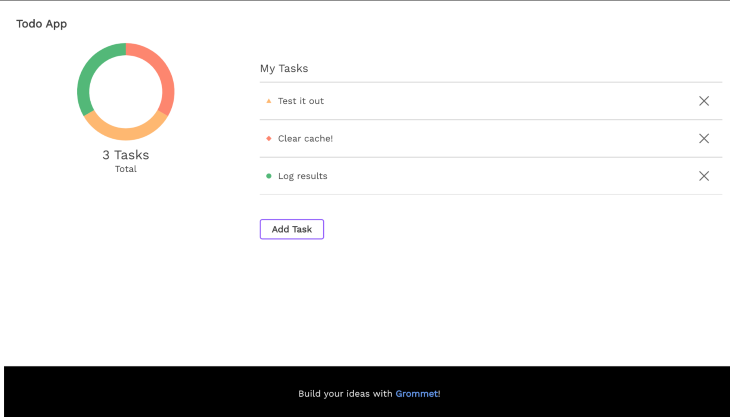
As a part of the first method, we just clone the grommet-sample repository and run it after installing the dependencies. These are the steps.
Clone the repository:
git clone https://github.com/grommet/grommet-sample.git
cd into the directory:
cd grommet-sample
Install the modules:
npm install
Start the dev server:
npm install
And we should be able to see the Todo App running in our local environment.
If you’d prefer to start with a CRA (create-react-app) project and work your way towards a full-fledged Grommet repository, this documentation explains the step-by-step process to follow in order to manually customize the repository created by CRA to support Grommet.
Those methods mentioned above work fine if we are starting with a new project from scratch and using Grommet v2, from the beginning. But, if we initially worked on a v1 project and want to move to v2, there are some additional steps to be followed because a few of the changes introduced in v2 are breaking in nature.
Grommet componentThe App component was the primary Grommet component for Grommet v1 which means that the entire application was expected to be wrapped in an App component like this:
import App from 'grommet/components/App';

<App>
  {application}
</App>
But, from Grommet v2 onwards, that component is to be replaced by the Grommet component as the App component is no longer present in v2:
import { Grommet } from 'grommet';

<Grommet>
  {application}
</Grommet>
Grommet component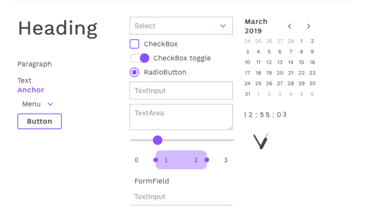
Applying a theme to the entire application is possible in Grommet v2 via the theme prop that can be supplied to the Grommet component. The value that is being supplied for the theme prop must be a valid theme like the grommet-theme-v1 that is displayed in the screenshot above. In order to apply the theme to our Grommet application, we write something like this:
import { Grommet } from 'grommet';
import { v1 } from 'grommet-theme-v1';

<Grommet theme={v1}>
// The app goes here
</Grommet>
Other examples of some popular themes are grommet-theme-hp, grommet-theme-aruba, and grommet-theme-nineties.
Box componentThe Box component in Grommet is the equivalent of the generic div in HTML. The Box component is used to place and align elements inside of it. Some of the most prominent changes that have happened in the Box component in v2 are:
onClick prop as it is mandated to use a Button instead wherever it is necessary to control on-click behaviorsize props as it is advised to use width and height insteadList componentThe List component in Grommet v1 was used as a container to wrap several ListItem components. And a list looks something like this:
<List>
  <ListItem justify='between' separator='horizontal'>
    <span>Alan</span><span className='secondary'>happy</span>
  </ListItem>
  <ListItem justify='between' separator='horizontal'>
    <span>Chris</span><span className='secondary'>cool</span>
  </ListItem>
  <ListItem justify='between' separator='horizontal'>
    <span>Eric</span><span className='secondary'>odd</span>
  </ListItem>
  ...
</List>
The code above displays this list:
Whereas the same result can now be obtained in the v2 library with a “less verbose” approach using this code:
<List
  primaryKey="name"
  secondaryKey="mood"
  data={[
    { name: 'Alan', mood: 'happy' },
    { name: 'Bryan', mood: 'cool' },
    { name: 'Chris', mood: 'odd' },
  ]}
/>
Some of the components like Header, Footer, Article, Section, Hero, Title, Quote, Card, etc., that were a part of Grommet v1 were completely removed and no longer exist as independent components. However, most of them can be used via the Box component by passing it an appropriate tag. For instance, in order to use the Header component, we would do something like this:
import { Box } from 'grommet';

<Box tag="header">
{/% Stuff inside the Header %/}
</Box>
While the Box component serves as a replacement for most of the components that got deleted, the Title component that got deleted can be reproduced by using the Text component and passing appropriate props like this:
<Text size="large" weight="bold">
  This is as good as a title!
</Text>
That was about the component level changes. There were also a few core changes at the technical level in the way that Grommet v2 handles certain aspects.
Using the babel-grommet-plugin it is possible to sanitize imports in Grommet v2. What that means is, any component that is imported from the library in this fashion:
import { Grommet, Button } from 'grommet';
Is automatically converted into:
import Button from 'grommet/components/button';
If react-intl was being used in the original Grommet v1 project, it needs to be installed separately as Grommet v2 does not include it by default.
If the original v1 project used the Rest utility provided by Grommet to make REST calls, for creating request params or query params or setting headers, all that needs to be done using the fetch library because the REST utility is not packaged as a part of the v2 library.
With all that setup complete and Grommet v2 working perfectly for us, we can now dig into some of the novel components that the library provides which are different from those available in other frameworks like Material or Ant.
Stack component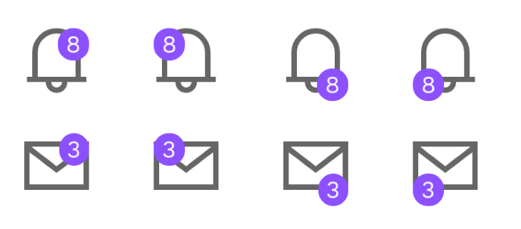
The Stack component is pretty unique. It lets us overlap UI elements on top of each other which can be used to create a call to action type of UX that we usually see in notification icons. Here is an example of how a notification count can be displayed on top of the notification icon:
import { Stack } from 'grommet';
import { Notification, MailOption } from 'grommet-icons';

<Stack anchor='top-right'>
  <Notification size='large' />
  <Box
    background='brand'
    pad={{ horizontal: 'xsmall' }}
    round
      >
    <Text>8</Text>
  </Box>
</Stack>
Notice the anchor prop passed to the Stack component. It decides the anchor point of the notification number on top of the icon.
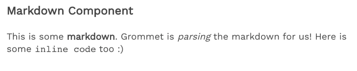
Markdown component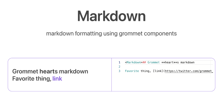
Grommet supports a Markdown component natively which means there is no need for an additional markdown parser in case we wish to display some .md content on our page. We just need to import the component from the library and wrap all our markdown text inside of the component and Grommet will do the rest. Here’s what the code for that looks like:
<Box tag='header' direction='row' pad='medium'>
  <Text size='large' weight='bold'>Markdown Component</Text>
</Box>
<Box pad='medium'>
  <Markdown>
    This is some **markdown**. Grommet is *parsing* the markdown for us! Here is some `inline code` too :)
  </Markdown>
</Box>
And this is what it gets rendered to:
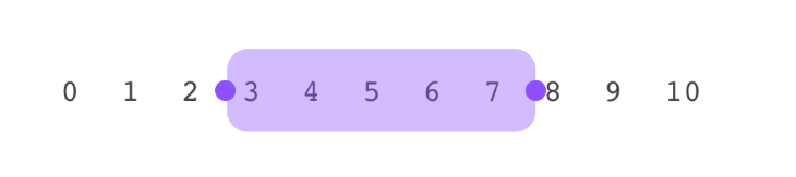
RangeSelector componentThis is an interesting component that is different from the ones being provided by other frameworks. It lets us select a range by tweaking both the starting point and the ending point of the range. Here is the code for implementing the selector, which uses the Stack component again:
<Stack>
  <Box direction='row' justify='between'>
    {[0, 1, 2, 3, 4, 5, 6, 7, 8, 9, 10].map(value => (
      <Box key={value} pad='small' border={false}>
        <Text style={{ fontFamily: 'monospace' }}>
          {value}
        </Text>
      </Box>
    ))}
  </Box>
  <RangeSelector
    direction='horizontal'
    invert={false}
    min={0}
    max={10}
    size='full'
    round='small'
    values={this.state.values}
    onChange={values => this.setState({ values })}
  />
</Stack>
Which renders this on the UI:
FileInput componentAnother component that is quite unique to the Grommet library is this FileInput component. This component, when placed on the UI, renders a button on the page. When that button is clicked, it opens up the native file selector for the OS. And the selected files are passed to the onChange listener. This is the code for setting up the component:
<FileInput
  name='file'
  onChange={(event) => {
    const fileList = event.target.files;
    fileList.forEach((f, i) => {
      console.log('file with index: ', f, i);
      // do whatever is supposed to be done with the files
    });
  }}
/>
And here is how it renders on the UI:
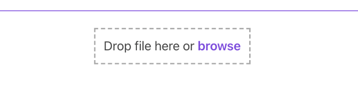
Although, do note that the component is currently only a part of the Grommet stable version and will be released with the library in the next release version.
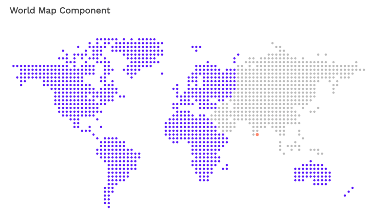
WorldMap componentAlthough the Grommet library provides several modes of visualization like the Chart, the DataChart, the Meter, there is one that stands out, which is the WorldMap component. It is a low-res, dot-based map wherein the dots can be assigned different colors based on which continent they belong to and also based on latitude and longitude value. Here is some code that marks the continent of Asia in grey while painting Bangalore in red:
<WorldMap
  color='neutral-1'
  continents={[
    {
      name: 'Asia',
      color: 'light-5',
      onClick: () => { console.log('clicked on Asia'); },
    },
  ]}
  onSelectPlace={(lat, lon) => {}}
  places={[
    {
      name: 'Bangalore',
      location: [12, 77],
      color: 'status-critical',
      onClick: () => { console.log('clicked on Bangalore'); },
    },
  ]}
  selectColor='accent-2'
/>
Which when rendered, looks like this:
Those are just a few interesting components that Grommet offers. The components page lists all of them.
With such an exhaustive list of components, one is always bound to find one for the requirement in mind. Also, when compared to other UI libraries, Grommet brings such a fresh aesthetic to the table.
The comprehensive storybooks documentation page makes it an even more lucrative option. If an elegant, feature-rich yet minimalistic framework that specializes in management dashboard interfaces is what one is looking for, then Grommet v2 is worth a try.
Install LogRocket via npm or script tag. LogRocket.init() must be called client-side, not
server-side
$ npm i --save logrocket

// Code:

import LogRocket from 'logrocket';
LogRocket.init('app/id');
// Add to your HTML:

<script src="https://cdn.lr-ingest.com/LogRocket.min.js"></script>
<script>window.LogRocket && window.LogRocket.init('app/id');</script>

A guide for using JWT authentication to prevent basic security issues while understanding the shortcomings of JWTs.

Discover how to build, render, and automate product demo videos with Remotion, replacing traditional screen recordings with reusable React code.

Chrome’s Modern Web Guidance embeds modern web platform skills into AI coding agents, helping them choose native HTML, CSS, and browser APIs over legacy patterns.

Learn how to use Fallow to analyze AI-generated code, detect dead code, duplicate logic, and complexity issues, and integrate automated code quality checks into your AI-assisted development workflow.
Would you be interested in joining LogRocket's developer community?
Join LogRocket’s Content Advisory Board. You’ll help inform the type of content we create and get access to exclusive meetups, social accreditation, and swag.
Sign up now

