There’s a lot that goes into the planning and execution of delivering a digital product. What are we going to build? What will it look like? How will it function? Everyone wants the product to succeed, and we each have different ideas for how that will happen.

To align on what we want to build, and how, we need to have many conversations around those details — from the strategic ones about where we are going, to tactical ones about how we are getting there.
These conversations require anchor points — things that we can latch on to, see, talk about, and debate. We need to take the ideas in our heads and put them down on paper, to discuss them. To have conversations about digital products, we need to make representations of those products first, called wireframes.
At its core, a wireframe is a representation of a digital product. It’s a tool, a technique that people use to communicate ideas, align teams, and work together toward delivering a final product.
Generally created and used by designers (though other departments can generate and utilize them as well), wireframes allow designers to take business ideas and visualize them in a way that allows teams to debate features, discuss implementations, and create products for the customers they serve.
Wireframes represent the vision of an idea. They stand as high level, “what if” possibilities of how we could approach a business problem. Using abstract shapes, boxes, and lines, wireframes serve as a way for people to have conversations about the direction of a product without getting into the details around color, positioning, or branding.
Wireframes also represent possible solutions. By visualizing how an idea can be implemented, teams can debate the value of one feature over another, discussing the compromises needed to execute on an idea the business wants to invest in.
Wireframes also serve as blueprints, expressing the final product as it should be built. Wireframes are used to communicate with engineers how to create the product from code, showing the exact placement of elements on a screen, much like an architect would communicate how to build a house from scratch.
Essentially, wireframes can stand for a lot of different things. They can represent a vision, a possibility, or even the final product. What a wireframe stands for, and what it is intended to be used as, all comes down to the purpose of why it was made and the type of wireframe we’re talking about.
When we think about the types of wireframes we want to make, we often think in terms of the fidelity — the level of detail — of those wireframes.
Choosing the right level of fidelity for sharing wireframes is one of the most critical wireframing skills when working with others. If you want to have a conversation about the business value of a feature, but bring a wireframe that is full of images, colors, and other beautiful details, then you risk that conversation becoming about those details instead of the broader point around whether or not you want to create the product in the first place.
You should come to a meeting with wireframes that are full of the level of detail you want to have a conversation about. But what’s the right amount of detail to include? What levels of fidelity can we design at in order to promote those conversations? Essentially, there are three different types of wireframe fidelity.
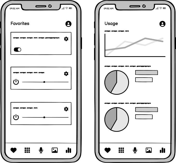
Low-fidelity wireframes are the least detailed, most basic form of wireframes. They tend to take out a lot of the details around the substance of an idea and instead focus on its strategic value: Do we want to build this product? What could it look like? What is the value of this idea, and why would we want to pursue this? Low-fidelity wireframes seek to answer this question and do so by serving as abstract representations of a possible product.
Low-fidelity wireframes don’t “feel real.” They aren’t something we’d ever release as a product. Rather, they serve as sketches, skeletons, high-level possibilities of what a hypothetical product could be. They don’t focus on the color, typography, branding, imagery, or anything else that is normally thought of as “design.”
You should use them when you want to express an idea, but not get stuck in a conversation about the specifics of that idea. Low-fidelity wireframes feel like a concept — an incomplete idea that is starting to take shape but isn’t yet complete. This allows you to have a conversation about the idea rather than the implementation of the idea, because the implementation feels like it isn’t done yet. And that’s the point — it’s not meant to be complete. It’s a rough draft, intentionally, so that there is room for a conversation about the merits of the idea.
Pros:
Cons:
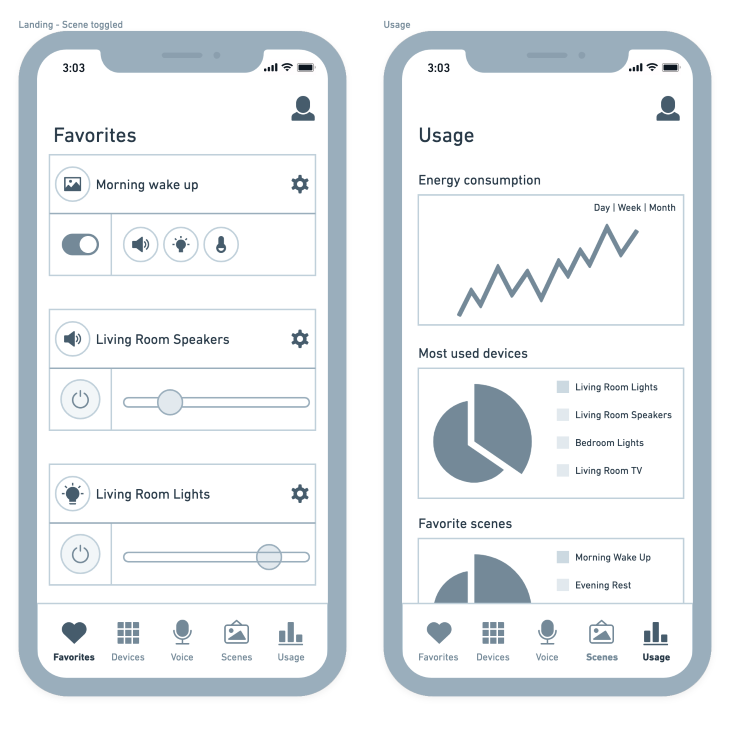
Midfidelity wireframes live in-between abstract and concrete. As a middle ground, these types of wireframes serve as part details, part vision of an idea.
Midfidelity wireframes show the execution of an idea and start to fill in the details around that idea, yet aren’t designed to represent the final product. Where can we go with this idea? Where would this feature live? How would the customer navigate this product? Midfidelity wireframes start to fill in the details of how something functions, now that the team is aligned in wanting to pursue the idea in the first place.
At the same time, midfidelity doesn’t try to put the final details in place. Rather, they serve to have a conversation around where those details would go, what the messaging would be, and how they might end up looking. We spend more time on the finer details, now that the strategy has been confirmed and we need to think about the execution.
Like low fidelity, midfidelity usually stays within greyscale. We start to add in the expected copy for the product, perhaps exploring the details around some visual elements as well, like buttons or cards. Midfidelity starts to bring shape to the final product by facilitating conversations around those details.
Generally, midfidelity wireframes are used when you need to talk about the execution of an idea, but are still exploring it strategically. It’s a midpoint that allows the team to talk about an idea and start to put the final elements in the places where we think they will go.
Pros:
Cons:
![]()
High-fidelity wireframes represent the final product. Sometimes referred to as “mockups,” high-fidelity wireframes portray or “mock up” what we intend to release to our customers. They focus on fit, finish, polish, and exact placements of where we want to put each element on the screen.
Is this the right visual design for our brand? Is this button too big? Is there enough contrast on the screen for the customer to clearly see the call to action? High-fidelity wireframes facilitate these types of conversations, letting teams decide on the exact implementation of every pixel on the screen.
High-fidelity wireframes are what we expect the final product to look like. They represent the functional specifications we intend to pass on to developers so that the product is coded to match those requirements. Elements are put into the exact spaces we intend for them to be when we launch our product to our customers.
Unlike the other two forms of fidelity, high fidelity has a ton of visual detail. We bring in brand colors, images, exact typographic treatments, and final copy as we represent the end product in static images.
High fidelity wireframes are used to have the final conversations about a feature. They serve as the blueprints for what will be built and are used in production once teams sign off on these final wireframes. They are also used to pitch to stakeholders or investors when trying to get an idea off the ground because they serve as a vision for a product without having to actually code that product.
Pros:
Cons:

You don’t need a computer to get started making digital products. In fact, the easiest, simplest way to make wireframes is with pen and paper.
Since we want to make low-fidelity wireframes, pen and paper is an excellent way to give that imperfect, not complete vibe that we want from low fidelity. It’s also a great way to get the ideas out of your head and onto a page — instead of trying to manipulate a digital tool, you can directly draw out what you’re thinking and share it with the team.
Designers don’t use pen and paper enough, and I highly recommend it for getting the ideas out of your head before heading to a digital tool to add extra detail.
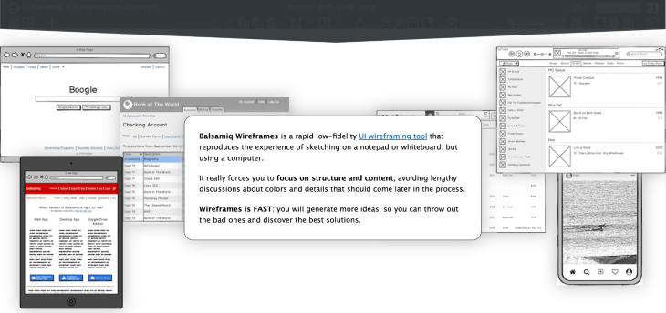
Balsamiq allows for that pen and paper feel to wireframes, but digitally. Their wireframing kit has an imperfect feel to its elements, suggesting that the wireframes made from it aren’t quite done yet. They feel like digital napkin sketches, and that’s a great thing when trying to design for low fidelity.
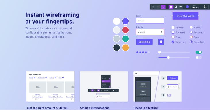
Whimsical is my go-to choice for midfidelity wireframes. They have an easy-to-get-started wireframing kit that allows for the perfect blend of premade components and customization to represent your ideas.
Using a drag-and-drop interface, Whimsical allows people to create designs quickly, cleanly, and easily. It’s also free (up to a certain number of objects), allowin people to make a few designs without committing to the software.
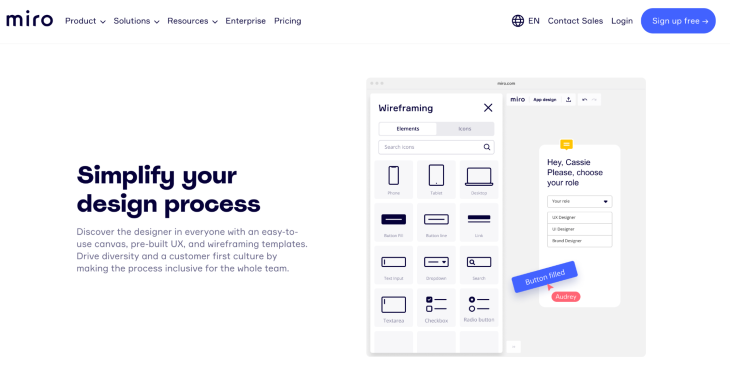
Like Whimsical, Miro offers custom wireframe kits that allow for quick and easy midfidelity wireframes. Miro tends to be less easy to access than Whimsical, however, as it usually requires a license.
However, unlike Whimsical, Miro integrates with a lot of other tools, and being able to do all the planning and ideation in a single tool has its advantages. Additionally, your organization may already own a license to Miro, given its popularity.
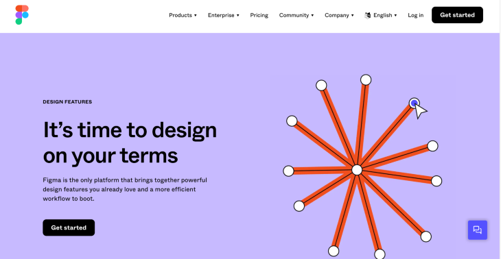
Figma is the industry standard for designing digital products. While it’s possible to make any level of fidelity in Figma, it’s truly at its best when designing for high fidelity. Figma allows for any modification to a design, giving designers the flexibility to be as creative and custom as they want.
At the same time, the simplicity of their interface combined with their in-cloud software solution gives Figma a competitive advantage over its peers that has catapulted it to its position on top of the design industry.
Another large part of Figma’s competitive advantage is its community — Figma focuses on fostering community involvement in its features and files, allowing for designers to make plugins, templates, and sample files that can be shared across the community to make designing easier for everyone.
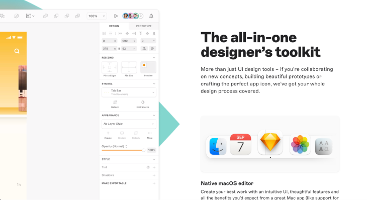
Sketch has very similar features and functionalities to Figma (and was on top before it). The main difference for Sketch is it’s not based in the cloud and only available for Macs.
This makes it a more limited software to share files with other designers, causing versioning issues, tossing files back and forth, and syncing files to third-party solutions in order to maintain consistency, good documentation, and updated work.
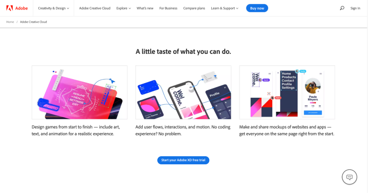
Like Sketch, Adobe XD also saves files locally instead of cloud-based file management. It too has cloud solutions, but they aren’t the focus of the product. Being a part of the Adobe suite, Adobe XD also has many integrations with the Adobe suite, focusing on living in an ecosystem of products. Additionally, Adobe has some higher fidelity features compared to its counterparts, like with text, audio, and animations, allowing for more advanced and immersive prototypes.
If you’re curious about the tools designers use in the industry, UX Tools does a survey every year polling designers on all the tools they use.
There isn’t any “right” version of fidelity for your wireframes. Rather, it’s about picking the right fidelity for the right conversation. What do you want to talk about? Choose a fidelity level that will promote that conversation (and not ones you don’t want to have).
Talking about the value of a feature? Try a lower fidelity, so the focus isn’t on the shape of the button or the specific icon being used to represent the feature. Want to implement the final product? Bring a higher level of fidelity, so you can have a conversation about position, placement, and color.
With a knowledge of the types of fidelity, and when to use each type, you’ll be able to set up a conversation for success – which will lead to success for your customers.
Featured image source: IconScout
LogRocket's Galileo AI watches sessions and understands user feedback for you, automating the most time-intensive parts of your job and giving you more time to focus on great design.
See how design choices, interactions, and issues affect your users — get a demo of LogRocket today.
A three-week mobile banking project taught me that the “proper” UX process is not always realistic. Sometimes, the better approach is to work with what you know, identify what you still need to learn, and make the strongest decision possible under real constraints.
A/B testing compares two versions of a design to see which performs better with real users. Here’s how UX teams can use it to test hypotheses, measure outcomes, and make smarter product decisions.
This case study shows how one ad experience redesign increased total ad exposure while lowering perceived friction, proving that timing and context can matter more than raw interruption.

As products evolve into ecosystems, navigation becomes a system-level challenge. This article explores how to align structure, context, and user journeys to create seamless movement across tools without confusion.