Creating a great user experience is a sum of optimizations for smaller UX rules and principles. One of these rules is a peak-end rule. Let’s discover what it is and how to provide better UX by optimizing peak and end experiences for your users.
People tend to judge past experiences based mainly on how they felt at their peak and their end rather than how they felt during the whole experience. Simple enough, right? Let’s use a holiday analogy.
If you stayed in a hotel that was just average, but you had two or three genuinely unforgettable moments there, and your last day was just perfect, you are likely to exaggerate in your memories how good the whole stay was. On the other hand, if the hotel was quite good, but you experienced a few severely dissatisfactory experiences and got very annoyed at the reception during check-out, you are most likely not coming back:
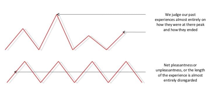
The same thing applies to products. We tend to judge our experience with a given product based on the peaks we had and how the experience finished, so it’s important to truly take care of those two parts.
We can embrace the fact that users remember peaks and end experiences more vividly to design more memorable product experiences.
There are two main things you can do to benefit from the rule:
Let’s talk about how you can do that and take a look at companies who are successful.
I’d define a “peak experience” as moments when the user feels amazing using the product. That’s either an “aha moment” when they realize the value the product brings them or a dopamine hit when they achieve something meaningful.
To identify those peaks, review your user journey flow and map parts of the flow when the user gets the most value or makes some sort of achievement. Then, ensure that the product interactions reflect and highlight those peaks for users. It can range from small acknowledgment animations to public shoutouts.
The goal is to maximize the chances the user will remember these moments for a long time. To put it into context, let’s look at a few real-world examples.
Duolingo is an EdTech app that gamifies the language learning experience. And there’s no better feeling when it comes to learning a language than the sense of progress.
Duolingo doesn’t miss these opportunities. Whenever you make any sort of progress, they make sure to highlight that and give you the dopamine boost. These milestones include:
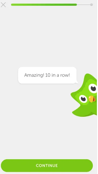
They even highlight the most minor achievements, such as completing ten questions in a row or practicing for five minutes. Duolingo ensures you end each session with a solid feeling of progress that’ll bring you back the next day.
ShareTheMeal is an application that lets users donate to the United Nations World Food Programme and combat food shortages worldwide. The whole process of donating is a peak experience for the donor, and ShareTheMeal sure makes it memorable:
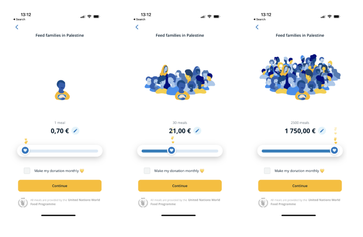
First, as you increase your donation size, the illustration dynamically changes and shows the increasing number of people you help. Although it’s a simple illustration, it gives a strong sense of tangibility. Additionally, regardless of the amount you donate, as you change the slider, you are bombarded with hearts that symbolize people’s gratitude towards you.
Although both of these highlights are purely cosmetic, they create a powerful experience that makes the donor feel good about themselves. It would be a completely different story if there was only a boring input field.
Reforge is an online learning platform providing courses on building great products. One of the peak moments in online learning is the feeling of progress when you complete a module, and Reforge reinforces that with a congratulatory message:
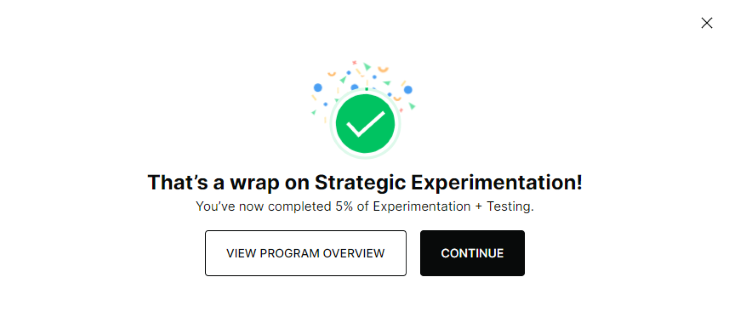
It also highlights the percentage of progress you make to reinforce the feeling of moving forward. Once again, although it’s indeed a tiny cosmetical pop-up, it does give a small dopamine hit which wouldn’t happen if Reforge ignored the moment or just waited until you finished the whole program before acknowledging your progress.
League of Legends is a MOBA-style computer game. There isn’t a more satisfying moment in video games than eliminating an enemy player. League of Legends’ creators know that and give you a public shoutout whenever you do so. The shoutout is more prominent the more enemy players you kill at once, increasing the dopamine hit even further:

As an avid gamer, trust me — everyone remembers their “pentakill” shoutout (when you manage to kill the whole enemy team) for weeks to come, and it’s almost certain they’ll play the next round after getting one.
While highlighting peaks is most important to make the whole experience memorable, you shouldn’t neglect the finishing experience. Ensure that whenever user interaction with your product ends, you:
Let’s take a look at a few examples to get an idea of how to leave users on a positive note.
At its core, Mailchimp lets you set up email campaigns and newsletters. Although they could just show a basic confirmation such as a “campaign set” (or worse, no confirmation at all), they take it a step further:
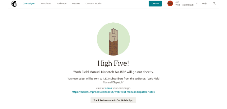
They give you tangible data on how many subscribers will receive the campaign. As your email list grows, the number also grows, being a small reminder of how far you’ve come. The high-five animation is also a better touch than a boring confirmation message.
Mailchimp also makes performing your next desired actions easier: sharing a link or tracking campaign performance. No extra steps, no extra friction.
The same way ShareTheMeal makes sure to highlight the peak part of the experience — the donation process — they don’t forget about effectively wrapping up the whole experience:
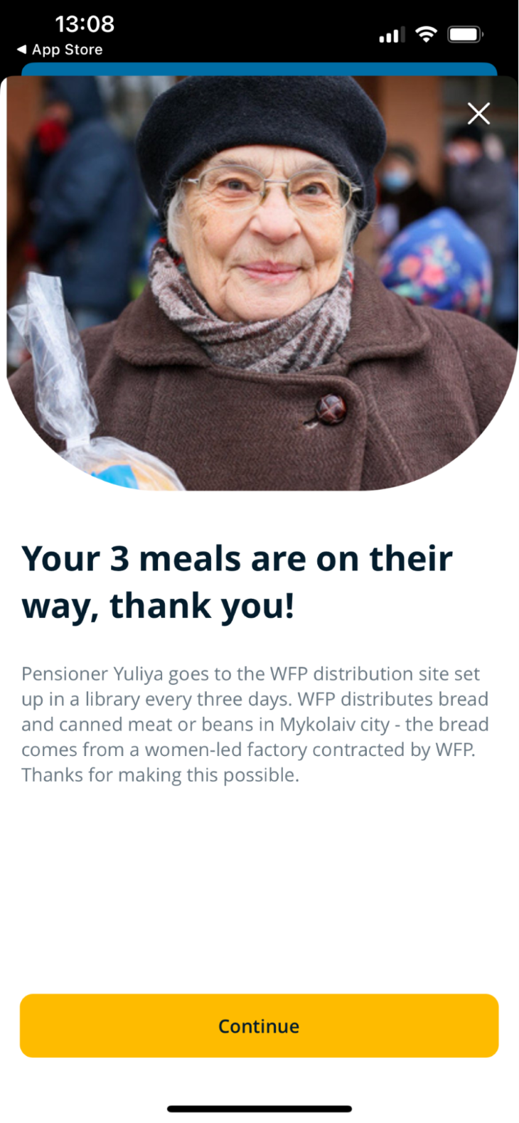
Instead of getting a boring “donation accepted” message, they nail the experience in numerous ways. First, they remind you how many meals you donated. Three meals are more vivid and feel much more impactful than $1.20. Also, the “are on their way” makes the meal delivery more tangible and vivid.
But most importantly, ShareTheMeal gives you an example of a person who benefits from the donation, together with a real-life photo of them. It helps donors genuinely feel the impact they are making and feel extremely good about themselves.
In some cases, the picture and story also generate curiosity in donors, making them more willing to make another donation just to read a different person’s story. ShareTheMeal proves that even a simple thing like a confirmation page can be an extremely impactful part of the user journey.
Sometimes it’s about tiny things. Let’s take a look at Zapier, a SaaS task automation platform. If you sign up for a paid subscription, the confirmation pop-up throws confetti at you, and their logo starts to dance:
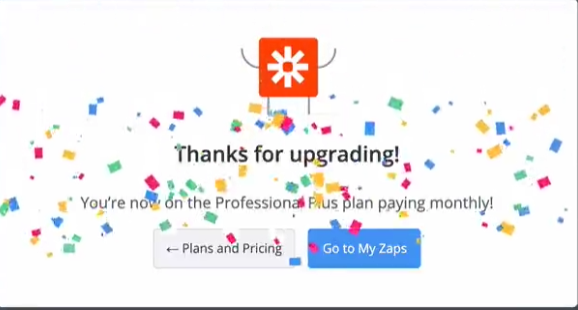
It makes the moment just a little bit more enjoyable and memorable. As small as it might sound, as I mentioned in the beginning, a great user experience is a part of these small, seemingly unimportant moments.
Users tend to judge their past experiences with a product based on the peaks during the experience and how it ended rather than on the sum of all their experiences. Make sure to remember that when designing various microinteractions in your product.
Map the journey users go through and map when you give them a dopamine hit. Then look at places where you can add an extra dose of dopamine. Often just a small animation or acknowledgment is enough to create peaks in people’s memories.
Don’t go overboard, though. Trying to highlight the experience every thirty seconds or so might have a counterproductive effect. Highlight an experience only when it’s actually deserved. Otherwise, you are just spamming microinteractions.
LogRocket's Galileo AI watches sessions and understands user feedback for you, automating the most time-intensive parts of your job and giving you more time to focus on great design.
See how design choices, interactions, and issues affect your users — get a demo of LogRocket today.
Optimization fatigue is real. Here’s why designing only for metrics drains creativity, and how to bring the human back into UX.
Let’s explore why and when to use drag and drop, discussing real-world examples, platform-specific considerations, and accessibility tips.
We’re told to reduce friction, but sometimes friction builds value. This blog explores how scarcity, when designed well, sharpens focus and strengthens user trust.
Discover how to craft UX-friendly hero sections with examples, design tips, and strategies that drive engagement and conversion.