Editor’s note: This blog was last updated in December 2025 to provide examples of the best hero sections, cover steps for creating an effective hero section, and answer the most frequently asked questions about hero sections. Special thanks to the original author, Chinwe Uzegbu, for her contributions to the first version of this post.

A hero section is the first, visually prominent UI block at the top of a web page or digital product screen. Its job is to welcome users, present the product value at a glance, and effectively guide them to a desired primary action. It improves the first user impression with the product using a compelling headline, supporting copy, and CTAs (call-to-action), and other visual enhancements.
Most modern websites and other digital products display hero sections right after the primary header segment, usually the product logo and the primary navigation area, or construct the whole main header area within the hero section. It can cover the whole or a large portion of the visible area of the initial screen to grab the user’s attention.
Hero sections share some similarities with other well-known UI element definitions, but it’s not a:
A well-designed, visually prominent, and user-friendly hero section provides you with the following benefits:
The hero section creates a good first impression, but that doesn’t mean you should aim to include it in every single product you design — in some scenarios, adding a meaningful hero section is practically impossible. If we do so, users may find it annoying, unwanted, unclear, and finally, user engagement will drop.
If your design scenario falls into one of the situations below, avoid using a hero section to keep user engagement up and reduce initial user interaction time:
The rule of thumb is to avoid using a hero section if you can’t create a meaningful one for a particular design scenario.
A hero section has four primary elements that you should be familiar with:
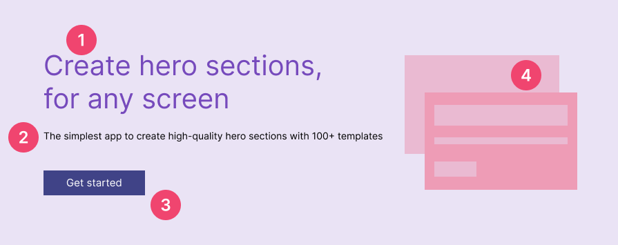
A standard hero section contains the above four elements, but you can undoubtedly go beyond it and use the following optional elements with your creative design skills:
Like any other UI/UX elements, there aren’t any rules about elements in a hero section, so you can innovate hero sections by adding new hero section elements.
Using your creative design skills while also caring for responsiveness, accessibility, and performance eventually creates welcoming, usable, and effective hero sections. Here is why you should design under screen, accessibility, and performance constraints while including the above core and optional elements:
Here are some hand-picked, well-designed hero section examples that you can use as inspiration to create a great hero section for your digital product:
A minimalistic hero section effectively uses minimalism as the core design philosophy and gives a simple but powerful and clear first impression. This hero section type uses short, optimized headings, supporting copies, CTA labels, and minimalistic visuals without excessive optional elements for aesthetic purposes.
Medium is a popular publishing platform that connects writers with worldwide readers. It uses a very minimalistic, clean design on every product screen and prioritizes content over visual aesthetics. The site has an ultra-minimalistic hero section, with only one CTA:

Medium’s minimalistic hero section succeeds because of these design elements:
The input-capture hero section type displays an input element for a CTA to make the particular CTA-related user flow short and smooth. This hero section type can contribute to increasing the conversion rate since it can hint that the particular input is what you all need for a smooth user flow start. Input capture heroes work best for product sign-ups and product onboarding, e.g., creating a personal website by asking for a subdomain
GitHub is a popular collaborative software development platform. Its landing page has an inviting hero section with a professional design and active color selections. This hero section extends the primary CTA with a text input element to enter the user’s email and continue with the signup process:

This hero section includes the following design considerations to make it more effective:
A split-column hero section goes beyond the traditional linear flow in hero design by using two columns for the heading, supporting copy, and CTA. Most split-column designs allocate the whole left column for the heading to prioritize welcoming users and marketing the product with a powerful, short heading.
Sketch is a popular, fully featured design software for macOS. The landing page of the Sketch app uses the split-column hero section type and separates the heading and other elements into two columns, as shown in the following preview:

This hero section succeeds because of these design elements:
The product preview hero section type includes an actual screenshot or a real product-like interactive prototype of the advertised digital product as the hero visual. This hero type lets users see how the product looks before using the product without letting them manually browse a product preview page via a CTA.
Cursor is a modern, AI-powered code editor that lets developers boost coding productivity with generative AI. Its landing page uses a colorful hero section with a preview of the actual product:
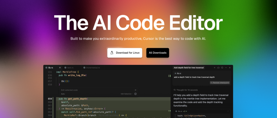
This hero section includes the following design considerations to make it more effective:
A product showcase hero describes the highlight features and capabilities of the advertised product using a product showcase video or interactive hero visual. This hero type typically uses a short, pausable, repetitive product showcase video/animation to summarize the product faster since users can learn the product in detail once onboarded.
Zoom is a popular communication platform that offers video conferencing, live chat, audio communication, and collaborative features. The Zoom platform’s website integrates a product showcase video into its hero section as follows:
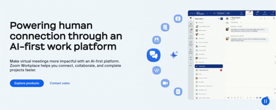
This hero section succeeds because of these design elements:
The animated hero section type animates hero section elements to improve visual aesthetics and display more information by making the hero section dynamic. This hero type dynamically changes headings and supporting copy text, highlights words or segments, and includes animations for the hero visual. Some animated heroes use microinteractions to make the hero section more engaging.
Contiant is another good example of animation in a hero section. This innovative open-banking-based payment platform website features a minimal hero section design with an animated heading, a concise description block, and an interactive, descriptive animation:
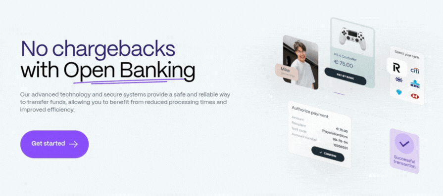
This hero section succeeds because of these design elements:
The typing-effect hero is a special subtype of the animated hero section type. It uses a realistic typing effect to dynamically change the heading. The typing effect provides a powerful, creative, marketing-friendly way to erase a part of the heading and add new parts to progressively deliver more information about the product using a single heading segment. Compared to the general animated type, the typing-effect hero is more suitable for technology, computer, software development, and AI-related domains.
Codecademy is a popular online learning platform that offers various courses for developers, data scientists, AI engineers, and security engineers. The Codecademy website’s homepage has a unique hero section that attracts visitors with a dynamic heading and a slideshow:

This hero section succeeds because of these design elements:
The full-size video background hero type uses a full-size, smoothly-looped video for the whole hero section background. This type usually extends the hero section over the product header section, which includes the primary navigation bar and the logo. This hero type uses strategies like headings with no supporting copy, well-thought-out positioning, foreground element backdrops, and opacity layers to make the video well-visible while also keeping core hero elements attention-grabbing.
Nissan is a well-known Japanese multinational automotive manufacturer. Nissan’s official global website has a hero section that covers the whole header section and includes a powerful, marketing-friendly background video:
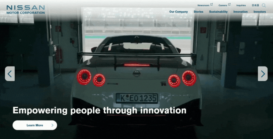
This hero section includes the following design considerations to make it more effective:
The pre/post-hero utility strip refers to an optional hero section element that appears before or after hero section elements. It usually contains icons and text. The pre/post-hero utility strip pattern offers a powerful way to let the user know about a crucial product capability without affecting the heading, supporting copy, and other hero section elements.
Krisp is a popular AI-powered note-taking and noise cancellation software that works with all popular online corporate communication apps like Zoom. The Krisp website’s hero section advertises the product well by also cleverly using the space before the headline for a pre-hero utility strip:

This hero section includes the following design considerations to make it more effective:
The carousel hero type displays multiple hero section pages within one hero area by autoplaying the next page under a specific interval and providing manual carousel controls like pause, next, and previous buttons. This hero type either switches the whole hero page at once or switches a part of it, e.g., switching hero images by keeping other core elements static
Tesla is a popular American multinational automotive and sustainable energy company. Its official website uses a carousel hero section to effectively advertise several vehicle models:

This hero section includes the following design characteristics to make it more effective:
| Pattern | CTA | Input before CTA | Hero visual type | Layout | Accessibility notes | When to use |
|---|---|---|---|---|---|---|
| Minimalistic | 1 primary, no secondary | No | Illustration, no dynamic motion | Single column | High contrast, simple | For products that follow an ultra-minimalistic design philosophy |
| Input-capture | 1 primary, no secondary | Yes (e.g., email, username, subdomain-like key inputs) | Abstract backgrounds, slight motion with basic interactions like mouse movement | Single column | focus-visible on input | When the primary CTA’s user flow can be improved with a short user input |
| Split-column | 1 primary, optional secondary | Optional | Neutral imagery, like gradients and abstract backgrounds | Two columns | Avoiding foregroud-background color blends | Try if you need to experiment effectiveness of a non-linear hero flow |
| Product preview | 1 primary, optional secondary |
Optional | Static preview, real-product-like prototype, abstract backgrounds | Single or two columns | Readability of primary elements in the product preview | For small or medium-size software product landing pages |
| Product showcase | 1 primary, optional secondary |
Optional | Video showcase, interactive showcases, Plain color backgrounds | Single or two columns | Pausing the showcase video, microinteractions accessibility | For large software product landing pages |
| Animated | 1 primary, optional secondary |
Optional | Multiple animated visual segments, microinteractions | Single or two columns | Microinteractions accessibility, avoiding distractive animations | Product design teams that prioritize aesthetics and creative design |
| Typing-effect | 1 primary, optional secondary |
Optional | Minimal imagery, plain-color backgrounds | Single or two columns | Typing effect duration | For technology, computer, software development, and AI-related products |
| Full-size video background | 1 primary, optional secondary |
Optional | None (only the background video layer) | Single or two columns | Foreground element readability | For automotive, sports, futuristic technology-related product designs |
| Pre/post-hero utility strip | 1 primary, optional secondary |
Optional | Static or slightly dynamic visuals | Single or two columns | Text readability of the utility strip | When you have a product capability that doesn’t fit well in the heading or supporting copy |
| Carousel | 1 primary, optional secondary |
No | Switching hero images | Single or two columns | Manual carousel controls, carousel page duration | When multiple products are available for advertising |
Create effective, high-quality hero sections that welcome users and increase conversion rate with the following best practices:
Anyone can create a hero section by assembling hero section sub-elements or using a pre-designed template, but you should consider going through the following steps if you wish to create an effective, high-quality hero section that brings benefits for both users and business organizations:
Before creating an effective hero section for your digital product, review the following most frequently asked questions.
What exactly should be in a hero section?
A generic hero section consists of a heading, supporting text block, CTA button, and visual enhancement to get the user’s attention, welcome them, and offer instant actions to continue using the product. Designers can extend a generic hero section with optional elements to include more information or to improve aesthetics
What are other elements that you can add to the hero section?
You can add a pre/post-hero element, a description block after the CTA section, and a text input before the primary CTA button. There are other ways to innovate as well, but make sure that they bring value to the user.
How big should a hero section be?
Cover a large portion of the visual screen. Some hero sections cover the whole visible screen, and some cover a part of it. Decide on your approach based on the elements that appear after the hero section and your design preferences.
What makes a hero section effective?
A welcoming, visually prominent, and thought-out design with a confident, friendly language tone makes a hero section effective.
Should hero sections have video backgrounds?
This depends on the designer’s preferences and product domain. If designers can advertise the product without affecting the other parts of the website/app, video backgrounds make the hero section more effective (e.g., the Nissan website).
Can you add a hero section to any digital product and get the same benefits?
No, in some scenarios, adding a hero section affects user engagement, e.g., browse-first products, products run on smaller devices, etc.
Is the primary navigation menu a part of the hero section?
No, but you can expand the hero section to go under the navigation menu region if you use a hero background video or image
How important is the whitespace in hero sections?
Using whitespace is a practical and effective way to reduce cognitive load in hero sections and emphasize core hero section elements, so using necessary whitespace is so important in any hero section
Should I use creative humor in hero sections?
Creative humor becomes a powerful marketing strategy in most design scenarios, but make sure that humor positively affects your brand and that the product domain is suitable for humorous advertising. Creative humor is not discouraged, but most designers prefer being confident and direct in hero sections rather than adding humor. Deciding this with your product owners is the best way.
How effective are microinteractions in hero sections?
Using microinteractions is undoubtedly an effective strategy to improve accessibility, user engagement, and overall visual look and feel. A well-thought-out microinteraction can even make a hero section memorable with positive emotions, e.g., 3D characters in GitHub’s hero section
Should the hero section prioritize user goals or business goals?
Both. A good hero section helps user accomplish their goals by also seamlessly embedding business strategies to achieve business goals, the same as you create user-centric products that satisfy business goals.
In this article, we discussed the basics of hero section design, popular hero section types, learned best practices, and evaluated some popular digital products that implement well-designed, effective hero sections. We also created a step-by-step guide to create a better hero section design and answered some FAQs.
A hero section is the element that the user sees first, so you should create it properly with a welcoming, confident, high-quality design to improve the first impression and increase the conversion rate. A well-designed hero section not only boosts organization revenue but also guides every user to accomplish their needs productively.
A general hero section that modern users are familiar with has several core elements, but you aren’t limited to strictly using them only — you are free to innovate new hero section types and various visual improvements using your creative design skills to evolve hero section design for the next UI/UX design era.

LogRocket's Galileo AI watches sessions and understands user feedback for you, automating the most time-intensive parts of your job and giving you more time to focus on great design.
See how design choices, interactions, and issues affect your users — get a demo of LogRocket today.
Multimodal UX goes beyond designing for screens. Learn how context-aware systems, progressive modality, failover modes, and accessibility-first design create better digital product experiences.

Learn how context-aware mode prioritization and seamless transitions improve multimodal UX and reduce mode confusion.

Research is becoming more democratized, product cycles are accelerating, and AI is transforming synthesis and ResearchOps. Here are the three trends shaping UX research in 2026.

Voice support is not the same as multimodal UX. Here’s how to design systems with true mode continuity and context-aware interactions.

 Learn more →
