Forms are an integral part of UX design. Whether they’re for logging in, gathering feedback, or collecting user input, they help facilitate user interaction with digital interfaces. But as with any data input process, errors are bound to occur. Therefore, we need a method for identifying or even preventing these errors. Enter form validation.

In this article, we’ll explore the role of form validation in enhancing user experience by discussing:
If you’re ready to explore form validation in UX, let’s get to it.
Form validation is the process where a website or application checks the data entered by a user to ensure it is correct. There are two possible outcomes: 1) the data is accurate, in which case, the user gets the go-ahead, and 2) the system spots an error and draws the user’s attention to it.
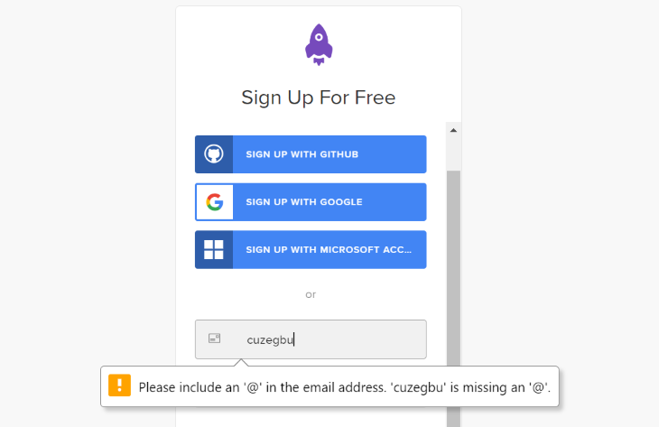
Take a signup form, for instance. When you enter your email address, the system checks to see if it follows the standard format ([email protected]) and if it hasn’t already been registered.
But why is this process necessary? You’ll soon find out as we’re about to discuss that.
In the digital world, users enter data through forms during registration, login, shopping checkout, or feedback submission. Form validation ensures that this data meets the required criteria, thus increasing efficiency and ultimately leading to higher conversion rates.
Does that mean that form validation affects conversion rates? Absolutely. Research has shown that nearly 70 percent of users will abandon a form if they encounter complications. This abandonment can be permanent, leading to missed opportunities for conversions. We need form validation to avoid these complications.
But it’s not enough to just know about form validation. Knowing the types of form validation and when to use each one is equally (if not more) important. So, let’s get to that.
Generally speaking, there are two approaches to form validation:
To be fair, both approaches have their merits. Yet, designers and UX professionals have differing opinions about the more effective validation approach.
We won’t get into the debate on which is more effective. However, we will explore each of these methods, their merits (and demerits), and also discuss some considerations for choosing an approach.
At the end of the discussion, you’ll be well-equipped to choose the most appropriate method for your needs.
Let’s start with inline validation, shall we?
This approach gives the user a validation message before they click submit. It can provide several types of real-time feedback:
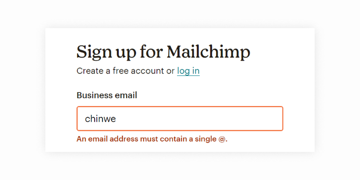
An example is this validation message from Mailchimp. Notice how it uses red to draw the user’s attention to the invalid email:
However, when the user enters their email in the correct format, they get the go-ahead (indicated by the green tick):

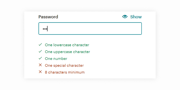
And when it’s time to choose a password, it lists the criteria for valid input and updates the user to keep them within limits:
As you may have already deduced, this validation approach has many benefits. Let’s explore some of them:
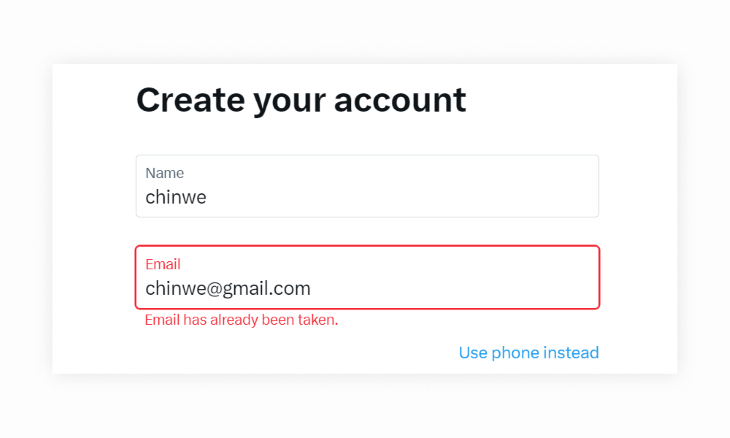
But as we all know, there are no perfect solutions. Inline validation also has some drawbacks. Let’s check them out:
So we’ve discussed the pros and cons of inline form validation. Let’s now move on to the other approach:
This approach involves validating the user’s input on the server side after the user has submitted a form or completed an action. After the user submits their input, the system performs validation checks, then either 1) returns an error message or 2) gives the user the go-ahead.
An example is this validation message from Amazon. Notice how the system flags all the fields containing errors:
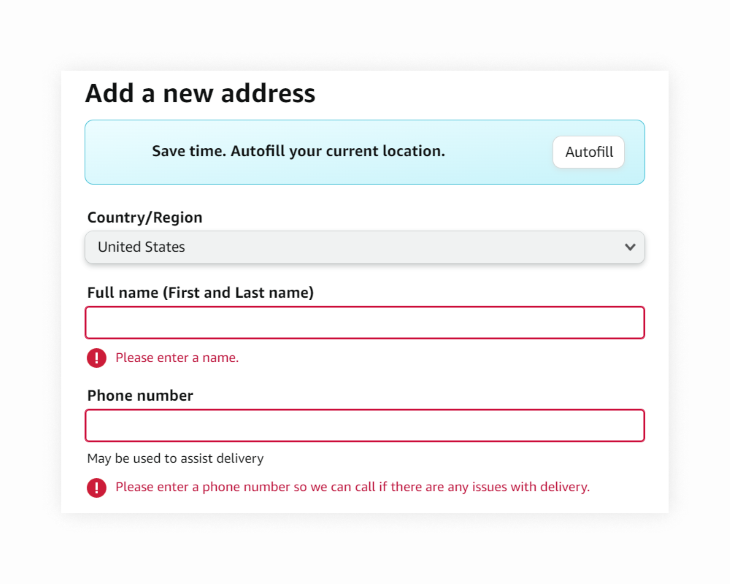
While this approach may seem old-fashioned, and some may even argue that it offers a poor user experience, it has some perks. Let’s explore them:
Of course, like with any other approach, after-submission has its drawbacks. Let’s explore them:
We’ve extensively discussed both approaches, but how do you choose which to use? Don’t worry, we’re about to discuss the considerations for picking the right validation approach.
When faced with the task of choosing a form validation approach for a specific scenario, there are several factors you should consider. Here are some of them:
Having said that, it’s not enough to know when to use a particular approach; you also need to know how to use it. So, let’s look at some best practices for implementing both validation approaches.
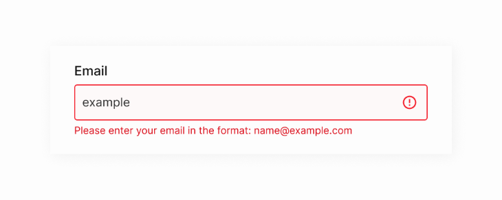
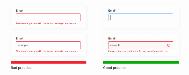
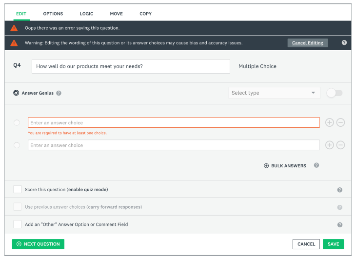
Effective form validation can enhance user experience and increase conversion rates. The choice between inline and after-submission approaches depends on factors like form complexity, technical constraints, and user expectations.
Whichever approach you use, ensure that users can identify the errors and understand how to fix them. Never leave your users guessing.
LogRocket's Galileo AI watches sessions and understands user feedback for you, automating the most time-intensive parts of your job and giving you more time to focus on great design.
See how design choices, interactions, and issues affect your users — get a demo of LogRocket today.

A three-week mobile banking project taught me that the “proper” UX process is not always realistic. Sometimes, the better approach is to work with what you know, identify what you still need to learn, and make the strongest decision possible under real constraints.

A/B testing compares two versions of a design to see which performs better with real users. Here’s how UX teams can use it to test hypotheses, measure outcomes, and make smarter product decisions.

This case study shows how one ad experience redesign increased total ad exposure while lowering perceived friction, proving that timing and context can matter more than raw interruption.

As products evolve into ecosystems, navigation becomes a system-level challenge. This article explores how to align structure, context, and user journeys to create seamless movement across tools without confusion.