Documentation isn’t exactly everyone’s favorite part of the UX design process. However, it’s crucial to the success of any project. When done correctly, it helps ensure your entire team is aligned as the project moves from one phase to another.

But what exactly does UX documentation involve and why do you need it? Well, you’re about to find that out. In this article, you’ll dive deep into the UX documentation process. So if you’re ready to discover the proper way to document your UX process, let’s get started.
Editor’s note: This blog was updated 14 July 2025 by Chidera Nwankwagu to provide new sections on team handoffs, design validation, and documentation tools, while expanding its coverage of strategy, structure, and design systems. It also offers a more detailed, real-world approach to UX documentation.
Think of UX documentation as a way to tell your project’s story — your design decisions, thought processes, and strategies. Telling this story is essential for several reasons:
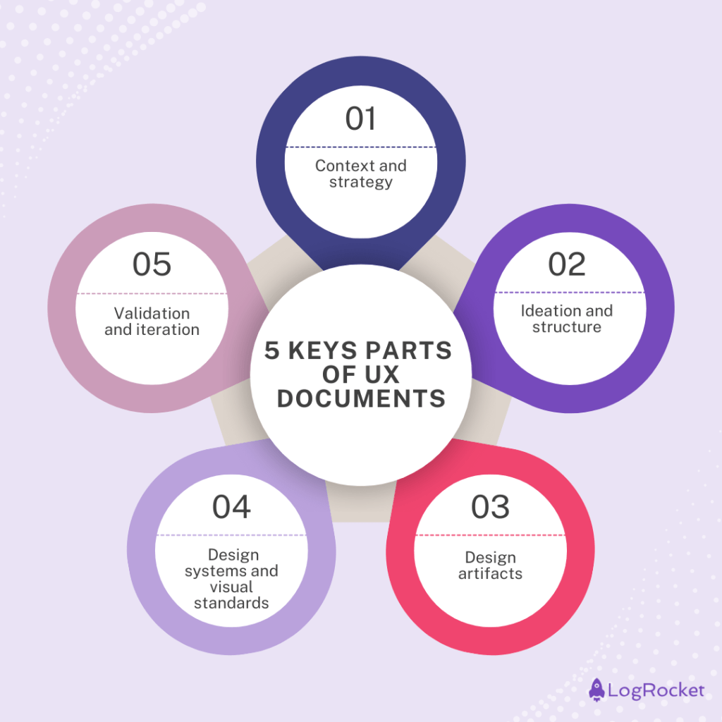
The contents of UX documentation vary based on your project needs, team maturity, and the product’s scope. That said, most documents can be organized into high-level categories that keep things consistent and easy to navigate. Below are some key sections to guide your documentation process:

Think of this section as the place that anchors your UX work within the broader product goals, user needs, and business strategy. It’s especially valuable for stakeholders and cross-functional teams who need a quick yet comprehensive overview of why the project exists, who it’s for, and how it connects to the organization’s objectives:
This category covers the behind-the-scenes work of the design process — how your ideas took shape, how they evolved, and what influenced each step. It offers a snapshot of your team’s thinking and decision-making, which is useful for onboarding new teammates, supporting future design audits, and aligning stakeholders around key shifts in the product:
This section is all about what the product actually looks like and how it behaves. It includes things like wireframes, prototypes, and visual references that show the structure and flow of the interface.
Most developers and QA folks turn here when they need clarity during a handoff. It helps make sure that everyone is aligned, especially when it comes time to build or test the final experience. Instead of second-guessing, the team can refer to these artifacts as a visual source of truth:
Here, you capture the reusable components, visual guidelines, and interaction patterns that ensure consistency across your product. This is essential for both designers and developers working on future features, as it defines the shared visual language of the product. Clear documentation helps the team maintain quality, scale efficiently, and avoid inconsistency in the user experience:
Finally, validation and iteration highlights how the design was tested and improved over time based on user feedback and accessibility standards. It includes usability testing reports, audit results, and post-launch insights, all of which help teams learn what’s working and what needs iteration.
This part of your documentation is especially valuable for product managers and UX leads when planning future work or evaluating impact after release:
To create a UX document that doesn’t put your audience to sleep, you need to know how to structure and organize your information correctly. Here are some tips to guide you in the right direction:
By following these tips, you’ll have a well-structured document that’s easy to follow.
Besides organization, you also want to make sure your UX documentation remains as concise and understandable as possible. These best practices help with that:
The right tool can make UX documentation easier to create, update, and share across your team. There’s no single “best” option, the choice depends on your workflow, team size, and budget.
Free tools like Google Docs, Google Sheets, or Slides are a great place to start. They’re simple, collaborative, and easy to use, especially if your team already works in Google Workspace.
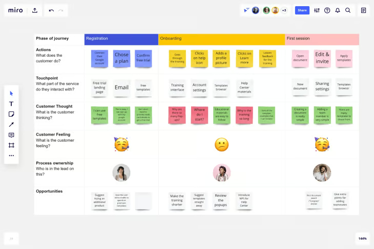
For more structured documentation, tools like Notion, Confluence, or Miro can be helpful. Notion works well for organizing everything in one place with nested pages and templates. Miro is great for visual documentation like journey maps and wireflows. Confluence is ideal for teams already using Jira or other Atlassian products, thanks to seamless integration:

When choosing a tool, consider a few things:
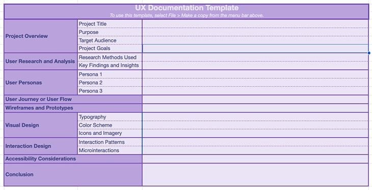
Your team might choose to use tools like Notion, Confluence, or Miro to manage documentation dynamically. But whether you’re just getting started or need a quick way to plan before jumping into those tools, a simple template can still be useful.
We’ve created a downloadable UX documentation template as a flexible starting point — something you can adapt, expand, or use to guide internal discussions before setting up your final doc. It’s also great for onboarding newer team members or organizing your early research and design ideas in one place:

You can use this template to capture the core elements of your documentation and shape your team’s approach — no matter what tool you eventually transfer it into.
And there you have it! Your practical guide to creating clean, clear UX documentation.
If you’re just getting started, try using our downloadable template on Google Sheets. It serves as a starting point for creating well-structured UX documents that effectively convey your design ideas and decisions.
Happy documenting!
LogRocket's Galileo AI watches sessions and understands user feedback for you, automating the most time-intensive parts of your job and giving you more time to focus on great design.
See how design choices, interactions, and issues affect your users — get a demo of LogRocket today.

Multimodal UX goes beyond designing for screens. Learn how context-aware systems, progressive modality, failover modes, and accessibility-first design create better digital product experiences.

Learn how context-aware mode prioritization and seamless transitions improve multimodal UX and reduce mode confusion.

Research is becoming more democratized, product cycles are accelerating, and AI is transforming synthesis and ResearchOps. Here are the three trends shaping UX research in 2026.

Voice support is not the same as multimodal UX. Here’s how to design systems with true mode continuity and context-aware interactions.