When push notifications appeared on the web, it was a breakthrough. The efficiency of information delivery skyrocketed, and many businesses started to implement them in their website design. However, users reported problems with compliance and overall experience when it came to an overload of notifications and inappropriate information appearance.
Working on push notifications is an ongoing task for the UX department because the improper delivery of the information can come at the cost of a damaged user experience.
There are numerous guidelines on push notification design, but it is important to consider the UX perspective and compliance in this process. To this end, this article will provide 10 tips on how to create effective push notifications, suggest what issues to avoid during this process, and outline specific compliance considerations.
A push notification is a type of message that a website sends to a user’s browser or app, which pops up on the user’s screen to provide updates or promote content. The user must opt in to receive these notifications, and they can be managed in the browser’s or app’s settings. Sometimes, such notifications are forced if the service of the website is not free or if the website decides to do so under clear compliance terms.
Push notifications are also a type of message that can be sent to a user’s device, regardless of whether the user is actively using the website or an app. They serve to notify users of new events or updates, such as a new message or friend requests and can appear as banners in the notification tray or on the device’s lock screen.
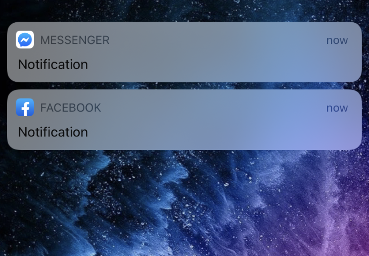
Social media platforms like Facebook and news websites commonly use push notifications to keep subscribers informed about the latest events, and users can manage their notification settings to control what they receive.
As a result, push notification design relies heavily on the UX aspect. Delivering a personalized and helpful notification might benefit overall user engagement and lead to a positive experience.
In contrast, bad timing, poor design, irrelevant information, and an overload of push notifications can trigger the user to uninstall the app, leave the website, or even tell others not to use your product or service in severe cases.
Push notifications should aim to strike a balance between providing users with relevant information in a timely manner and avoiding overloading users with too many notifications.
Additionally, such notifications can be used to gather relevant data for UX designers to improve the user experience.
To create effective and compliant notifications, follow these ten tips outlined below.
Push notifications are groundbreaking when it comes to enhancing user experience. For example, the update on new messages from friends might force a person to visit social media immediately after the alarm.
This tendency benefits both the developers and the user as both sides get what they want — developers increase time on the website and engagement, and the user is happy to receive live alerts.
Therefore, use push notifications if you have a specific purpose in mind, like the reasons below.
Attract customers at specific touchpoints, send real-time reminders and updates that encourage regular engagement, and provide timely and useful information, such as special offers and rewards.
An effective push notification design strategy can increase user engagement drastically, reducing the number of customers who stop accessing an app or website. Push notifications offer a nonintrusive way of keeping in touch with users and offering new features and promotions.
Try to recover those who don’t use the website or app regularly. With personalized offers, reminders, and updates sent through push notifications, app retention rates can increase significantly. This makes push notifications a valuable tool for turning inactive users into active ones and keeping them engaged with the app in the long term.
Find a way to trigger immediate purchases in your mobile app or website. By sending informative messages to your users about limited-time offers or special discounts, push notifications can encourage users to take action and make purchases, ultimately leading to increased conversion rates.
Push notification design has evolved, and now there are more advanced tools for sending your audience the right message at the right time and place, thanks to machine learning and geolocation. This can help improve user targeting and ensure that users receive relevant and personalized notifications.
For example, the Starbucks app identifies patterns in a user’s behavior, generates personalized offers, and notifies the user of that promotion via a push notification. Similarly, weather channels use geolocation to inform users of weather conditions relevant to their area.
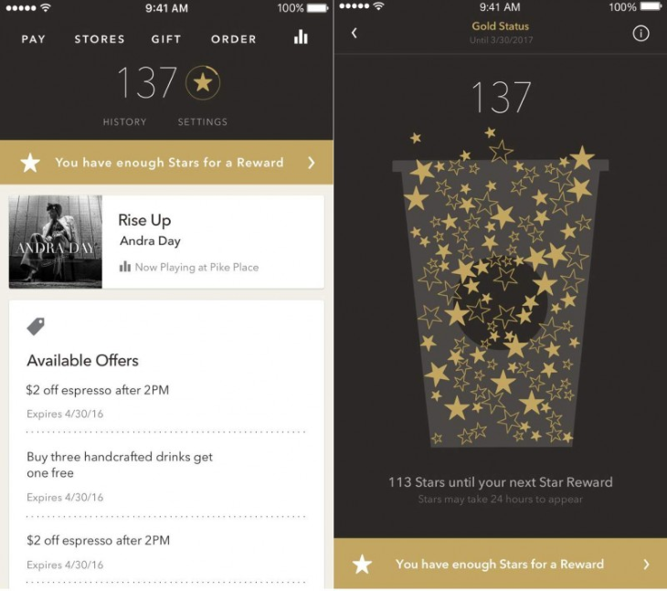
Push notifications offer an opportunity to gain customer insight through detailed reporting on open and click-through rates, which can be used to refine and improve notification strategies. Notifications can also be used to gather valuable UX data.
One example of this is how Uber asks you to rate the driver after each trip.
When you start working on notifications, answer these questions that predict the behavior of users signing up for push notifications:
Each notification has to provide valuable information for the UX team to analyze and increase user engagement.
In the context of UX, it is crucial to ensure that notifications add value for the user and do not disrupt their experience with the app or website. Although users are generally receptive to notifications that deliver value, question whether a notification is necessary before sending it.
Notifications never appear for the sake of it — they are useful to the end user. Otherwise, this can be perceived as spam. For example, notifications from Facebook encouraging users to connect with people they do not know or find more friends are not helpful and do not add value for the user.
Notifications should not direct users back to the app or website thoughtlessly without a clear purpose or benefit. A successful push notification always provides value to the user, and messages that do not help users should be avoided.
For example, a price tag on a new product appearing as a push notification would be more annoying than helpful because the offer comes from nowhere without consideration of the customer’s immediate needs.
In the context of UX, timing is a critical aspect of tailoring notifications to users effectively. Push notifications should be sent at times that are most convenient and useful for the user, taking into account their time zone.
Hence, if your notification is from the fitness app that congratulates the user on reaching the daily steps goal immediately after they make the final step, you might not consider the time you send it as the user is active right now. However, when the case is different, sending notifications at night might be a bad idea because the user might delete the app if it wakes them up.
While users may choose to disable notifications during certain hours, this is not an ideal solution. A better approach is to send notifications during periods of high engagement, such as between 6–8pm, unless the message is urgent and requires immediate attention. Same as with the fitness app — you must find a way to deliver your message when the user is active. On the other hand, if the message is urgent and requires immediate actions like notifications on emergencies in your areas, you must be able to deliver that message at any time.
Push notification design has to be personalized with more attention to detail, if possible. Personalized push notifications have a higher engagement rate compared to nonpersonalized ones. The messages should be tailored so that users feel like the notification is just for them, not a mass message. Here are some personalization tips:
UX designers can use push notification customization to deliver personalized and relevant content to each user, which can help to increase user engagement and satisfaction. Adding small details, such as the recipient’s name, can significantly improve performance.
However, personalization should go beyond just using the recipient’s name, and instead provide relevant and valuable information based on user interests.
Analyzing user data can help tailor messages to individual users, as seen in Netflix’s personalized notification system that tracks a user’s viewing habits and recommends relevant content. For example, they send a notification to you only when the new season appears of the show you watched before, not piling up the notifications about anything new that emerges on their platform.
Deep links are an effective way to increase conversion rates and reduce friction by taking users to a specific location within an app or website where they can respond to a push notification’s call to action.
Deep linking can be taken a step further by bringing users directly to a checkout page that is autopopulated with items for purchase. However, make sure your deep links work perfectly and never mislead. Misleading a user might be treated as a lie and cost the client’s trust.
If the user did not find what they were looking for when they opened a notification, the outcome might be a lost customer. For example, a push notification from a football app notifies its users about a player being transferred from one club to another. An effective deep link will lead the user to a page that shows more details about the transfer. If the notification leads the user to the landing page with no information about that event or with just a paragraph hidden somewhere, they might close the page and never return.
In the context of user experience, when sending a push notification, it’s important to make it successful by using short, declarative sentences and avoiding jargon. The message should use active verbs if it includes a call to action and be communicated within the brand’s tone.
To encourage click-through, raising a question or creating a mystery can be effective, but it’s essential not to be too pushy with sales notifications.
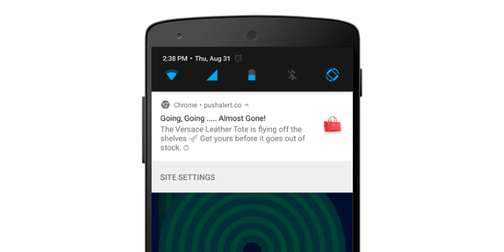
Using a clear and concise headline that tells the recipient precisely what the push is about is crucial. The character limit for push notification design varies, but it’s essential to use the limited space to grab the reader’s attention.
Managing the frequency of push notifications is crucial to prevent user disengagement. The number of push notifications to send depends on the type of product and user preference.
However, sending too many push notifications will inevitably lead to the loss of clients as they will opt out. It’s essential to start with a lower number and monitor UX metrics to find the optimal frequency that can boost engagement without eroding trust.
Moreover, it’s essential to avoid sending notifications in bursts and focus on quality over quantity by combining multiple messages into as few as possible.
Obtaining clear and informed consent from users before sending push notifications is important to ensure compliance with privacy laws. This includes providing users with information about the types of notifications they will receive, the frequency at which they will receive them, and the option to opt-out of receiving notifications. Caring for users and their information is key to increasing trust and boosting user satisfaction.
The opt-in and opt-out options should be easy to find and use. The UX team should always ensure that compliance information is presented in a clear and concise manner, using language that is easy to understand. For example, the opt-in option could be a simple, “Yes, I want to receive notifications” button, while the opt-out option could be a “No, thanks” or “Not now” button.
Push notification compliance refers to following relevant laws, regulations, and guidelines in sending push notifications. Different operating systems, such as Android and iOS, have their own guidelines for push notifications.
For example, iOS guidelines recommend using push notifications for important and time-sensitive information, such as messages, calendar events, and reminders. On the other hand, Android guidelines suggest that push notifications should be used sparingly and only for high-priority notifications, such as urgent messages or alarms.
Push notifications can also collect and process personal information, so it is important to comply with privacy laws, depending on the region. For example, one can consider the General Data Protection Regulation (GDPR) in the European Union and the California Consumer Privacy Act (CCPA) in California.
To comply with privacy laws, businesses should take steps to ensure that their push notification design practices are transparent and lawful. This might include providing clear and concise information about the types of personal information that are collected and how they are used, obtaining consent from users before sending push notifications, and giving users the ability to opt out of receiving notifications or having their personal information collected and processed.
Push notifications can enhance engagement, improve usability, and offer personalization on websites and apps. To be effective, the UX team should consider the benefits they provide to the customers and developers.
For customers, push notifications must be:
For the company, push notifications must be:
By following the 10 tips identified above, UX designers can create compliant and effective push notifications that provide a positive experience for users.
Header image source: IconScout
LogRocket's Galileo AI watches sessions and understands user feedback for you, automating the most time-intensive parts of your job and giving you more time to focus on great design.
See how design choices, interactions, and issues affect your users — get a demo of LogRocket today.
A three-week mobile banking project taught me that the “proper” UX process is not always realistic. Sometimes, the better approach is to work with what you know, identify what you still need to learn, and make the strongest decision possible under real constraints.
A/B testing compares two versions of a design to see which performs better with real users. Here’s how UX teams can use it to test hypotheses, measure outcomes, and make smarter product decisions.
This case study shows how one ad experience redesign increased total ad exposure while lowering perceived friction, proving that timing and context can matter more than raw interruption.

As products evolve into ecosystems, navigation becomes a system-level challenge. This article explores how to align structure, context, and user journeys to create seamless movement across tools without confusion.