Movement is a significant part of human life. It’s the trees rustling outside in the wind, it’s going for an afternoon walk, and it’s the cat with the “zoomies” running up and down the stairs. When we think of movement, we typically think of movement in animate beings in the physical world, as in the previous examples. But does movement also apply to inanimate objects? And what about movement in design?
Think of any famous painting – The Starry Night by van Gogh, The Kiss by Klimt, or The Great Wave off Kanagawa by Hokusai. These works of art aren’t living at all, but they steer and engage the viewer’s eyes throughout the entire composition.

This is all thanks to movement, or more specifically – movement in design.
Movement is a key principle in design — whether it’s the flow of a user interface or the way a button animates when clicked.
UX designers can use movement to engage users, provide feedback, and intuitively guide them through interactions. Movement — be it from subtle microinteractions or complex page transitions — keeps users connected. It helps them understand what actions to take next.
In this blog, I explore and share more on the types of movement in UX design and how movement improves the user’s experience. I will also look at examples of digital products that use movement.
Including movement in interface design is critical to keeping users engaged and assisting them as they work on tasks on a website or app. There are a few types of movement that can help you accomplish this. But which type should you use and when?
To determine which type of movement suits your purpose, I’ll discuss three common types:
The first type of movement we’ll discuss is kinetic motion. Kinetic motion is, well, literal movement — there is “physical” movement on a device. This type of movement is known to grab the user’s attention to important information and boost overall user engagement of a website or app.
Kinetic motion follows the laws of physics to simulate real-world movement. And this makes it feel more authentic.
For example, when an object moves from point A to point B at a constant speed, it feels fake. In the real world, objects move at various speeds and with smooth transitions.
To match this expectation, kinetic motion often adopts an ease-in-and-out effect. This effect is an animation timing function. It starts slowly, accelerates, and then decelerates before stopping. It mimics the way objects move in the real world, making the movement look legitimate and visually interesting.
Kinetic motion is best applied in the following instances:
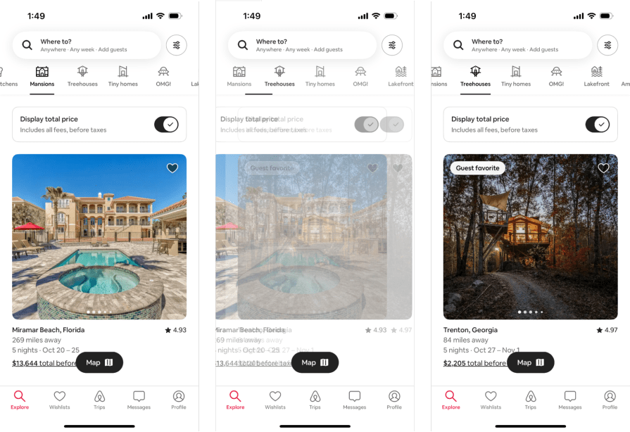
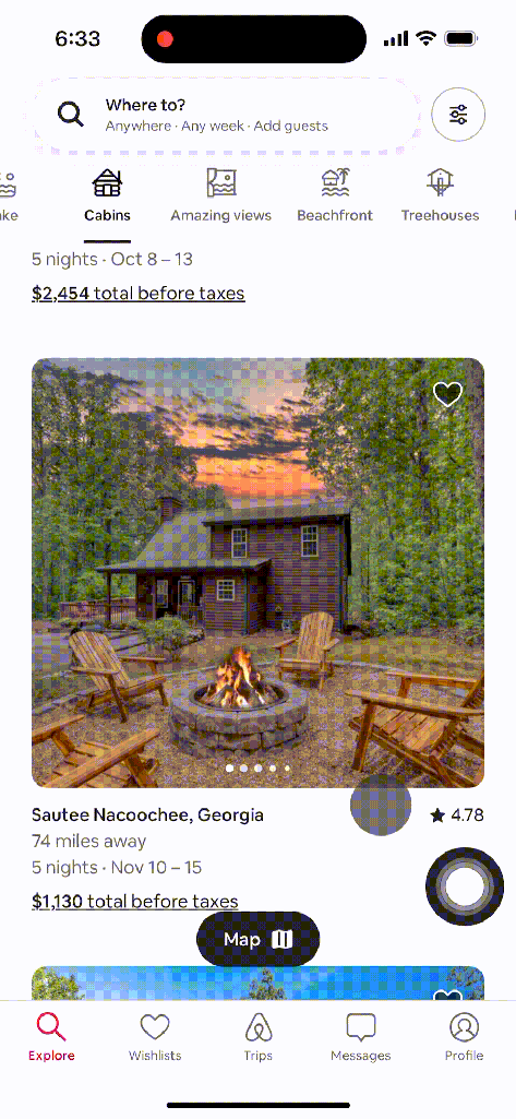
Airbnb’s mobile app showcases kinetic motion. As you select the type of place you want to stay through the top tabs, there’s a smooth transition as you move from tab to tab, and the main content switches using an ease-in-and-out effect.
Implied movement suggests motion without any physical action. It’s common in paintings and print media but is also useful in UX design.
Implied movement uses colors, lines, and space to convey motion in a composition, which helps guide the viewer’s eyes from section to section.
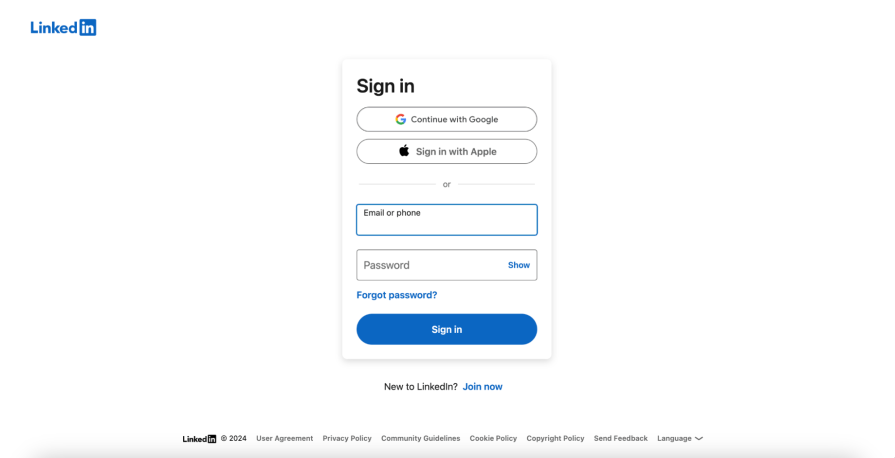
For example, on a sign-in page, there are two text fields as well as a bold “Sign in” button. The left alignment of the elements directs the viewer’s eyes from top to bottom, and they eventually land on the bold button for their next action.
Implied movement is best applied in the following instances:
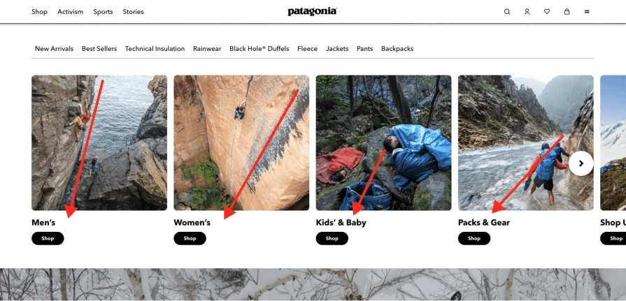
On Patagonia’s homepage, minimal animation is used. Instead, Patagonia uses intentional imagery to create implied movement. The imagery grabs the user’s attention and directs it to CTAs (call-to-actions). In the images representing a shopping category, a diagonal line runs from the top-right corner to the bottom-left corner — pointing to its corresponding CTA (“Shop”).
Last up is rhythmic movement. Rhythmic movement blends literal and static forms of motion from kinetic and implied movement. When any of those movements are used, they are applied consistently across the website or app so the user can create a sense of intuition and predictability.
Rhythmic movement uses repetition and timing to establish recognizable patterns in an interface.
Let’s say a user selects a “hamburger menu” icon in the top-left corner of their device. A navigation menu eases in from the left, and an overlay fades in to cover the main content. After the user experiences this movement once, they expect it every time they select the “hamburger menu” icon.
You can apply rhythmic movement in instances like:

YouTube demonstrates rhythmic movement through the grid layout on the homepage and consistent UI interactions. The grid layout tells me that I can scroll down the page to access more content that follows the grid pattern, and the UI interactions follow a sharp, pop effect whether I select the “hamburger menu” or “bell” icon.
Now that we’ve reviewed the three common types of movement in UX design, let’s discuss how applying movement to interface designs improves the user’s experience.
Why is movement so vital in UX design? I’ll answer it simply — without it, the user’s experience just wouldn’t be the same; we’d be lucky if the user could even complete a simple task.
But honestly, it’s hard to imagine a website or app that doesn’t use any movement. No directional cues, no page transitions, and no feedback animations. Excluding movement means the user has no guidance or intuition for their intended tasks.
Movement plays a vital role in UX design — it provides users feedback, helps them navigate a website or app, and keeps them engaged.
Without receiving feedback, users are not given an indication that they interacted with an element. So, the user tries the interaction again or gives up altogether. Obviously, neither is desired because this leads to duplicate submissions or deletions and the user abandoning the website or app.
Feedback is achieved by applying interactive states to UI components (hover effect) and giving users a signal of an action they took (deleting an image):
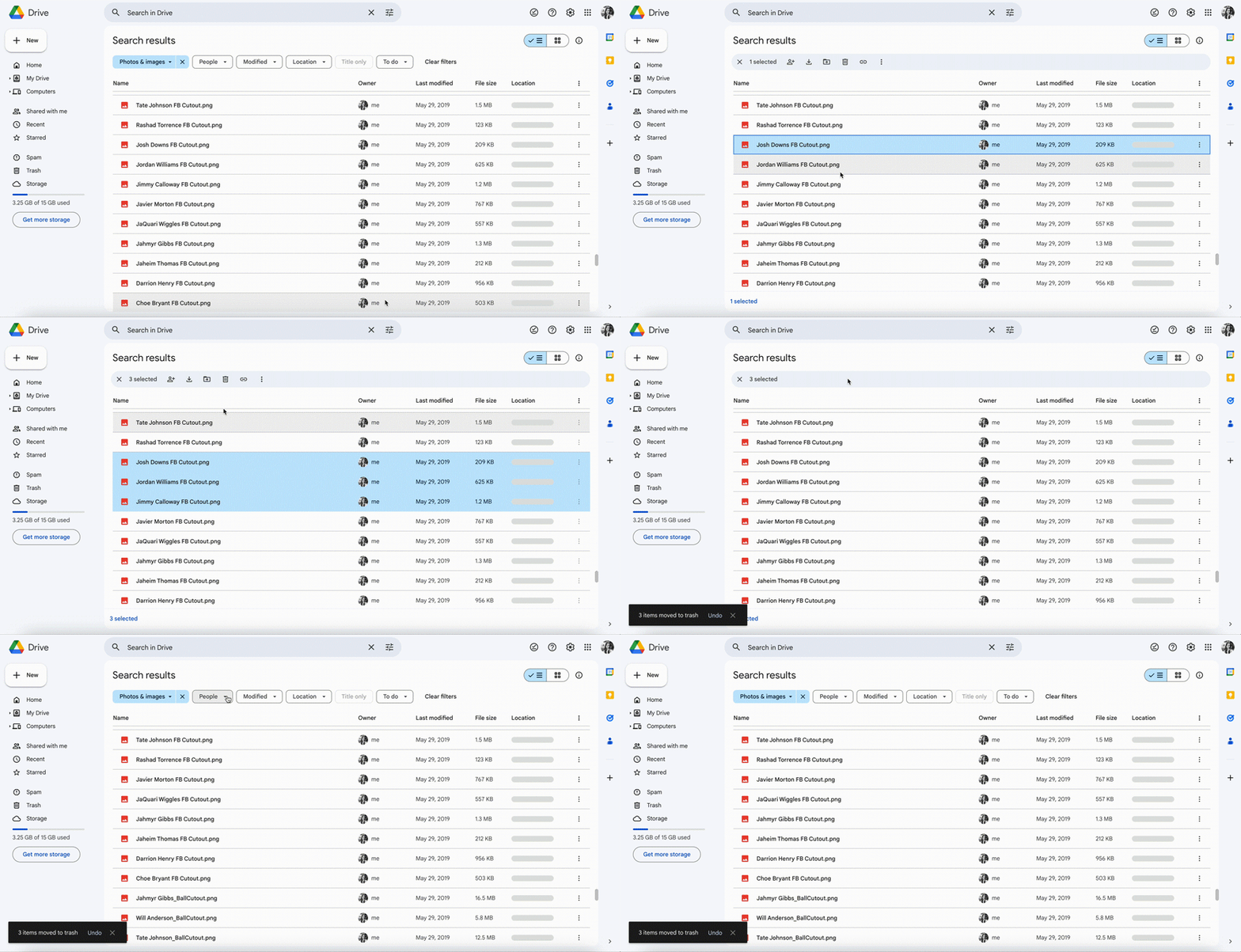
Movement in UX design also supports a website or app’s navigation.
Animated page transitions or overlays help users understand their position in the interface. They also prompt them to continue their task flow.
For example, in a mobile app where screen real estate is limited, drill-down pages are necessary. This means that task flows are split into more pages than they typically are with the desktop version. Using movement in the mobile version is crucial for the user to intuitively know where they are, how they can progress in their task, and how they can go back.
Lastly, movement helps users remain visually interested and engaged in the overall UX of a website or app.
A user’s attention is sacred, and the interface must compete with many potential distractions. A boring or confusing interface won’t keep the user immersed in the experience. But this is where movement comes in. It draws the user’s eyes to important information using subtle animations or bold CTA buttons to help them remain active in their task flow.
Movement keeps their eyes on their screen and tells them where to go next.
Let’s look at some digital products that effectively use movement within their user experiences. To see differences in how movement is used between device sizes, I’ll review Airbnb’s mobile app and Microsoft Teams’ desktop app. After reviewing the case studies, we’ll go over the best practices when adding movement to the design.
Airbnb is one of the most well-known companies that have disrupted the tech industry, so it’s not surprising that they have an app experience loaded with movement.
As I said before, intuitive navigation is crucial. Since more pages are required for a user to complete a task flow on a mobile device, it’s easy to get lost and confused. But Airbnb integrates kinetic motion into its page transitions to do this flawlessly.
For example, when I select a listing from the “Explore” page, the listing expands to cover the previous page. In this new view, I can look at more details like images. If I decide to reserve the listing, I select the “Reserve” button. Then, a sheet animates from the bottom of the screen to cover the listing page. The direction each new page appears from, as well as the animation itself, keeps me in the task flow but intuitively tells me how I can backtrack if needed.
Airbnb also includes implied movement through visually strong (bright pink) CTAs that help lead the user to their next step.
If I’m on a listing page, I have the CTA of “Reserve” to move forward in booking the Airbnb. If I’m on the “Trips” tab but have no upcoming trips, I have the CTA of “Start searching” so I can book my next Airbnb.
Each of these is an example of implied movement, using bold colors to attract attention and provide guidance on the next actions.
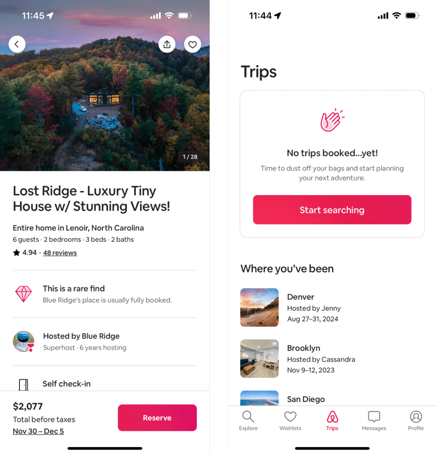
The use of movement in Airbnb’s app provides the user with intentional animations and bold CTAs as they move through tasks. The user intuitively knows where they are located in the app and the next actions they can take as they research and book listings.
Next, let’s look at Microsoft Teams’ desktop app (also known as “Teams”).
Teams leads the way in workspace collaboration by giving the ability to easily message and call teammates. Similar to Airbnb, Teams’ app experience is seamless because it incorporates different types of movement throughout the interface.
Teams uses implied movement with simple interaction cues from the visual treatment of UI components like icon buttons. Since the visual treatment is consistent across the app, I assume all elements that look like an icon button function similarly.
Not only that, I get quick feedback that an element is interactive through a hover and active state effect. This is demonstrated when I hover over an icon button — it changes color, and a tooltip appears.

Teams also uses kinetic motion sporadically to bring attention to information that matters most. This is shown through the app’s microinteractions and page transitions.
For microinteractions, when I select a button with a menu, a popover appears with a subtle ease-in effect. It’s quick but successful at leading me to select one of the items on the menu.
As for page transitions, as I select a new section from the left icon panel, both the panel to the right of the icons and the main content updates to reflect the new section I’m in. The animation is instantaneous and jumpy, but it effectively tells me I’ve changed locations in the app.
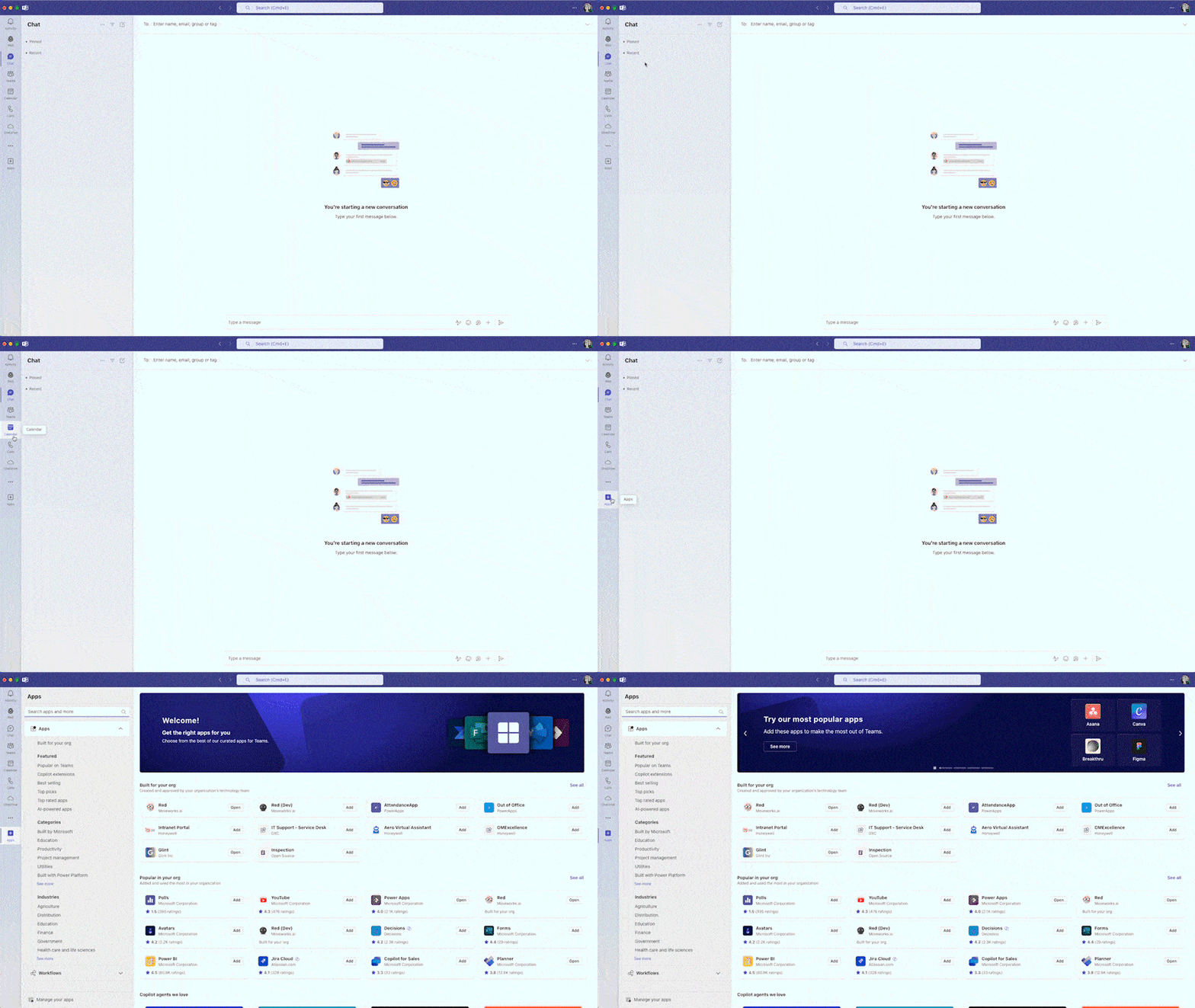
Since Teams applies the interaction cues, microinteractions, and page transitions consistently throughout the app, its patterns are easily recognized. Its rhythmic movement helps me intuitively know what will happen if I select a certain button or swap to a new page. As a plus, this reduces cognitive load. Because users can receive many notifications while using Teams, reducing the user’s cognitive load is especially important so they don’t feel overwhelmed.
The Airbnb and Teams case studies show that movement is often added intentionally to assist the user with interaction patterns and navigation.
But what are some other best practices? I’ll review them below:
Movement is a significant design principle that’s applied to the fine arts, but also to UX design. It brings inanimate objects to life through static and literal forms of movement to keep the user’s eyes visually engaged and moving throughout a composition or interface.
There are three common types of movement that can be applied to designs:
Incorporating movement in UX design is vital to providing user feedback, assisting navigation, and keeping the user engaged in the interface’s experience. Without movement, users struggle to complete even the simplest of tasks, which can lead to users taking actions they didn’t mean to or even abandoning the interface.
Many digital products, like Airbnb and Microsoft Teams, demonstrate movement. Airbnb and Teams use page transitions, interaction cues, and bold CTAs to assist the user in knowing their interface location and their next actions. Both apps use best practices when applying movement to design by including appropriate timing and easing effects, reinforcing an interface’s visual hierarchy, and ensuring the movements are adaptive across device types. These best practices enhance the app’s usability through movement by guiding users through tasks and reducing cognitive load.
Movement is a powerful principle that should be included in UX design. Next time you use one of your favorite websites or apps, see if you can spot where movement has been applied.
LogRocket's Galileo AI watches sessions and understands user feedback for you, automating the most time-intensive parts of your job and giving you more time to focus on great design.
See how design choices, interactions, and issues affect your users — get a demo of LogRocket today.

As products evolve into ecosystems, navigation becomes a system-level challenge. This article explores how to align structure, context, and user journeys to create seamless movement across tools without confusion.

Figma’s AI features have exploded in 2026 — from text generation and image editing to full UI drafts and code handoff. But speed isn’t the same as quality. This guide breaks down every major feature, what it’s good at, and where human judgment still does the heavy lifting.
Zero UI works well for screenless, voice-first experiences, but most digital products still require visual interaction. Here’s why multimodal UX offers a more scalable foundation for the future of design.

Multimodal UX goes beyond designing for screens. Learn how context-aware systems, progressive modality, failover modes, and accessibility-first design create better digital product experiences.