When designing user interfaces, it won’t be long before you encounter a need for a call to action (CTA). Whether your user needs to submit a form, complete a purchase, or sign up for your mailing list, you first need to present them a button where they can take that action.
But not all buttons are created equal — and that’s good news for you. Some of the actions your users need to take aren’t as important as others, either. To optimize your UI for the most effective calls to action, you need to start using ghost buttons.
As the name implies, a ghost button is less obvious than a standard button. Much like a ghost, it blends into the background where you might not notice it until you need it.
And also like a ghost, its subtlety is its superpower. While the standard UI button usually has a fully defined body and a contrasting fill color, a ghost button typically has no outline and no fill (or a fill matching its background) when it is at rest.
Only when a mouse hovers on the ghost button does it then take on a slight shaded fill color, and its boundaries become apparent.
The irony of using ghost buttons to create effective CTAs is that you shouldn’t use ghost buttons for the most important actions on your page. But when you use ghost buttons, you create a visual hierarchy of buttons that allows you to promote the most important button to the forefront of your interface and demote the least important ones into the background.
An effective design system will contain a primary button, a secondary button, and a tertiary button, with each level growing increasingly more subtle. Depending on the complexity of the design system, you may only have a primary and secondary button, or you may need to add a quaternary button as well. In any case, your lowest-level button should be the ghost button.
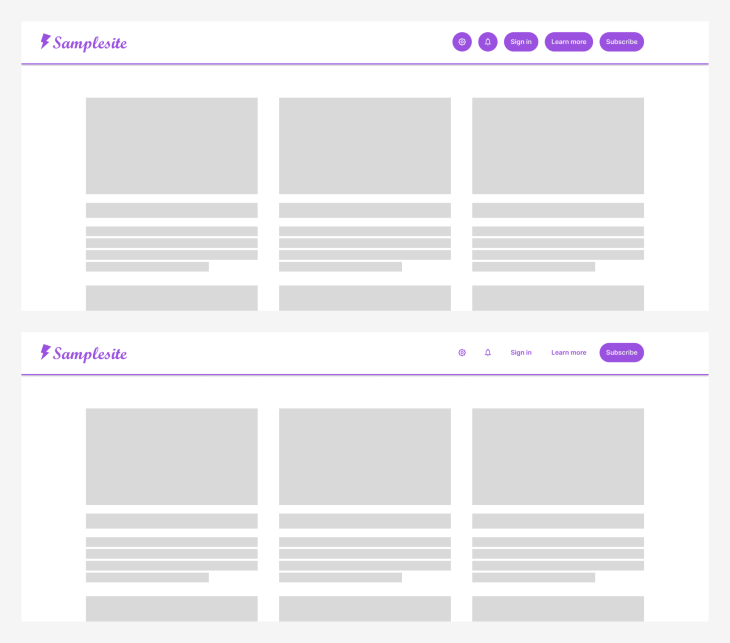
Whether or not you’ve noticed, button hierarchies are all around you. Consider this example:

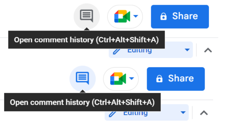
Notice how Google Docs uses a primary button for the share action, a secondary button for the call button, and a ghost button for the comment button.
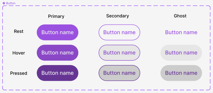
Good interaction design dictates that all your buttons should respond to mouse and keyboard interactions. Therefore, each button in your design system needs visually distinct rest, hover, and pressed states.
Buttons also typically have a disabled state, a focused state, and (sometimes) additional active or inactive states. But for the purposes of this article, we will focus on the first three, as they are the interactions that cause ghost buttons to appear:
All buttons in your design system need to have these states, and for consistency’s sake, the interactions should be similar from one button type to another.
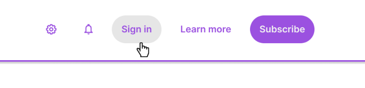
In the example below, notice how the ghost button in Google Docs behaves differently in a hover state (light gray fill). Compare that to the light blue fill when the button is clicked, which indicates that the two states are different from one another:
The best way to design ghost buttons is to build them in a similar way that you build your primary and secondary buttons.
Pick one color that will be consistent across all of these button types; if you have an established color palette for your app or site, it is a good idea to use the accent color for buttons.
For your primary buttons, use a fully saturated color for the body of the button and use a contrasting white or light gray color for the text or icons on the button. That allows you to invert the colors for your secondary and ghost buttons, using that accent color only for the text, icon, or outline. This allows the secondary and ghost buttons to be subtle, but still look like they are related to the primary buttons.
When you build out the buttons, start with the rest state for each button. Give the secondary and ghost buttons either no fill, a plain white fill, or the same light shade that you used for the text on the primary button.
Then create the hover state for each button. You can style these however you want, but an easy way to begin is to take the fill color from the rest state and decrease the brightness by 10.
Next, adjust by the same amount for your secondary and ghost hover states. (If you used no fill for the rest state, then give the hover state a plain white fill and then decrease the brightness by 10). At the same time, darken the text and outline color by the same amount as your primary state to maintain a color contrast compliant with WCAG guidelines.
For the pressed states, repeat the same process, but decrease the brightness by an additional 20. This will give you three different buttons that clearly indicate their interaction state while at the same time looking like they belong to the same design system:
Now that you’ve created a variety of buttons for your design system, look for opportunities to relegate less important buttons on your page to a ghost button.
In general, you should only have one primary button visible at any given time, or at least within a button group. This means that for any group of buttons, you should determine which action you want to drive the user’s attention to.
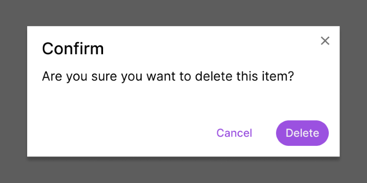
In many cases, this is the button that continues the basic flow of the page, such as in the confirmation dialog below. While you should always provide a cancel option to your user, this is the less common action when confirming a deletion. Therefore, you should use a ghost button for the cancel action to draw attention to the delete action:
When designing an effective app or website, you often have a primary goal for users that reach your page. Maybe you want them to shop, subscribe, sign up, or donate. It’s possible that a user can take all of those actions on your site, but if you make all of those buttons look the same, you’ll only add visual noise to the page while providing too many options of seemingly equal value.
Instead, pick your single most important goal. Make this your primary button and use ghost buttons for the other options. See the example below, where one version uses five primary buttons and the other version uses four ghost buttons and one primary button. In the second version, it’s much more clear where the user’s attention should focus:
And fortunately, because you designed these as proper ghost buttons with distinct hover and pressed states, your users will still know that they can interact with the other buttons and take those secondary or tertiary actions as well:
Ghost buttons, much like their name implies, are meant to be inconspicuous compared to primary buttons. But in the zero-sum game of UI design, when one button hides, another can become more apparent. Ghost buttons allow you to strike an aesthetic balance of visual elements on a page without sacrificing utility or functionality.
When ghost buttons are used frequently, they allow primary buttons to be used sparingly, and that means primary buttons can stand out and guide a user to the intended next step. Next time you plan out an interface, take some time to be intentional about the action you want a user to take; now, use your new arsenal of buttons to drive those results.
Header image source: IconScout

LogRocket's Galileo AI watches sessions and understands user feedback for you, automating the most time-intensive parts of your job and giving you more time to focus on great design.
See how design choices, interactions, and issues affect your users — get a demo of LogRocket today.
Explore the core principles of GUI design and learn how consistency, simplicity, feedback, accessibility, and user testing contribute to better digital experiences.
After five years in UX, I revisited the Daily UI challenge to reconnect with hands-on design. Along the way, I learned that great interfaces come from thoughtful briefs, sound judgment, and user feedback, not just better AI tools.
Learn what makes a great login screen through real-world examples and UX best practices for creating secure, accessible, and low-friction authentication flows.
Skeuomorphism helped define early digital interfaces by mimicking real-world objects to make technology more intuitive. Learn how it compares with flat design and neumorphism, why it declined, and where it still has a place in modern UX.

 Learn more →
