Designers use cards to spotlight and contextualize information. You can find them in a wide variety of contexts from ecommerce websites, social media platforms, and news/weblogs to dating apps or task management applications. Cards offer content previews, display featured information, related items, navigational options, and so on.
Because of their flexibility, they serve as a go-to method for designers when information needs to be differentiated, organized by relation/sequence, and displayed in a layout or carousel. You might think of them as part of a class of UI menu components that includes lists or tables.
The benefits that cards provide include:
This article discusses the importance of cards in UI design, the anatomy of cards, best practices for their design and use-cases for their deployment.
Editor’s note: This article was updated by Neel Dozome on 21 April 2025 to expand on best practices, show cards in context, and cover FAQs.
A card is a UI design component that displays content and actions about a single subject. Designers use cards to organize related information effectively, often linking to other internal pages.
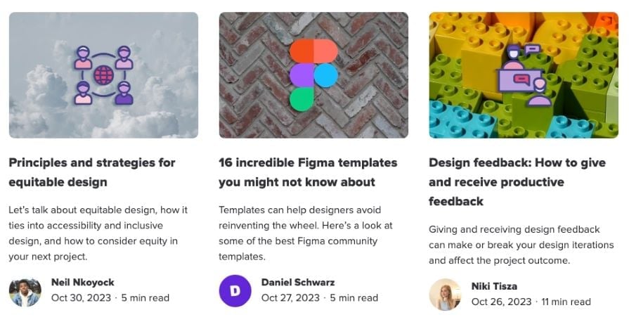
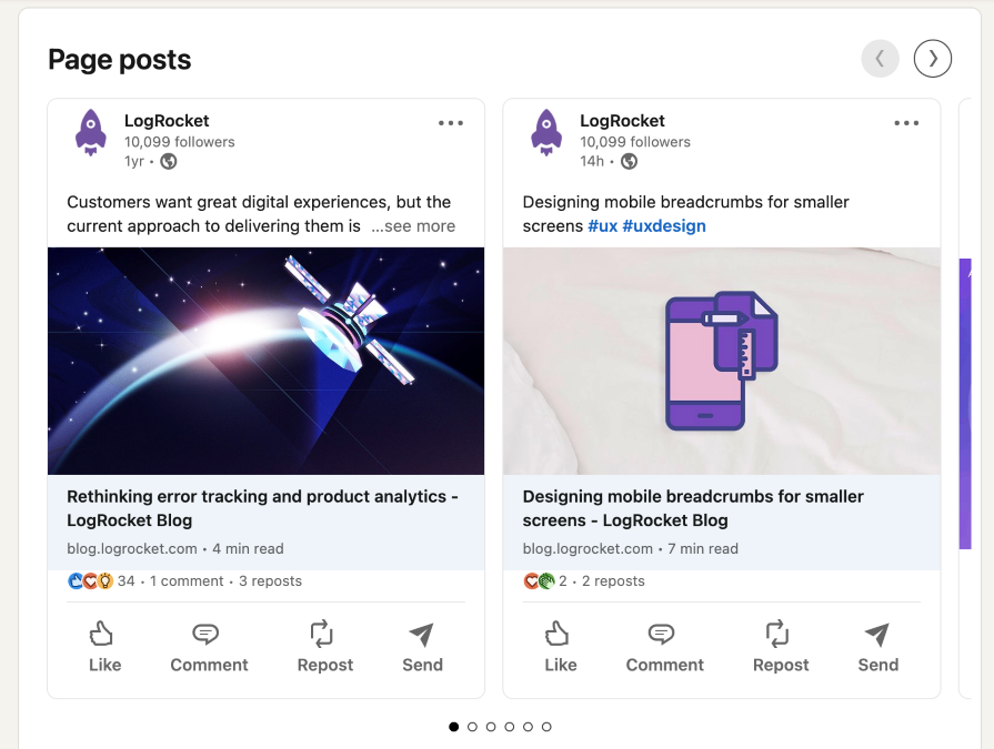
For instance, there are even cards on this blog page. They include pertinent information like post titles, authors, and publish dates:
You’ve probably also seen cards on shopping websites for individual products like Amazon’s cards for grocery services:

Cards are built to be modular and flexible. They consist of three core sections — the header, body, and footer — all within a single container, typically with clearly defined square or rounded edges. The card’s content is organized into these three sections, with the visual emphasis depending on the relevance of each element.
Except for the card’s title, all other elements are optional. This allows for a wide range of possibilities across digital experiences. Each section can contain pre-formatted subcomponents, such as the card’s title, subtitle, text, or other content types, including tables, grids, data visualization, buttons, links, forms, and more:
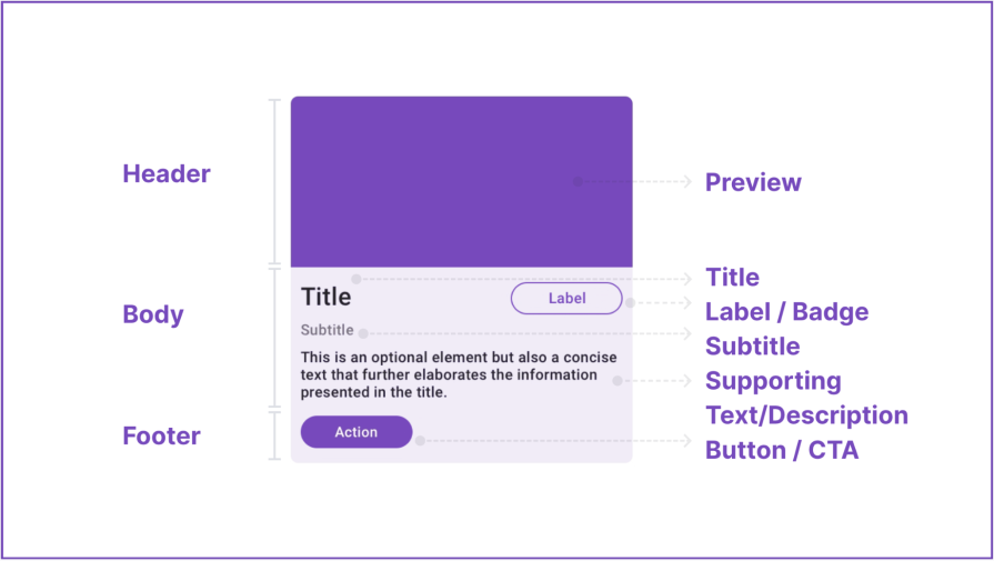
The card header usually contains media, such as a preview or an image, to give the user a visual cue about the card content. The aspect ratio of this area can range from 4:1 (shortest) to 3:4 (tallest), with recommended default sizes of 2:1, 4:3, and 16:9.
As I mentioned above, cards can have a variety of functions, and you can include basically anything you deem essential. A few common elements you’ll find in the body of a card include:
The footer can serve as a primary action area for elements like buttons, CTAs, or other controls. If there’s just one action (besides opening or viewing the card), use a button or CTA to communicate that action. You should carefully consider the design and interaction of these elements to offer an intuitive user experience.
A footer is exclusive to standard cards. Otherwise, the card container can function as a clickable card. If a card only allows for viewing or opening in more detail, don’t include buttons or CTAs. A click anywhere on the card should trigger that action.
Cards offer a preview of the linked content and can display featured information, related items, navigational options, and so on. Ideally, you should use them in groups to present related information. These are the benefits that cards bring to an app:
When aiming to spotlight information or offer related content, you can think of cards similar to a list or a table component. For example, ecommerce platforms often provide a switch to toggle between a list and a card view.
You can use cards in UI design for a range of interfaces. These include, but are not limited to:
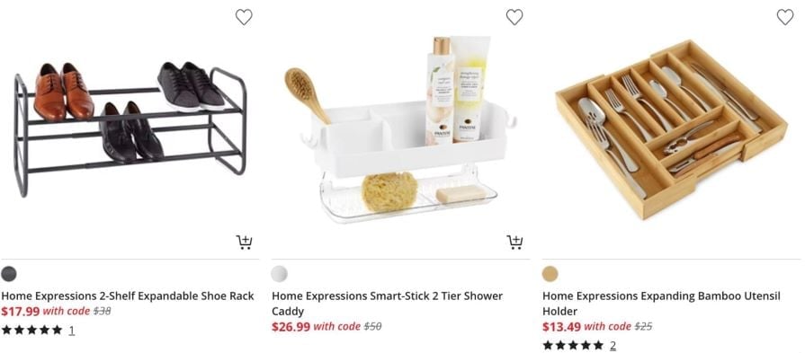
Cards can be used to clearly and concisely display vital product information, including detailed pricing, visually appealing product images, and straightforward add-to-cart options. This use of cards can significantly enhance the shopping experience for users:
Cards allow you to fully showcase user profiles. They can also be used to present individual posts, media content, and other interactive elements, all encapsulated in a neat card format:
Cards provide a way to present headlines and article summaries. Additionally, they can showcase featured images or graphics, giving the user a snapshot of the content before they delve deeper:

Cards can be a tool for efficiently organizing and presenting tasks. They can display relevant information, such as deadlines, priority levels, and task details, in a visually appealing and easily understandable format:
Now that you know what cards are and why you would use them, let’s go over how you can design your own card UI:
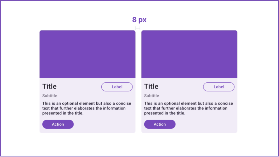
Let’s pause for an important note about spacing. Cards should typically be spaced apart by a width of some multiple of four pixels, with 8px or 12px being common choices. This practice helps to create a balanced and harmonious layout, making it easier for users to distinguish between cards and ensuring the viewing experience:
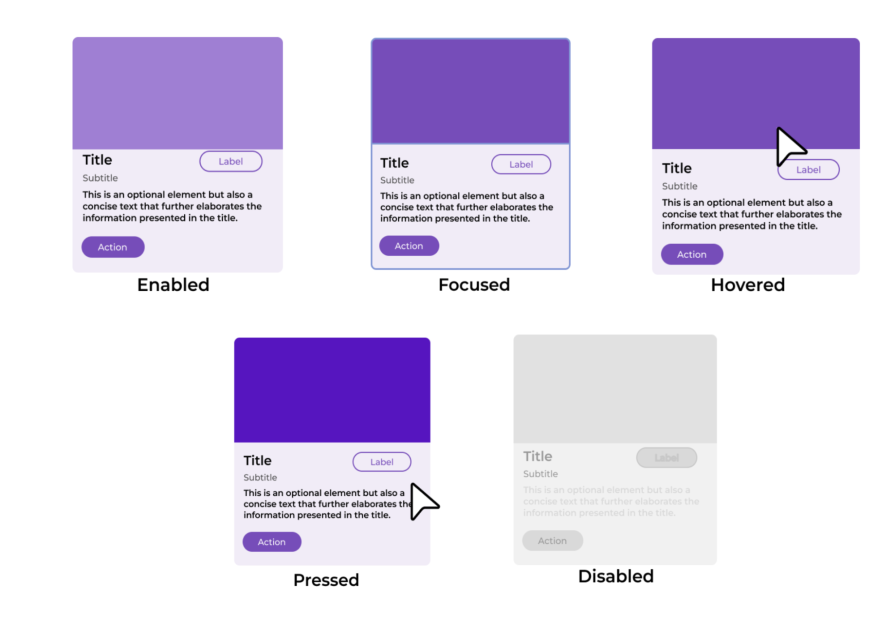
Lastly, when designing your card, it’s crucial to include different states to reflect the status of the interactive components. These states are:
There are various types of cards, but all card content follows the same general purpose: to set an expectation for what happens when a user interacts with it. When creating effective UI card designs, keep these tips in mind:
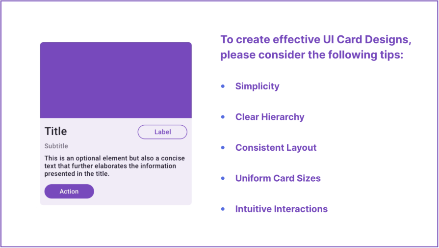
Cards should provide a snapshot of available information, not an overload of unnecessary details. Only communicate what one will find at the card’s destination.
Titles should be short (five to seven words) and focused on the value of interacting with the card. Metadata should be brief (about 10 to 15 words, though it can be longer depending on the complexity of the information), supplementing the title with more in-depth context. Keep button text to one to three words, using a verb phrase to state the action one’s taking.
Establishing a clear visual hierarchy within the cards is crucial. You can achieve this through the strategic use of visual cues such as size, color, and typography.
Implementing this visual hierarchy guides the user’s eye and allows them to quickly and efficiently identify the most important information. This can significantly enhance their browsing experience, making the interaction with the cards more intuitive and the information more accessible.
Consistency in the layout across cards is key for a cohesive and familiar user experience. This includes spacing, alignment, and placement of elements.
Cards grouped together should have similar size and content length, controlled by character and word counts. Opt for left alignment to optimize readability and avoid centering text and content.
Aim for similar card sizes and content length within groups or carousels. A hybrid approach, such as bento grid designs, can help strike a balance between uniformity and flexibility, allowing the grid to maintain its structural integrity while offering creative freedom.
However, prefer a masonry layout over a uniform grid so that the design doesn’t appear haphazard. Furthermore, avoid extending the button in the same row to match a card of a different length, and do not leave ugly gaps between rows of cards.
It’s important to incorporate intuitive interactions within the cards. This could include but isn’t limited to swipe gestures, clickable elements, or hover effects. The key intention behind this is to enhance the overall user experience.
Ensure sufficient contrast between text and background elements to meet the Web Content Accessibility Guidelines (WCAG). Color shouldn’t be used as the only visual means of conveying information or distinguishing a visual element.
Regular body text should generally be at least 16px (12pt), while large text should be a minimum of 24px (18pt). Larger font sizes improve readability for users with low vision or cognitive disabilities. It’s recommended that text should be scalable up to 200 percent without losing functionality or content.
Users should be able to navigate to a card and the elements within a card using assistive tech. If an image in a card is purely decorative, hide it from screen readers. Labels should have alt-text explanations, as should important images.
To give you a better idea of how you can create card interfaces, pay attention to how these successful companies used them to help customers:
One of the more visually ergonomic and aesthetically pleasing deployment of cards can be seen on the Apple TV platform. The cards on the app offer viewing options and information about shows currently available. The design is a discernibly more elevated one than competitors, which is crucial to Apple’s brand identity:
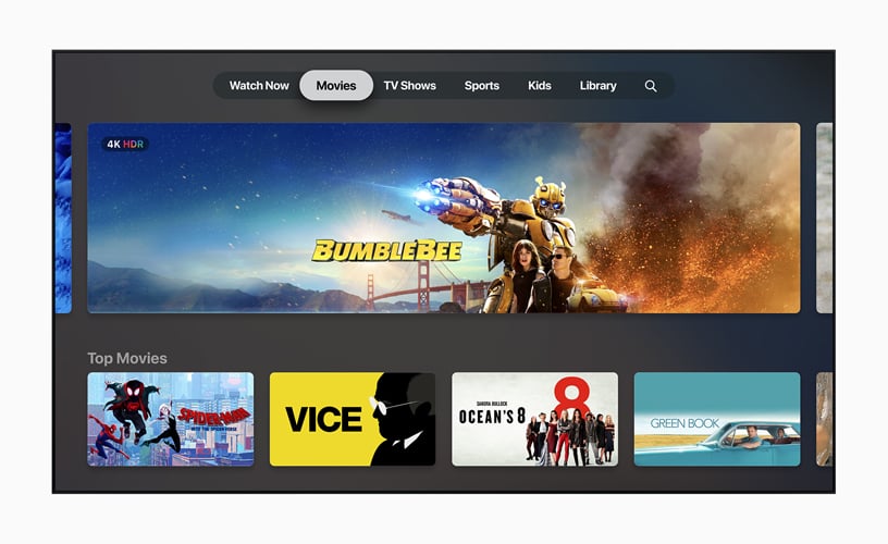
Apple differentiates with the following characteristics:
Balatro is a hit card-based game app that has surpassed five million downloads. Similar to Duolingo, its game dynamics are heavily rooted in leveraging UI elements. As a card-based game, Balatro is a good example of how UI card components can create interesting and engaging experiences, especially through subtle and fun animations:
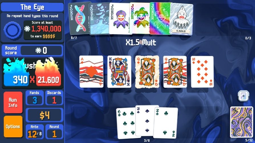
Balatro’s UI cards have the following features:
Trello is a web-based, kanban-style (meaning signboard or billboard in Japanese), list-making application that’s widely used in the tech industry. Work items are represented visually as cards on a board, allowing team members to see the state of every piece of work at any time. It provides a simple, intuitive, and highly-customizable interface that prioritizes legibility, work flow and collaboration:
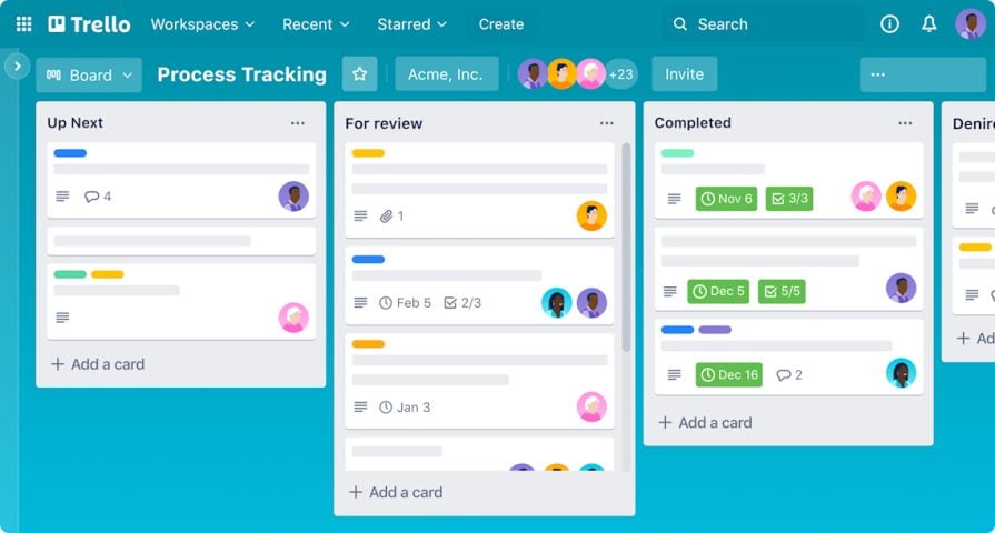
Trello’s Card UI is characterized by the following features:
This section answers the most common questions people ask about card interface design.
In UI design, a card is a modular design component used to present content in a visually organized and digestible way. Cards are typically rectangular or square containers that group related information into a single unit, often resembling physical cards like business or playing cards. They are widely used in web and mobile interfaces for their simplicity, versatility, and ability to enhance user experience.
The structure of a card is generally described to possess the following anatomy:
Some cards just possess a body, where the entire element invites a click, tap or similar interaction. When structuring a card, elements such as visual hierarchy, color contrast, spacing/padding, and alignment are important considerations.
Card layouts are a highly effective tool for organizing content in a user-friendly and visually appealing way. In UI design, cards enhance usability, aesthetics, and functionality. The benefits of using this method include:
The adaptability and versatility of card layouts make them essential to modern UI design across various industries and platforms.
Card-based user interfaces are versatile design patterns that can be applied to various digital products to enhance usability and organization. Here are some examples of key use cases:
Common pitfalls to be avoided in card design are:
Additionally, there are certain contexts where cards aren’t the ideal option. For example, data-heavy interfaces are better served with structured tables or lists that handle dense information better. Another example is a linear workflow, such as forms, where a step-by-step process and continuous layout results in a better user journey.
By adhering to these best practices for card design, you can create interfaces that aren’t only visually appealing but also user-friendly. In doing so, you can ensure that the user effectively presents and comprehends information, enhancing the overall user experience and interaction with the platform.
As mentioned at the very beginning of this blog post, the card design could be modular and flexible. If you would like to learn more about UX design, make sure to come back for our next post. In the meantime, good luck with your cards!
Header image source: IconScout

LogRocket's Galileo AI watches sessions and understands user feedback for you, automating the most time-intensive parts of your job and giving you more time to focus on great design.
See how design choices, interactions, and issues affect your users — get a demo of LogRocket today.

AI agent simulations promise faster, lower-risk UX testing by replacing real users with AI-simulated personas. Here’s how the method works, where it falls short, and when designers should rely on simulated users versus real user testing.
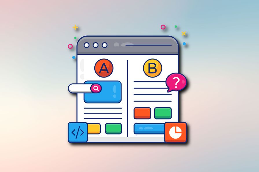
A/B testing is great for comparing two versions of a design, but multivariate testing helps teams evaluate multiple design element combinations at once. Here’s how both methods work, how they differ, and when UX teams should use each one.
Design engineering has always lived between design and code. But with AI tools turning prompts into interfaces and code into editable canvases, that bridge is becoming a new way of building.
A three-week mobile banking project taught me that the “proper” UX process is not always realistic. Sometimes, the better approach is to work with what you know, identify what you still need to learn, and make the strongest decision possible under real constraints.

 Learn more →
