Task switching is one of the most underestimated productivity killers in digital experiences. Every time a user is forced to jump between different screens, tabs, or workflows, they lose momentum, context, and focus.
A Stanford University study famously debunked the myth of multitasking. It found that when people attempt to juggle multiple tasks, they don’t actually split their attention. Instead, the brain switches focus back and forth rapidly, meaning that only one task gets full attention at a time. The cost of this switching is higher error rates, slower task completion, and greater mental fatigue.
In UX, that translates to a frustrating experience: users must hold information in their working memory, reorient themselves repeatedly, and waste valuable time. For products where efficiency is critical, like finance, healthcare, or trading platforms, this friction can make or break the experience.
On one project, our team worked on designing a trading platform interface. Trading platforms are naturally complex. They need to support real-time charting, watchlists, order placement, open trade management, and chat or news feeds.
A typical trading platform usually brings together four critical components:
In the initial version of our design, each of these components lived in its own tab. At first, this seemed like a clean and modular approach. But in practice, it forced users to jump across multiple screens just to complete a single task. Here’s what that looked like:
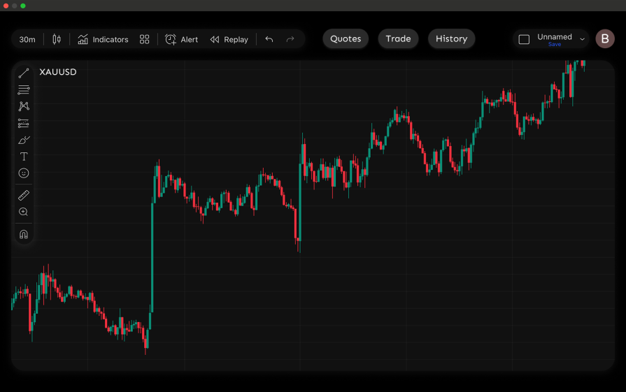
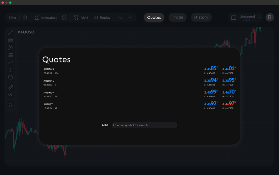
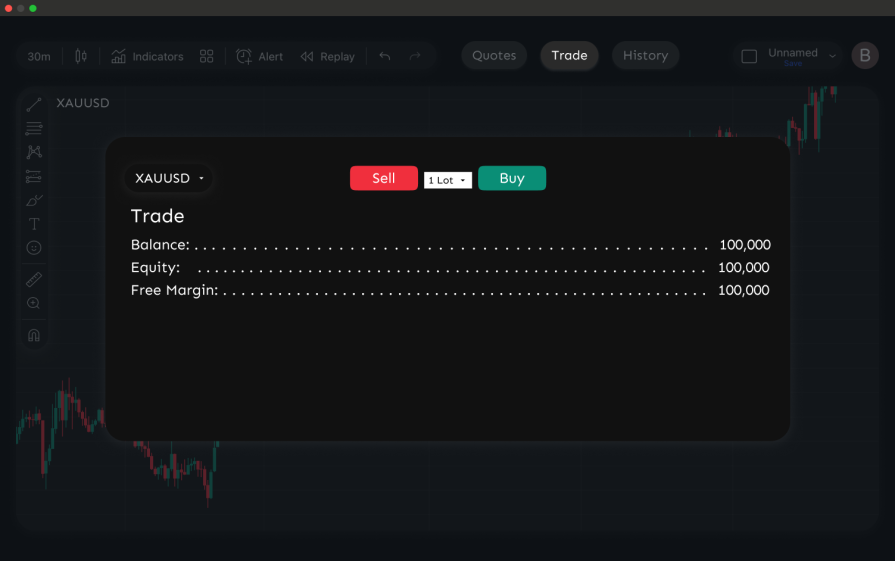
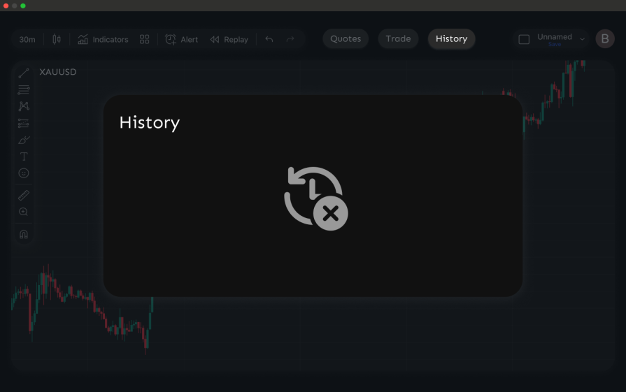
What should have been a single task, like analyzing the chart, placing a trade, and confirming it, was broken into four different screens.
In usability testing, traders expressed clear frustration:
This fragmented flow led to slower reactions, more errors, and wasted mental effort, serious problems in trading, where seconds can determine profit or loss.
To solve these issues, we consolidated the core components into a single unified trading screen. Instead of spreading the workflow across four tabs, traders could now analyze, trade, and review without leaving the main interface.
Here’s how the redesigned screen was structured:
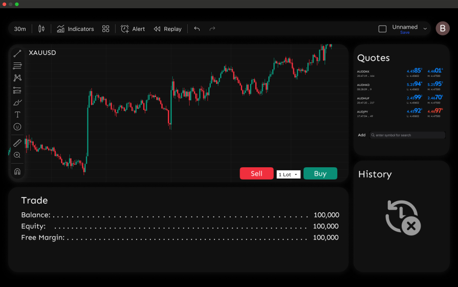
By merging everything into one screen, we reduced the steps needed to complete a trade from four separate tabs to a single flow. Traders could:
In usability testing, this translated into clear improvements:
The result was a faster, smoother, and more efficient experience that cut down on cognitive load and supported quicker reactions, critical in a high-stakes trading environment.
When we redesigned the trading platform, the improvements didn’t happen by accident. They were guided by a set of UX principles that map directly to Nielsen’s usability heuristics and are grounded in what we know about working memory and human factors.
These are the same principles we leaned on, and they’re worth keeping in mind when you’re auditing your own designs:
Our biggest hurdle was making sure the screen didn’t get “too busy.” Putting everything traders needed on one screen sounded like the perfect solution, but it quickly risked turning the interface into information overload.
Progressive disclosure helped, but honestly, figuring out what deserved to stay visible and what could be tucked away was the tricky part. We leaned heavily on usability testing during auditing sessions to get this right. Seeing how traders actually worked helped us spot which data points were must-haves versus nice-to-haves. The feedback we got made it easier to deliver a clean, focused UI that also gave users enough context to make fast decisions.
If you’re designing or auditing products for task-switching issues, remember that task switching often hides in plain sight. As designers, our job is to notice when users are being forced to juggle too many screens or workflows for what should be a single task.
Here are a few ways to identify and go about it:
Users may not explicitly mention “task switching,” but their feedback often reveals it. Listen for cues such as:
These are strong signals that the design is forcing unnecessary context shifts.
Even if users don’t say it out loud, watch for the patterns:
Run through your own workflows and ask:
If the answer is “yes,” you’re likely looking at a task switching issue.
Once you’ve identified the pain points, apply principles like proximity, progressive disclosure, consistency, and visibility of system status to reduce the number of steps and keep users in context.
Users don’t truly multitask; they pay a heavy cost every time they’re forced to switch contexts. By thoughtfully grouping related features, reducing unnecessary navigation, and supporting visibility, we can design experiences that keep users focused and effective.

LogRocket's Galileo AI watches sessions and understands user feedback for you, automating the most time-intensive parts of your job and giving you more time to focus on great design.
See how design choices, interactions, and issues affect your users — get a demo of LogRocket today.

AI tools can generate beautiful UI concepts in minutes, but most teams struggle to integrate those outputs into real design systems. This guide explores why AI drifts toward generic patterns and how to build governed workflows that keep speed without sacrificing brand consistency.

Adaptive interfaces personalize experiences using behavioral signals and machine learning. But when personalization becomes autonomous, systems can reinforce patterns, limit discovery, and shape user behavior in ways designers didn’t intend.

Security requirements shouldn’t come at the cost of usability. This guide outlines 10 practical heuristics to design 2FA flows that protect users while minimizing friction, confusion, and recovery failures.

2FA failures shouldn’t mean permanent lockout. This guide breaks down recovery methods, failure handling, progressive disclosure, and UX strategies to balance security with accessibility.


