Although many designers use them interchangeably, style guides and design systems are two different tools with their own unique strengths and weaknesses. Misunderstanding the differences between the two can negatively affect the whole product design/development process and ultimately counteract the benefits they provide.
To help you understand them better, this article unpacks the differences between style guides and design systems by discussing them separately, identifying similarities and differences, and showing you how to optimally use them in product design and development scenarios.
In UI/UX design, a style guide refers to a document that presents guidelines for repetitive visual segments and content in product interfaces to manage consistency across every part of a software product. Product design teams create style guides based on company branding, design philosophy (e.g., minimalism, maximalism, etc.), and designer preferences to use as a foundation for styling product interfaces.
A generic style guide typically states guidelines for colors, typography, imagery, content, UI component states, logo usage, and any visual entity that requires consistency.
Using a style guide improves the overall UI/UX process by:
Using a style guide also improves the overall development process by:
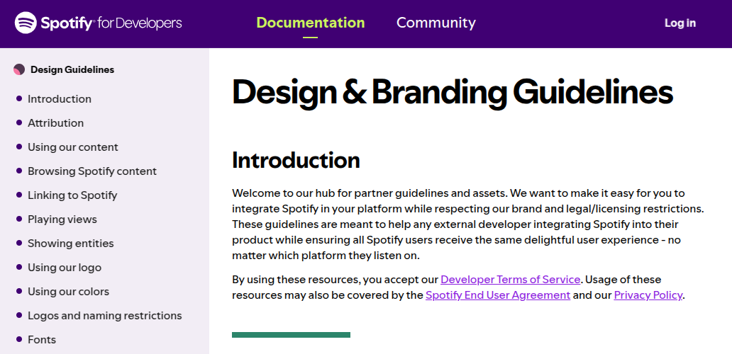
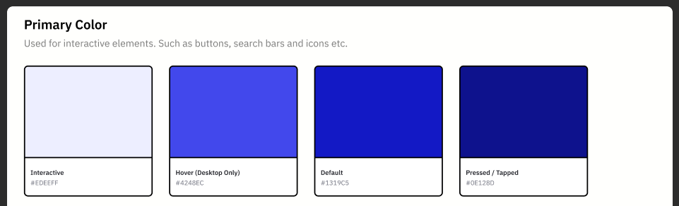
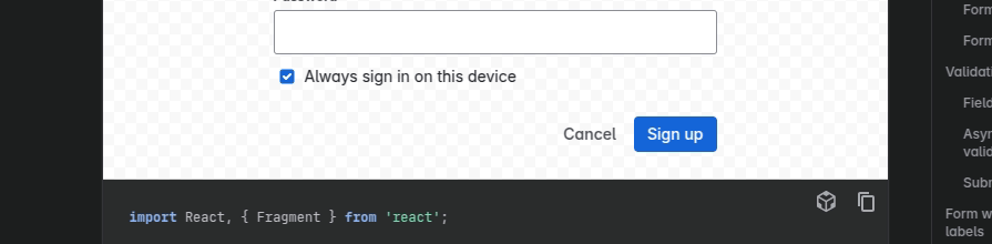
As an example, look at how Spotify structures its style guide documentation:
A style guide document guides you on how to apply consistent styles for every UI element in a product interface. Here are the key elements in a modern style guide document:
Apart from these general elements, sometimes you might have to include unique design guidelines and facts based on initial product design decisions. Reusable components aren’t a part of a normal style guide document, but some designers extend their style guides by adding reusable components created with their favorite prototyping tools to speed up new product design.
You can create a style guide to achieve consistency and streamline your design process by following these steps:
This comprehensive guide explains how you can create a style guide with Figma:
In UI/UX design, a design system is a collection of building blocks and standards that help you efficiently create a wide range of consistent product interfaces. Product design and development teams create design systems by creating component libraries, pattern libraries, and design standards based on style guides. A design system usually presents available components, patterns (a group of components), design tutorials, and standards for designers and developers using a documentation website.
Using a design system effectively improves the overall UI/UX process by:
Using a design system effectively also improves the overall development process by:
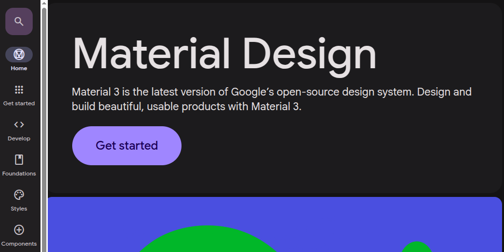
See how Google’s Material design system structures its documentation:
A design system offers product design/development building blocks and standards by explaining how to create high-quality product interfaces. Key elements include:
Apart from these general elements, some modern design systems implement live previews and interactive tutorials to improve design system learnability. For example, see how the Atlassian design system documentation lets developers see live previews and copy code snippets productively:
Product design and development teams create design systems to create a scalable solution for building consistent, high-quality products by following these steps:
This comprehensive guide explains best practices for creating better design systems.
While some product teams create their own design systems based on their own style guides, others strive to save more time by extending or adhering to open-source design systems like Google’s Material.
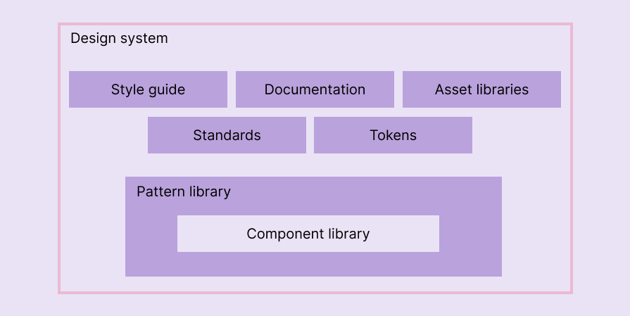
From a high-level view, you can see that a style guide document lives within a design system, as depicted in the following diagram:
Now, let’s go deeper into the comparison by identifying similarities and differences between a style guide and a design system.
A style guide should be defined within UI design stages. Designers usually create real product-like designs during high-fidelity prototyping stages, so they should start creating a well-structured style guide while creating initial high-fidelity prototypes.
Even though a style guide is a foundational document, finalizing it before starting with high-fidelity prototypes isn’t practically possible, so the ideal approach is to work on your high-fidelity prototypes and the style guide side-by-side, updating the style guide based on new design requirements in high-fidelity prototype screens.
A design system implements a solution to boost product design and development speed with a comprehensive framework. You can decide to create a design system based on the following characteristics and signs:
A design system offers building blocks for designing and developing products, so to create a design system, you need finalized UI elements and patterns. You usually need a stable, high-fidelity prototype or an early MVP (minimum viable product) version before creating a design system. However, you can also start creating a design system for a delivered, mature product if it shows signs of design debt.
If you wish to extend an existing design system or directly use a pre-made one, you can instantly start creating your first high-fidelity prototype with it.
Style guides and design systems help you develop consistent, high-quality products efficiently, but they’re two different components. A style guide is a foundational document that states branding and low-level design guidelines, whereas a design system uses a style guide and provides building blocks and standards for creating consistent products efficiently.
The following table outlines the key differences between the two:
| Comparison factor | Style guide | Design system |
| Created based on | Company branding guidelines and design philosophy | Style guide and other design principles |
| Focus | Describing visual and content guidelines for consistency and branding | Providing building blocks and standards for consistent product design and development |
| Scope and depth | Low-level design elements like colors, spacing, typography | High-level design elements like components and patterns |
| Presentation method | Document | Document |
| Key elements | Color palette, typography, branding details, imagery, core design guidelines, content guidelines, layout, and UI element samples | Style guide, components, patterns, layout system, tokens, tutorials, asset libraries, and standards |
| Benefit for designers | Can create consistent UI elements using provided values and guidelines | Can create product interfaces using pre-designed components and patterns |
| Benefit for developers | Can develop consistent UIs by also participating in a smooth design handoff process | Can create product interfaces using pre-developed components and patterns |
| Suitable for | Any product development team that aims to build consistent products | Any product development team that aim to invest time for boosting efficiency beyond style guides |
| Examples | Spotify style guide, Payoneer style guide | Material, Atlassian design system |
Creating a design system drastically improves your entire product development process, but it can be challenging and time-consuming. So, most product design and development teams usually start with a style guide and consider switching to a design system when they spot signs of design debt.
You can make the transition process smoother with the following tips:
A style guide and design system have similarities, so most design teams use them interchangeably without understanding their differences. Some designers extend style guides with key elements in design systems and still call it a style guide. Meanwhile, some designers create style guides and name them design systems.
However, using them incorrectly negatively affects the entire UI/UX and development process, so you should understand the difference between a style guide and a design system and use each optimally to improve your product design and development process.

LogRocket's Galileo AI watches sessions and understands user feedback for you, automating the most time-intensive parts of your job and giving you more time to focus on great design.
See how design choices, interactions, and issues affect your users — get a demo of LogRocket today.
Explore the core principles of GUI design and learn how consistency, simplicity, feedback, accessibility, and user testing contribute to better digital experiences.

After five years in UX, I revisited the Daily UI challenge to reconnect with hands-on design. Along the way, I learned that great interfaces come from thoughtful briefs, sound judgment, and user feedback, not just better AI tools.

Learn what makes a great login screen through real-world examples and UX best practices for creating secure, accessible, and low-friction authentication flows.
Skeuomorphism helped define early digital interfaces by mimicking real-world objects to make technology more intuitive. Learn how it compares with flat design and neumorphism, why it declined, and where it still has a place in modern UX.

 Learn more →
