We are inveterate storytellers, “who create our own identities around a story,” says philosopher Owen Flanagan. It seems appropriate that story (without the definitive article) is a powerful design thinking tool.

Task and user flows are ubiquitous industry-standard design tools, yet they lack the human factor, leading to a less engaging way to bring the user journey to life. Using story to map out how a user might interact with a product is a key way of predicting the user’s experience with your product or service.
Story mapping is a powerful, fresh, and enjoyable way to map and visualize the user’s journey through your product or service in a visual and dynamic manner. For the designer and product team, it breathes life into design challenges, opens our mind to ideas, and discovers potential obstacles to overcome.
N.B., this technique should not be confused with Agile story mapping, popularized by Jeff Patton, as this technique is more concerned with the prioritization and implementation of software features.
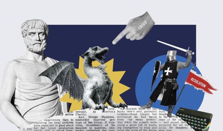
This is a true story about addiction and loss. It’s not quite the Dickensian story you are hoping for, but it is a story of a young boys’ intrepid journey through the digital underworld.
When I was 12, I received a ZX Spectrum 48K as a Christmas present. This was a big deal. It was 1983 and home computers were at their peak of popularity.
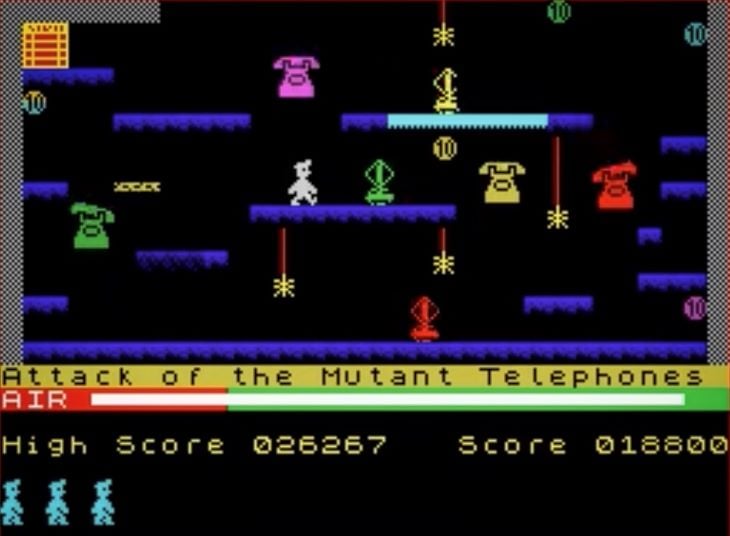
Manic Miner was my first home gaming experience, and it came free with the computer. Our protagonist was a cute pixelated Miner who, for unknown reasons, needed to journey through ingenious mazes and avoid fiendishly complex traps. As soon as the cassette finished loading eight minutes later (imagine waiting eight minutes for anything), I was hooked by the clunky 8-Bit graphics, horrid sound effects and lagging gameplay.
My parents were getting concerned, as I refused to play outside with my friends for two weeks. Occasionally, I would even sneak down at midnight to bask in the soothing irradiated light.
I mastered the game quickly, although the last few levels were difficult. If I died on level twenty, I would have to replay all twenty levels again as there was no save option. It was maddening. I was getting close to triumph, only a few levels to go. What could possibly happen?
Think of any film, be it a film by Michael Bay or Park Chan-wook. It begins by introducing the character or characters. An event occurs that changes their situation. This causes conflicts that are resolved in some manner by the end. This is story structure.
The origins of this approach go back to Aristotle, the originator of the classical story structure. He told us that a story has “a beginning and middle and end.”
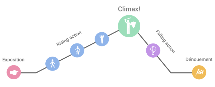
In 1863, the German playwright and novelist Gustav Freytag updated the three-act structure by investigating ancient Greek drama and plays of Shakespeare. He identified common patterns and introduced the five-act story arc. He represented this structure as a pyramid, which is still in use today.
Donna Lichaw, a strategy consultant, has specifically used Freytag’s Pyramid as the basis for story mapping: “What’s great about ‘story’ is that it provides you with a framework for turning your customers into heroes.” This is where the use of story really shines for product design. This is the user’s journey, and the user is the hero of our story. Let us venture forth.
Let’s break down the reasons that story mapping is so powerful into two parts.
Story mapping is about engaging your audience and quickly communicating concepts to the product team. People can grasp concepts far more quickly when presented graphically. Contrast this with the use of abstract feature centric diagrams. Story mapping is a highly collaborative and inspirational tool.
There may be some in the audience that think we are descending into some sort of arts-and-crafts design hell by using this technique. Far from it. Renowned psychologist Jerome Bruner argues that story provides a means of structuring and reflecting on our experiences. It is an appropriate tool that allows us to organize our stream of ideas and experiences, order them, and work out meaning in our design flow.
Story mapping is about uncovering strengths, weaknesses, gaps, and opportunities that you might otherwise miss. Instead of focusing on the “how” things are done, we can answer the “who, what, where, when, and why.”
It lets us map out the smallest feature, single interaction, full project, or even a family holiday. Using the story arc also models how we interact with products as events plotted out with natural peaks and troughs of tension and release. Mapping these user flows onto a story arc helps us see the flow of ideas and interactions as your users might experience them.
Story mapping can be used at any stage in the design process. These are a few key places to keep it in mind.
Having this philosophy constantly in the forefront of your mind when designing anything big or small is a useful mindset to develop.
I started out using this technique when creating a large user journey, say onboarding or search flow. It works well by taking our attention away from the UI and design patterns and instead focusing on what the user might like to do.
I now use it to uncover flaws in a conceptual flow full of assumptions and default thinking. I then apply this technique to it, mapping out the steps that we have and finding the potential flaws in it.
Sorry? No, I’m not sorry and I’m not joking: you can plan a dinner with story mapping. It can even be used for personal events like weddings, anniversaries, parties, and kids’ events if you want to inject some excitement into proceedings.
For a story to be worthwhile, it must have a point. The user’s goal is that point. If you don’t have a point, you won’t have an interesting story. I like to use job stories for this part.
Let’s discover the user’s motivations and goals first. I like to use the job story format for the jobs the user needs to do.
All you need to storymap are Post-It Notes, markers, and a firm wall, or you can use a white-boarding tool like Miro. Let’s break down the process.
We will take a simplified task flow as our example. At each stage, we have story stages such as “trigger” and “crisis,” then below these, our user actions on the green cards and psychological biases and principles on the orange cards.
There are seven stages and one add-on:
You can mix and match these stages in whatever way you think is appropriate. The important thing to keep in mind is the natural arc these stages create. How the user starts, what they do, and how they end their journey is what you should take away from this.
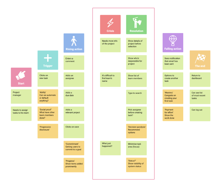
The user, in this case, could be a manager who needs to assign tasks to his team. This gives us context to move forward.
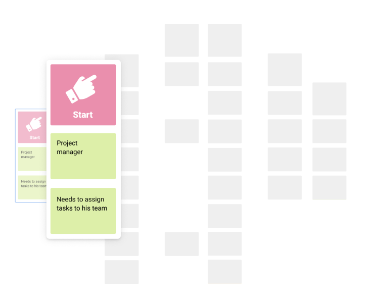
This is a problem our user wants to overcome. If there is no problem, there should be something enticing to get the user to act. (If there is no problem, then maybe you shouldn’t be doing it.) In our case, the manager needs to create a task.
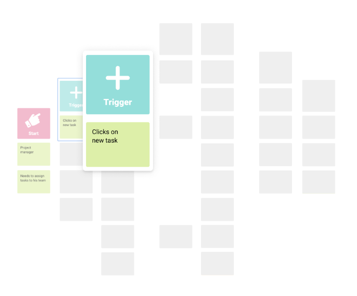
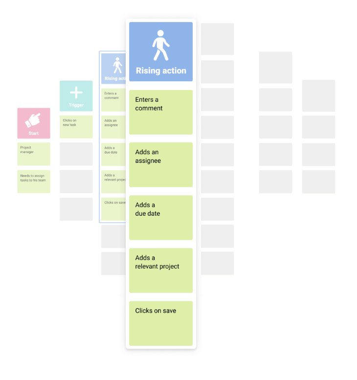
This is the journey, and it should build to a climax. There might be many steps or just a few, but the fewer steps to a goal, the better. Our manager creates his task.
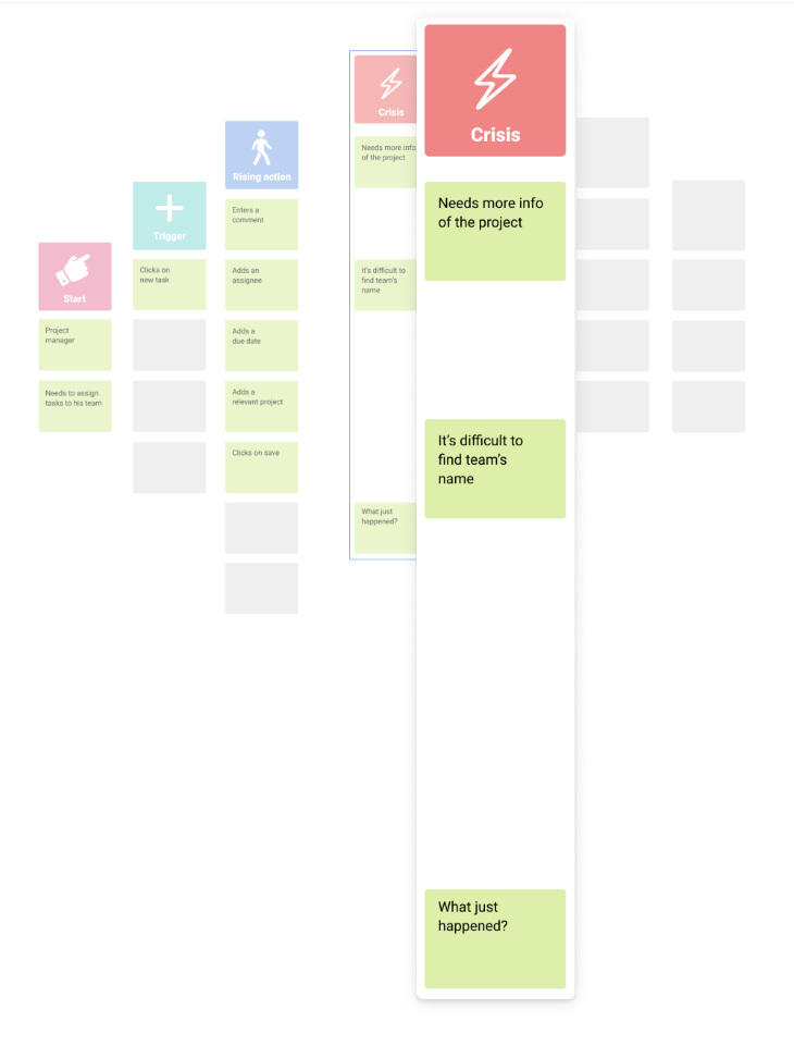
These are the potential issues the user may have. It’s the dragon at the gate or the military in your way. Issues here could be difficulty in recalling team members’ names, lack of feedback, too many options. It’s the low point for the user experience.
This is how the user overcomes the obstacles. The knight comes to the rescue.
What we really want here is for the user to never know there were potential issues at all. They can go about their task with a minimum of fuss. See how I have tied the “resolution” items to the “crisis” points. We can map as many of these as we want.
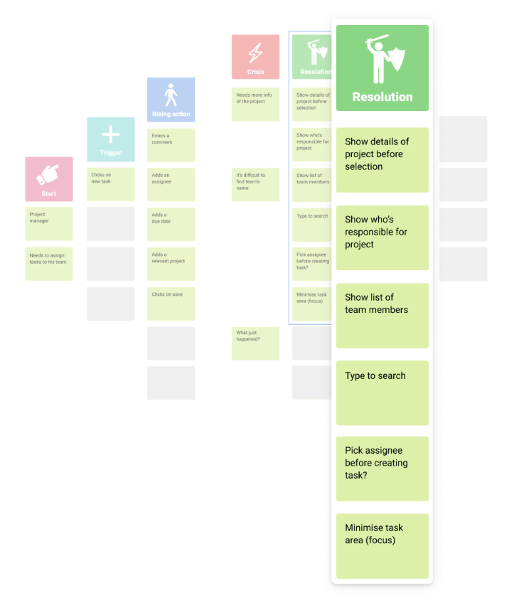
The feedback we give the user at this stage is important in how they remember the experience. Peak-end rule is a psychological heuristic that predicts that people “remember a memory or judge an experience based on how they felt at the peak moments, as well as how they felt at the end.”
Finish the experience gracefully. “Congratulations, we’re giving you free chocolate for life” always works.
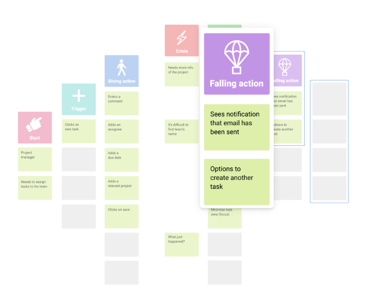
Don’t shove them out the door into the rain. Give them an umbrella or possibly hail a cab for them.
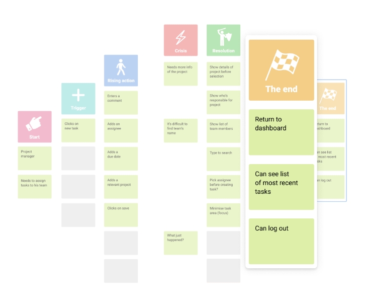
When the user has completed all the actions in the flow, let them have a place to go. Examples are returning them back to a dashboard, home page, or giving them options to do another task. Similar to falling action, the end should have a satisfying experience.
Under each plot point, note down which action we assume the user will take, layer it with detail, such as what psychological behaviours we might expect and what principles we can employ. Reference the Design with Intent cards to guide us. I try to keep it as simple as possible.
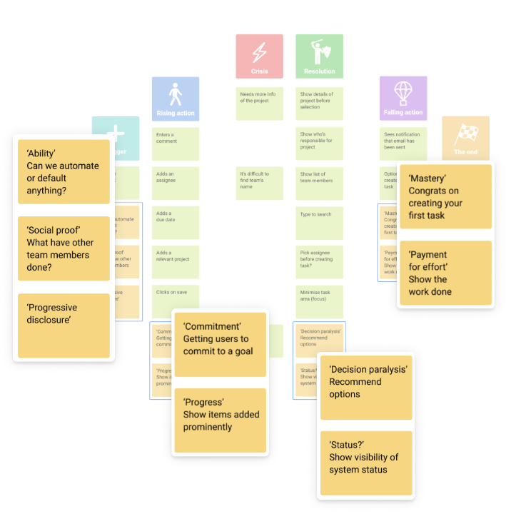
The goal in story mapping is to frame the user as the protagonist and the hero of your product story. These stories can be as short and long as you like.
But a word of caution: if the story becomes too complex, it will become unwieldy. If you feel frustrated, stop and pare back your story, and work on smaller chunks at a time.
I realized that there is a correlation between reflecting on the design process and story mapping as a tool. Storytelling can investigate our design process, and highlight interesting stories at the end of a design sprint. This process can explain what happened during our design thinking phase, what issues arose, and how best to learn from it.
By combining Job Stories with story mapping, we can create a powerful user-centric approach to design, and the more you think in story arcs, the more the user will become the hero of your design journeys.
So what happened with Manic Miner? I had reached level 18, Amoebatrons’ Revenge, and a few levels away from triumph. Then the cassette got jammed. Yes, the tape literally got stuck in the tape recorder as I loaded it up for the next attempt, twisted and snapping as I tried to pry it out of the machine. To say I was heartbroken was an understatement. So much for state-of-the-art technology.
I tried again 22 years later. Older and wiser, and using an emulator, I battled and rediscovered the old joy again. I finally got to level 20, The Final Barrier.
This is the moment that Manic Miner ends.
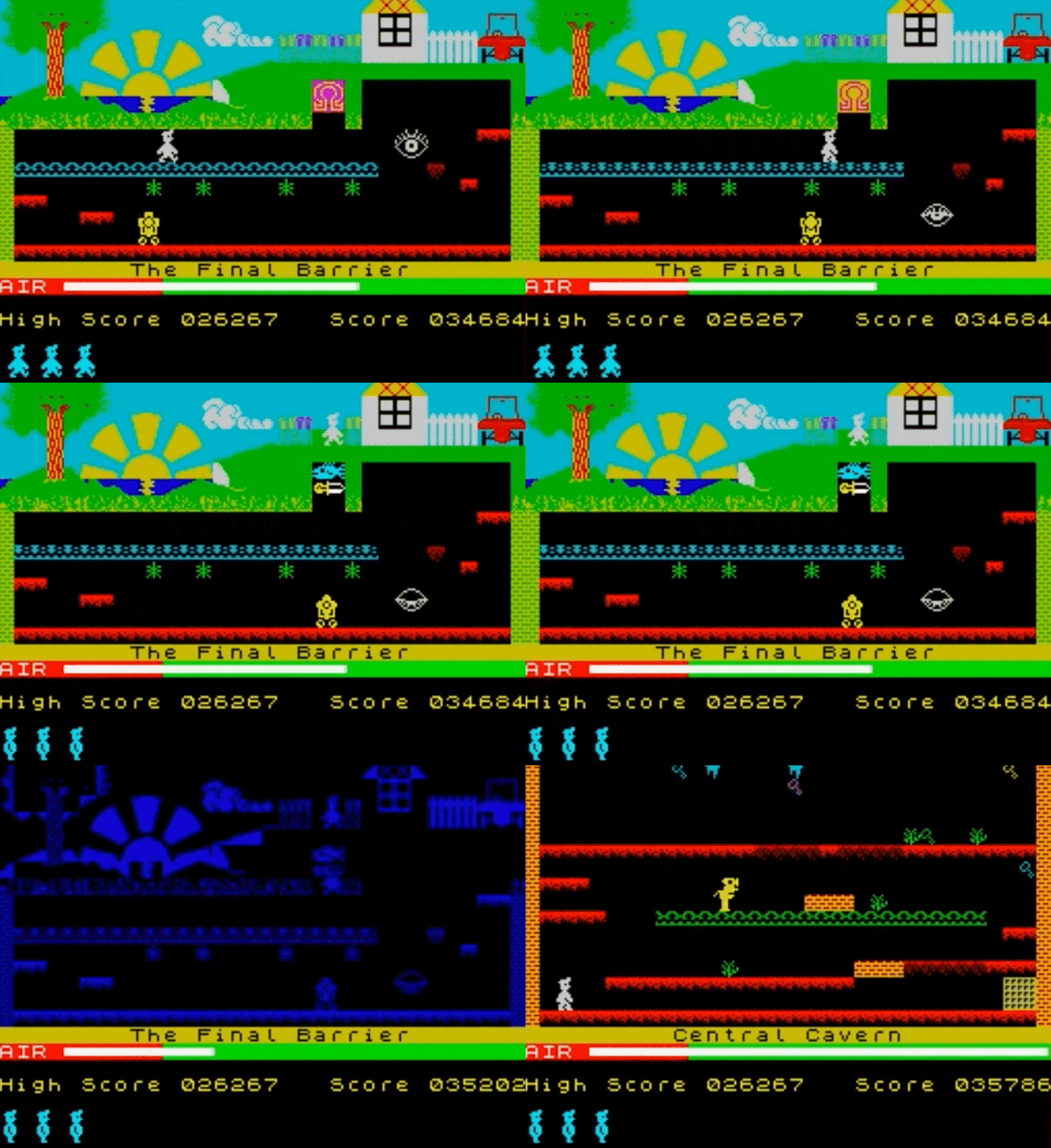
I was waiting for something spectacular. Why is Manic Miner stuck in the air? I thought. Has the game crashed?
There was no message.
No “congratulations, we’re giving you free chocolate for life.” No falling action. No fanfare. Nothing.
The game just started again.
I felt cheated and still do to this day.
What’s the moral of this story? Always remember to make your user the hero of the story, and make sure their journey is worthwhile.
LogRocket's Galileo AI watches sessions and understands user feedback for you, automating the most time-intensive parts of your job and giving you more time to focus on great design.
See how design choices, interactions, and issues affect your users — get a demo of LogRocket today.

As products evolve into ecosystems, navigation becomes a system-level challenge. This article explores how to align structure, context, and user journeys to create seamless movement across tools without confusion.
Figma’s AI features have exploded in 2026 — from text generation and image editing to full UI drafts and code handoff. But speed isn’t the same as quality. This guide breaks down every major feature, what it’s good at, and where human judgment still does the heavy lifting.

Zero UI works well for screenless, voice-first experiences, but most digital products still require visual interaction. Here’s why multimodal UX offers a more scalable foundation for the future of design.

Multimodal UX goes beyond designing for screens. Learn how context-aware systems, progressive modality, failover modes, and accessibility-first design create better digital product experiences.