Like most UX design decisions, choosing the best type of navigation isn’t a one-size-fits-all verdict. It depends on your digital product, target users, and UX goals.

Navigation impacts both users and businesses. Not only does well-structured navigation affect a user’s cognitive load and engagement, but it also influences conversion rates and SEO ratings. It’s vital to design user-centered navigation to ensure usability, which generates user satisfaction (and loyal customers).
Sticky and fixed navigation have recently become popular UX choices because they both answer this need for user-centered navigation. The terms “sticky” and “fixed” may seem similar, so much so that they are sometimes used interchangeably in UX design. But they actually describe different types of navigation.
Let’s set the record straight by examining the differences between sticky and fixed navigation, then review the use cases, pros, cons, and best practices of each.
Selecting the best-fitting navigation for your website or digital product is important for the user’s experience and information architecture. It impacts the user’s flow and how much attention is given to the content. It can even boost conversation rates.
You may or may not know this, but the names “sticky” and “fixed” come from the CSS property for position. So the navigation header can have position:sticky; or position:fixed; assigned, which determines how the element will behave in the interface.
Sticky navigation bars are dependent on the user’s scroll position. But no matter where the user scrolls on the web page, at least part of the navigation is visible. When the navigation header has position:sticky;, it essentially toggles between relative and fixed based on the user’s scroll position.
For example, a web page has two levels of a navigation menu — the first level includes primary actions, and the second level includes secondary actions. When the user scrolls down, both navigation levels scroll until the second level hits the top of the viewport. So, the first level is no longer visible, but the second level is.
Only part of Medium’s navigation sticks to the top of the page when the user scrolls:
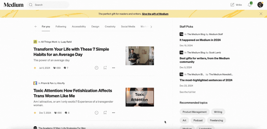
When you think of sticky navigation, you probably think of a header or bar that remains near the top of a web page (like in the previous scenario). This top-sticky position is the most common type of sticky navigation, but there are two other types — left-sticky and right-sticky.
Let’s compare each type of sticky navigation:
Sephora uses left-sticky navigation for filters, and LinkedIn uses right-sticky navigation for secondary links:

These sticky navigation types can also be combined in the same interface design.
For example, a website may use top-sticky navigation for primary global actions (actions you can take on any page), as well as use left-sticky navigation for secondary local actions (actions you can only take on a specific page).
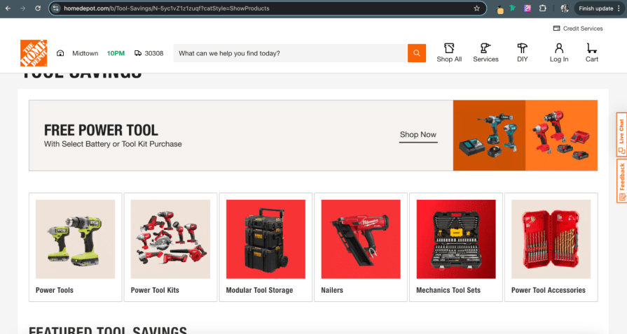
In contrast, fixed navigation always stays “locked” in place on the web page and doesn’t adapt as the user scrolls. When the navigation header is assigned position: fixed;, it becomes a permanent part of the interface. Due to its persistence, fixed navigation headers are frequently positioned at the top of web pages.
So, as the user scrolls down the web page, the navigation header remains where it is, and the content scrolls beneath it. Unlike sticky navigation, fixed doesn’t adapt to the user scrolling–all links and menu items remain where they are.
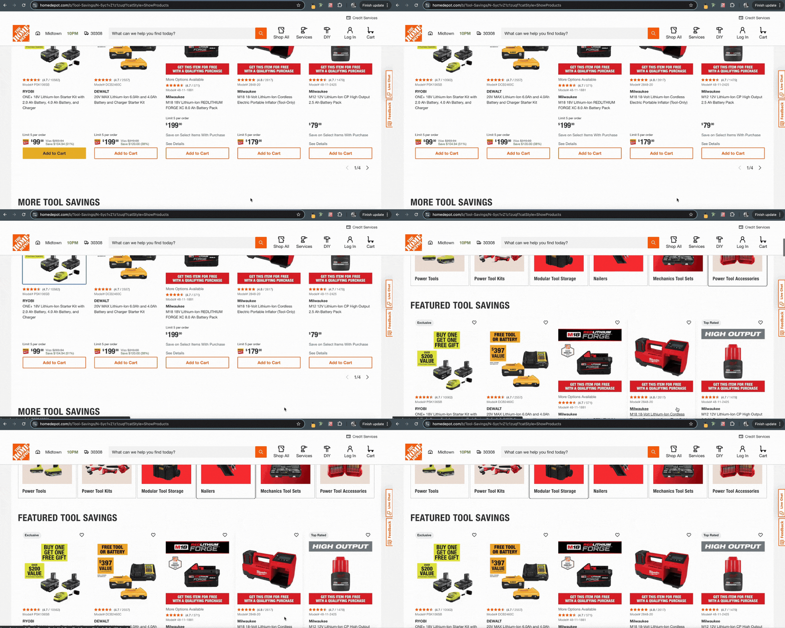
Home Depot uses a fixed navigation so the branding and important links are always visible:
As mentioned earlier, selecting when to use sticky or fixed navigation has multiple dependencies, like the UX goals. But there are known scenarios when one should be used over the other to optimize both the user’s experience and content.
For a quick guide on when to use which navigation type, here’s a breakdown of the scenarios where it’s better to use sticky or fixed navigation below:
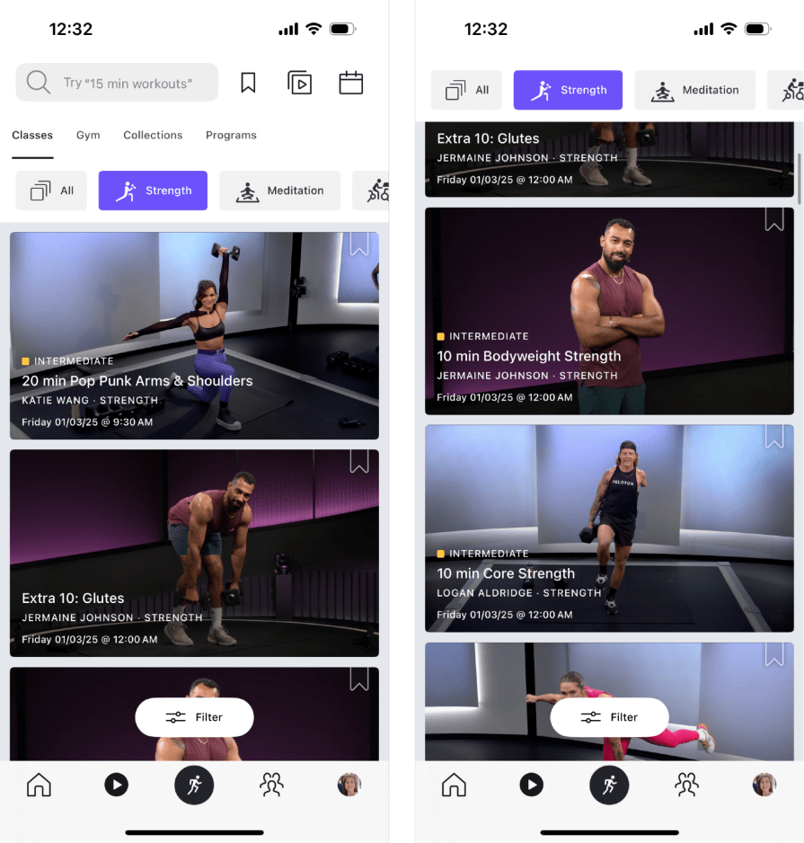
Peloton’s mobile app navigation condenses once the user scrolls to only show available filters:
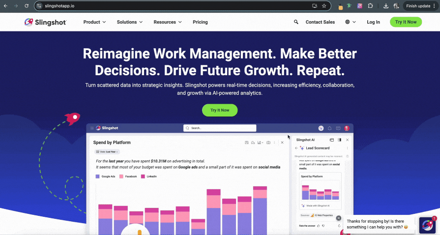
Slingshot provides fixed navigation that consistently shows all links and branding:
We know that at least part of sticky navigation always remains on the web page no matter where the user scrolls, and it’s best used in scenarios like content-heavy websites. Let’s further explore its pros, cons, and best practices.
position: sticky; is not supported on older browsers (so a fallback option is needed)Trip Advisor’s sticky navigation has a distracting jump effect when it adapts as the user scrolls:

position: sticky; are more efficient versus Javascript because they load web pages faster. You can also enhance the performance by using system fonts and SVGs for iconsFixed navigation works best on simple websites because its position stays “locked,” keeping it at the top of the web page as users scroll. Let’s take a look at fixed navigation’s pros, cons, and best practices to better discern when to use it.
position: fixed; property is easy to implement from a developer’s perspective, and most users are accustomed to finding the navigation bar at the beginning of a web pageHome Depot’s fixed navigation partially obstructs the keyboard focus when using Shift+Tab keys:
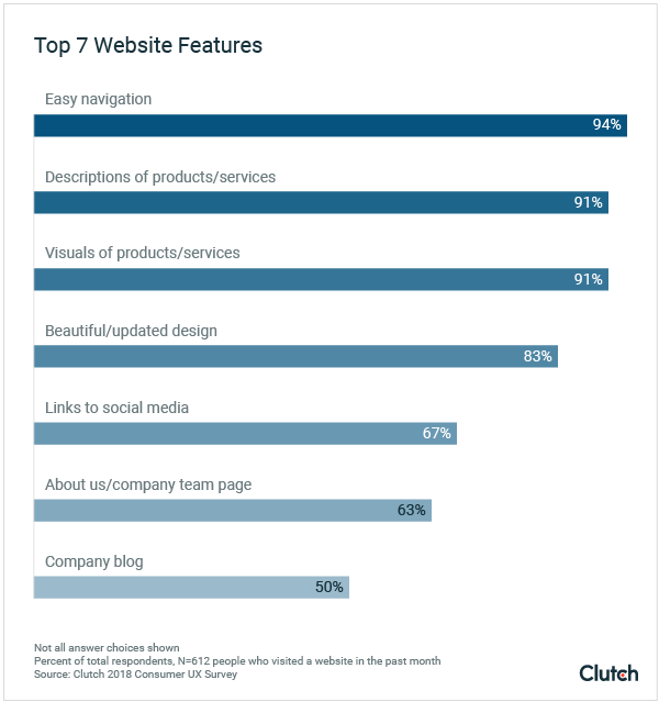
Though there are pros and cons for using sticky or fixed navigation, users tend to prefer sticky navigation due to its benefits from enhanced usability. Unlike fixed navigation, sticky balances usefulness with screen real estate — so users can easily access the navigation without it intruding on their overall experience.
Here’s a closer look at other reasons why users prefer sticky navigation:
Data holds up these claims.
Contentsquare, a product analytics platform, shows that actionable websites with sticky navigation have decreased bounce rates (users who leave a site after visiting a single page) and increased conversion rates (users who completed a desired task).
Since the ability to easily find information is important to users, websites that swap to sticky navigation can anticipate optimized performance from their analytics.
Sticky and fixed navigation bars are now customary in UX design because they both consistently enhance a product’s usability. Though they sound similar, they have different navigation patterns. As sticky navigation adapts to the user scrolling, fixed navigation remains locked on the interface.
Sticky and fixed navigation each offer unique strengths and weaknesses, making them ideal for specific scenarios. Use sticky navigation for content that involves extensive scrolling, and fixed navigation for simpler websites.
If you’re unsure whether to use sticky or fixed navigation, you need to test it. Run an A/B usability test with real participants and examine their success rate, time-on-task, and overall satisfaction with one navigation to compare results to the other.
At the end of the day, it’s important to pick a navigation type that supports both the user and business in meeting their goals.
LogRocket's Galileo AI watches sessions and understands user feedback for you, automating the most time-intensive parts of your job and giving you more time to focus on great design.
See how design choices, interactions, and issues affect your users — get a demo of LogRocket today.
A three-week mobile banking project taught me that the “proper” UX process is not always realistic. Sometimes, the better approach is to work with what you know, identify what you still need to learn, and make the strongest decision possible under real constraints.
A/B testing compares two versions of a design to see which performs better with real users. Here’s how UX teams can use it to test hypotheses, measure outcomes, and make smarter product decisions.
This case study shows how one ad experience redesign increased total ad exposure while lowering perceived friction, proving that timing and context can matter more than raw interruption.

As products evolve into ecosystems, navigation becomes a system-level challenge. This article explores how to align structure, context, and user journeys to create seamless movement across tools without confusion.