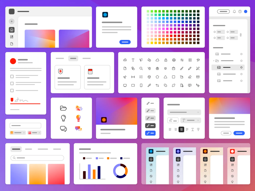
Adobe’s Spectrum design system has been a cornerstone of the company’s visual language since its inception in the 2010s. Spectrum marked a revolutionary step in providing designers and developers with a standardized set of UI components and design guidelines, transforming the way Adobe products were designed and establishing a consistent visual language and user experience. Over time, Spectrum has evolved into a beacon of design excellence.

But why the need for Spectrum 2? According to the announcement post, Adobe recognized the evolving landscape of user expectations, technological advancements, and the imperative for even greater cohesion across its suite of products. Spectrum 2 isn’t just an update; it’s a strategic response to these challenges, aiming to further elevate user experiences in the digital era.
Now, let’s journey back to Spectrum’s pioneering days and delve into the enhancements that Spectrum 2 brings to the table.

According to the article written by Shawn Cheris, senior director at Spectrum, they found six main reasons to update the design system:
Have you been thinking your design system needs an update? These might be key indicators that it’s time.
Rapid advancements in technology over the past decade have necessitated an update to Adobe’s design system, Spectrum. The original system may not have fully accommodated the latest technological capabilities and interfaces.
Shifting design trends within the industry have prompted the need for adjustments to Spectrum. Staying aligned with current design practices ensures that Adobe’s products remain visually relevant and appealing.

With Adobe’s product portfolio now encompassing over 100 unique applications across diverse platforms and languages, an updated design system is crucial. Spectrum 2 aims to provide a unified design language across this extensive product range.
The complexity of Adobe’s ecosystem, spanning web, desktop, mobile, and mixed reality platforms, demands a design system that can seamlessly adapt to various environments. Spectrum 2 is designed to enhance consistency and usability across this diverse landscape.

Evolving user expectations for polished and seamless digital experiences have influenced the decision to update Spectrum. Spectrum 2 aims to meet and exceed these heightened standards to enhance user satisfaction.
To maintain a unified and cohesive user experience across Adobe’s extensive suite of products, Spectrum needed an update. Spectrum 2 is envisioned to provide a consistent design language, ensuring a harmonious user journey throughout Adobe’s ecosystem.
Adobe’s vision for Spectrum 2 centers around three core principles, each shaping the new design system:
These can be almost universally applicable to design anywhere, so let’s talk about what they mean.
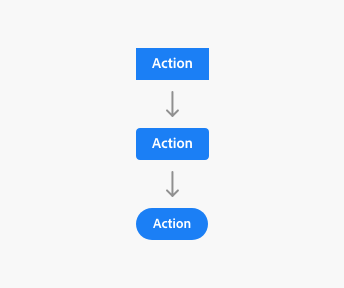
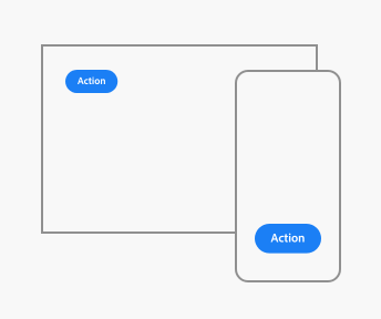
Adobe’s diverse product range spans across multiple platforms, including macOS, Windows, iOS, Android, and the web. Initially, Spectrum prioritized cross-platform consistency to facilitate user learning and knowledge transfer.
However, as platforms have matured, each developed distinct conventions, prompting Spectrum 2 to provide specific variants tailored to each platform’s unique characteristics.
Recognizing the individuality of Adobe’s product offerings within Creative Cloud, Document Cloud, Experience Cloud, and Adobe Express, Spectrum 2 is designed to be adaptable. This allows product-specific decisions.
This approach empowers in-house experts within each product area to customize Spectrum 2 according to the diverse needs of their customer base, ensuring flexibility for different groups of product designers implementing the system in their respective tools.
Ensuring inclusivity and accessibility is a paramount objective for Spectrum 2, aligning with the WCAG for its web applications. Adobe’s dedicated accessibility team, actively contributing to WCAG guidelines, focuses on foundational aspects like contrast ratios, accessibility tags, keyboard controls, and focus states.
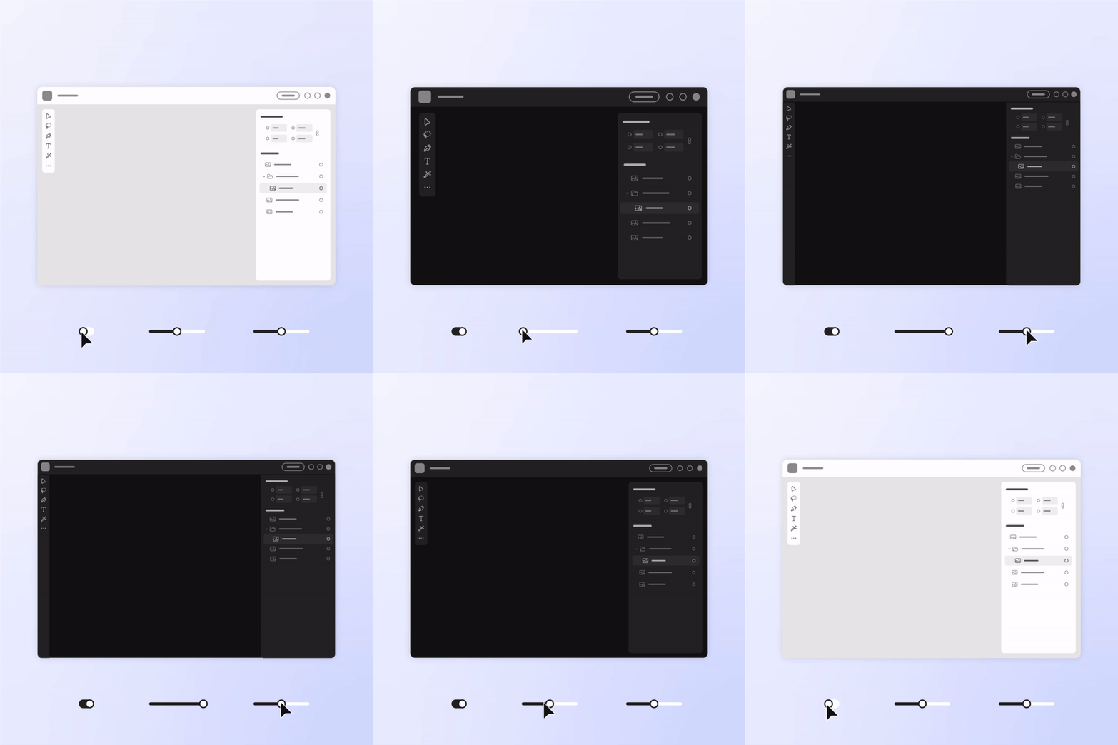
But Spectrum 2 goes beyond fundamental accessibility requirements, aiming to cater to individual needs and preferences:


Adobe’s Spectrum design began with a serious tone, emphasizing professionalism through minimalistic, grayscale aesthetics. However, Spectrum had some limitations when handling complex screens, prompting a shift after the 2019 Adobe Express project.
The Express theme introduced a more approachable design with lighter tones and brighter colors while retaining Spectrum’s core structure:
This successful adaptation influenced Spectrum 2, which combined the foundational Spectrum design with Adobe Express’s user-friendly elements. Spectrum 2 aspires to unify Adobe’s visual language, offering both expressiveness and approachability across all products.
Updating the UI is a key element of the whole process, but specifically, Spectrum is revamping the following component sets:
Spectrum 2 brings a fresh design language by blending Spectrum’s rational icons with the friendly Adobe Express style. The icon set features a balance between sharpness and approachability, complemented by Adobe Clean, their signature typeface:
Revamping the gray system, Spectrum 2 embraces Adobe’s brand colors, enhancing contrast and integration. The color palette is diverse, catering to inclusivity and accessibility across Adobe’s product experiences:
The design team introduces a versatile toolkit of geometric shapes for illustrations, aligning Spectrum 2’s color system with brand colors. This ensures visual cohesion across Adobe products.
Spectrum’s previous illustration style supported everything from simple line work to full-color editorial images. The new system has to fill those needs across all of Adobe’s products in a visually cohesive way:
While we have limited official information available about Spectrum 2, the insights I’ve gleaned from its predecessor provide a glimpse into what the design community can anticipate.
While we eagerly await the specifics, the following highlights present potential updates and features that could define the transformative nature of Spectrum 2. As designers eagerly await its release, these expectations underscore the continuous evolution and user-centric ethos embedded in Adobe’s commitment to innovation.
Responsive resizing is set to redefine how designers approach the adaptability of their creations. The addition allows for the seamless adaptation of designs to various screen sizes, ultimately enhancing user engagement and satisfaction by ensuring a harmonious experience across a diverse range of devices.
Spectrum 2’s commitment to user empowerment is evident in its comprehensive documentation and an array of resources. From support forums to workshops, webinars, and training sessions, Adobe intends to provide users with multifaceted support, enabling them to harness the full potential of Spectrum 2’s capabilities effectively.
The original Spectrum docs will be a good place to start:
The provision of collaborative tools — including a design library, style guide, and templates — underscores Adobe’s commitment to facilitating effective cooperation between designers and developers in the multiplatform design landscape.
As anticipation builds for Spectrum 2’s release, it promises not only an evolution in design but a celebration of collaborative innovation. This likely means Adobe will further prioritize collaboration and collaborative tools going forward:

Witness the integration of design tokens, a key element facilitating consistent application of design elements. Discover how design tokens enhance collaboration among designers, promoting a unified and cohesive design language.
Another aspect that could benefit from enhancement is Spectrum 2’s level of customization. While Spectrum 2 provides a solid foundation, it could unlock its full potential by embracing greater flexibility. Giving designers and developers more customization options would allow them to tailor the design system to the unique requirements of their specific projects and teams. This increased adaptability would elevate the overall effectiveness of Spectrum 2 — creators could make more engaging digital experiences.
Look forward to performance optimizations in Spectrum 2. Spectrum 2 aims to deliver designs that load quickly and provide a smoother user experience, ensuring optimal performance across various applications.
Adobe Spectrum 2 takes cues from other well-known design systems. One key influence is Google’s Material Design, known for its bold use of color, typography, and visual depth. Spectrum 2 adopts some of these visual aesthetics:
Spectrum 2 also takes a cue from the modular approach of Atomic Design, popularized by Brad Frost. This approach emphasizes building design systems from small, reusable components, enabling greater flexibility and consistency across different platforms and devices. Spectrum 2 embraces this modularity.
Typographic trends observed in other design systems have also influenced Spectrum 2. The system incorporates contemporary font pairings and styles, resulting in improved readability and visual hierarchy. This attention to typography enhances the overall user experience, making it easier for users to navigate and understand the content presented.
Additionally, Spectrum 2 can benefit from studying IBM’s Design Language, renowned for its emphasis on user-centered design and accessibility. IBM’s design principles could offer insights into creating inclusive and user friendly interfaces, aligning with Spectrum 2’s commitment to accessibility.
Spectrum 2 signifies a substantial evolution in Adobe’s design paradigm, characterized by numerous nuanced modifications. These alterations cater to a wider user base.
Spectrum 2 will roll out gradually, with initial updates for specific Adobe products expected later this year, followed by a comprehensive integration across the suite in 2024. Preview glimpses of Spectrum 2 in web applications reveal enhancements such as improved visual hierarchy, brighter aesthetics, incorporation of rounded design elements, and increased readability.
Adobe’s commitment to refining Spectrum is evident, with plans to tailor dedicated versions for both desktop and mobile products currently in progress. For a detailed exploration of Spectrum 2 and its future trajectory, be sure to refer to the Spectrum 2 site.
I’m excited for Spectrum 2. It evolves Adobe’s design legacy, addressing the dynamic landscape of user expectations.
Spectrum 2 not only aims to provide a consistent design language but also embraces platform individuality, ensuring a seamless user experience across diverse Adobe products. Spectrum 2 heralds a new era in design, promising a delightful and accessible journey for users across the digital spectrum. As we anticipate the gradual rollout and integration across Adobe’s suite, their new design system promises to redefine digital experiences with its user-centric ethos and innovative design principles. Designers take note!
LogRocket's Galileo AI watches sessions and understands user feedback for you, automating the most time-intensive parts of your job and giving you more time to focus on great design.
See how design choices, interactions, and issues affect your users — get a demo of LogRocket today.

A three-week mobile banking project taught me that the “proper” UX process is not always realistic. Sometimes, the better approach is to work with what you know, identify what you still need to learn, and make the strongest decision possible under real constraints.

A/B testing compares two versions of a design to see which performs better with real users. Here’s how UX teams can use it to test hypotheses, measure outcomes, and make smarter product decisions.

This case study shows how one ad experience redesign increased total ad exposure while lowering perceived friction, proving that timing and context can matter more than raw interruption.

As products evolve into ecosystems, navigation becomes a system-level challenge. This article explores how to align structure, context, and user journeys to create seamless movement across tools without confusion.