“Simple, clean, and effortless” — it’s long been a mantra of UX design. And for good reason. Simplicity makes digital products easier to use, faster to load, and more intuitive. But somewhere along the way, simplicity began to get confused with sameness.

Imagine an 8-year-old. They’re at an age where they’re becoming more independent, such as learning how to tie their shoes and brush their teeth. If the 8-year-olds’ parents continue to tie their shoes and brush their teeth for them, they won’t develop the skills needed for increased autonomy.
The same rule applies to UX.
If the designer hand-holds their user with overly simplified interfaces, the user won’t know what to do when facing a challenge.
Of course, there are reasons why simplicity is a core principle of UX design. It makes complex processes efficient and enhances the intuitiveness of dashboards. No one wants to do something too challenging or time-consuming. Think of the rise of AI. It makes our lives easier by automating tasks we don’t want to do. But it also prevents us from continuing to build our critical thinking skills. As AI is integrated into more product experiences, we risk diminishing the product’s emotional engagement and user meaning.
However, there is a balance between excessively simple UX, which can be boring and monotonous, and UX that is cluttered and intricate. We’ll explore how to find that balance between simplicity and complexity to create engaging and intuitive interfaces. First, let’s review why simplicity is the UX standard and where simple UX design fails. And then, we’ll see how you can balance ease with substance in your UX designs.
UX design is known for simplifying complex processes into easy and intuitive experiences. Designers are advised to “simplify, simplify, simplify,” which involves reducing steps, user clicks, and overall clutter in the interface.
But how does UX adopt this simplicity mindset, and why is it so coveted?
Let’s look at a few reasons below.

Although simple UX allows for a mobile-first approach and optimizes performance, there are instances when it negatively impacts usability and user engagement. To better understand the pitfalls, let’s examine the hidden cognitive costs and emotional consequences of oversimplified UX. I’ll also review some real-world examples.
Some may challenge the notion that simple UX can be too simple — it doesn’t seem like easy-to-understand interfaces and “do-it-for-you” features are truly so troublesome. These UIs and features expedite and enhance the user’s ability to complete more tasks. But there is a price to pay for building cognitive skills.
The concept of the cognitive cost of convenience examines the idea that users struggle to establish their mental models in overly simplified interfaces. When users are handed tasks or navigate an application, they can only build short-term memory — creating a superficial understanding. So, once the user needs to stray away from the ideal user flow (or “happy path”), they may not know what to do. They never had the opportunity to learn and become autonomous.
As products introduce more AI assistants and agents, predictive text generation, and LLMs to reduce the effort required of users, they are also stripping users of their ability to think critically and fully comprehend interface designs:
Not only does overly simple UX sacrifice the user’s ability to think critically and be autonomous while navigating a product, but it also creates user boredom. This is caused by user interfaces that feel sterile — lacking character and blending into other product experiences. When a user feels a sense of blandness and boredom, they will look elsewhere for a competitor’s product that offers more uniqueness and energy.
Users expect moments of delight and surprise. If they don’t get that, users won’t become engaged in the experience or be able to distinguish it from a different product. When creating a simplistic UX, be cautious of draining the interface of any brand character. Because without it, users won’t emotionally connect with the product.
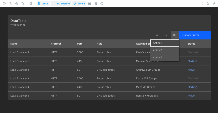
To help declutter interfaces, navigation and critical actions may be tucked away in overflow menus instead of being placed directly on the UI. Although it simplifies the interface, users may struggle to find what they’re looking for, such as a specific webpage or action.
For example, data tables often include multiple hidden menus to conceal table-related actions, which may hinder the findability of those actions:
Popularized by Apple and Google, the flat UI design sparked in the 2010s — swapping textures and shadows for solid colors and minimal icons. Although it gave interfaces a modernized aesthetic, it reduced the affordances users need to discern what is interactive from what isn’t.
For example, many products began using simple buttons and icons that blended into the application background — providing fewer visual cues to guide the user.
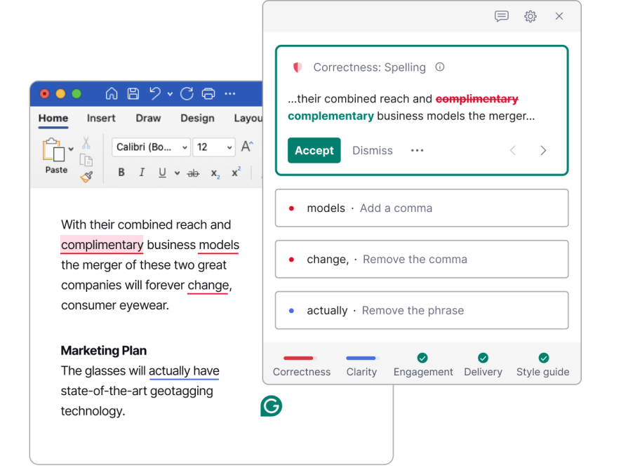
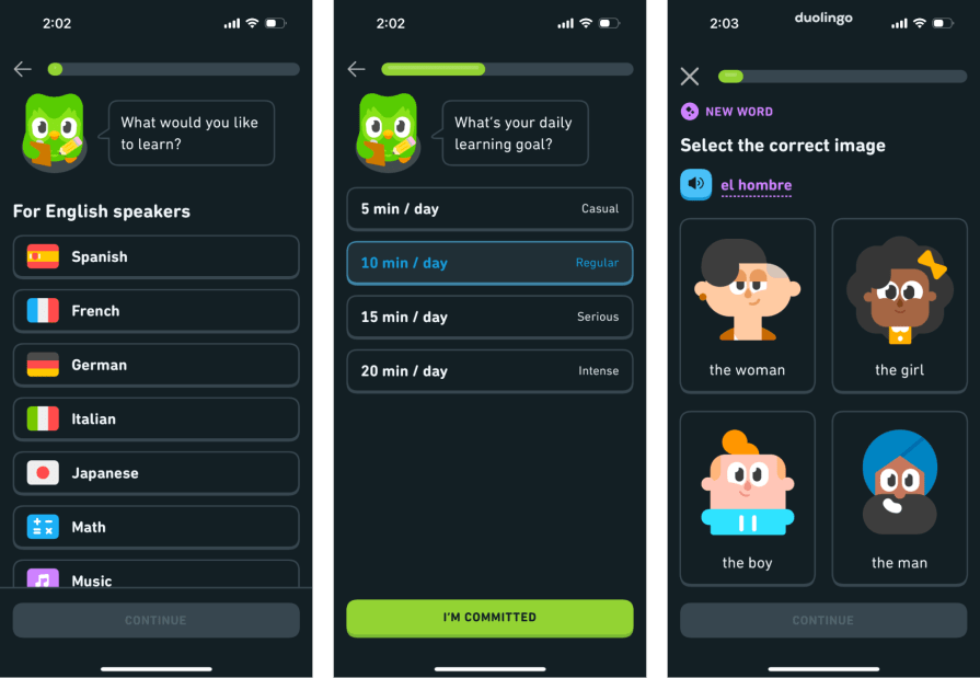
In an effort to expedite the form-filling process, a new UX trend has emerged, where the user is automatically advanced after making a selection. So once the user selects a button, they’re automatically navigated to the next question of the form — preventing the user from reviewing their answer or backtracking to the prior step.
Simplicity will always be a core principle of UX design; however, as we saw in the previous section, oversimplification can prevent users from critically thinking and emotionally engaging with a product.
How can designers offer clean, understandable interfaces while also incorporating essence and meaning?
To find this middle ground, let’s examine a few methods for creating clear, layered user experiences that retain brand character without erasing meaning or compromising brand personality:
As we have seen, removing content from an interface to increase its simplicity can also remove context. You might think that less content reduces the cognitive effort required of users, but it can actually hinder usability.
For example, if user actions are hidden under a menu or the interface’s buttons blend into the application because its visual cues (such as color and shadows) have been removed, the user will have to work harder to figure out how to use the interface.
Including too much content can be distracting, making it difficult to discern what is helpful and what isn’t. Conversely, having too little content can be confusing, as it hinders finding the necessary steps to progress to the next level.
To find the right balance in an interface’s content, ask yourself the following questions to determine if the content should remain or be removed:
When a user first enters your product’s experience, they shouldn’t be bombarded with too much information or actions. This is where a good level of simplicity is beneficial — providing the user the primary and essential information they need to get started, then progressively disclosing secondary information when the user is ready to explore more.
A couple of examples of a layered experience include:
One issue with many SaaS products is that their dashboards often resemble one another. They use the same muted color palettes, cards with rounded radii, and CTA (call-to-action) language. Though there isn’t a problem with the product’s usability, there is no clear differentiation. So, the user easily blends separate interfaces together and forgets what made your product better.
Here are ways to introduce character into the product:
As designers, we shouldn’t treat our users like they’re 8-year-olds who can’t tie their shoes. They need to be able to do it themselves. If we oversimplify our interfaces and hand-hold our users, we’ll hurt both the user experience and the product holistically.
We need to find a middle ground between creating products that are easy to understand and clean, but aren’t boring and stagnant.
Simplification has been a core principle in UX design for many years. As people began using mobile phones to access the internet, it became apparent that traditional methods of displaying content on desktop screens did not translate well to the smaller screens. In response, brands like Apple and Google introduced a minimalist approach to their interfaces, optimizing user experience and performance speeds. As a result, other products followed suit, and simplicity became a fundamental pillar of UX.
Most of the time, simple UX leads to greater usability and user satisfaction. But when excessively done, it can be detrimental to the product’s success. Over-simplified interfaces prevent users from building their own mental models. And that leads to confusion and frustration when they encounter a user flow that deviates from the standard user path. Not only that, but users also struggle to emotionally connect with simple interfaces that are flat and lack character. Without this connection, users won’t stay engaged in the experience (and probably won’t return).
There are ways to balance ease and clarity with character and richness, thereby avoiding user boredom and confusion. You can clarify the interface without losing meaning, layering one experience on top of another, and incorporate moments of brand personality. The user will seamlessly glide from one step to the next without feeling disengaged or fatigued.
Learn what not to do from designs that oversimplify and drive users away. Create usable interfaces that are also rich in character, equipping users to connect with your product experience.

LogRocket's Galileo AI watches sessions and understands user feedback for you, automating the most time-intensive parts of your job and giving you more time to focus on great design.
See how design choices, interactions, and issues affect your users — get a demo of LogRocket today.

Learn what makes a great login screen through real-world examples and UX best practices for creating secure, accessible, and low-friction authentication flows.
Skeuomorphism helped define early digital interfaces by mimicking real-world objects to make technology more intuitive. Learn how it compares with flat design and neumorphism, why it declined, and where it still has a place in modern UX.

Memos don’t have to be complicated. Just keep them clear, concise, and focused on actionable items. More on that in this blog.

AI has made polished, confident content easy to generate, but that does not make it trustworthy. This article explains how UX teams can design stronger quality signals using source transparency, validation, confidence communication, and reputation.

 Learn more →
