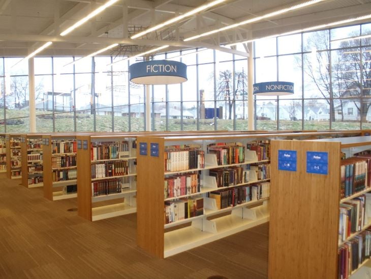
Think about the last time you walked into a library: each section is organized by themes and each aisle has signs that sort the books in a certain order. This makes it easier to locate that mystery novel by your favorite author or a textbook for your history class.

This is basically what IA aims to do — create a digital library of information that’s organized and easy to navigate. When done properly, navigation and discoverability should feel like second nature.
In this article, we’ll explore techniques for organizing and categorizing content, using personas and user journeys to guide our decisions, as well as designing intuitive navigation systems that feel like second nature to users. We’ll also talk about conducting user research and card sorting in refining our information architecture to optimize user experiences.
The field of information architecture (IA) revolves around the art of organizing and structuring content for websites and applications in a manner that resonates with users’ sensibilities. It entails ensuring that elements like back buttons seamlessly lead users back to their original page and navigation menus are readily accessible and intuitive to use.
A well-executed IA categorizes content strategically, ensuring that users are seamlessly guided through the product and effortlessly locate the specific information they seek. By crafting a thoughtfully designed IA, you enhance navigation and discoverability, thus minimizing the risk of users feeling disoriented or bewildered when engaging with your website or application.
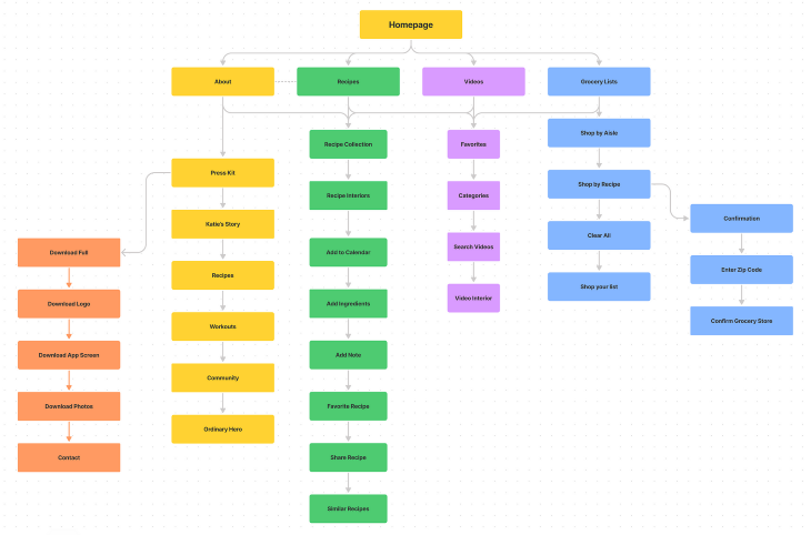
Crafting an effective IA starts with solid user research. We need to dive into the minds of our users and figure out what makes sense to them.
This research can take various forms: interviews, surveys, usability testing — you name it! The goal? To tap into their expectations and existing mental models when it comes to organizing and categorizing content.
During these research sessions, make sure to ask your users about products they find easy or challenging to navigate. Get them to talk about their past experiences with products that have complex information structures.
We want to know what worked well for users, what made their lives easier, and which pitfalls we should steer clear of in our own designs. So, gather those valuable findings and search for common themes — they’ll guide us in breaking down our content into appealing categories.
Imagine you’re stranded on a website with a chaotic information architecture. The homepage? It’s hidden away, buried two levels deep within some obscure page. And to make matters worse, there’s no clear navigation menu to rescue you from this digital maze.
It’s like searching for a needle in a haystack! Frustration will set in pretty quickly, and before you know it, you’re gone from that app, never to return.
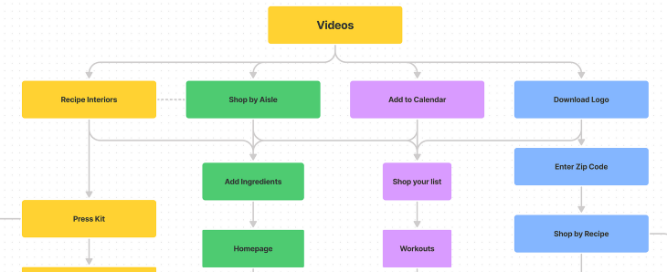
Without first conducting user research, designers will rely on their assumptions, which leads to guessing which categories and navigation structure would work best. Without having solid user data to back up your decisions, there’s a high chance of creating biased outcomes that can potentially lead to poor experiences for your users. You’re essentially rolling the dice and hoping for the best, which isn’t the best approach.
By engaging with real users through different research methods, designers can gather feedback about their preferences and expectations around the content organization and design products that fit their users’ needs.
Personas serve as representations of the diverse user types who will engage with your website or digital product. While they are fictional, personas are grounded in real user data and insights obtained from thorough user research. These personas combine user needs, goals, motivations, and pain points into profiles that humanize the data and insights gathered. Designers can use personas as a compass to make decisions that align with their users’ expectations.
For this example, imagine that you’re working on a task management app and your research uncovers this incredible group of users: busy working professionals who are constantly juggling multiple projects and struggling to meet those pesky deadlines. I mean, we can all relate to that, can’t we?
Now with these insights, it’s time to create a persona that truly embodies this user group. Let’s give our persona a name, like Busy Brian. As we dive deeper into Brian’s world, we start unraveling his motivations, such as his desire to be more productive and stay organized amidst the chaos.
And let’s not forget about Brian’s goals, like optimizing his work efficiency and keeping a tight grip on those all-important deadlines. But Brian also faces his fair share of frustrations. Think of mountains of paperwork and searching through endless information to find reliable resources.
But we can add even more personality to our persona. Let’s sprinkle in some unique traits that make Brian, well, Brian. Maybe he’s bursting with infectious enthusiasm or has a secret arsenal of cutting-edge tools that keep him on top of his game. These little details bring our persona to life and make him someone we can truly relate to.
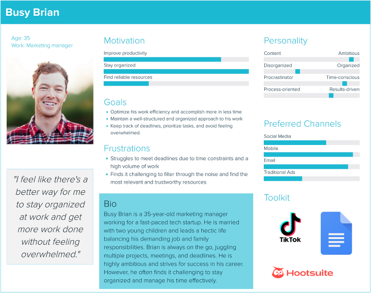
Now that your persona is populated with information that’s backed by user data, you can reference it when making decisions to create an IA that addresses Busy Brian’s needs and goals.
Some designers fall into the trap of creating unrealistic personas that are filled with assumptions and unnecessary details. You shouldn’t include the fact that your persona “enjoys long walks on the beach” unless it’s relevant information to the product that you’re designing. This can lead to misguided design decisions, which defeats the purpose of creating a persona in the first place.
User journey mapping is a technique that helps in understanding the path a user takes to accomplish a goal. These maps, also referred to as diagrams, outline the different stages of the journey and include the unique touchpoints and interactions users have with your product from initiation to conclusion.
The main goal of user journey mapping is to gain an understanding of users’ objectives, emotions, and challenges at each stage of their journeys. It enables designers to identify gaps in the present user experience as well as areas for improvement. In the context of developing the IA, the user journey map assigns priority to content based on its relevance to user needs and aligns the content organization with user flows.
Miro serves as an exceptional tool for crafting user journey maps. It provides a digital whiteboard that facilitates real-time collaboration with your team, ensuring alignment among all stakeholders. Also, Miro provides a predesigned template to get you started.
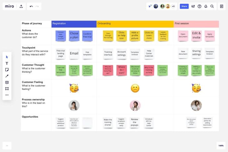
With your personas in hand, utilize the comprehensive information to guide the mapping of user journeys for each individual. Begin by identifying the distinct stages of each journey, encompassing elements such as product discovery, content search, milestone completion, and progress tracking. Thoroughly document the user’s thoughts and emotions throughout each stage of the journey.
By mapping out these journeys, you will uncover touchpoints where content organization can be tailored to suit the needs of the personas. This process will enable well-informed decisions regarding the hierarchy, structure, and categorization of your content. Moreover, it guarantees that users can conveniently access the most pertinent information when needed, resulting in a more favorable user experience.
Card sorting is a popular activity where users actively participate in organizing content. In this exercise, you write each page or section of your content on separate cards and ask users to categorize them based on their own understanding.
Users can also create structured hierarchies by combining categories. Card sorting helps designers gain insights into how users naturally organize information according to their preferences and thoughts.
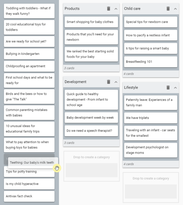
When choosing a card sorting method, there are three options available:
Engaging multiple users in card sorting exercises yields valuable insights and contributes to developing an information architecture that meets the expectations of most users.
Once the IA has been established and validated by users, the next step is designing a navigation system. Similar to a design system, the navigation system consists of reusable elements like menus, breadcrumbs, or tabs, as well as consistent patterns that aid users in navigating your website or digital product.
The objective of designing a navigation system is to equip designers and developers with the necessary components to create an intuitive navigation experience within their products. This system will guide users in discovering content and navigating the product, eliminating any confusion arising from inconsistent user interface elements or design patterns.
Based on the structure of the information architecture, designers can create primary and secondary navigation menus for the product.
For instance, Costco’s website features a primary navigation menu at the top, including main content categories like Grocery, Deals, or Pharmacy. Hovering over each category reveals a secondary navigation menu within a modal, providing further subcategories. This approach helps users quickly find information without getting lost on the website.
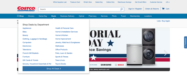
Consistency is key when presenting primary and secondary navigation. Ensure that the navigation style remains uniform across your website or application so that users can easily navigate and become accustomed to the system.
Tabs are a type of navigation component that can be arranged horizontally or vertically. They are designed to group together sections of content that are at the same hierarchical level and do not need to be shown simultaneously.
In mobile interfaces, tabs are commonly used for primary navigation purposes due to their visibility and easy accessibility. For instance, WhatsApp utilizes tabs at the top of its home screen to switch between the Chats, Status, and Calls pages. Given the limited horizontal space on mobile devices, tabs are best suited o when there are only a few content categories to display.

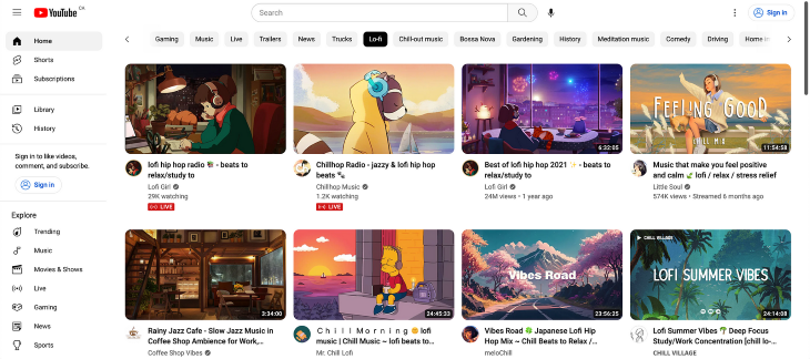
On desktop applications, tabs can also be observed in the form of a vertical navigation menu. For instance, YouTube’s website utilizes tabs as primary navigation on the left side of the page. This vertical side navigation enables users to add their own playlists to the menu, requiring vertical scrolling to access the entire menu.
Breadcrumbs are a commonly used navigation pattern, especially in ecommerce sites or applications with complex information architecture and multiple levels of depth.
The term “breadcrumbs” originates from the tale of Hansel and Gretel, where breadcrumbs were used to trace their way back home. In navigation systems, breadcrumbs fulfill a similar function by presenting a trail of links that indicate the user’s current position within the information hierarchy.
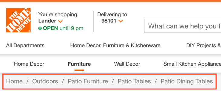
For example, The Home Depot’s website includes breadcrumbs as a tertiary navigation menu to accommodate its diverse array of categories and subcategories. This pattern proves valuable when navigating through multiple levels within a section, allowing users to effortlessly return to the initial level without relying on the back button. Moreover, breadcrumbs offer users contextual cues, serving as a reminder of the specific section they are presently exploring.
To optimize content discovery, it’s important to incorporate a robust search function on your website or application, which empowers users to locate any desired content. Having an easily accessible search bar provides a sense of support when users are unable to find specific content through navigation menus.
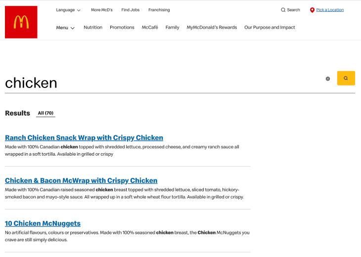
When organizing search results, strive for a well-structured and uncluttered layout that facilitates effortless scanning. Implement clear headings to expedite result evaluation. For example, McDonald’s website employs large, underlined fonts for search result headers, while adopting smaller fonts for result descriptions, effectively emphasizing the associated links and capturing users’ attention.
Many search functions offer valuable features like type-ahead suggestions, suggested searches, and a history of recent searches. These functionalities drastically reduce the time required for users to access desired information, especially when compared to alternative routes that often demand significantly more time to yield similar outcomes.

Organizing and categorizing content within the information architecture plays a vital role in creating user-centered designs. By understanding user needs, expectations, and existing mental models, designers can develop personas based on real data. These personas then inform the creation of user journey maps, which highlight opportunities to prioritize content based on user needs and align it with key user flows.
Card sorting is a valuable activity for gaining insights into how users perceive content organization, which directly influences the structure of the information architecture. Lastly, implementing an effective navigation system ensures intuitive user navigation and facilitates the discovery of desired content.
When content is well-organized and categorized, users are more likely to have a positive lasting impression of your product and will want to continue using it.
Header image source: IconScout
LogRocket's Galileo AI watches sessions and understands user feedback for you, automating the most time-intensive parts of your job and giving you more time to focus on great design.
See how design choices, interactions, and issues affect your users — get a demo of LogRocket today.

Multimodal UX goes beyond designing for screens. Learn how context-aware systems, progressive modality, failover modes, and accessibility-first design create better digital product experiences.

Learn how context-aware mode prioritization and seamless transitions improve multimodal UX and reduce mode confusion.

Research is becoming more democratized, product cycles are accelerating, and AI is transforming synthesis and ResearchOps. Here are the three trends shaping UX research in 2026.

Voice support is not the same as multimodal UX. Here’s how to design systems with true mode continuity and context-aware interactions.