Card sorting has existed for many years as a tool to understand the user’s mental model better. It helps UX designers and researchers improve design within apps and websites.

This article will review this method’s benefits and disadvantages, discuss when to use it, examine the different types of card sorting, and cover the steps and best practices for effective card sorting.
Editor’s note: This article was updated by the author on 25 February 2025 to condense information and add new insights, including comparing various card sorting methods, discussing less common variants like reverse and modified Delphi card sorting, providing five simple steps and best practices, and more.
A card sorting exercise involves categorizing different items into groups. It helps you understand how users classify information in their minds so you can improve your website or app.
Imagine you have a website that sells all types of furniture, from chairs to tables to beds. When a user searches for a new sofa, how will they find it — by room, style, size, color? Do they also want to consider a sofa that extends into a bed at the same time?
As you can see, we need to build navigation and categorize the information in the app in a manner that reflects how users organize information in their minds about the item they search for. Using the card sorting method, we understand better how to organize this information.
Information architecture is the practice of organizing, naming, and structuring content to make it easy for users to find and use. Card sorting is one of the most efficient methods to create a clear information architecture on a website or app for the user.
UX researchers can run a card sorting exercise when launching a new website to understand how the information can be organized.
You can also do card sorting before adding new sections to your existing website or to test if the current navigation and information architecture work well. This will let you see if your users can easily find the information they need.
There are a variety of card sorting methods you can choose from. Let’s examine what each of them can do and how they differ.
An open card sort involves participants categorizing different topics according to their own sense of organization. Typically, designers use open card sorting to gain a deep understanding of how users group content.
In an open card sorting exercise, you would give participants cards and ask them to categorize the cards and name the categories based on their preferences. After, you and the participant can evaluate the structure and discuss why they chose those specific categories:

When you do open card sorting, it’s a good idea to have the participants categorize first, then give them cards to write their category names on. That way, they can focus on organizing the information first and then give the category a name.
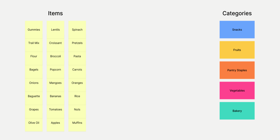
Closed card sorting involves presenting cards with existing items and category names to the participants, and they need to sort them accordingly. While open card sorting helps you figure out how users conceptually group topics, closed card sorting lets you assess your existing categorization structure.
For example, if you were assessing the information architecture for a grocery app, you might have categories like Fruit, Vegetables, and Snacks. After that, the user could sort cards containing items like bananas, tomatoes, and chips according to their category:

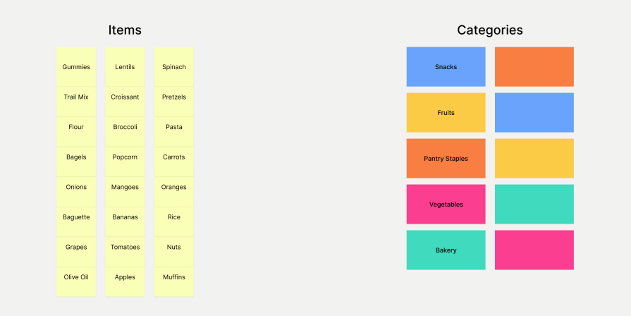
Hybrid card sorting method combines open and closed card sorting methods, allowing participants to group cards into predefined categories as well as create their own ones. You can use this technique if you already have some categories established but are unsure how others should be categorized:

Here’s a summary table comparing these three methods:
| Open card sorting | Closed card sorting | Hybrid card sorting | |
|---|---|---|---|
| Description | Users create their own categories to organize information. | Users sort items into predefined categories | Participants can sort items into set categories or make their own categories. |
| Pros | ✅ Provides deep insights into users’ mental models ✅ Helps discover unexpected or intuitive groupings ✅ Results are not biased by predefined structures |
✅ Validates an existing categorization structure ✅ Faster and easier analysis because of the predefined categories ✅ Useful for testing and refining existing navigation systems |
✅ Offers both open and closed methods ✅ Users can express their preferences while keeping consistency ✅ Balances structure with free-form user input |
| Cons | ❌ Can result in inconsistent categories between participants ❌ Analysis can be time-consuming due to variations ❌ May not work well when a specific structure is needed |
❌ Limits discovery of other user perspectives ❌ Users may struggle if categories don’t match their expectations ❌ Can reinforce biases in existing categories |
❌ More complex to analyze than closed sorting ❌ Can still introduce biases from existing categories |
| When to use | Early-stage UX research for IA; when we want to understand how users naturally categorize information | When refining an existing product’s navigation, or when testing IA before implementation | When you have some established categories but not all, or when performing mixed methods research |
Moderated card sorting is a technique where a facilitator is present, either in-person or online, while participants categorize information. This method helps UX researchers and product designers better understand users because they can interact directly with them, like asking them questions if needed, as well as answering their questions, clarifying misunderstandings, or resolving any other issues.
In unmoderated sessions, you don’t have to be present at the same time as the participants. While this means you can’t interact directly with them, potentially causing you to miss out on crucial insights, it’s a much more flexible and scalable option.
Here’s a quick table comparing moderated vs. unmoderated card sorting:
| In-person card sorting | Remote card sorting | |
|---|---|---|
| Description | Conducted in a physical environment | Completed virtually, often in the participant’s personal environment |
| Pros | ✅ If moderated, can benefit from all the pros of having a facilitator present ✅ Can put participants into groups to see how they collaborate on the task ✅ Environment is focused on the task, preventing distractions ✅ Interacting with physical materials can be more engaging for participants |
✅ No geographical or time limitations, especially if unmoderated ✅ More cost-effective (only software and an optional participation reward) ✅ More scalable and flexible, especially if unmoderated ✅ Information is already available and organized online, making analysis easier |
| Cons | ❌ Involves more logistics, like scheduling or physical location and materials ❌ Data must be collected manually, which can be more work ❌ Typically costs more |
❌ No additional insights from body language and other nonverbal cues ❌ Higher potential for technical difficulties and misunderstandings ❌ May be less engaging and more distracting for participants |
| When to use | For small, focused user groups when deep, qualitative insights or team collaboration is needed | When scalability and speed are priorities, or budget or scheduling constraints exist. Ideal for global research with multiple user bases |
Card sorting can be conducted in person, in a physical environment like an office, or remotely, where participants complete the task on their computers, often in their personal environment such as home. The basic exercise is the same, but let’s look at the pros and cons of each method:
| In-person card sorting | Remote card sorting | |
|---|---|---|
| Description | Conducted in a physical environment | Completed virtually, often in the participant’s personal environment |
| Pros | ✅ If moderated, can benefit from all the pros of having a facilitator present ✅ Can put participants into groups to see how they collaborate on the task ✅ Environment is focused on the task, preventing distractions ✅ Interacting with physical materials can be more engaging for participants |
✅ No geographical or time limitations, especially if unmoderated ✅ More cost-effective (only software and an optional participation reward) ✅ More scalable and flexible, especially if unmoderated ✅ Information is already available and organized online, making analysis easier |
| Cons | ❌ Involves more logistics, like scheduling or physical location and materials ❌ Data must be collected manually, which can be more work ❌ Typically costs more |
❌ No additional insights from body language and other nonverbal cues ❌ Higher potential for technical difficulties and misunderstandings ❌ May be less engaging and more distracting for participants |
| When to use | For small, focused user groups when deep, qualitative insights or team collaboration is needed | When scalability and speed are priorities, or budget or scheduling constraints exist. Ideal for global research with multiple user bases |
There are two more variants of the card sorting exercise you may want to use: reverse, and modified Delphi. For an in-depth look at the Delphi technique, you can check out this article; otherwise, let’s explore these methods using the summary table below:
| In-person card sorting | Remote card sorting | |
|---|---|---|
| Description | Conducted in a physical environment | Completed virtually, often in the participant’s personal environment |
| Pros | ✅ If moderated, can benefit from all the pros of having a facilitator present ✅ Can put participants into groups to see how they collaborate on the task ✅ Environment is focused on the task, preventing distractions ✅ Interacting with physical materials can be more engaging for participants |
✅ No geographical or time limitations, especially if unmoderated ✅ More cost-effective (only software and an optional participation reward) ✅ More scalable and flexible, especially if unmoderated ✅ Information is already available and organized online, making analysis easier |
| Cons | ❌ Involves more logistics, like scheduling or physical location and materials ❌ Data must be collected manually, which can be more work ❌ Typically costs more |
❌ No additional insights from body language and other nonverbal cues ❌ Higher potential for technical difficulties and misunderstandings ❌ May be less engaging and more distracting for participants |
| When to use | For small, focused user groups when deep, qualitative insights or team collaboration is needed | When scalability and speed are priorities, or budget or scheduling constraints exist. Ideal for global research with multiple user bases |
To execute a card sorting session, it is necessary to prepare first by setting the goal and understanding what we want to achieve.
Additionally, you need to prepare with participants and collect all necessary materials and information before starting to ensure we get the most effective results.
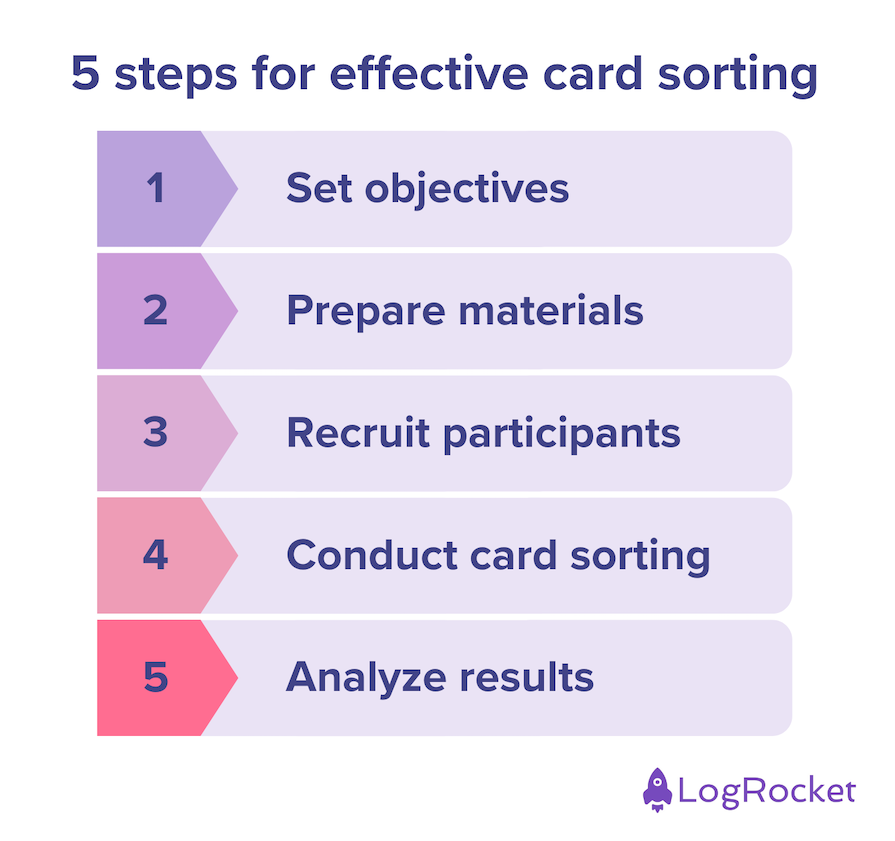
Let’s take a look at how to do it in five easy steps:

Before starting, it is important to ask yourself what you want to achieve. Do you want to understand how to organize categories for the new digital product you’re working on? Are you redesigning a website or testing an app’s navigation?
After choosing what you want to achieve, you need to select the method you will use. For example:
So first, select what you want to achieve, then find the most effective method to achieve it.
What you need to do to prepare depends on which method you choose:
It may help to invite someone else to the session to take notes and help if needed. This person can help you organize the session and ensure it runs smoothly.
You can recruit participants for a card sorting study in different ways:
After that, you’ll need to open a line of communication:
In-person card sorting
Online session
Moderated session
Unmoderated session
Onsite session
Online session
After conducting a card sorting exercise, analyze the data to gain insights into the user’s mental model. Finding common categories and relationships between the different cards from the entire group of participants’ results will help you determine the most effective way to organize the data.
Remember that you can also learn much from the user’s comments and observations you make during the session. These insights will give you valuable context and help you better understand why the participants are thinking in such a way.
Using a spreadsheet app, you can organize the information more accurately and analyze the data more efficiently.
When you use a specific tool for card sorting, you may find that the software has advanced data analysis features. These features can save you time and help you quickly identify patterns and trends. If you want to test some tools with advanced data analysis features, you can look at OptimalSort, UXtweak, and UserZoom.
After analyzing the data, it is important to share your findings with your stakeholders and team. In this way, everyone will clearly understand what insights have been gained and how they can be used to improve the navigation and information architecture of the website or app.
A card sorting method is an easy way to understand how to arrange the information on a website or an application to make it easier for users to find what they’re looking for. This simple method involves organizing cards into categories and can be useful both before and after the product is launched.
You can incorporate card sorting in your UX research in five easy steps:
There are various card sorting methods you can use gain insights about your product’s IA:
Now that you have this detailed guide to card sorting best practices in hand, it’s your turn to leverage this tool in your UX research!
Featured image source: IconScout
LogRocket's Galileo AI watches sessions and understands user feedback for you, automating the most time-intensive parts of your job and giving you more time to focus on great design.
See how design choices, interactions, and issues affect your users — get a demo of LogRocket today.

Zero UI works well for screenless, voice-first experiences, but most digital products still require visual interaction. Here’s why multimodal UX offers a more scalable foundation for the future of design.

Multimodal UX goes beyond designing for screens. Learn how context-aware systems, progressive modality, failover modes, and accessibility-first design create better digital product experiences.

Learn how context-aware mode prioritization and seamless transitions improve multimodal UX and reduce mode confusion.

Research is becoming more democratized, product cycles are accelerating, and AI is transforming synthesis and ResearchOps. Here are the three trends shaping UX research in 2026.