Modals can be useful in a UI, but for all their potential benefits, they also come with some UX risks. In one case, my team launched a modal on a checkout page that showed customers items of potential interest — tailored using data they shared about their preferences and “liked” items — before completing checkout.

This modal drastically increased sales of those suggested items. But at some point, an older customer started bombarding the support department with tickets, complaining that she wasn’t able to check out due to the modal. Support was needed to explain to her, with screenshots, how to close a modal, even though it was intuitive for any regular user.
Potential customers who are not tech-savvy enough to navigate otherwise-intuitive digital products may be a relatively niche user type. However, this experience taught me two things. First, if at all possible, you shouldn’t ignore those niche user types. Second, when you consider introducing a new feature into your UI, you need to carefully think about how that feature might impact UX.
While some features might be beneficial for one segment of your audience, another segment might turn their backs on you if they do not know how to interact with even the simplest interfaces. I always ask people to consider that case before they integrate any new modal, as introducing even one extra modal can risk losing new customers. Given the high stakes, make sure you understand the best practices and intent before you do anything.
That being said, I will break down some lessons from top brands on how to integrate modals effectively, as well as provide some extra examples from my own work to guide you in the process of using modals effectively in your own work, as we know that some modals might actually boost revenue tremendously or solve problems that affect user experience.
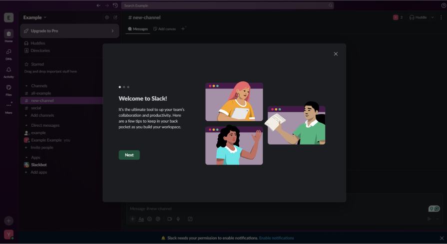
When new users join Slack, they are introduced to the platform through a series of onboarding modals that guide them step by step. Rather than overwhelming users with an information-heavy tutorial, Slack uses short, visually cohesive modals that align with its overall design language. Each modal introduces a specific feature in a digestible way, allowing users to learn at their own pace.
Importantly, users can skip or close the modals at any time, ensuring they remain in control of their experience. This approach creates a sense of friendliness and accessibility, transforming what could be an intrusive onboarding process into a supportive, user-centered introduction.
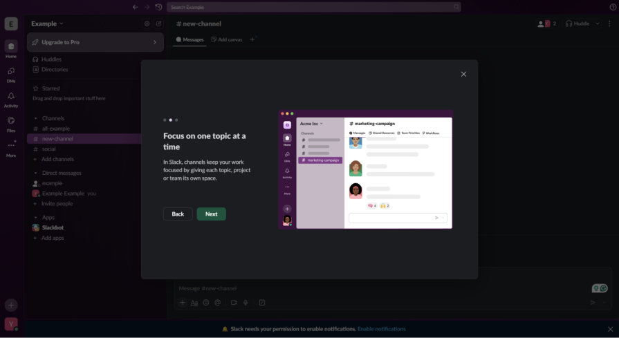
Slack’s onboarding exemplifies guided discovery, a UX approach that teaches users through exploration rather than instruction. By keeping users in control through skip options and self-paced interactions, Slack taps into self-determination theory, which emphasizes autonomy as a driver of user satisfaction.
As soon as you create your first project on Slack, you are greeted with multiple modals that show you what you can do on Slack and highlight a couple of interactive features, like channels. All of the modals are designed to feel like an explanation of a friend who has used the program before and tries to empower you to have a great time using it, too.
Also, all modals are skippable — if you click anywhere, they disappear. An important note is that allowing any action to close the modal may have helped in the example I mentioned earlier about the customer from older generations.
The key takeaway from Slack’s onboarding approach is that guidance should feel empowering, not instructional. The platform demonstrates how modal-based onboarding can reduce friction by focusing on clarity and brevity. Instead of dumping information all at once, Slack’s progressive structure lets users absorb new concepts only when they’re relevant.
The visual harmony between the onboarding elements and the core interface also reinforces trust and comfort, signaling that Slack’s design is intentional and considerate. By respecting user autonomy and attention span, Slack ensures that its onboarding experience enhances rather than interrupts engagement. The additional technical feature of skipping supplementary modals is also important to note, as it can be useful in situations where your potential customers might not be tech-savvy.
For teams designing their own onboarding experiences, Slack’s strategy offers a clear roadmap:
This approach helps build trust and encourages users to explore more confidently.
LinkedIn uses modals to alert users when they’ve reached their connection request limits. While this is an important feature for maintaining platform integrity, the execution can feel abrupt and frustrating. They later introduced less intrusive modals linked to a security system designed to combat the significant exposure of fake accounts and bots on the platform.
The modal effectively stops a user mid-action with little context or empathy, leaving them with no immediate solution other than waiting. A later version could further lead to account suspension or other actions against an account that functions like an automated program. This can make the platform feel restrictive rather than supportive, as regular users could also face the same restrictive messages.
While the intention to prevent spam or misuse is valid, the communication style can come across as punitive, disrupting user momentum and creating unnecessary friction in the experience. However, we can still learn how to structure the modal effectively, as we all know that LinkedIn is one of the most successful companies that exists in the world.
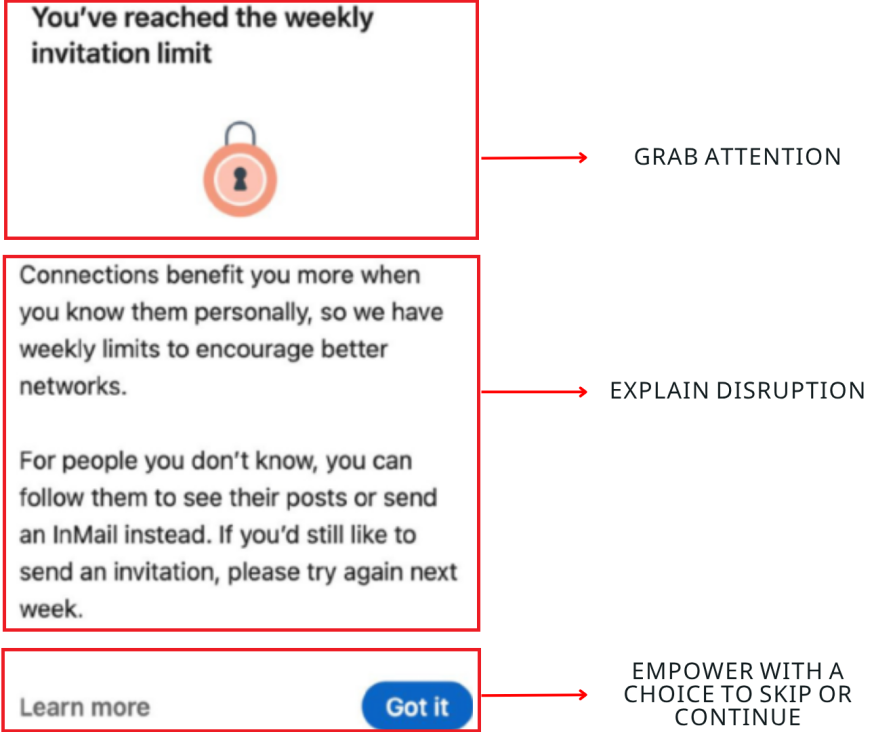
The key takeaway from this case is that restriction modals must be framed with empathy and, at the very least, explain why the user sees the modal. Limiting user actions is sometimes necessary, but the tone and design of the message determine how the restriction is received. If a modal feels accusatory or dismissive, it undermines the user’s trust and engagement.
From a usability standpoint, LinkedIn’s modal violates Nielsen’s heuristic of error prevention vs. recovery — it prevents users from proceeding but offers no recovery path or emotional reassurance. Incorporating emotional design principles here would help transform a punitive moment into a constructive dialogue with the user.
By contrast, empathetic framing, such as acknowledging the user’s enthusiasm or suggesting alternative actions, can turn a frustrating interruption into a constructive moment. Instead of simply saying “You’ve reached your limit,” a message like “You’ve made great progress connecting this week – try engaging with pending invites while your limit resets” feels far more human and encouraging.
For platforms implementing similar restrictions, a more user-friendly approach would include actionable alternatives and positive reinforcement:
These tips still allow you to inform the user of important alerts, but also show them what they can do next, keeping them engaged on your platform. Remember, the more they stay with you, whether it is a SaaS or even a social media platform, the better the engagement, the higher the trust, and the greater the outcome in the long run.
In collaborative tools like Figma, modals are used to confirm critical actions, such as sharing a file, granting edit permissions, or publishing prototypes. These are high-stakes interactions that affect multiple users, and the modal serves as a safeguard against accidental errors.
Figma’s confirmation dialogs are direct yet unobtrusive, providing clear context about what the user is about to do. Rather than interrupting the workflow unnecessarily, they appear only when the action carries significant implications. This helps users stay in control while also ensuring accountability and clarity in shared work environments.
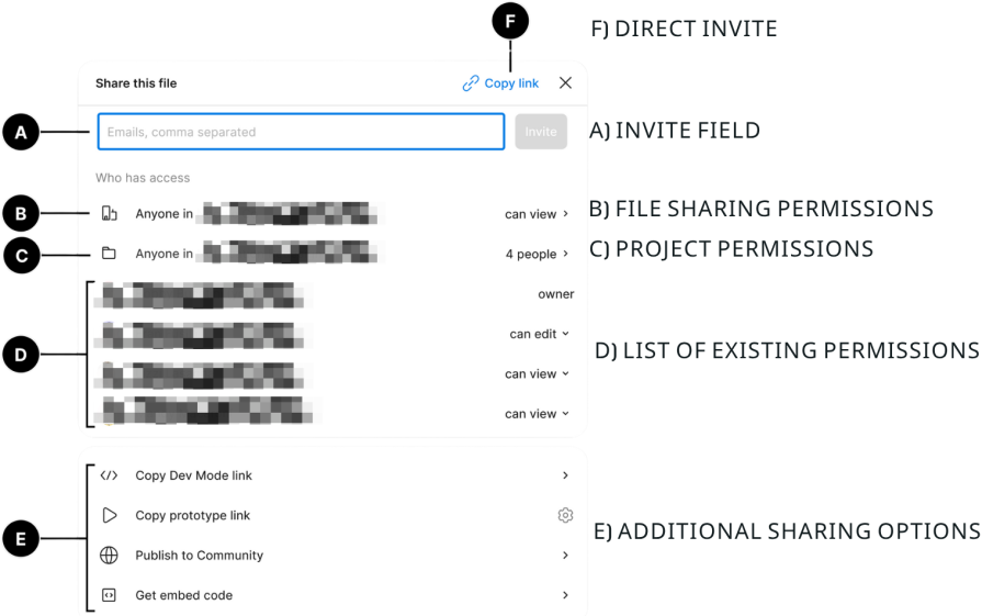
The key takeaway from Figma’s approach is that modals are most valuable when used for confirmation of irreversible or impactful actions. By requiring an explicit confirmation for important tasks, Figma reinforces user intent, prevents errors, and builds trust in the product’s reliability.
These modals don’t feel like interruptions because they appear only when logically necessary, making the interface feel deliberate and predictable. This design choice also reflects the principle of recognition over recall, where users are guided through visible, explicit choices rather than forced to remember complex implications.
In collaborative tools, such transparency functions as a trust signal, reassuring users that the system values accountability and shared awareness. This transparency helps maintain user confidence – when everything else runs seamlessly, these rare pauses to confirm an action remind users that their control and security are prioritized, but their actions might cause critical changes that will affect multiple parties or some projects on a higher level than usual.
For designers, the actionable insight is to use confirmation modals judiciously and design them for clarity:
In this way, modals serve not just as a security measure but also as an essential trust-building mechanism within collaborative digital ecosystems.
Across platforms like Slack and LinkedIn, we see that modals can either help users navigate complex systems or disrupt them entirely.
Slack’s onboarding experience proves that when modals are used gently, offering skippable, visually cohesive steps, they can enhance learning and confidence. In contrast, LinkedIn’s connection limit modal shows how restrictive language or abrupt design can frustrate even experienced users.
The key is to treat every modal as part of a conversation, not a command. Before adding one, consider who your users are and how familiar they might be with your interface. Remember the older customer in the checkout case: even one unnecessary layer of friction can push someone away.
To make your modals feel like friendly guides rather than barriers, keep in mind:
LinkedIn’s restriction modals highlight an important truth: even when a modal serves a valid purpose, such as preventing spam or misuse, poor tone and framing can turn it into a source of irritation.
Where Slack’s modals empower, LinkedIn’s can occasionally feel punitive, especially when they appear without clear explanation. Yet, both examples underline the importance of communicating intent.
A modal that interrupts should still feel considerate, transparent, and solution-oriented. This is especially vital when the message involves limitations or restrictions.
To balance necessary friction with empathy, consider the following principles:
When handled thoughtfully, even limiting modals can reinforce reliability and fairness — turning potential frustration into a moment of reassurance.
While Slack’s modals build confidence and LinkedIn’s must balance restriction and tone, Figma demonstrates the ideal case for confirmation modals.
In collaborative platforms, where a single action can affect multiple users or entire projects, modals act as a safety net. Figma only uses them when absolutely necessary, confirming irreversible actions like sharing files or publishing prototypes, ensuring they feel purposeful rather than intrusive.
The difference lies in intentionality: modals that appear sparingly and at meaningful moments enhance user trust, while constant interruptions erode it.
To ensure confirmation modals contribute to clarity rather than clutter, focus on:
When executed like Figma’s, confirmation modals remind users that the system values their control and awareness, proving that even brief interruptions can strengthen trust when they serve a clear, protective purpose.
While Slack, LinkedIn, and Figma show that modals can be powerful when used thoughtfully, not every situation warrants one. The line between helping and hindering users often depends on urgency, importance, and disruption.
Slack’s onboarding modals work because they appear at a natural learning moment, while Figma’s confirmation dialogs are justified by the weight of their actions. But when information is non-critical, persistent, or easily reversible, a lighter pattern may preserve flow and reduce cognitive strain.
The goal is to maintain visibility and clarity without taking control away from the user. When the message doesn’t need to interrupt or pause the user’s journey, consider more subtle UX patterns, such as:
Ultimately, modals serve best when something critical, irreversible, or deeply informative must occur, as seen in Figma’s confirmation dialogs or Slack’s guided onboarding. For everything else, lighter interaction models like banners, drawers, or toasts maintain flow, reduce frustration, and make your design feel more humane.
Knowing when to step down from a modal isn’t just a stylistic choice — it’s a sign of empathy for your users’ momentum and mental focus.
Before using modals, apply a quick heuristic evaluation: assess if the modal truly serves the user’s goals or primarily the business’s. Evaluating through the lens of user control, feedback, and visibility of system status ensures your decision supports usability, not disruption.
Use this checklist before designing or approving any new modal. Answer each question honestly — if you find yourself saying “No” more than a few times, it’s probably time to explore lighter alternatives like banners, drawers, or toasts:
“Do I actually need a modal for this interaction?”
| 1. Impact & risk level | Does this action have serious or irreversible consequences (e.g., deletion, payments, access sharing)? | Use a confirmation modal – users need clarity before committing. | Skip the modal – a lighter inline confirmation or toast is enough. |
|---|---|---|---|
| 2. Security or compliance requirement | Does the user need to explicitly consent, verify, or confirm something for security or legal reasons? | Use a modal – focus on trust, visibility, and authentication. | Use inline disclosure or an info banner if consent is ongoing or low-risk. |
| 3. Timing & interruption justification | Is this happening at a natural pause or context switch (like Slack’s onboarding modals)? | Good – user attention is available, proceed with a modal. | Avoid – mid-flow modals break focus; use side panels or in-place hints. |
| 4. Information urgency | Does the message require immediate acknowledgment or a decision to continue? | Modal is justified – it ensures visibility and prevents progress until addressed. | Use passive notification patterns (banners, toasts) that don’t block progress. |
| 5. Cognitive load & clarity | Is the information short, actionable, and easily understood at a glance? | Modal can enhance focus and reduce ambiguity. | If the content is complex or long, use drawers or separate screens instead. |
| 6. Frequency & fatigue | Will users see this modal rarely and only when necessary? | Good – rarity preserves impact. | Avoid – frequent modals lead to fatigue; integrate info inline. |
| 7. User autonomy | Can users easily dismiss, skip, or defer the interaction? | Safe – respects control. | If not, replace with less intrusive pattern (banner, inline prompt). |
Quick checklist:
“If not a modal, which UX pattern fits best?”
| Inline banner/notification | For low-priority info or general status updates | Payment reminder, “Your profile is incomplete” | Non-blocking, keeps the user in context |
|---|---|---|---|
| Tooltip/hover card | For contextual explanations or onboarding hints | Explaining icons, form fields, or new features | Lightweight and non-disruptive |
| Side panel/drawer | For multitasking or secondary tasks | Editing settings, reviewing details | Keeps the main screen active; good for productivity |
| Inline expansion (dropdowns / accordions) | For optional or detailed content | Advanced settings, FAQs | Maintains continuity; avoids interruption |
| Toast/snackbar | For instant feedback or confirmations | “Message sent”, “Saved successfully” | Temporary, self-dismissing; minimal disruption |
| Embedded confirmation (inline) | For small, low-risk confirmations | Deleting a comment, saving a draft | Feels seamless and integrated |
Quick selection rules:
Modals are among the most high-stakes elements in UX, capable of guiding users through critical moments, preventing their critical errors, or derailing their flow entirely. The difference lies in execution.
As Slack and Figma demonstrate, clarity, timing, and user autonomy can transform an interruption into a helpful guide. Figma shows how modals safeguard high-stakes actions, while LinkedIn reveals the risks of framing them too harshly.
The lesson is clear: modals succeed when they respect intent, provide context, and keep users in control. For designers, this means testing relentlessly, measuring impact, and learning from both positive and negative patterns.
In practice, the best modal strategies emerge from iterative usability testing and data-driven design, where engagement metrics and qualitative feedback guide refinement. Combining empathy with evidence ensures that every modal decision enhances both user satisfaction and business outcomes.
The next time you face the choice between a modal or an alternative, use these principles to make intentional, user-centered choices.

LogRocket's Galileo AI watches sessions and understands user feedback for you, automating the most time-intensive parts of your job and giving you more time to focus on great design.
See how design choices, interactions, and issues affect your users — get a demo of LogRocket today.
Adaptive interfaces personalize experiences using behavioral signals and machine learning. But when personalization becomes autonomous, systems can reinforce patterns, limit discovery, and shape user behavior in ways designers didn’t intend.
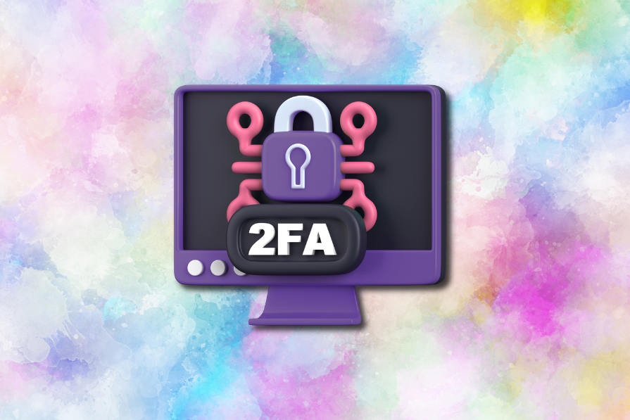
Security requirements shouldn’t come at the cost of usability. This guide outlines 10 practical heuristics to design 2FA flows that protect users while minimizing friction, confusion, and recovery failures.
2FA failures shouldn’t mean permanent lockout. This guide breaks down recovery methods, failure handling, progressive disclosure, and UX strategies to balance security with accessibility.
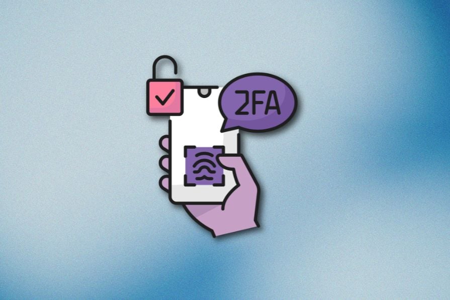
Two-factor authentication should be secure, but it shouldn’t frustrate users. This guide explores standard 2FA user flow patterns for SMS, TOTP, and biometrics, along with edge cases, recovery strategies, and UX best practices.

 Learn more →
