Designers generally design modern buildings, interiors, gardens, and products primarily based on two design philosophies: minimalism and maximalism. Minimalism and maximalism offer opposite concepts for product design with different ways to handle space, structure the layout, and design aesthetics. Because of this, each design concept affects user emotions differently.

Minimalism, a popular design concept in modern digital product design recommends designers create simple, calming, UIs by reducing complexity. Meanwhile, maximalism competes with the minimalistic design concept by recommending the opposite — motivating designers to create strong, bold, and powerful UIs by increasing complexity.
In some design scenarios, maximalism offers more benefits than the popular minimalistic approach, so you should at least become familiar with maximalism as a bold alternative to minimalism.
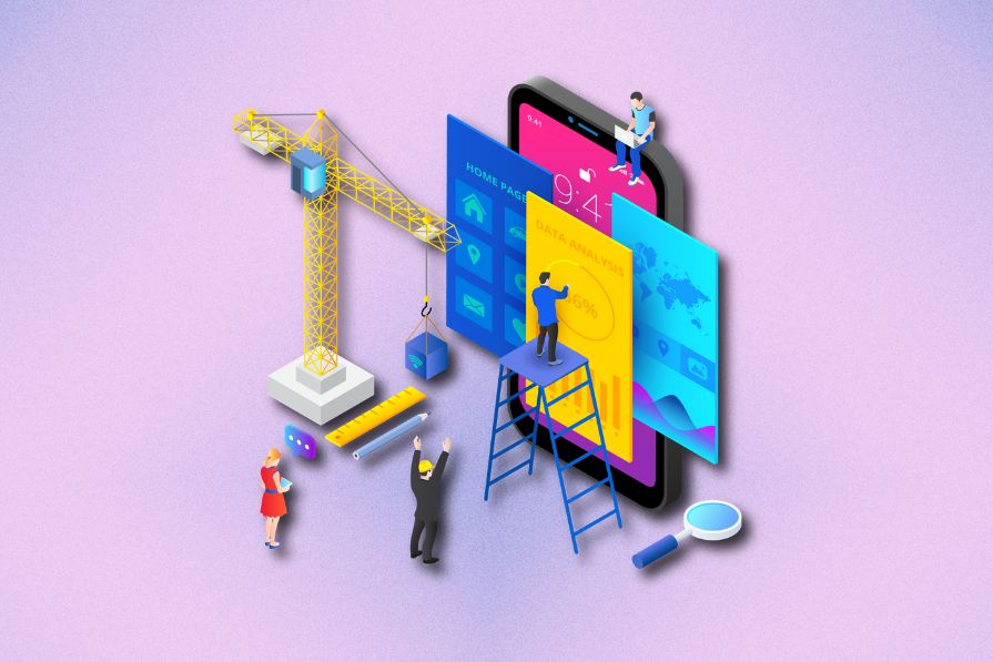
This article explores the benefits and challenges of maximalism in UI design and compares it with minimalism. You’ll also learn when to use the maximalist approach and evaluate some well-designed maximalist UI designs in popular digital products.
Maximalism is a design philosophy that uses “more is more” as the fundamental design rule to eliminate empty spaces in design viewports by filling them with vivid patterns, colors, imagery, and other elements. It uses increased complexity and visual richness as design techniques to create strong, active, colorful, and memorable product interfaces.
The minimalistic design approach recommends designers reduce details in design to achieve simplicity, but the maximalist approach recommends increasing design details to prioritize abundance over scarcity:

Maximalism uses increased complexity as a fundamental design rule and the following principles to create active, powerful UI designs:
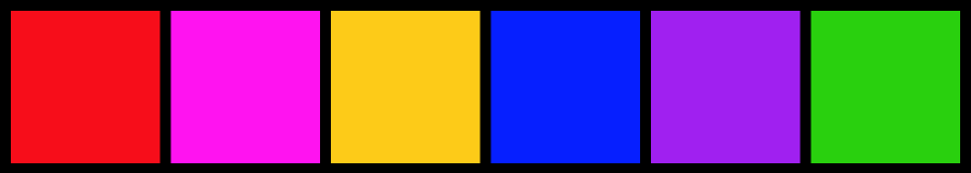
Colors are the fundamental building blocks of any UI design. Without a proper color arrangement, you can’t effectively perceive product interfaces. Maximalism uses vibrant colors so users perceive the designs as colorful, active, and powerful visual surfaces.
Colors undoubtedly affect human emotions and change the entire digital product experience. Designers often select vibrant colors associated with creativity, energy, confidence, and entertainment like red, orange, pink, yellow, blue, purple, and green with maximalist UI designs. Most maximalist designs use slightly shaded versions of these colors to make eye-catching, but eye-comfortable color types.
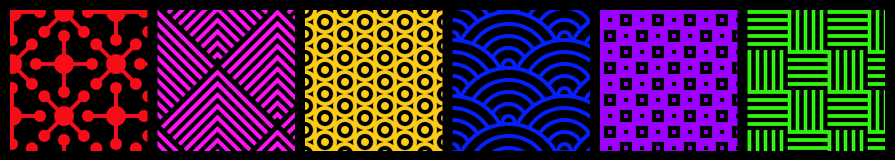
Maximalism doesn’t recommend keeping empty spaces in UI design since empty regions add simplicity and break the fundamental abundance rule of the maximalist approach. So, maximalist designs often increase complexity in empty, neutral regions using eye-catching and repetitive patterns.
Designers typically use motifs, repetitive shapes, image-based textures, drawings, and textual patterns as common maximalist background patterns. Maximalist patterns also use vibrant colors to highlight graphic details and adhere to the maximalist color selection principle.
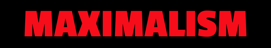
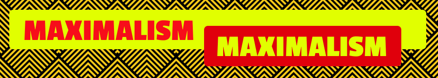
Typography styles can control the strength of textual segments. Maximalist designs have energetic and powerful themes, so designers lift the tone in textual segments by often using capital letters and bold text styles. Maximalist designs use fonts that offer large, solid letters to include large text segments in a powerful tone.
When working with maximalism, you use large, filling text segments to cover available space optimally by increasing design surface complexity with typography styles.
The complexity of a paint can be increased by drawing multiple layers. Similarly, the maximalist approach recommends using multiple layers to construct a complex UI surface. Maximalist design layers are typically stacked together to represent a three-dimensional-like view on the two-dimensional user viewport.
In this design style, UIs go beyond the standard, simple layout concepts, like linear, flex, and grid-based, and motivate designers to innovate without sticking to a specific layout system. For example, most maximalist designs use absolute positioning to place layers on top of other layers creating complex layout systems.
Imagery like photos, illustrations, diagrams, and icons are common, frequently used elements in modern UI design. Like you carefully modify imagery to match the digital product theme or domain, designers should adjust the richness in imagery to match the maximalist design philosophy.
Maximalism promotes complexity, energy, and confidence, so designers choose detailed and powerful imagery for maximalism-based UI designs. For example, a maximalist website design uses a detailed, colorful, powerful header image rather than a neutral, calming one.
Using maximalism in UI design provides benefits for users, designers, organizations, and the product brand because of the following advantages:
You usually remember and have nostalgia for happy, joyful, and active moments of life. Maximalist designs use vibrant colors and creative aesthetics to step outside professionalism and create memorable user experiences.
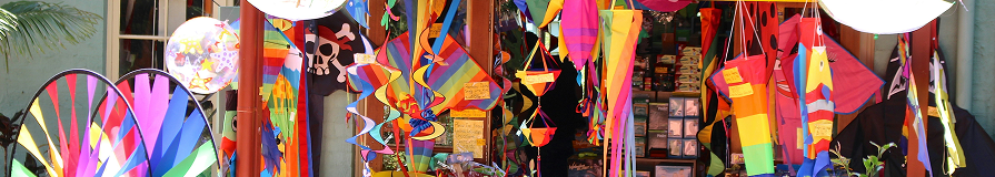
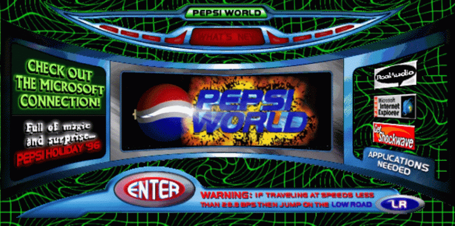
For example, almost all 90s websites followed somewhat old-fashioned maximalist design approaches with eye-catching flashing banners, image-based buttons, and colors and created a nostalgic experience for everyone:
If designers try to be creative using complex, colorful illustrations and artistic surfaces, the minimalistic approach loses its fundamental design rule: simplicity. Maximalism welcomes complex patterns, colorful surfaces, and aesthetics, so designers can use their creative design skills without boundaries under the maximalist approach.
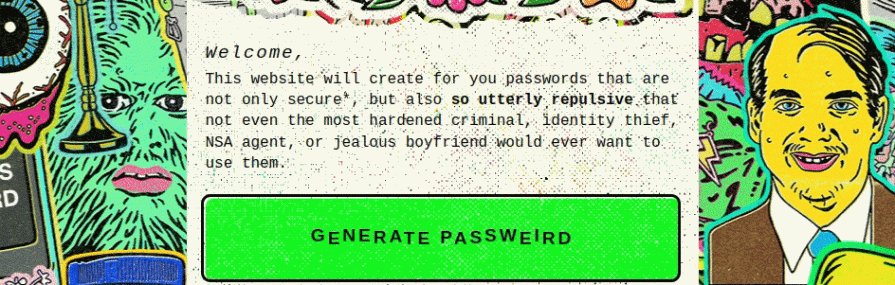
See how the Passweird website (a password generator tool) uses creative colorful, energetic backgrounds and creative, memorable animations:
Using a too-professional, standard design approach makes an entertaining theme weaker. For example, imagine the effectiveness of using a standard, calming corporate website template to design a landing page for a comedy show.
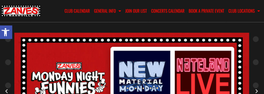
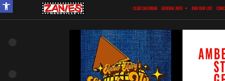
Maximalist design principles create a natural theme for entertainment, strength, and creativity, so designers can effectively use maximalism in such design scenarios. For example, see how maximalist design principles create a better theme for Zanies Comedy Club’s website:
Businesses use branding and marketing strategies to attract customers. Effective, eye-catching, and memorable branding and marketing undoubtedly help companies to enter the market with a good first impression.
Maximalist designs stand out over calming, formal, and neutral designs. Maximalist color themes and aesthetics can effectively represent the brand through the product and can create eye-catching, effective marketing materials.
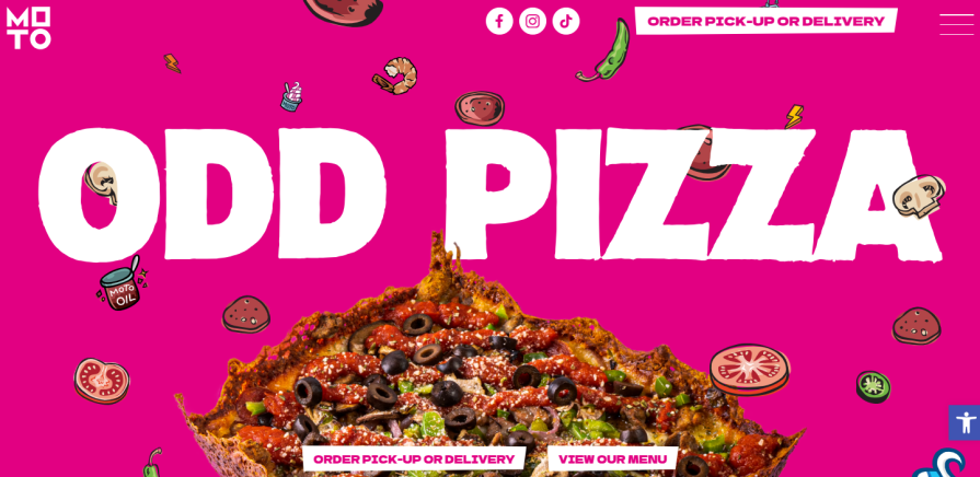
See how the MOTO Pizza website’s maximalist, marketing-friendly color theme helps create an effective food-themed website:
Increased UI complexity and energetic themes in maximalism can negatively affect the UX of a digital product. Because of this, keep an eye out for these common challenges:
Digital accessibility motivates designers to carefully design digital products for large user groups who access the product with different abilities and from various devices. Every user is different.
Some users are sensitive to colors, and some users struggle to read strong, bold typography comfortably. Some users can’t easily focus a specific region on complex, colorful UI designs. Meanwhile, some users have visual problems that prevent them from perceiving vibrant colors properly.
As a good designer, you should help everyone to productively use your digital products even if you follow maximalism as the foundational design concept.
Here are some ways to offer better accessibility factors from maximalism:
Most maximalist websites use an accessibility toolbar to turn off vibrant colors and use readable fonts. Both Zanies and MOTO Pizza websites integrate the popular WordPress one-click accessibility toolbar:
Maximalist UI design complexity can negatively affect usability since it can slow down users from achieving their goals. Besides reducing the maximalist design characteristics, you can reduce complexities in interaction design (IxD) while keeping maximalist visual complexity.
For example, you can gain usability in maximalist designers by reducing user interaction points and removing excessive features — taking a maximalist approach to UI design but minimalist in interaction design.
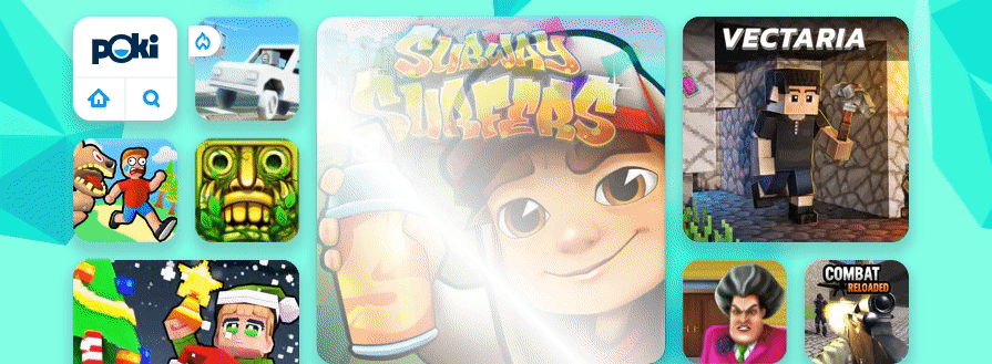
See how Poki, an online game store, implements a maximalist frontend with a few additional features than letting users play, like or dislike games:
Maximalist style doesn’t complicate the low-fidelity prototype design since you can ignore complex layers, patterns, and colors at the low-fidelity design stage. However, high-fidelity prototypes should be real-product-like ones, so you should include maximalist features in high-fidelity prototypes.
Design complexity in maximalist style can slow down designers’ work. Moreover, developers also may face problems while re-creating the exact high-fidelity prototype in the development environment of the real digital product.
Here are some ideas to solve design/development task complexities:
Maximalist designs go beyond formal, professional themes and create energetic, memorable, and entertainment-focused product interfaces. So, maximalism isn’t suitable for domains where you should use a professional, formal, and corporate design, such as higher education, finance, business, healthcare, law, government, etc.
Maximalism works effectively for creativity, entertainment, and culture-related product designs.
Here are some example use cases where you can consider using maximalism:
Maximalism is generally a good choice if you want to step outside traditional corporate design themes and create a memorable experience using creativity and complexity as design fundamentals.
Optimally select the best design philosophy for your next digital product design by comparing maximalism and minimalism from the following table:
| Comparison factor | Maximalism | Minimalism |
| Design philosophy | “More is more” — uses abundance and visual richness | “Less is more” — uses simplicity and calmness |
| Colors | Vibrant and energetic | Neutral and calming |
| Empty spaces | Filled with vivid patterns and vibrant colors | Often filled with white/black (based on the device’s theme) or neutral colors |
| Typography | Strong, bold, and stylish | Clear, thin, and clean |
| Imagery | Powerful, complex imagery that adheres to maximalism | Neutral, simple imagery that adheres to minimalism |
| Layers and layout | Promotes multi-layer, complex layout with absolute positioning | Promotes plain, simple, standard layouts like linear, flex, and grid |
| Effect on usability and accessibility | Can negatively affect usability and accessibility, but can be controlled with design adjustments and accessibility toolbars | Offers better usability and accessibility factors |
| Average implementation workload for designers and developers | Moderate | Minimal |
| Suitable for | Scenarios where you step out professionalism and explore creativity freedom | Scenarios where you should design with professionalism |
These designs of popular products effectively use maximalism as the fundamental design concept:
Dirt 5 is a popular racing video game developed by the Codemasters game development company. Dirt 5’s official landing page uses a maximalist design because of its entertainment theme and the energetic colors used in the car models and objects of the game:
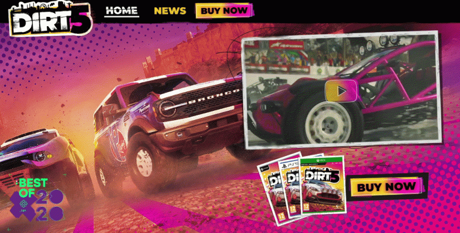
Notice the following maximalist design facts of this landing page:
Overall, the Dirt 5 video game landing page implements a somewhat heavy-maximalist surface for users with vivid colors and complex patterns but simplifies interaction points.
BEHAVE is a low-sugar candy brand. The BEHAVE official website uses a maximalist design approach to create a suitable, memorable design for candy lovers:
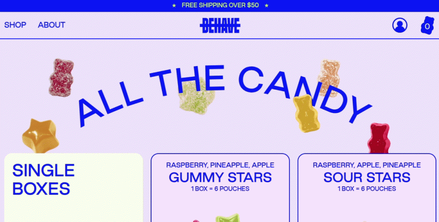
Notice the following maximalist design facts used in this website frontend:
Overall, the BEHAVE website implements a maximalist design with most maximalist principles, but it avoids complex patterns and uses empty spaces for better accessibility.
When you push your fundamental design style towards the minimalist side, the product interface becomes more calming, neutral, and corporate-friendly. On the other hand, pushing to the maximalist side creates more energetic, creative, and complex product interfaces. Pure minimalist pages can create user engagement issues and heavy maximalism can overwhelm users with too many visual details.
Most modern websites adhere to maximalist design principles while using minimalist designs.
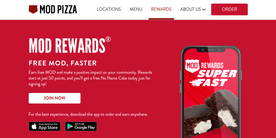
For example, the MOD Pizza website uses maximalist typography and colors but uses a minimalist layout, as shown in the following preview:
This article covered the maximalist UI design concept by discussing maximalist design principles, benefits, challenges, and suitable usage scenarios. You also saw practical design examples that effectively use the maximalist approach to create a better visual impact.
Maximalism offers a practical way for you to freely use your creativity to impress users with memorable, energetic, and powerful digital product interfaces. However, using heavy, complex maximalism can affect usability and professionalism. Make sure to balance maximalist characteristics within minimalist designs for corporate-friendly designs.

LogRocket's Galileo AI watches sessions and understands user feedback for you, automating the most time-intensive parts of your job and giving you more time to focus on great design.
See how design choices, interactions, and issues affect your users — get a demo of LogRocket today.

AI has accelerated design execution, but speed can come at the expense of intentionality. Learn how UX teams can preserve product thinking and judgment.
UX testing is not limited to layouts, copy, and visual design. Full-stack and server-side experiments help teams evaluate how backend logic, APIs, algorithms, and product flows affect the overall user experience.
In A/B, A/B/n, or multivariate testing scenarios, using p-value with traditional null-hypothesis-based statistical analysis is so common, and most designers […]
Traditional A/B testing splits traffic evenly, but multi-armed bandits dynamically send more users to the better-performing version. Here’s how the method works, where it helps, and when UX teams should use it over classic A/B testing.

 Learn more →
