Designers, take your mockups to the next level: learn how to create visually stunning mockups with Figma.
A website mockup is a visual representation of a website’s layout, design, and content. It is typically created using design software such as Figma or Sketch and is used to showcase the website’s design to stakeholders and clients, as well as to plan and organize the website’s development.
A mockup is not a functional website, but it allows designers, developers, and clients to get a sense of how the final website will look and feel and helps them to identify and solve any design problems before the website is built.
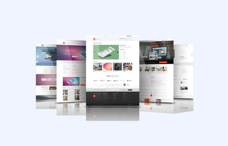
Now that we understand what a mockup is, let’s examine why it is important to create high-quality mockups.
Before a design is approved by a client or a company’s stakeholders, we need to show a mockup or prototype to demonstrate the results of our work. Typically, this presentation highlights the visual aspect of the website, as well as the primary tasks users will be able to do with the newly designed website. This is usually done in a meeting where a presentation is given to explain the entire design process, leading up to the final concept, which is a visual representation of the website.
A prototype can be a mockup brought to life by adding interactions, animations, and basic functionality to the static layout. It can be used for usability testing to gather feedback and make improvements before the final website is built. A prototype can be created with the same tools used to create mockups or with specialized prototyping software such as Adobe XD, Figma, or InVision.
A prototype is important for many reasons. The foremost reason is to showcase the website to developers, clients, and stakeholders, from which we can gather feedback. This feedback can be used to make improvements to the website or to validate the concept before moving on to the development stage of the process.
The second benefit of creating prototypes is to use them for usability testing. By checking with potential users, we can identify any usability issues with the concept. It’s better to find any issues with a prototype than with a fully built website because catching usability issues early can save a significant amount of time and money for the company in the long run.
Overall, a prototype is an essential step in the design process to ensure the creation of a high-quality and user-friendly final website.
A mockup is the closest visual representation of a real website, which helps the architects of the ecosystem understand how to build it. Frontend developers need to know exactly what to bring to life, and having a detailed mockup will help them with the closest experience. Providing a prototype will also help backend developers understand the interactions they need to build through the website.
Think of a website as an ecosystem that has a visual aspect built by frontend engineers that connect some parts of the website to endpoints built by backend engineers. These connections make the website complete the actions taken by users.
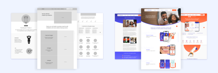
When it comes to the visual representation of a website, there are three important steps to take in the process. First, we need to create the skeleton of the website, a concept that we call a wireframe. Second, we need to put skin to our skeleton, a concept that we call a mockup. Finally, we give life to this body with a concept we name prototypes.
A website mockup is built on an artboard, a working area for creating and editing digital artwork. This artboard can be fictionally divided and structured with a layout and a grid.
A layout is the distribution of elements such as text, images, or buttons on an artboard. A layout can be responsive, meaning that all these elements change dynamically based on the size of the screen. A grid is a smaller division, a collection of vertical and horizontal lines used to structure all elements with consistent spacing.
Now we have an artboard that is divided by a layout and a grid to help us place elements across its borders. The elements we can place on it are the following:
To all these elements (text, images, and components) we can apply styles, such as colors, icons, and effects. Styles allow consistency, helping users navigate easily across the website.
In summary, when choosing a mockup tool, it is important to consider the following factors:
One tool that meets these criteria is Figma, a browser or desktop cloud-based software, vector graphics editor, and prototyping tool that allows for real-time collaboration and version control.
Figma is an all-in-one tool for creating wireframes, mockups, and prototypes with the help of design system libraries. It also includes a design system library for creating and managing styles and components. Figma offers a free version for up to three files, a free version for students and teachers, and different plans for individuals and organizations.
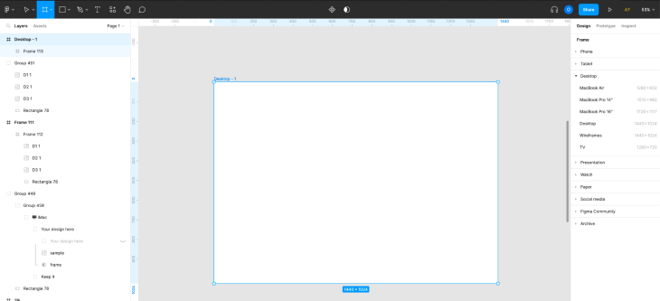
Create a new design file in Figma and navigate to the top left tools panel where you will find a hashtag symbol. Click on it, and a list of artboards will appear on the right panel. As an alternative, press the A key on your keyboard to reveal the same panel.
This is the Frame section, where you will find multiple artboards to choose from such as phone, tablet, and desktop, but you can also find options such as smart watch and social media.
Unfold the Desktop section to reveal multiple options, including the most common sizes of 1280×832 and 1440×1024.
If you prefer to create an artboard with a different size, you can click and drag the mouse to freely create one. Note that you can also customize the size of the artboard even after creating or selecting one.
To create a responsive website, you will need to create a mockup for each of the breakpoints of your layout. Typically, designers have four different layouts: one for phones, another for tablets, and two for small and large desktops.
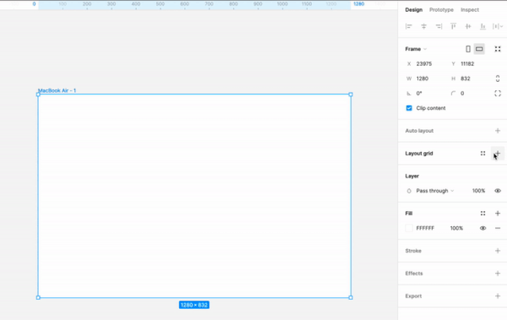
To use the Layout Grid feature in Figma, select the artboard and press the plus button on the left-hand panel tool. After pressing the button, a standardized layout will be applied to the artboard.
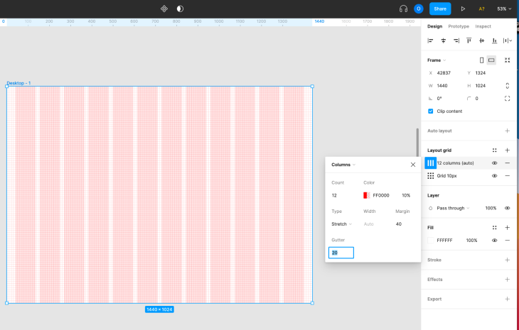
To customize it, click the multiple squares button and a settings panel will appear. On the top, you have a dropdown where you can select whether you want a grid or a vertical or horizontal layout.
Here are some recommendations for creating grids and layouts:
The 8px grid system is widely recognized as the most popular, as it makes it simpler and more consistent to adjust designs. All elements on the web page align to an 8px square baseline grid for various devices such as mobile, tablet, and desktop.
Sizing and spacing of elements on the web page should be in increments of 8px; this includes any defined height or width, margin, or padding. Alternatively, you can use a 4px grid.
A layout consists of multiple columns separated by spaces called gutters. The outer edges of the layout are referred to as layout margins.
The structure of the layout is composed of content blocks, such as the header, navigation, and footer. These blocks of content can span multiple columns and adjust in size with the grid. Ideally, use 12 columns for desktop and 4 columns for mobile.
As you already have a wireframe, it’s time to use it as a reference to create the new website mockup. Some designers prefer to build the wireframe by replacing components one by one on the same artboard, while others prefer to do it in a new artboard. The choice is yours.
There are different options to approach this:
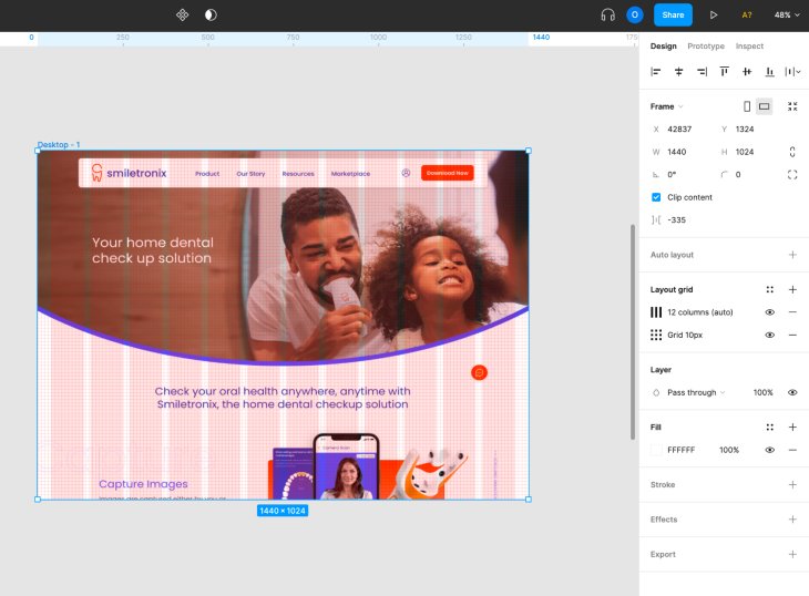
Now that you have a beautiful website in front of you, you are ready for the next steps.
If you are building a responsive website, remember to create the artboards for the other screen sizes. You will just need to reorganize the components across the columns to fit the new screen size.
Have in mind to prepare the assets for development, meaning you need to have images or icons ready to be exported, usually in the form of SVG or PDF.
Finally, remember that now is the time to create prototypes to turn your website into a lively place full of interactions.
Here’s a brief explanation of Breakpoints and Responsively, two Figma plugins for creating responsive mockups:
Both of these plugins can be very useful for creating responsive designs in Figma, and the choice between them may depend on your personal preferences and the specific needs of your project.
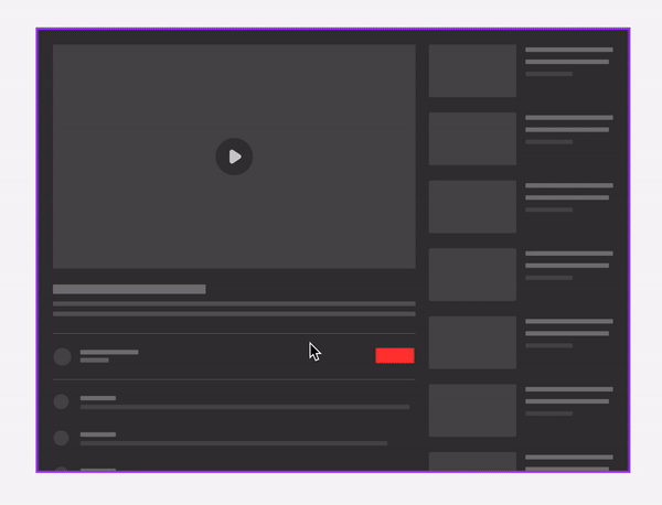
The process of creating a website can be broken down into three distinct steps: wireframing, mockup creation, and prototyping.
By mapping out the user experience with a wireframe, you can establish a clear structure and layout for the website. Next, by creating a visually appealing mockup, you can refine the design and add polish styles to the overall look and feel. Finally, by prototyping the website, you can test and refine the functionality.
Now that you have learned the basic process of creating a mockup from scratch, you can put that knowledge into practice by opening Figma and experimenting with building your first website. Keep in mind that creating a website involves a lot of trial and error, so don’t be discouraged if things don’t turn out exactly as you planned. Instead, take it as an opportunity to learn and improve your skills. And remember, building a website should be fun, so enjoy the process!
LogRocket's Galileo AI watches sessions and understands user feedback for you, automating the most time-intensive parts of your job and giving you more time to focus on great design.
See how design choices, interactions, and issues affect your users — get a demo of LogRocket today.
Multimodal UX goes beyond designing for screens. Learn how context-aware systems, progressive modality, failover modes, and accessibility-first design create better digital product experiences.
Learn how context-aware mode prioritization and seamless transitions improve multimodal UX and reduce mode confusion.

Research is becoming more democratized, product cycles are accelerating, and AI is transforming synthesis and ResearchOps. Here are the three trends shaping UX research in 2026.

Voice support is not the same as multimodal UX. Here’s how to design systems with true mode continuity and context-aware interactions.