One of the most common UI components in product design is the dropdown menu. It’s a flexible component used in various contexts, such as forms, filters, navigation, or settings. A dropdown menu is an essential element in a design system, as it is used in designing apps and websites.

The best part about dropdown menus is their versatility. They can be made simple or complex, depending on the use case.
For most of us, Figma is by far the tool of choice for UI design, according to UX Tools’ 2023 Design Tools Survey. In this article, we’ll look at the elements of a dropdown menu, its different variations, walk through the steps to design a dropdown menu in Figma, including best practices for designing dropdown menus. I’ve also created a Figma template that contains all the components needed for the tutorial.
A dropdown menu is an interactive UI component that presents a list of options when selected. Users can choose one or several options from a dropdown menu, which may result in an action or behavior once the system is informed of the selection.
Some examples of such actions or behaviors can include filtering content, navigating to a different page, changing languages, or opening a modal. Before we begin making the dropdown menu in Figma, let’s get familiar with its different elements.
As with any interactive UI component, a dropdown menu needs a trigger for the user to select to open it. The trigger for the dropdown menu can vary.
In a form, the trigger is most likely a form field, which contains some placeholder text to indicate that the user can select it. In other cases, such as a navigation or context menu, a dropdown menu trigger can simply be a text or icon button:

Dropdown menus use visual indicators that indicate the dropdown menu can be selected, such as a border surrounding a form field, a hover state, or a down chevron.
A chevron is commonly used for dropdown menus, as they point in the direction that a menu will appear. When the dropdown menu is active, the chevron points up, indicating that selecting it again will close the menu:
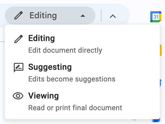
In navigation or context menus, you can use multiple dropdown menus, which enforces the expectation on the user that selecting another menu item will result in a dropdown. In these cases, using a chevron may not be necessary because it takes up additional space. Using a hover state is sufficient for the user to understand that the dropdown menu item is selectable.
Labels help users understand the purpose of the dropdown menu and what types of options they can expect to see. They appear right above the dropdown field in slightly smaller text. Helper text is placed underneath the field to provide error messages or descriptions that might help users with selecting options:

Selecting a dropdown menu triggers a list of options dropping down from the trigger. This list contains selectable items and can be scrollable if the number of options exceeds the space available for the dropdown. The list can also include elements like a search bar to help users find the option that they are looking for:
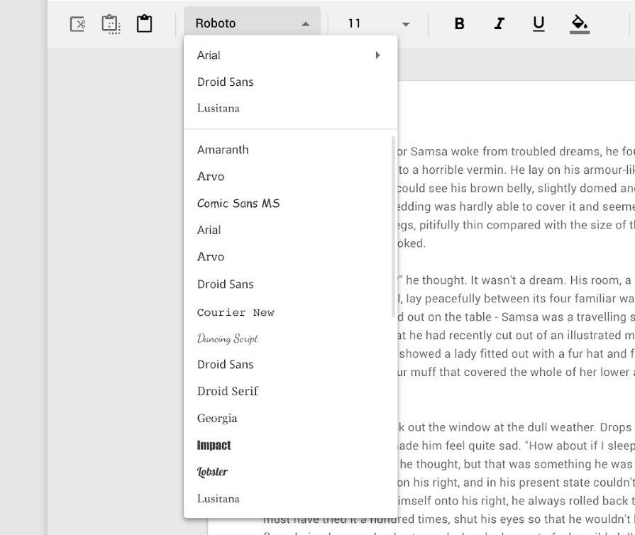
Each row in the dropdown list is a selectable item. Hovering your cursor over a list item results in a highlight to indicate that the item is selectable.
In a dropdown menu, selecting an item closes the menu and shows the user’s selection in the field. To improve searchability, list items can be separated into categories by dividers:
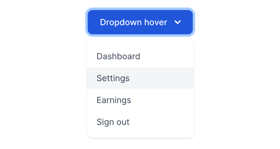
A simple dropdown is the most standard variation of the dropdown menu. It’s used in navigation menus, action menus, or form fields where the user can select one out of a few options:
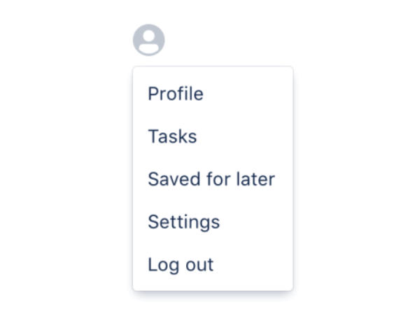
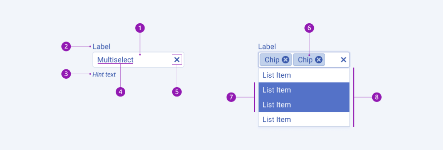
You can use a multiselect dropdown to allow users to select more than one item in a dropdown menu, such as in a filter. Each list item can contain a checkbox to allow for multiselection. However, some multiselect dropdowns highlight each selected row instead of using checkboxes.
In both cases, the form field will update to show the selected items usually as removable tag components, to allow users to easily unselect an option without having to open the dropdown menu again:
A nested dropdown is typically used in complex navigation or action menus to represent a hierarchy of options. The first dropdown menu contains high-level categories, which, when selected, result in a secondary dropdown menu consisting of options within that category:

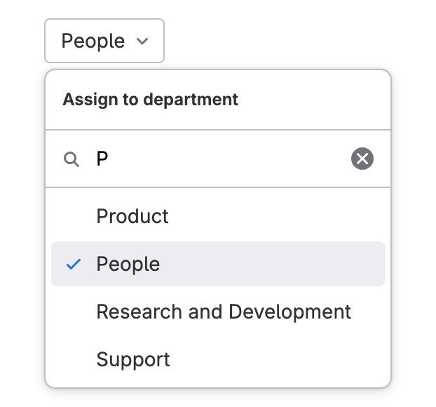
A searchable dropdown contains a search bar fixed to the top of the dropdown list. When the dropdown menu is active, users can use the search bar to type in a search query. As the user types, the list items narrow down to show only the results that contain the search query.
A similar version of the searchable dropdown is the combobox, which uses a text input field to allow users to directly type their search query, which will narrow down the dropdown list:
Now, we’ll walk through how to make a dropdown menu step-by-step in Figma. For this example, we’ll create a dropdown menu used for a form field, including both single selection and multiselection. We’ll also create customizations, such as nested dropdowns, a search bar, headers, and dividers.
First, let’s start by creating the trigger first, then the list items, which when combined will make the dropdown list.
The trigger for the dropdown menu will be a select component. Add a frame to your Figma file with a 250px width and 44px height. This will be the base of your dropdown field. Give the frame a white fill and a 1px gray stroke.
Next, add auto layout to the frame. Ensure that the layout selection is horizontal. Set the gap to auto and alignment to the center, then set the horizontal and vertical padding to 10px. This will allow us to neatly space out the contents of the field.
Add 16px text to the frame as placeholder text for your dropdown field. Then, add a down chevron icon to the frame as well. The auto layout should align the text to the left and the icon to the right of the field:
To include a label and helper text, add text in a smaller font, around 12px, above and beneath your dropdown field. Use auto layout to evenly distribute the label, dropdown field, and helper text 4px apart, while aligning them to the top left.
Now, you’ve completed making the filled state of your dropdown field:
Make a copy of your filled state dropdown field. When the dropdown field is active, the border should indicate that it is currently open. Change the border color of the dropdown field’s frame to a different color, like blue. Change the down chevron icon to an up chevron icon, or simply rotate it 180 degrees. The chevron should indicate the direction that the menu would move if the dropdown field is selected. When it is open, clicking the dropdown field would close the menu.
To create the error state, make another copy of your filled state dropdown field. An error state usually highlights the field in red, so change the border color to red. Change the helper text color to the same red, as this is where you would place your error message:
Finally, a form field needs a disabled state in the event that the action is not enabled for the user. Make another copy of your filled state dropdown field and change the fill color to gray. Then, change the color of the text inside the dropdown field to a darker gray. This will indicate to users that the field is unselectable:
Now that your four states are completed, select all of them and create a component set. This will make each of them a variant of the same component, which will allow you to easily switch between variants when you apply an instance of the component in your designs.
Name your main component Dropdown. Create a property for your component called State and name each variant accordingly, such as Filled, Active, Error, and Disabled:
You might want an instance of the dropdown field without the label or the helper text, or both. Copy each variant and hide the label. Then copy them again and hide the helper text.
Finally, copy them again and hide both the label and helper text. Add properties to your main component for Label and Helper text, with Yes or No assigned accordingly. This will make it easy to turn on and off the label and helper text in your instances:
Since we want the ability to multiselect from this dropdown menu, we’ll need to add a tag component to the dropdown field, which indicates the number of items selected. This tag should have an X icon beside the number to allow users to clear their selection without opening the dropdown menu:
Make a copy of all of your Filled, Active, and Error variants within your component set. The Disabled state won’t need a multi-select variant as a disabled dropdown field would just show the placeholder text.
In each field, add the tag next to the placeholder text. Add the tag and text into an auto layout frame with a 4px gap between items so they remain aligned to the left, while the chevron icon remains aligned to the right.
Finally, add a property to your main component called Type. Assign the variants as Simple or Multiselect accordingly. Now that we’re finished creating the dropdown trigger, let’s move on to the list items:
Our dropdown menu list will have a few item variants to accommodate for different use cases. Whether your designs need a simple dropdown, multi-select dropdown, nested dropdown, or search capabilities, we’ll create the necessary list items to make a flexible dropdown menu.
Similar to the dropdown field, each list item should have the same dimensions. Add a frame with a 250px width and 44px height. Set the fill to white.
Next, add auto layout to the frame. Ensure that the layout selection is horizontal. Set the gap to 0px and alignment to the left. Set the horizontal and vertical padding to 10px, just like we did with the dropdown field.
Add 16px text to the frame as placeholder text for your list item. You’ve just created the default list item:
To indicate that the list item is selected, change the placeholder text to a different color, such as the blue that was used for the dropdown field’s active state. The placeholder text should also use a heavier font weight, like Semi Bold or Bold.
But simply changing the font may not be enough to make the selected list item noticeable. Add a checkmark icon to the item, while setting the frame’s gap to auto and alignment to the center. This will align the placeholder text to the left and the checkmark icon to the right:
Now, let’s create a checkbox list item for our multi-select dropdown menu. Make a copy of the default list item and add an unchecked checkbox icon to the left of the placeholder text. Add auto layout around the icon and text with a 4px horizontal gap between items. This will keep them evenly spaced and aligned to the left side of the item:
For the selected state of the checkbox list item, apply the same treatment to the placeholder text as the default selected one. Bold the text and change the text color to blue. Replace the unchecked checkbox icon with a checked checkbox icon, also filled in blue:
The category list item will be used to open nested dropdown menus. Simply make a copy of the default list item, and add a right chevron icon to the frame. Ensure that the auto layout gap is set to auto and alignment to the center, so that the text remains aligned to the left while the icon is aligned to the right:
For each list item that you’ve created so far, make a copy. Replace the fill with the same blue color, but adjust the opacity to 10 percent. This will give the list item a highlight to indicate that it is selectable when a cursor hovers over it:
If your list is complex and can benefit from having separate sections, use a header list item to name them. This item is not selectable and will not have a hover state. To create it, simply make a copy of the default list item and bold the placeholder text:
The divider is used for separating your list into sections. It’s simply a horizontal line with a 250px width. Add an auto layout frame to it with a 1px vertical padding and align it to the center:
The search bar is an optional list item that lives at the top of the dropdown list. Using the base frame of 250px width and 44px height, set the auto layout padding to 4px on all sides. Then add another frame inside of it with a gray stroke border and 4px corner radius. Set the horizontal and vertical resizing to Fill. This is the container for the search bar.
Next, add auto layout to the search bar frame. Using a horizontal layout, set the gap between items to 8px and alignment to the left. Set the horizontal padding to 10px. Now, the content of the search bar will be spaced properly.
Add a search icon around 20px wide and tall into the search bar frame. Next to it, add in placeholder text that says Search. Both the icon and text should be in light gray:
When the search bar is active, the search icon disappears. The light gray placeholder text is replaced by input text, which uses the default text color. Add an X icon to allow users to cancel their search query. Set the auto layout gap to auto and alignment to center, so that the text remains aligned to the left while the cancel icon is aligned to the right:
By selecting all of the different list items you just created, create a component set to make each of them a variant of the same component. Name your component set List-Item:
Now that you have your list item variants created, it’s time to put them all together into a list. The order in which you add the list items doesn’t really matter, as they can all be swapped with each other. However, the search bar should always be at the top.
Add 10 to 15 instances of the list item and add auto layout to them. You can hide some of these items for additional flexibility if your designs require it. Ensure that the layout is vertical and the vertical gap between items is set to 0px. Create the frame into a component called List. Change the list item variants to the ones that you want. The possible combinations are endless.
Give your list component a white fill, so that the background color shines through the hover state list items. Finally, add a gray stroke and a drop shadow, as it will appear on top of other elements on the page. This will create a sense of depth and separation to make the dropdown list easier to read:
Now that we have our list component created, let’s revisit our dropdown component. We want to add an instance of our list component to each Active state variant of the dropdown component, so that we not only have an active dropdown field, but also the dropdown menu.
Select each Active state variant and paste in an instance of the list component. The helper text will separate the dropdown field from the list, so set the positioning of the list to Absolute position. This will exclude the list from the auto layout flow of the dropdown component, but still keep it in the auto layout frame. Move the list upwards until it connects with the bottom border of the dropdown field, covering up the help text:
For the multiselect dropdown variants, ensure that your list uses the checkbox list items. Now your dropdown menu is completed:
Now that we’ve made our dropdown menu component in Figma, here are some best practices for using dropdown menus in your designs.
A dropdown menu list should be easy to scan. Order the list items in a way that would make sense to the user. Consider common list ordering such as alphabetical, by last name, or by most frequently used.
While nested dropdowns may be necessary to house complex list options, if your menu requires more than two nested dropdowns, consider creating a separate dropdown for that category of options. Nesting too many dropdown menus makes it difficult for users to discover the nested options as they are hidden within multiple levels of menus.
Users should be able to clear a multi-select dropdown menu without opening the menu. The clearable tag that appears in the dropdown field when a selection is made allows users to do that. This makes it convenient for them to clear the dropdown, which saves the user time.
To make your dropdown menu accessible, ensure that it supports keyboard users. The user should be able to navigate the menu using the up and down arrows, while the left and right arrows should open and close nested dropdowns. As the user moves through the dropdown menu with the keyboard, the hover states of each list item will show them which option they are currently focused on. By hitting the Enter key, the user should be able to select the option, while hitting the Esc key should close the dropdown menu.
Why reinvent the wheel? You can download this Figma template with all the dropdown essentials.
A dropdown menu is an essential UI component for product design. We’ve walked through the steps to creating a dropdown menu in Figma along with a few variations, such as a multi-select dropdown, a searchable dropdown, and a nested dropdown. Now, you can use the flexible dropdown component in your designs to suit various use cases.
Just remember to follow best practices when using the dropdown menu in your designs. Make sure that list items are ordered logically so that users can easily find what they are looking for. Try to use a maximum of nested dropdowns, or otherwise consider separating dropdown menus. In the case of multi-select dropdown menus, allow users to clear the dropdown without having to open the it as it saves them time and effort. Finally, always ensure that your dropdown menu is keyboard accessible so that all users can use it.
LogRocket's Galileo AI watches sessions and understands user feedback for you, automating the most time-intensive parts of your job and giving you more time to focus on great design.
See how design choices, interactions, and issues affect your users — get a demo of LogRocket today.

Multimodal UX goes beyond designing for screens. Learn how context-aware systems, progressive modality, failover modes, and accessibility-first design create better digital product experiences.

Learn how context-aware mode prioritization and seamless transitions improve multimodal UX and reduce mode confusion.

Research is becoming more democratized, product cycles are accelerating, and AI is transforming synthesis and ResearchOps. Here are the three trends shaping UX research in 2026.

Voice support is not the same as multimodal UX. Here’s how to design systems with true mode continuity and context-aware interactions.