A car’s dashboard gives you just enough info to drive safely — speed, fuel, warning lights. But imagine if it were cluttered or confusing… you might miss something critical. That same principle applies to digital dashboards. When they’re noisy or unorganized, they impact how users perceive data and make decisions.
Whether you’re designing for execs making strategic decisions, support teams handling operations, or analysts chasing insights, dashboards need to do one thing above all — make data useful. And that takes thoughtful UX.
Recently, I took a closer look at five widely used dashboards tools that set the bar high in different ways. Not just because they’re beautiful (some aren’t), but because their design choices help real users act faster, see clearer, and make better decisions.
This isn’t a pixel-by-pixel teardown on dashboards. It’s a designer’s perspective on what works and more importantly, why. If that interests you, let’s dive in.
Editor’s note: This blog was rewritten by Chidera Nwankwagu and updated on 18 July 2025 to show real world examples of effective dashboards and explain what each does well.
Not all dashboards are built the same. Understanding the type you’re building is the first step to crafting a better experience. Here are the three main types I usually reference:
With the different types in mind, let’s take a look at examples of dashboards from real world companies.
Type: Strategic/operational hybrid
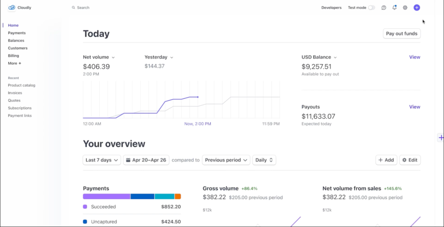
Stripe’s dashboard balances technical insight with clarity. It’s tailored for real-time financial tracking — revenue, payments, balances — and is built with precision in mind. Stripe’s layout uses a left-hand nav and top-level widgets to surface what matters fast: whether money is flowing in, where it’s going, and what needs attention.
Despite its data-rich nature, the UI never feels dense. Through crisp typography, generous whitespace, and subtle use of color, Stripe makes complex financial information easier to digest.
What it does well:
Stripe shows that data-heavy dashboards don’t have to overwhelm. When you pair strong visual hierarchy with clean UI and functionality, users can move confidently, even through complex financial workflows.
Type: Strategic/analytical
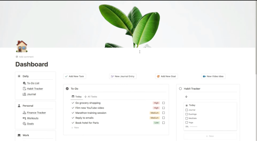
Notion isn’t a traditional analytics dashboard, it’s a modular workspace that users mold into dashboards, planners, wikis, and more. That flexibility is precisely what makes it powerful. Teams can build dashboards that reflect their specific needs: goal tracking, company OKRs, sprint progress, content calendars, and beyond.
While some tools lock users into rigid layouts, Notion gives people space to shape their own structure. Its dashboard blocks (tables, toggles, charts, embeds) let users create a single source of truth across departments.
What it does well:
Notion is an example that dashboards aren’t just about data — they’re about alignment. By empowering users to design their own information flow, it reinforces the idea that dashboards are not static — they evolve with the team.
Type: Strategic/analytical
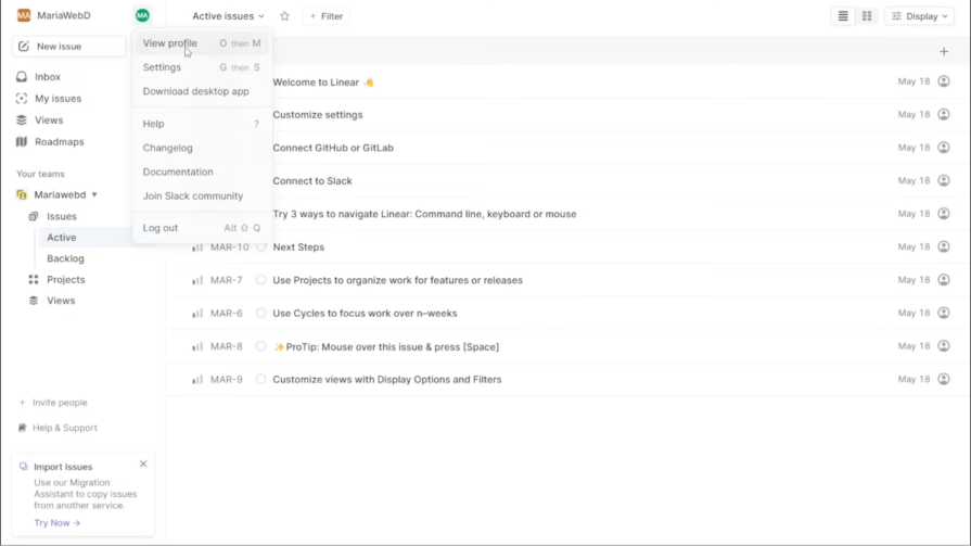
Linear’s dashboard is built for velocity. It’s designed for engineering and product teams, so it’s not flashy. Linear succeeds by stripping away friction and doubling down on performance.
Every interaction feels fast: page loads, keyboard shortcuts, and filtered views are near-instant. Combined with dark UI tones, sharp typography, and minimal ornamentation, the tool gives off a sense of control and clarity that’s hard to fake.
What it does well:
Linear proves that performance is a UX feature. In dashboards where speed and clarity are key, stripping away excess and optimizing for intent can turn routine task tracking into flow.
Type: Strategic/analytical
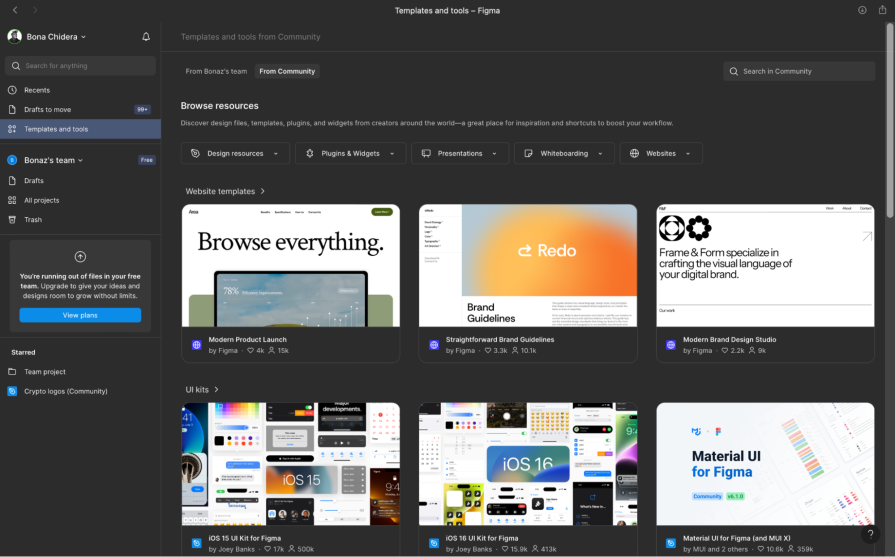
Figma’s dashboard isn’t just a file browser — it’s a creative launchpad. It organizes design files, team projects, and shared libraries in a way that helps both individuals and teams stay aligned. For design teams managing dozens of files across multiple workstreams, this level of structured visibility is essential.
But beyond just storage, Figma’s dashboard reflects design thinking in motion. Tiles have previews, hover interactions are micro-animated, and team sections mirror real-world hierarchies. Everything feels polished and purposeful.
What it does well:
Figma’s dashboard teaches us that clarity doesn’t mean coldness. Dashboards can feel intuitive and inviting especially when you combine visual feedback, team context, and seamless transitions.
Type: Strategic/analytical
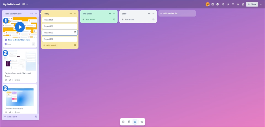
Trello’s dashboard is tailored for lightweight project management and team coordination. Its card-based system and board layout emphasize clarity over complexity. While not a “dashboard” in the strict analytical sense, Trello excels at giving teams a visual snapshot of what’s happening and what’s next — particularly for marketing, content, and small cross-functional teams.
Users can set up boards for different projects, move cards to reflect progress, and use Power-Ups (Trello’s plugin system) to add analytics, reports, or custom fields. The design is simple but expandable, which makes it great for non-technical users who still want to track and manage workflows effectively.
What it does well:
Trello proves that not every dashboard needs complex analytics to be effective. For teams focused on collaboration and clarity, a well-structured Kanban layout — paired with just-in-time enhancements — can reduce overwhelm and help users feel in control.
It also reminds us that progressive disclosure is a powerful UX strategy: don’t show everything at once — reveal complexity only when it’s needed.
Across all five examples, I noticed recurring UX principles that great dashboards embrace:
If there’s one thing I’ve learned designing dashboards, it’s that less is usually more — but only when the “less” is the right less. Dashboards should inform, not overwhelm. Whether you’re supporting C-level decision-makers or on-the-ground operators, clarity is the most important feature you can build.
So, next time you design a dashboard, ask yourself: What will this user care about in five seconds? That’s your north star. Because great dashboards don’t just display data — they drive decisions.

LogRocket's Galileo AI watches sessions and understands user feedback for you, automating the most time-intensive parts of your job and giving you more time to focus on great design.
See how design choices, interactions, and issues affect your users — get a demo of LogRocket today.

AI has made polished, confident content easy to generate, but that does not make it trustworthy. This article explains how UX teams can design stronger quality signals using source transparency, validation, confidence communication, and reputation.
Inclusive design is evolving beyond accessibility alone. This guide explains how UX designers can create more inclusive products through usability, accessibility, neurodiverse UX, adaptive personalization, multimodal design, and culturally aware product experiences.

I was working with an intern on a UX research project, and before we even started, we both had private […]

AI has accelerated design execution, but speed can come at the expense of intentionality. Learn how UX teams can preserve product thinking and judgment.

 Learn more →
