Struggling to design a landing page that sparks conversions? To understand the principal components of high-converting landing pages and how to measure user activity, you need to understand the essentials. This article explores key design elements and taps into the psychology behind building an effective landing page.
Typically, a landing page is a standalone page designed for specific marketing purposes. The core task of the landing page is to convert visitors into leads or regular users. To achieve this, visitors must accomplish a particular goal with minimal effort.
The message on the landing page should meet visitors’ expectations and speak directly to their needs. Every single element — like the call-to-action button, visuals, or social proof — should lead a visitor to the primary goal of the landing page. Clear and concise content, accessibility, appealing images, and a mobile-friendly interface can increase the chances of conversion.
How can you measure the success of the landing page if everyone has their own opinion about a visually appealing landing page? The factor that defines a successful landing page is the conversion rate.
Conversion rate is one of the most important metrics for every landing page. It measures the percentage of users that completed the desired action on your landing page.
Conversion rates are not only clicks. For example, we can also calculate the percentage of users who installed an app or did other actions that meet a landing page goal.

Calculating the conversion rate is simple. You take the total number of users that finished the core task (clicked, subscribed, downloaded the app, etc.), divide it by the total number of visitors, and multiply by 100. You will get the conversion rate as a percentage. Knowing the results, understanding the reasons for your conversion rate, and applying UX design principles can boost the landing page conversion rate.
There are various landing pages, depending on your marketing goals. Let’s go through the five most common types of landing pages and study the examples of the most successful.
These are similar types of landing pages that usually collect users’ data. Both lead magnet and squeeze landing pages give visitors a valuable offer — an ebook, a short course, a discount, or free shipping in exchange for visitors’ contacts (typically email addresses). Squeeze landing pages are usually simple, often popups.

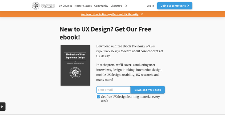
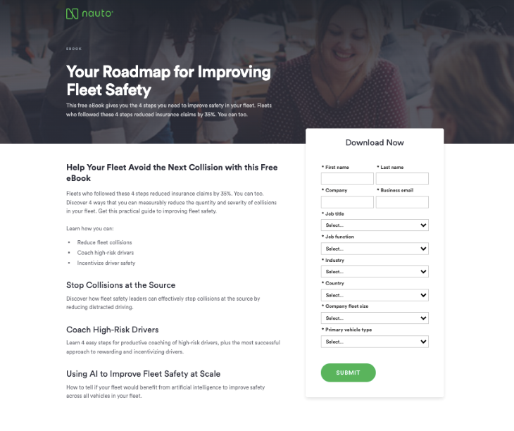
In the case of lead magnet landing pages, they may collect more data, like the user’s name, job title, and industry, depending on the goals of the marketing campaign.
The goal of the sales landing page is to convince users to buy a product or a service. When you are sure that a lead has become a customer, it’s time to make an offer, and that is exactly what a sales landing page does. The sales landing page should be informative and show the benefits of your product. Promotions, discounts, and guarantees can help visitors to make a decision.
Airbnb uses personalization on its sales page for hosts. They show you an estimated weekly pay for rent based on your location. That’s a great way to show you the real benefits of becoming an Airbnb host.
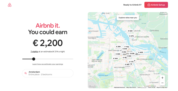
The next type of landing page is the page that encourages you to use the company referral program.
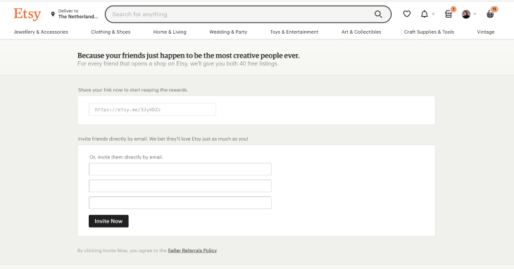
Etsy gives 40 free listings for both a person who shares the link and the recipient. This page includes simple instructions and a call-to-action button. This type of page is usually as simple as possible, including a link to share and instructions with the benefits of sharing the product.
Here is another successful example from Coursera. All the fields in the form are automatically filled in, which makes sharing extremely easy. They did the job for the user, with only the last step left to click the call-to-action button.
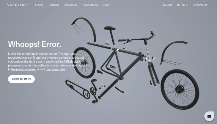
Nobody likes to see this page, but sometimes it happens. A good sense of humor can help to keep visitors and further establish your brand.
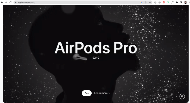
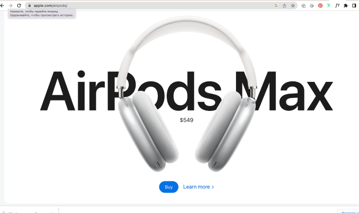
The main goal of the product page is to promote or sell the product. Visuals are crucial for this page because people respond to images faster than text. Apple used terrific videos and photos to promote AirPods: no text, just impressive visuals, the price, and the call-to-action button. “Less is more” is one of the main rules of a successful landing page.
Although the success of a landing page depends on different factors like the audience, industry, and product or service you offer, some patterns can improve the UX of any landing page. Let’s dive into the subject and analyze which components successful language pages include.
Intrigue your visitors. Rather than rattle off product features, it’s better to show the benefits a user will have from owning your product.
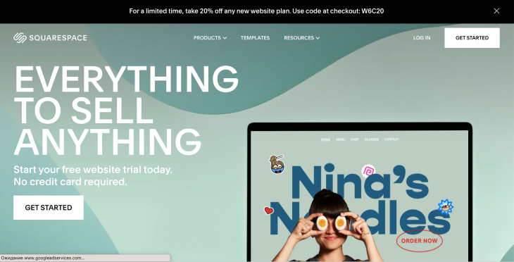
Speak directly to visitors’ pain points and give them the problem and solution in the heading and subheading of the landing page. That is exactly what Landbot does in their header. “No-code chatbot” is the user pain point solution, and the subheading perfectly describes all the benefits for the user.
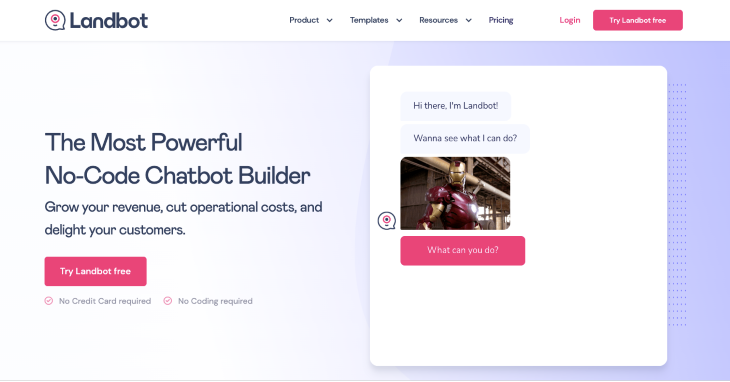
The landing page image should be relevant, emotional, and reflect the benefits that a visitor will have. The key goal is to focus the visitor’s attention and evoke emotion.
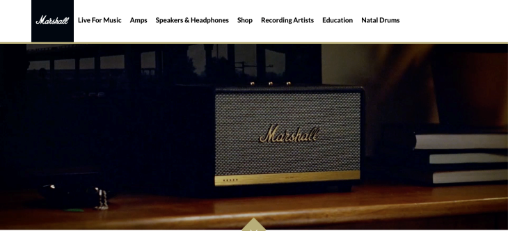
Look how Marshall conveys emotions. They create products that connect with users emotionally, so they use vintage photos and videos to reflect the mood and show the lifestyle of someone with their products.
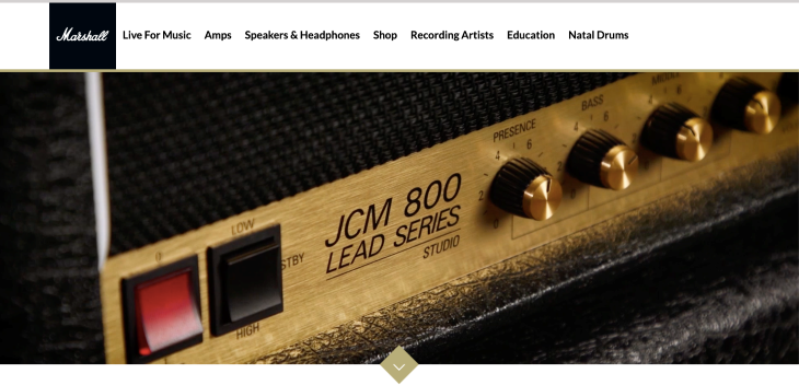

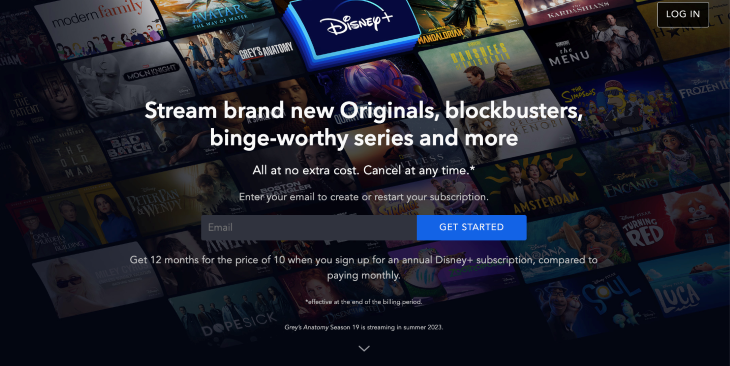
Place, color, and language are the things that make a successful call-to-action button. Plain language and action-oriented names help visitors to understand what they get by clicking the button. The common approach is to use action verbs like download, subscribe, buy, get, book, etc.
As for the place and the color of the button, the button needs to stand out on the page and has a contrasting color to clarify that it’s the next step of a user’s journey. When choosing a color, don’t forget to check it for accessibility.
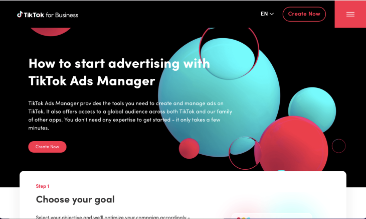
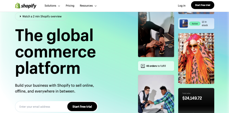
It’s important that a product description is relevant to the heading and leads to the main goal. Your visitors should be involved with your product from the moment they land, otherwise you will lose them. People don’t read long texts, so it’s better to be concise and to the point. Look at a great example from Shopify, who explained their product in just one sentence.
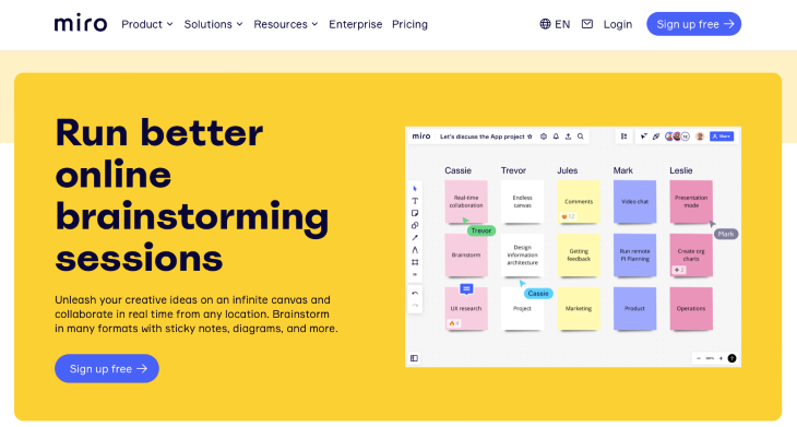
Miro briefly describes their services, using their limited space to answer a user’s main questions: “Who can use their services,” “How can they use them,” “Where can I use this product,” and “What problems can be solved with this product,” showing all the benefits to the users.
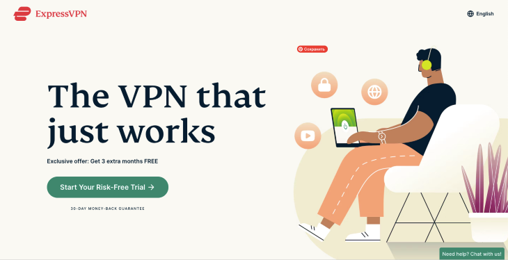
What makes your product special? Why is it better than competitors? Explain your value to your potential customers. Here is a great example from ExpressVPN, who added two short statements: an exclusive 3-month free offer and a 30-day guarantee.
Social proof is everywhere: athletes wearing sports brands, neighbors recommending kids’ classes nearby, a customer that commonly reads about ten reviews to make a purchase. Word of mouth is an important marketing tool. People like sharing their experiences, so it’s better to include customer reviews or other social proof like a “best seller” note or a badge saying “we are in the press.” All kinds of ratings will help you gain more trust from potential users.
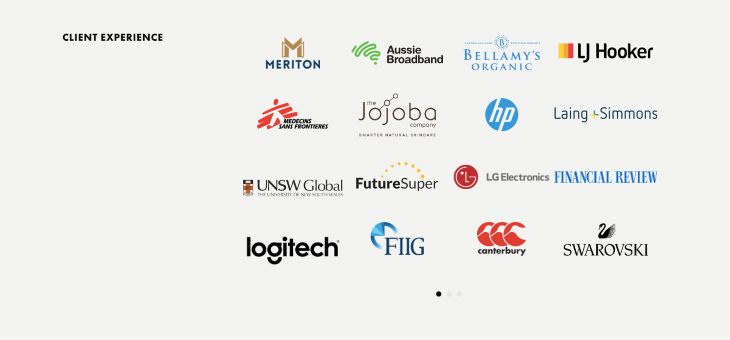
Webprofits added a section with their clients and partners as social proof.

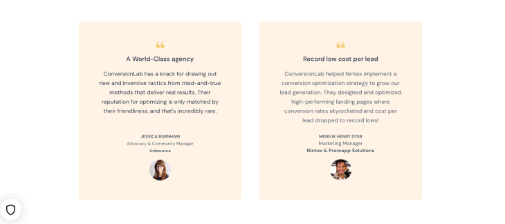
ConversionLab added customer reviews to their landing page:
UX analytics tools can help you to analyze user behaviors and improve online experience. Taking four simple steps will help you plan your testing:
Testing is important. If you constantly optimize your design elements- buttons, heading, description, sooner or later, you will find the combination that converts the best.
To understand who your visitors are, which designs work better for them, and what prevents them from finishing a desired action, you have to study and analyze their behavior and interaction with your landing page.
Check out the tools that can help you to investigate the problems users meet on your landing page.
These tools capture user actions on your landing page. You can see and analyze the recording of their movements through the page, which will help you to fix bugs and improve the overall user experience.
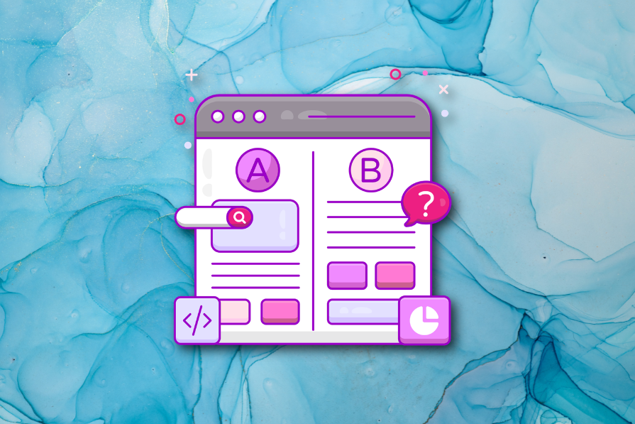
The idea of A/B testing is to help you check page elements such as buttons, menus, and heading font so you can understand which version of your design performs better.
Feedback and voice of the customer tools collect feedback across different platforms from your users to analyze their experience and act on their feedback.
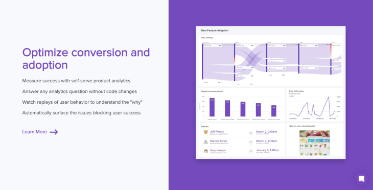
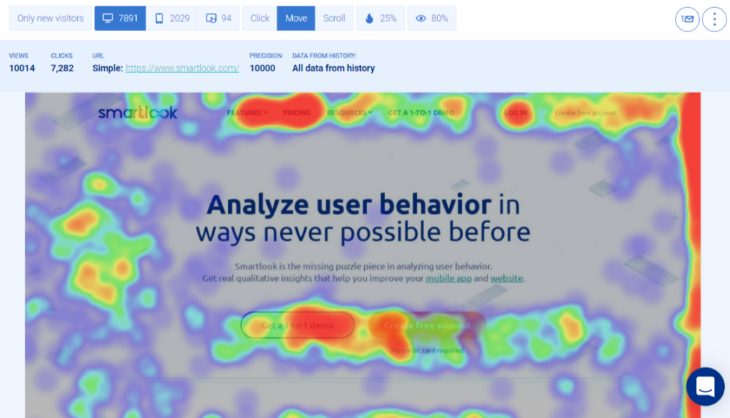
These tools provide an overview of the typical users’ behavior and give you the necessary data to understand what draws your visitors’ attention, what they click, and which elements they ignore.
The red color shows areas where visitors interact more, green is the average number of clicks, and blue shows the least clicks.
A well-performing landing page converts visitors to customers. You can understand how successful your landing is by measuring the conversion rate.
There are different types of landing pages depending on the marketing goals, but all of them include six key elements: a successful heading, appealing visuals, a call-to-action button, a product description, a value proposition, and social proof. To improve your landing page, you should test and analyze your visitors’ behavior with the help of behavioral analysis tools.
LogRocket's Galileo AI watches sessions and understands user feedback for you, automating the most time-intensive parts of your job and giving you more time to focus on great design.
See how design choices, interactions, and issues affect your users — get a demo of LogRocket today.
A three-week mobile banking project taught me that the “proper” UX process is not always realistic. Sometimes, the better approach is to work with what you know, identify what you still need to learn, and make the strongest decision possible under real constraints.
A/B testing compares two versions of a design to see which performs better with real users. Here’s how UX teams can use it to test hypotheses, measure outcomes, and make smarter product decisions.
This case study shows how one ad experience redesign increased total ad exposure while lowering perceived friction, proving that timing and context can matter more than raw interruption.

As products evolve into ecosystems, navigation becomes a system-level challenge. This article explores how to align structure, context, and user journeys to create seamless movement across tools without confusion.