There are endless ways to design digital product interfaces— you can use different colors, typography properties, layouts, and text. We should choose the most user-friendly, efficient, and high-quality design variant that also supports business goals. If you end up with the two best design versions for a specific part of the digital product interface during your UX process, how would you fairly decide which one to use?
A/B testing, the most popular quantitative UX decision-making technique, helps you to seamlessly get the userbase’s help to find the most suitable design version if you struggle choosing which design variant is better.
Let’s understand what’s A/B testing, when you should (or shouldn’t) do it, and how to conduct one for your design scenarios properly, avoiding common A/B testing mistakes.
Editor’s note: This post was updated in May 2026 by LogRocket author Shalitha Suranga to provide a more comprehensive guide to A/B testing in UX design, including when to use A/B tests, when to avoid them, common mistakes, UX experiment metrics, and how A/B testing compares with usability testing.
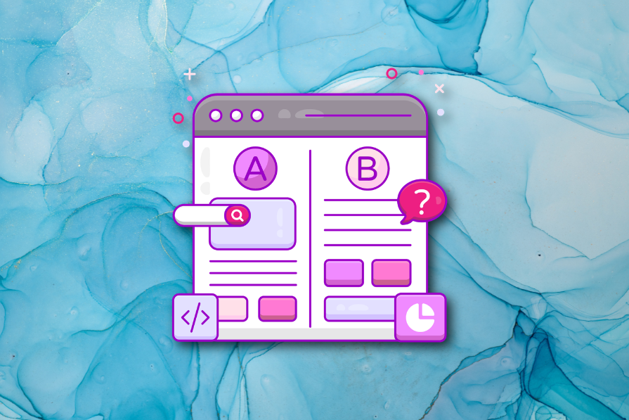
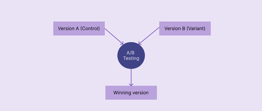
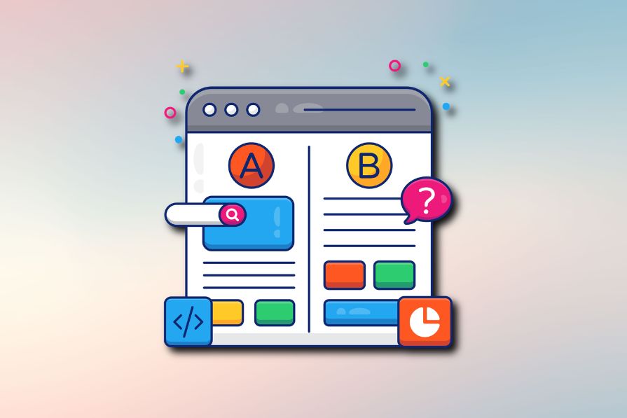
In UI/UX design, A/B testing, also known as split testing, refers to a quantitative UX research method that compares two design versions based on real user behavior to identify the top-performing design version. It’s named with “A/B” since two versions, A and B, are evaluated:
A/B testing selects the winning version using metrics like click-through rate (CTR), conversion rate, bounce rate, and average session duration:
A/B testing is a powerful, user-centric decision-making technique with proven benefits to incrementally extend existing user interfaces:
A/B testing is a low-risk, low-cost, fast, and effective decision-making method that uses real users’ behavioral data
A/B testing goes through five key phases: defining goals and metrics, defining a hypothesis, creating design variants, experimentation, and analysis:
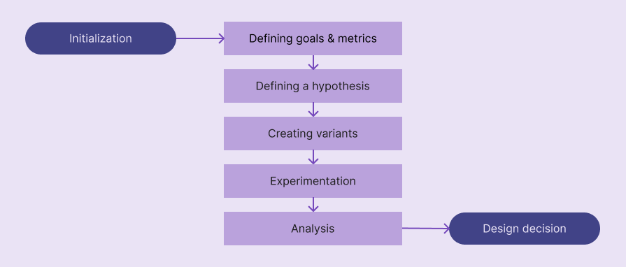
Let’s understand what exactly happens inside each step:
You should know the goals of your A/B testing case before beginning it. Basically, answer the “Why should I do an A/B test?” question to get a clear understanding of goals. e.g., “I am doing an A/B test to understand which CTA label performs better.”
To form a strong hypothesis for your A/B test, you need to select a good metric that calculates the final scores for each variant. Metric changes can affect each other, so selecting several guardrail metrics along with the primary one helps you confidently decide which design variant is the best in all aspects.
Here are some common metrics used in most A/B tests:
You aren’t limited to these metrics; you can use other metrics like scroll depth, retention rate, etc., or create your own metric based on your A/B testing goals
A/B testing hypothesis refers to a concise assumption that states why changing a specific design element increases/decreases a specific metric. Like in other quantitative analysis scenarios, A/B testing uses an alternative hypothesis with a null hypothesis to statistically conclude whether version A or B is better.
A good A/B testing hypothesis should contain the following details:
You can use the following generic template to define your alternate hypothesis:
If we [changes for a design element], then [metric changes], because [rationale]
Here are some examples:
Create a solid hypothesis using the above format and carefully analyze your existing design and new idea.
A/B testing is usually done for the original, existing design against a new proposed design variant, so you usually have to newly design only one variant at this stage. If you do A/B testing for two new ideas, you should create two design variants.
Create a new design variant based on your hypothesis and prepare it for A/B testing experimentation, which is handled by developers. This isn’t a special design — use Figma or your team’s preferred design tool to create the high-fidelity prototype for the particulate UI region.
At this stage, you are collaborating with developers to run the A/B testing. You should send the following things in an A/B testing experimentation plan to developers to help them conduct an accurate A/B test:
Once A/B testing has been started, 50% of users will receive version A, and the other 50% will get version B through A/B testing tools (e.g., Optimizely) or other feature deployment strategies (via load balancers, feature flags, etc.) that the development team uses.
At the end of the experimentation, the development team will provide values for all requested metrics.
Evaluate your hypothesis based on A/B testing results — it can be accepted or rejected. Even though you can simply identify which design variant is better just by comparing the values of the metric, you should write a statistical analysis by stating statistical confidence, especially because you conduct traditional, statistical, quantitative research under UI/UX A/B testing.
When you write the A/B testing conclusion, you should mention whether your alternative hypothesis is accepted (null hypothesis is rejected) or rejected (null hypothesis is accepted) using a statistical result interpretation method like p-value or Bayesian method.
If the hypothesis is accepted, version B is better than the original version A, and you can continue the version B deployment process, collaborating with developers. Otherwise, you can keep the original version A and document the summary for future A/B testing scenarios and general design considerations.
Let’s simulate an A/B test for a sample scenario by following the above steps to understand the process further.
Assume that you need to do an A/B test to prove that changing the primary CTA label to “Try it for free” from “Get started” will improve the conversion rate.
The goal is to prove that changing the primary CTA label to “Try it for free” will increase conversion rate. The primary metric is conversion rate. Guardrail metrics can be ones that validate revenue impact, like revenue per visitor (RPV), freemium conversion rate, etc.
Creating a new landing page design variant by changing the CTA label
Running the test for 2 weeks for new users
Assume that this sample A/B test produced the following result table:
| Metric | Version A | Version B |
| No. of visitors | 10000 | 10000 |
| Conversions | 500 | 600 |
| Conversion rate | 5% | 6% |
According to the result, version B performed better than version A, increasing the conversion rate by 20%. Let’s write a statistical conclusion for these results by using the popular p-value comparison method.
Use an A/B testing tool or an A/B testing p-value calculator to calculate the p-value. I used AB Testguide online calculator:
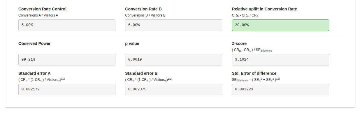
The calculated p-value: 0.0019. The calculated p-value is less than the common significance threshold, 0.05, so the 20% conversion rate increment of version B is statistically significant and isn’t likely due to chance.
Hypothesis accepted, using “Try it for free” as the primary CTA label increases the conversion rate by 20%. So, version B can be deployed.
Designers can effectively improve UX by using A/B testing for the following cases:
Conducting A/B tests for the following cases won’t deliver statistically confident and overall effective results:
A/B and usability testing can both be used to evaluate designs; however, they are two different testing strategies that produce two different result types:
| Comparison factor | A/B testing | Usability testing |
| Description | A quantitative UX research method that helps designers decide the best version by evaluating two design versions on the live product | A qualitative UX research method that helps designers get insights about design ideas or improvements from a small number of participants |
| Research method type | Quantitative | Qualitative |
| Goal | Deciding which design version is better | Identifying user pain points |
| When it’s done | After shipping the product | In any stage of the product design process |
| Type of participants | Actual users | Actual or potential users and other product stakeholders |
| Number of participants | Many, usually thousands | Less, usually 5-10 |
| Experiment environment | Live product | Prototype, staging environment, or a special session of the live product |
| Results | A boolean result, yes/no, which describes whether or not the proposed design variant is better than the original version | Insights about pain points and efficiency that help improve usability factors |
A/B testing identifies whether or not a new design element variant is better than the existing one using numbers (quantitative data), and usability testing produces insights about user behavior within a digital product.
Even if you initiate an A/B test for the right scenario, it can still produce incorrect results if you don’t carefully avoid the following common A/B testing mistakes:
Here are some common questions that you may ask yourself when you are getting started with the UI/UX A/B testing process:
Yes, you can test any number of design variants, but it’s called A/B/n testing — not the standard A/B testing
Large enough to get a statistically significant result. You don’t need to worry about this if your product receives a very large amount of traffic; otherwise, verify the sample size requirement using an A/B testing sample size calculator like Optimizely’s
Until you reach the sample size requirement or statistical significance. In a product that receives good incoming traffic, running A/B tests for at least 1–2 weeks is recommended
Yes, but a good version B can drastically reduce negative effects
Running a single A/B test in parallel by splitting the traffic is better since sequential traffic can lead to time-based bias
No, you can use dynamic A/B testing traffic allocation to increase traffic for the winning version to optimize the traffic. It’s called a multi-armed bandit test
In this article, we discussed how to get started with A/B testing for evaluating two design versions during the product development process. A/B testing is a widely used design evaluation technique that tech giants use to improve usability and product revenue. A/B testing is a simple technique that any digital product can benefit from, but it should be initiated properly with an efficient, automated flow to effectively select the most suitable design variant while maintaining seamless user involvement.
If you are going to run your first A/B test on your digital product, build an efficient, automated A/B testing workflow by collaborating with developers first, using a dedicated A/B testing tool like Optimizely, VWO, etc., or building an organization-specific flow using developers’ deployment tools like Kubernetes. Then, identify whether an A/B test is really needed for your decision-making scenario, start with a clear goal, define a strong hypothesis, run the experiment properly, and conclude with proper statistical analysis.

LogRocket's Galileo AI watches sessions and understands user feedback for you, automating the most time-intensive parts of your job and giving you more time to focus on great design.
See how design choices, interactions, and issues affect your users — get a demo of LogRocket today.

AI agent simulations promise faster, lower-risk UX testing by replacing real users with AI-simulated personas. Here’s how the method works, where it falls short, and when designers should rely on simulated users versus real user testing.
A/B testing is great for comparing two versions of a design, but multivariate testing helps teams evaluate multiple design element combinations at once. Here’s how both methods work, how they differ, and when UX teams should use each one.

Design engineering has always lived between design and code. But with AI tools turning prompts into interfaces and code into editable canvases, that bridge is becoming a new way of building.
A three-week mobile banking project taught me that the “proper” UX process is not always realistic. Sometimes, the better approach is to work with what you know, identify what you still need to learn, and make the strongest decision possible under real constraints.


