How many times have you picked up your smartphone today? If you’re like most people, it could be up to 144 times before today ends. Whether due to notifications, social media, or just checking in, there’s no denying that technology is stealing our attention. As designers, we can change this narrative. And that’s where humane design comes in.

Humane design prioritizes users’ well-being and dignity above profit. It goes beyond fulfilling their immediate needs and asks, “What are the long-term implications of technology on the users’ mental and emotional health?”
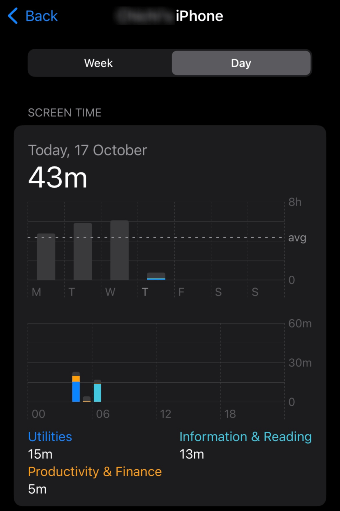
Thankfully, big tech companies are starting to wake up to the negative impacts of digital overload and are deploying tools to help users monitor their device usage. Take Apple’s Screen Time, for example — it can help users track and limit their iPhone usage. This shift is largely thanks to a movement started by Tristan Harris, an ex-Google Design Ethicist.
Tristan co-founded the Time Well Spent Movement and the Center for Humane Technology to raise awareness about the negative effects of attention-grabbing technology and empower people to take action. As part of their efforts to tackle this issue, they laid out some guidelines known as the humane design principles.
This article will dive into five key humane design principles, highlighting real-world examples. It will also show you how to implement these principles in your designs to ensure a user-first digital experience.
Without further ado, let’s get started!
The truth is that digital products are traditionally designed to grab as much human attention as possible. That’s basically design 101 — we design to hold a user’s attention. Scrap that — design to have a user hooked. After all, more user engagement leads to more business revenue. And to keep the money coming in, we use habit-forming strategies like social validation, gamification, and even limited-time offers to get users to engage with our products.
But at what cost does this engagement come?
Well, it turns out that all this engagement comes at a significant cost to the users’ psychological and physical health. Sure, digital products can make life easier, but that doesn’t erase the possible side effects like isolation, depression, anxiety, sleep problems, reduced physical activity, and even poor posture.
Humane design helps combat these problems by shifting the focus from merely “hooking” users to genuinely enriching their lives. But how can you make this shift as a designer?
The answer is simple. Put users in control. Design products that help users focus on what matters rather than pulling them away from it. The principles we’re about to discuss will help you achieve just that.
Empowering design shifts the focus from making money to genuinely helping people. It puts users in control, keeps them informed, and ultimately enhances their lives without taking over.
Here’s how you can create designs that empower:
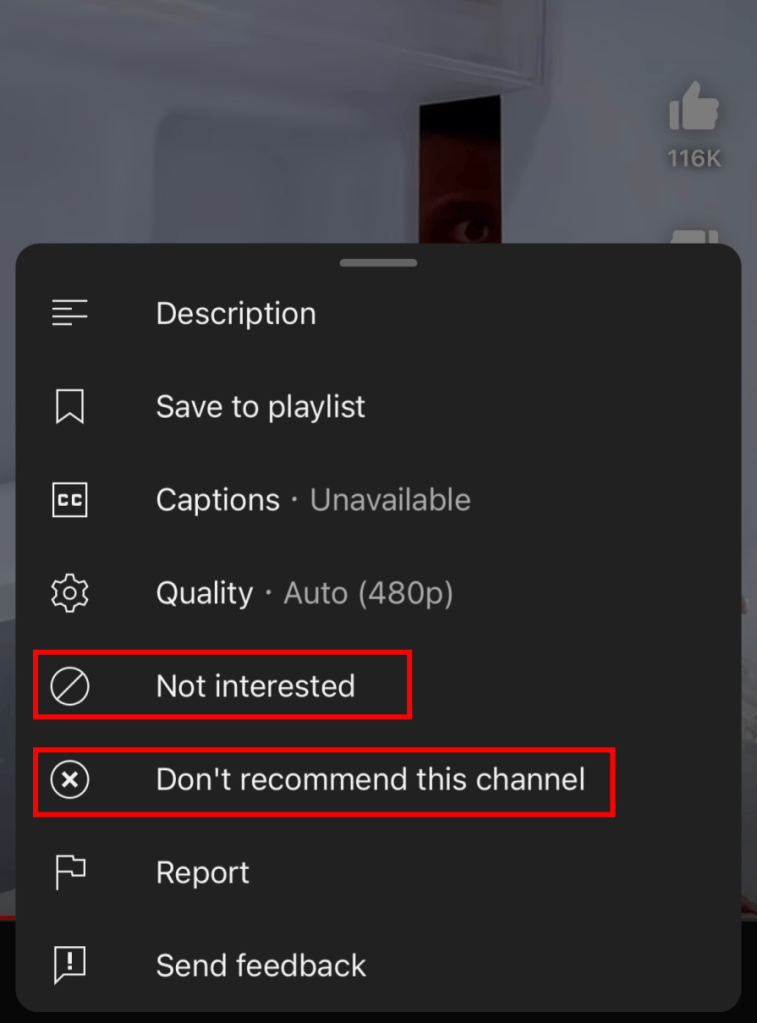
1. Put users in control
Give users the power to control the algorithm by allowing them to customize what they see and experience.
2. Promote awareness
Help people become aware of how much time they spend on their devices. That way, they can become more intentional with their use of technology.
3. Invisible until needed
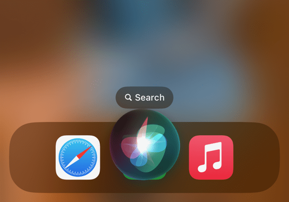
Provide support without interfering with users’ daily lives. Some tools and features should only appear when they’re truly helpful to avoid being a distraction.
People should control technology, not the other way around. When you let users choose what they engage with and how much, you put the power back in their hands. They feel more satisfied and more likely to stick around as they interact with the product on their own terms.
Now let’s see how this compares to purely business-driven designs:
When you focus solely on maximizing engagement for profit, you may see a spike in engagement. But in the long run, users feel overwhelmed and manipulated. After all, binge-watching sensational content never makes anyone feel better about themselves, does it?
Inclusive design takes account of the full range of human diversity to ensure that products work for everyone. Here’s what you can do:
1. Design for disabilities first
Make your product accessible to users with a particular disability, and it’ll be better for everyone. By focusing on the needs of a specific group of people, you create solutions that help all users.

2. Build diverse teams
You need a diverse team to create diverse products. When it’s impossible to represent the diversity of humans on your team, seek outside perspectives.
3. Give users control
Give users the power to adjust aspects like zoom, font size, and animations so they can interact with your product in a way that works best for them.
By considering the needs of specific groups, you enhance usability not just for them but for everyone else. Better usability means more user satisfaction, increased loyalty, and better outcomes for both users and businesses.
Now let’s see how this compares to purely business-driven design:
If your sole aim is to make a huge profit, you’re more likely to target people who will generate the most revenue. In doing so, you unintentionally exclude some groups. And as we know, making people feel like their needs don’t matter isn’t exactly a great look for any brand.
Transparent design means being clear about your intentions, being honest in your actions, and avoiding dark patterns. You can ensure your designs are transparent in their intent by following best practices like:
1. Data transparency
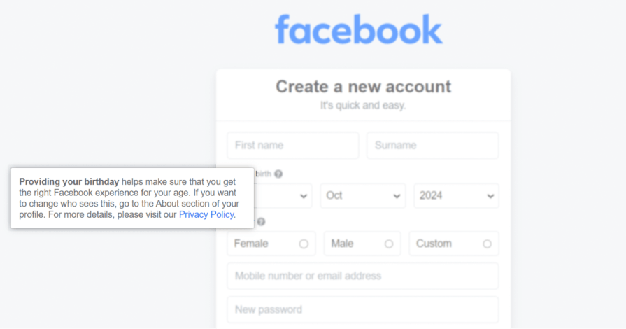
If you’re asking for a user’s information, they’ll want to know why you need it and what you’ll do with it. Anticipate and answer these questions to make the users less apprehensive about sharing their data.
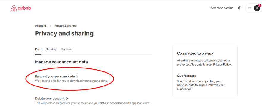
2. Access to data
Make it easy for users to find and access their data. One way to do this is by allowing them to download any information you have about them.
3. Easy exit
Make it easy for users to leave if they choose to do so. Provide them with the option to unsubscribe or delete their account and make the process straightforward.
You gain the users’ trust when you’re open and honest about your intentions. And as users are more likely to engage with your product if they trust you, it leads to higher engagement in the long run.
Now let’s see how this compares to purely business-driven designs:
Shady business tactics like dark patterns can spur users to act fast. However, over time, they feel manipulated and lose trust in the brand. Users who don’t trust your brand won’t stick around for long.
Finite design maximizes the quality of time users spend on a product by limiting the experience and prioritizing relevant content. Practice things like:
1. All caught up
Notify the users when they’ve seen all available content. This can help prevent mindless scrolling.

2. Load more
Give users the option to click a “Load More” button to see additional content. This way, instead of scrolling endlessly, they can control what they view.
3. User-controlled viewing
Autoplaying videos push users to binge-watch. Instead, let users consciously decide what they want to view by clicking to play the next video.
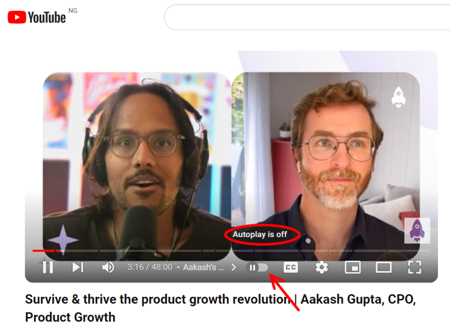
Finite designs help users to be more intentional about their technology use. More deliberate and mindful interaction leads to a more satisfying and productive user experience.
Now let’s see how this compares to purely business-driven designs:
While profit-maximizing tactics like endless scrolling leads to more interaction, the quality of interaction is often much lower. Why? At some point, users will zone out and start consuming content passively rather than engaging intentionally. In the end, more time spent might not always mean better experiences.
Respectful design puts people’s time, attention, and digital well-being above all else by using design elements like:
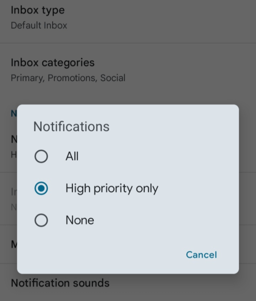
1. Match the urgency
Not every notification needs to interrupt users right away. To avoid unnecessary distraction, your method of delivering notifications should be based on their importance.
2. Adapt to the situation
Just like humans know when it’s the right time and place to communicate, tech should respect when it’s appropriate to send notifications.
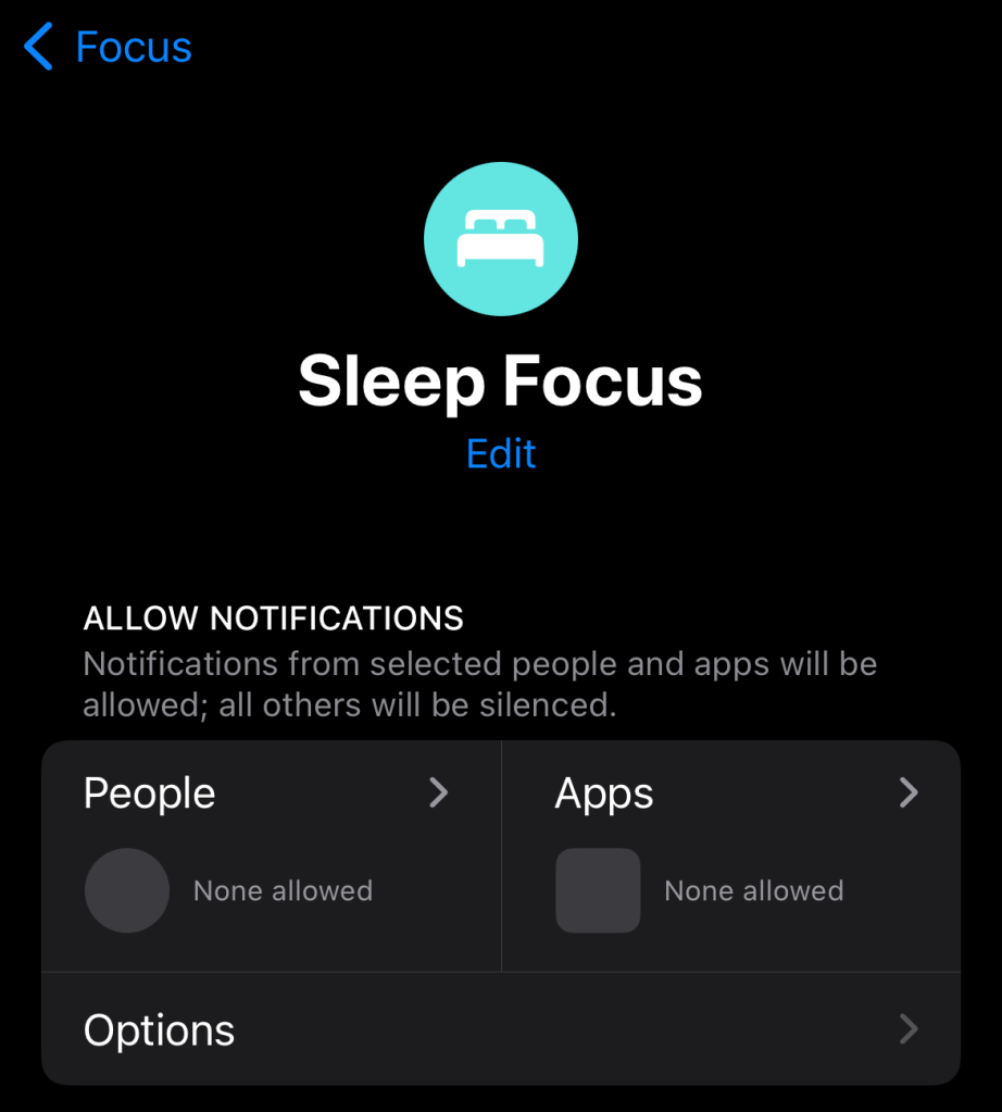
3. Let users customize
Allow users to choose who they receive notifications from and how and when they receive them. This can help reduce unwanted distractions.
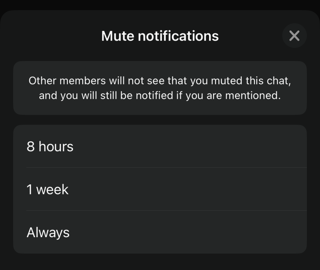
By minimizing unnecessary distractions, respectful design reduces stress and cognitive load on users. This helps prevent user frustration and leads to a more seamless user experience.
Now, let’s see how this compares to purely business-driven designs.
Sure, aggressive strategies like persuasive notifications and limited-time offers can compel users to engage with a product. But the problem with them is that they can become intrusive and irritating over time. Once a product becomes a burden to a user, they won’t be using it for much longer.
User experience design, as a discipline, largely focuses on creating user-centered designs. As a designer, your core goal is usually to address users’ needs.
Humane design challenges you to take things a step further. It’s a more ethical approach that addresses the users’ immediate needs and considers what’s best for their long-term well-being.
Humane design seeks to create products that genuinely improve life, not just create immediate gratification.
So, while both approaches focus on the user, user-centered design emphasizes immediate satisfaction, whereas humane design focuses on sustainable, positive impacts over time.
As designers, we can shape how people experience technology. Even small design decisions have a long-term impact on users. Make that impact a positive one. By adopting humane design principles, you create products that not only engage users but contribute to their overall well-being.
In the long run, this benefits both users and businesses. For users, humane design promotes a healthier relationship with technology which leads to greater user satisfaction. And for businesses, it builds user trust, which leads to more long-term engagement.
So, always take a step back and ask yourself — are my designs truly enriching users’ lives, or am I just driven by the urge to keep them hooked?
As technology keeps evolving and people rely more on their devices, adopting humane design principles ensures that your designs improve users’ lives instead of controlling them.
To learn more about humane design, I’d suggest you check out Humane by Design.
LogRocket's Galileo AI watches sessions and understands user feedback for you, automating the most time-intensive parts of your job and giving you more time to focus on great design.
See how design choices, interactions, and issues affect your users — get a demo of LogRocket today.
As products evolve into ecosystems, navigation becomes a system-level challenge. This article explores how to align structure, context, and user journeys to create seamless movement across tools without confusion.
Figma’s AI features have exploded in 2026 — from text generation and image editing to full UI drafts and code handoff. But speed isn’t the same as quality. This guide breaks down every major feature, what it’s good at, and where human judgment still does the heavy lifting.

Zero UI works well for screenless, voice-first experiences, but most digital products still require visual interaction. Here’s why multimodal UX offers a more scalable foundation for the future of design.
Multimodal UX goes beyond designing for screens. Learn how context-aware systems, progressive modality, failover modes, and accessibility-first design create better digital product experiences.