Ever wondered how you can open a new app and instantly understand how it works? Right away, you recognize the various elements and know their purpose. It’s not magic — it’s the power of Human Interface Guidelines (HIG) at work.

Human Interface Guidelines are a set of design principles that ensure that apps follow familiar patterns, making them intuitive and easy to navigate. They cover everything from the layout and navigation to typography, color, and accessibility.
This guide will help you understand HIG. It will cover its definition, importance, key principles, and best practices for implementing it. We’ll also examine real-world examples and show you how to apply HIG in your design projects.
Human Interface Guidelines are a set of design principles, standards, and recommendations that act as a framework for designers and developers, helping them create consistent, intuitive, and user-friendly interfaces. These guidelines, provided by platforms like Apple, Microsoft, and Google, define how things should look, feel, and work on a specific platform or operating system.
The HIG is a great place to start when making design decisions for your app. It outlines the design principles for the platform you’re designing for and gives you tips to help ensure that your design works as people expect.
Some well-known examples of HIGs include:
The main aim of HIG is to create a consistent experience across a platform (like an operating system or desktop environment) by standardizing design practices. This consistency reduces users’ cognitive load as they can quickly learn and adapt to new apps or features based on recognition.
But make no mistakes — these guidelines do more than just ensure consistency.
Here are some other key benefits of adhering to HIG principles:
Present information in a simple, straightforward way that users can easily understand. This means using legible fonts in the appropriate sizes, a clear visual hierarchy, and concise language.
Maintain consistency across the entire interface to help users recognize and understand how things work without relearning new actions in different contexts. This means keeping the navigation bar the same across all app screens and using a uniform button style.
Give users autonomy while using an interface by allowing them to interact with a system on their own terms. This means ensuring they can initiate, adjust, or undo/redo actions.
Create interfaces that everyone can use, regardless of their capabilities or situation. This means keeping things simple and easy to understand while ensuring that your designs work for everyone, including people with disabilities and those who interact with their devices in non-conventional ways.
Here’s a step-by-step guide to get you started incorporating the HIG into your design process:
Review your project goals and identify your target users. Understand your audience’s needs and the purpose of the app or interface you’re designing.
Choose a suitable framework or design system (Material Design, Fluent Design, or Apple Human Interface Guidelines) based on the platform you’re designing for and familiarize yourself with its guidelines.
Next, align the framework with your brand’s identity and user needs. This means finding a way to express your brand while following platform conventions to ensure your app or interface feels familiar to its users.
Create a prototype of the design and test it with users to gather feedback and identify areas for improvement. Focus on usability and accessibility to ensure that the design meets HIG standards.
Revise your design based on user feedback, ensuring it remains clear, consistent, and easy to use.
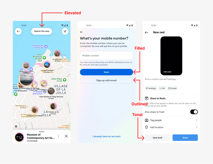
Social networking giant Instagram does a great job incorporating Google’s Material Design guidelines into its Android interface.
For example, the guideline outlines five common button types — elevate, filled, tonal, outlined, and text:


This consistency improves usability and makes the app feel intuitive, as users can rely on familiar button behavior and visual cues throughout their journey.
The popular messaging platform WhatsApp uses human interface guidelines to ensure clarity in its iOS app. The app provides a clear visual hierarchy by:
But that’s not all. Another way WhatsApp ensures clarity is through effective tab-bar implementation.

The tab bar is highly effective for helping users seamlessly navigate between app sections. This is because:
Apple Photos is a clear example of how to do accessibility right by sticking to HIG principles. The app offers several accessibility features, including:
Using the human interface guidelines isn’t just about following them; the magic lies in correctly implementing them. Let’s explore some best practices to help you do just that.
By applying Human Interface Guidelines in your UX design process, you create digital products that look good and are intuitive enough for anyone to use. The guidelines provide a solid foundation for creating consistent and intuitive interfaces while still leaving room for your creativity to shine through.
If you’re a designer or developer, take some time to understand HIGs and check out how successful products use them in their designs. That way, you’ll be armed with the resources you need to create products that feel relatable to your users.
But remember, it’s not just about following the guidelines blindly — it’s about using them as a tool to create experiences that feel familiar and put the users first. Ultimately, what matters is your users’ satisfaction, not how well you tick some design boxes.
LogRocket's Galileo AI watches sessions and understands user feedback for you, automating the most time-intensive parts of your job and giving you more time to focus on great design.
See how design choices, interactions, and issues affect your users — get a demo of LogRocket today.

As products evolve into ecosystems, navigation becomes a system-level challenge. This article explores how to align structure, context, and user journeys to create seamless movement across tools without confusion.

Figma’s AI features have exploded in 2026 — from text generation and image editing to full UI drafts and code handoff. But speed isn’t the same as quality. This guide breaks down every major feature, what it’s good at, and where human judgment still does the heavy lifting.

Zero UI works well for screenless, voice-first experiences, but most digital products still require visual interaction. Here’s why multimodal UX offers a more scalable foundation for the future of design.

Multimodal UX goes beyond designing for screens. Learn how context-aware systems, progressive modality, failover modes, and accessibility-first design create better digital product experiences.