Your organization has invested heavily in design, and the team has designed a solution. It is now time to test the solution to determine whether the design team’s assumptions are true.

There are several frameworks in use to test, and usability testing (or user testing) is one of the most widely used.
Before delving into usability testing, it is critical to understand usability and the principles at work. Let’s learn more about this testing process and how we can most effectively apply it for profound insights:
Usability describes the ease with which a product or user interface may be used. Neilsen Norman Group, pioneers in the field of UX Design, devised five criteria to evaluate a product’s usability.
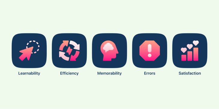
Global product markets are extremely competitive. If your product is difficult to use; if the user has difficulty finding relevant information; if your product fails to help the user with his task; if your product has poor aesthetics or interface; or if the user gets lost while using your product, there is always another product on the market to which the user can switch.
If you’re building products internally for your organization, it’s important to keep employee productivity in mind. The time spent muddling through products is time wasted by the employee without getting any work done.
Building solutions while keeping users in mind is one of many strategies to stay or even lead the race.
Testing a product’s usability is a way to evaluate how simple or easy it is to use that product. Primarily, testing is conducted by analyzing how participants from the target audience perform a given task.
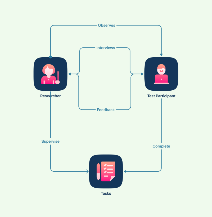
The researchers observe, analyze, and listen to how the participants use the product while conducting usability testing. The feedback from users enables the design team to make significant improvements to the user experience.
In the below image, you can see how the tasks are carried out by the researcher and test participant:
Usability testing can be done at different stages of the design process.
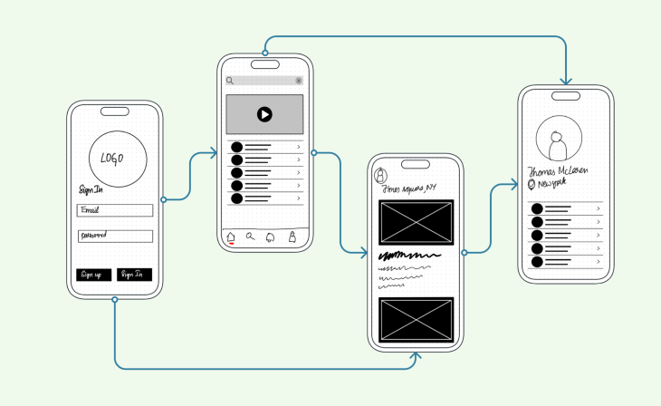
Testing can be conducted when your product is still an idea, and researchers use low-fidelity interactive prototypes to test. This is called concept testing.
The following image shows the designer prototyping with low-fidelity wireframes to test the usability of an idea:
You can also conduct usability testing with a highly interactive prototype. This is often called a high-fidelity wireframe and is more detailed when compared to low-fidelity wireframes.
High-fidelity wireframes might look more like this:
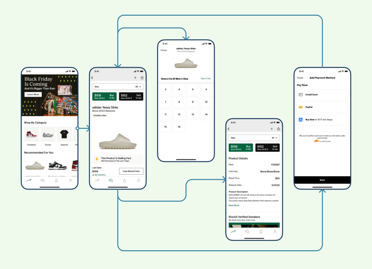
This is the most common type of usability testing as it gives the design team more meaningful insights on what needs to be revised or added before the product release.
Usability testing can be broadly classified into three categories: moderated and unmoderated; remote and in-person; explorative and comparative testing.
Moderated usability testing is conducted with the help of a moderator who guides the user through the task.
Moderated usability testing is generally more expensive and time-consuming than unmoderated testing. However, it provides more insights as the moderator can ask probing questions to understand the user’s thought process.
On the other hand, unmoderated usability testing does not require the presence of a moderator. The user is typically given a set of tasks to complete and asked to provide feedback at the end.
Unmoderated usability testing is less expensive and time-consuming than moderated usability testing, but it may not provide as much insight since the user is not being guided by a moderator.
Remote usability testing can be conducted with the help of tools that allow users to test the product from their own location. This type of testing is convenient as it doesn’t require users to travel to a specific location. However, it may be difficult to replicate real-world conditions in a remote setting.
In-person usability testing requires users to come to a specific location to test the product. This type of testing allows for better control over test conditions but may be inconvenient for users who have to travel to participate.
We can use explorative testing to gain insights into how users interact with a product. This type of testing is often used during the initial stages of product development during the design phase, when designers are looking for ideas and feedback on how to improve the product.
Another type is comparative. Comparative usability testing is used to compare the usability of two or more products. This type of testing is often used when companies are developing new versions of existing products or when they are considering switching to a new product altogether.
Once you have a prototype ready, it’s time to test it. Since there is no one-size-fits-all method or template for usability testing, I advise you to put together a plan in preparation.
There are a few things to keep in mind when planning for usability testing:
There are two main ways of conducting usability tests: remotely or on-site.
Each method has its advantages and disadvantages. Remote usability testing can be conducted more quickly and cheaply than on-site testing, as there is no need to travel or provide physical space for testing. However, it can be harder to establish a good rapport with test participants when conducting tests remotely, and there may be technical issues that can impact the quality of the data collected.
On-site usability testing requires more time and effort to set up but can provide a more realistic testing environment. This is because users are tested in their natural environment, surrounded by distractions such as colleagues, phone calls, and emails. On-site testing also allows for more opportunities for informal conversation with participants, which can provide valuable insights into their thought processes.
Ultimately, the decision of whether to conduct remote or on-site usability tests depends on the needs of the project. If time and budget are limited, then remote testing may be the best option. However, if realism is a priority, then on-site testing is worth the extra effort.
When conducting usability testing, be sure to recruit participants from the target audience. This will ensure that the results of the usability testing are representative of the group of users that the product is intended for.
There are a few different ways to go about recruiting participants from the target audience. One way is to reach out to individuals or groups that represent the target audience and ask if they would be interested in participating in a usability test. Another way is to post a message on social media or online forums that are frequented by members of the target audience, asking if anyone would be interested in taking part in a study.
Additionally, consider how many participants to recruit. As we mentioned earlier, you should have at least five participants in a usability test. This will allow for enough data to be collected and analyzed while still keeping the study manageable.
If you’re having trouble recruiting participants from the target audience, there are a few things you can do to increase your chances of success. First, offer an incentive for taking part in the study, such as a gift card or free product. Second, make sure that you explain what the study entails and what time commitment is required upfront. Finally, try reaching out to multiple groups or individuals instead of just one or two; more outreach means a higher likelihood of response.
The results that come from unstructured user testing are valuable, but it’s not the only way to learn from your users. Testing requires a specific process in order to generate meaningful results. So it’s important to consider if:
Being a good researcher means guiding the test subject through specific tasks. Whenever someone proposes you something that contradicts the goals of the task, discard it and go back to the goal. By doing this, you’ll hopefully find usability problems before they bother your visitors.
The most important tool in the facilitator’s arsenal is the test script. The script includes:
It’s important to start with the simplest task and ease into more complex ones because it gives subjects time to adjust to circumstances. Starting with complex tasks would overwhelm the subject, which may lead them to blame themselves and lose confidence in their ability to complete the remaining tasks.
As a usability tester, it is important to keep several things in mind while conducting your test. First and foremost, you must be an active listener. This means paying attention to not only what the user is saying, but also how they are saying it. Are they hesitant? Confused? Excited? Your observations can provide valuable insights into the user experience.
In addition to listening, you should also be observing the user throughout the test. What are they doing? What do they seem to be struggling with? What do they find easy or enjoyable? Again, your insights can help improve the user experience.
Finally, don’t forget that a usability test is just one tool in the larger process of designing and developing a product. Insights from other sources (such as market research or focus groups) can also help shape the final product.
The whole process of evaluating the test results boils down to turning the qualitative and quantitative data observations into actionable points on usability issues.
Before you start evaluating the results, review all the original goals you had initially set out to test. This will help you with insights and stay focused on the relevant results you seek.
Next, organize your test data by reviewing test sessions. In this, you should be looking for issues encountered, actions test subjects took, time taken to cope, and comments during the test. Record the data against category, task, the problem they faced, and the subject’s emotion if necessary.
Evaluate results for qualitative and quantitative data. Qualitative data provides you with insights into issues. For example, the number of subjects who couldn’t find the phone number of a customer representative or subjects facing checkout issues.
Quantitative data provides you with numbers that can help to identify the severity of the issues. For example, success rate, error rate, time taken for completion, and more. Most test results in usability studies will be qualitative, but quantitative data offers your research significant credibility for future revisions.
Finally, prioritize the feedback and findings based on their impact. For example, critical, serious, moderate or P1, P2, P3, and so on.
After conducting a usability test, document the results in order to improve the design of the product. An ideal usability test report documents the following sections:
Usability tests are a great way to get feedback on the user experience of your product, but there are some limitations to keep in mind.
First, usability tests can be time-consuming. You’ll need to schedule time for participants, set up the test environment, and then debrief after the test is complete. This can take anywhere from a few hours to a few days, depending on the scope of the test.
Second, usability tests can be expensive. You’ll need to pay for participants’ time, as well as any equipment or software you need for the test itself.
Third, usability tests only provide limited feedback. You’ll get some insights into how users interact with your product, but you won’t get a complete picture of their experience. For example, you won’t be able to see how users react to changes in your product over time or how they use it in different contexts.
Usability tests can also be biased. The people who agree to participate in a usability test may not be representative of your target audience. Additionally, the way you design the test itself can introduce bias. For example, if you give participants specific tasks to complete during the test, you may inadvertently influence their behavior.
Finally, usability tests only provide insights into the user experience at a single point in time. Your product will continue to evolve and users’ needs and expectations will change along with it. Usability tests can help you assess the current state.
When you can’t run a usability test, there are still a number of ways to collect data about how your users interact with your product.
Heuristic evaluation is a method of evaluating a product by observing and critiquing it against set heuristics, or guidelines. Surveys are another way to collect data from users and can be used to ask general questions about satisfaction or specific questions about particular features. Keystroke level modeling is a more technical method of observing user behavior, and can be used to track how users navigate through a site or app and what actions they take.
Usability testing is an important part of the product development process because it can help improve the user experience of the final product. By testing with real users, you can identify areas where the product could be improved in terms of usability and functionality. To create a successful product or service, this feedback is crucial.
Featured image source: IconScout
LogRocket's Galileo AI watches sessions and understands user feedback for you, automating the most time-intensive parts of your job and giving you more time to focus on great design.
See how design choices, interactions, and issues affect your users — get a demo of LogRocket today.
A three-week mobile banking project taught me that the “proper” UX process is not always realistic. Sometimes, the better approach is to work with what you know, identify what you still need to learn, and make the strongest decision possible under real constraints.
A/B testing compares two versions of a design to see which performs better with real users. Here’s how UX teams can use it to test hypotheses, measure outcomes, and make smarter product decisions.
This case study shows how one ad experience redesign increased total ad exposure while lowering perceived friction, proving that timing and context can matter more than raw interruption.

As products evolve into ecosystems, navigation becomes a system-level challenge. This article explores how to align structure, context, and user journeys to create seamless movement across tools without confusion.