A design token is a stored value of a specific style or setting that you can reuse by referencing its name. These design tokens are stored collectively in a transferable, platform-agnostic format that makes it easy for designers and developers to import them into website codebases, app codebases, and UI design tools such as Figma.

The user-facing benefit of design tokens is that they efficiently facilitate visual consistency, especially when part of a design system where they’re well organized and well documented.
The business benefit of design tokens is that they encourage reasoning, maintainability, and reusability. All that goes into creating design systems that are more robust and easier to build from, leading to quicker production times and easier scalability across any number of platforms.
Let’s say that you want to reuse your brand color (270 100% 50% in HSL) across one or more Figma files. Because it’s your brand color, It’s obviously important to use that color specifically — that’s the color people recognize.
So you’d create a design variable named “Color Brand” and assign the HSL value to it. After that, you’d be able to reference the design variable’s name instead of having to remember all of those numbers. If you were to change the variable’s value, the update would automatically sync across all instances.
What’s even better is that design variables are handed off to developers so they can leverage the same benefits in the same way.
For example, “Color Brand” would appear in Figma’s Dev Mode like this:
background: var(--Color-Brand);
…and developers would initiate them in CSS (web code) like this:
:root {
    --Color-Brand: hsl(270 100% 50%);
}
…then actually use them like this:
footer {
    background: var(--Color-Brand);
}
And, of course, the code updates as the design changes as well.
But how do design tokens fit into all of this? Well, as mentioned before, design tokens are stored in a transferable, platform-agnostic format. This format is called JSON (.json) and looks like this:
{
    "Color Brand": {
        "value": "hsl(270 100% 50%)"
    }
}
This JSON file lives in Figma behind the scenes and is what powers the design variables. If imported into a website project, the design tokens can be transformed into CSS variables. It can also be imported into iOS and Android projects.
Imagine changing a style in Figma, and it just syncs to your website, iOS app, and Android app, all thanks to this little designtokens.json file.
You can use design tokens to store all kinds of values — spacings, colors, typographic properties, any other properties, settings, and more. In Figma, design tokens fit into one of four design variable categories:
true or false, so it’s for this-or-that settings, such as toggling layer visibility based on certain conditionsTo create a design token (variable), click on the Open variables icon, then + Create variable, and then choose a type of design variable.
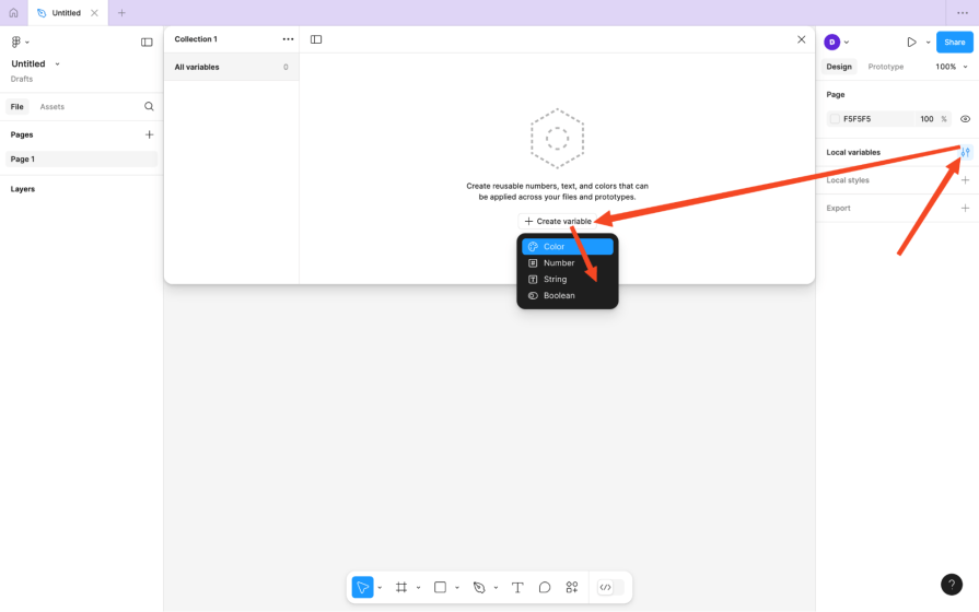
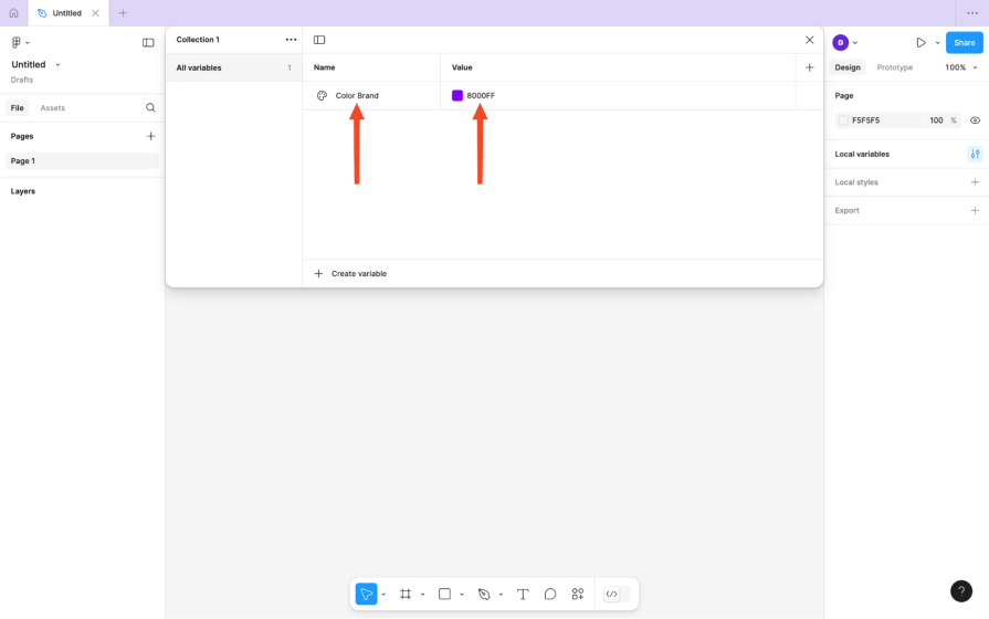
Next, ensure that it has a Name and a Value. If you want, the value can reference another token (this is called ‘aliasing’), but I’d avoid doing this as it makes design files super complicated.
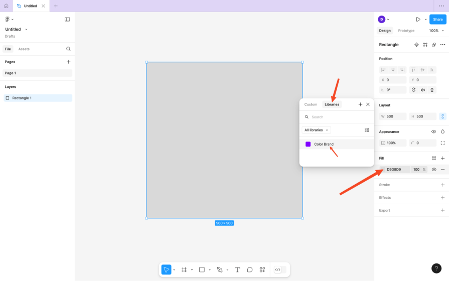
To reference a color token, visit any property that takes a color (such as a fill, stroke, or drop shadow), then switch to the Libraries tab and choose the relevant design variable:
To reference a number token, visit a supported property that takes a number, click on the Apply variable hexagon icon, and then choose the relevant design variable:
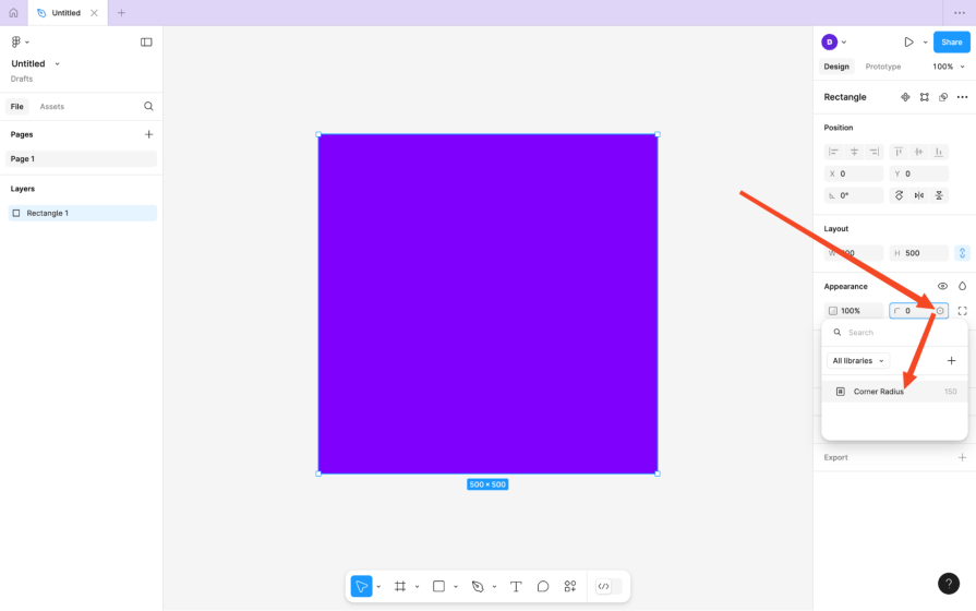
If the field’s a dropdown, the icon’s at the bottom of it.
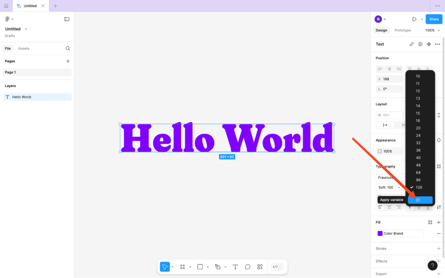
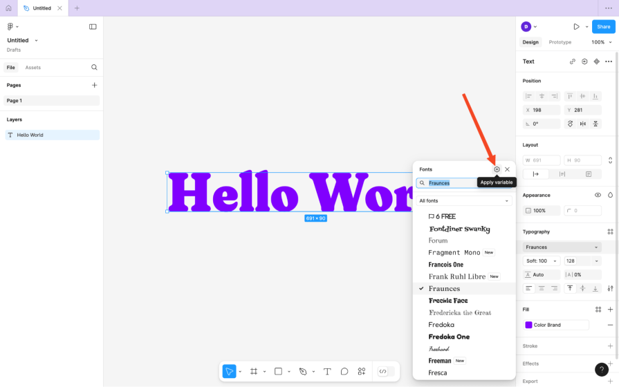
To reference a string token, visit a supported property that takes a string, click on the “Apply variable” hexagon icon, then choose the relevant design variable (just like before).
For the fonts property, the icons are in the top-right corner of the fonts modal.
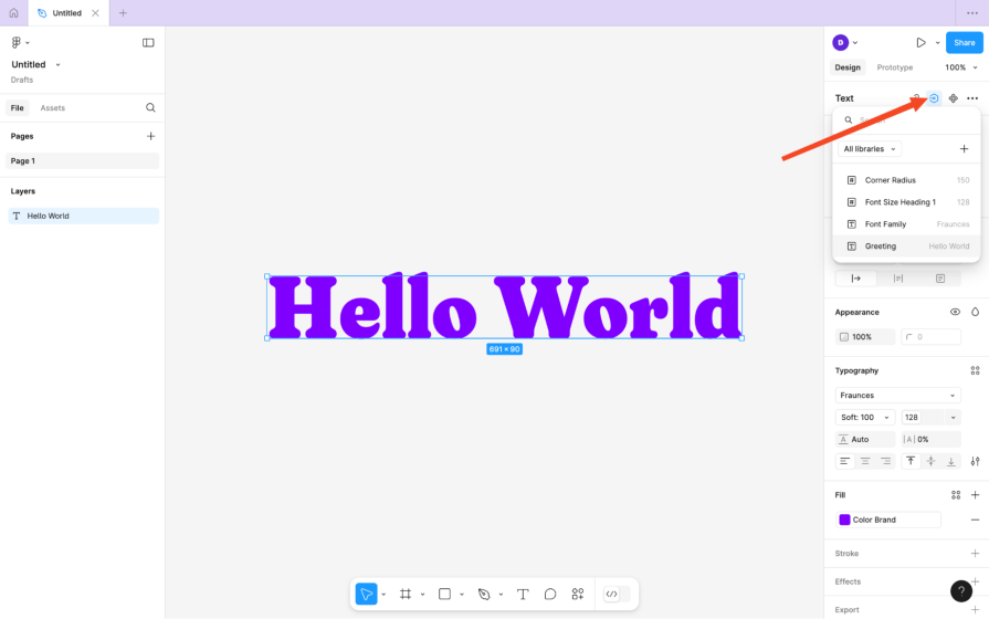
To set the string value of a text layer, the icon’s near the top-right corner of the Design tab (in the Text section):
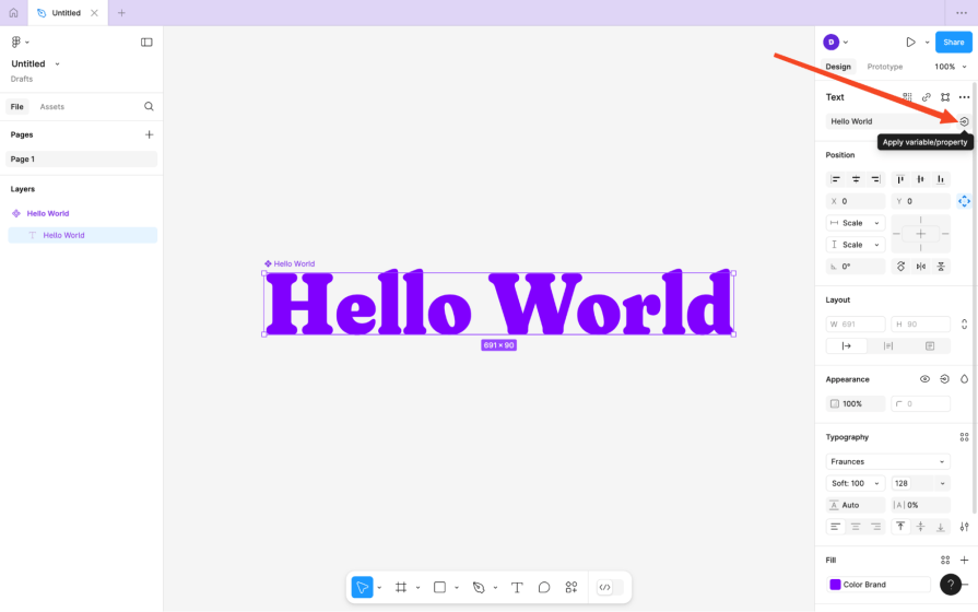
It looks a bit different if the layer’s inside a component:
For other supported properties, check the aforementioned locations. The (font) weight property, for example, is at the bottom of the dropdown.
Some properties take numbers and strings. For example, weight can take “Bold” and “700” (which means bold). Percentages (e.g., “100%”) must be strings because of the non-number “%.”
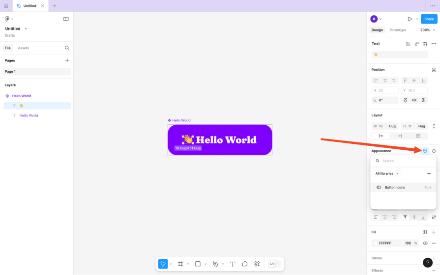
To reference a boolean token, locate the icon in the Appearance section of the Design tab after selecting a layer within a component. If the token’s value’s false, the layer is hidden:
What if you need your design to have different versions? You might want a light mode and a dark mode, different brand styles and brand names for different brands, different languages for different users, and so on.
Well, you can set all that up with variable modes.
To set up a variable mode, click on the Open variables icon, and then the New variable mode or + icon near the top-right corner. Ensure that both modes are named, then provide different design variable values for the new mode:
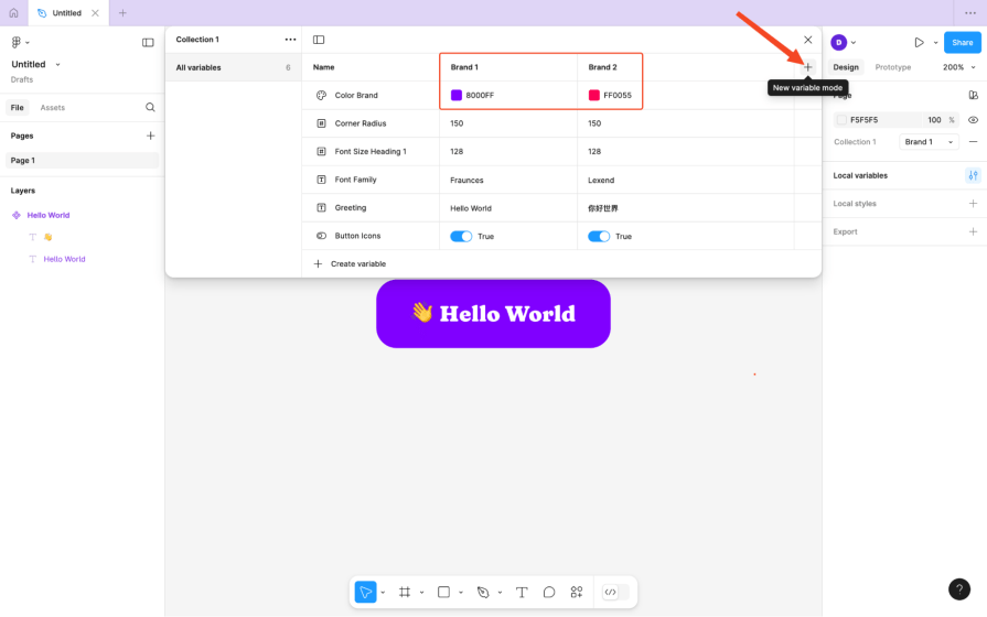
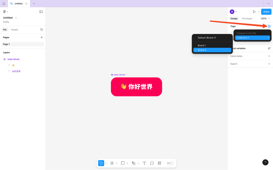
After that, whenever you want to switch modes, click on the Apply variable mode swatch icon in the Page section of the Design tab, then choose the mode.
Fairly easy to set up and manage — and powerful.
It’s important to establish and then maintain a naming convention for your design tokens. This helps with organization and, more specifically, searchability. It also helps designers and developers remember the names of them without having to look them up. That’ll likely mean having a tiered naming convention, like this:
| Name | Value |
| Color Brand L10 | HSL 270 100% 10% |
| Color Brand L30 | HSL 270 100% 30% |
| Color Brand L50 | HSL 270 100% 50% |
| Color Brand L70 | HSL 270 100% 70% |
| Color Brand L90 | HSL 270 100% 90% |
| Color Accent L10 | HSL 270 100% 10% |
| Color Accent L30 | HSL 270 100% 30% |
| Color Accent L50 | HSL 270 100% 50% |
| Color Accent L70 | HSL 270 100% 70% |
| Color Accent L90 | HSL 270 100% 90% |
The color tokens above represent brand and accent colors at 10/30/50/70/90% lightness. This means that these design tokens can be logically looked up in Figma by color > type of color > lightness (or written that way in code), which is organized and easy to remember.
Speak to your devs and come to an agreement on what makes the most sense — maybe Darkest/Darker/Standard/Lighter/Lightest makes more sense to everyone?
Grouping design variables in Figma is actually quite interesting and is determined by how you name them. That is, a / creates a new category nested within the current one. This means that…
…would become…
…, which is better, right?
The code output remains the same.
Grouping might not be enough. If you foresee having too many design variables, still collectionize them as well.
You can do this by clicking on the “Open variables” icon, then the “More options” icon, then choosing “Create collection.”
Warning — you can’t move design variables between collections, so you have to anticipate this and create the collections accordingly.
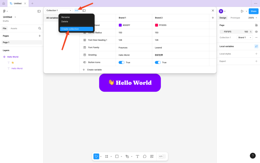
Note that collection names don’t appear in code outputs.
It’s also worth mentioning that Figma design variables can be used in many, many ways to create dynamic prototypes. This might not relate to your design system, in which case you’ll want to isolate those variables into collections.
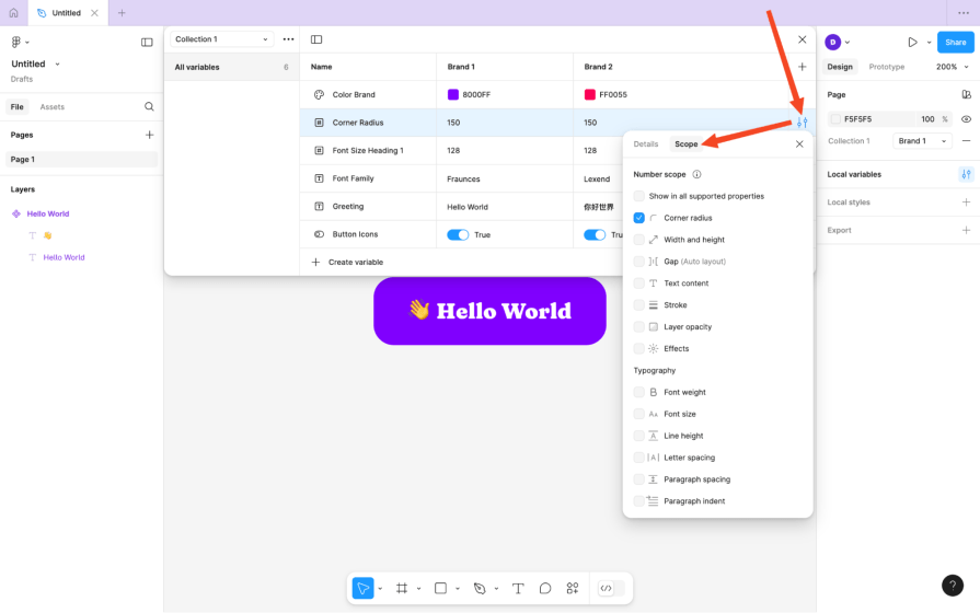
Another thing that we can do to manage design variables is specify their scope.
Obviously, a color variable wouldn’t appear in a list of number variables, so no action would be needed there. However, what if we wanted to restrict a color variable from being used in drop shadows because the design system forbids it?
Click on the Open variables icon, then the Edit variable icon, then switch to the Scope tab and then uncheck the relevant boxes (in this scenario that would be the Effects checkbox).
As a web developer, I like CSS variables to be lowercased, but “Color/Brand/L50” for example, outputs to --Color-Brand-L50 on the web, and while you could rename this token to “color/brand/l50” to output var(--color-brand-l50), you can customize it in other ways.
Your developers can do this by clicking on the Open variables icon, then the Edit variable icon, then the Add code syntax icon, and then choosing a platform (Web, iOS, or Android).

After that, they can type out their favored code output (e.g., var(--color-brand-l50) or var(--ColorBrand50)) for that platform.
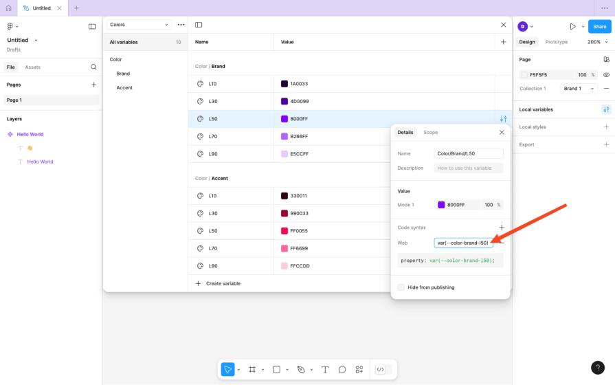
The first option is best for standardizing a favored style of formatting, whereas the second option is best for overwriting a design variable name only as the need arises.
Design variables vs. styles? Nope — you should keep using styles, which are reusable collections of properties, and if those properties reference design variables, then they’re reusable collections of design variables, too, in a way.
This awards us finer control over reusability compared to the all-or-nothing level of reusability that we had before variables.
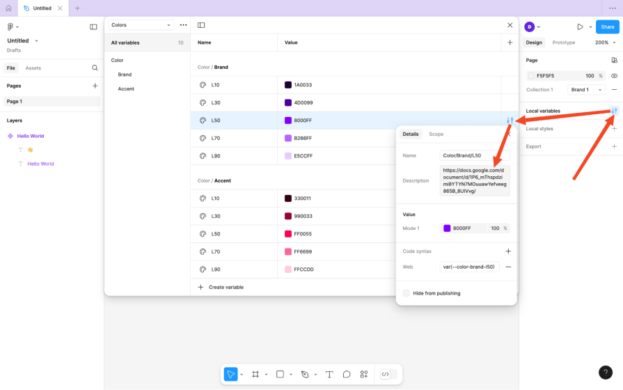
It’s important to document your design variables and, by extension, your design tokens. You’d have somewhat done that already by grouping, collectionizing, scoping, and creating a naming convention, but documenting provides more insight into the reasoning behind the design choices and opens them up for debate.
There are quite a few awesome design system documentation examples here.
To document a design variable/token, click on the Open variables icon, then the Edit variable icon, then either write a short description of it in the Description field or link to an external document (that’s in more depth, perhaps).
When you create design variables in Figma, you’re actually creating design tokens. Figma then transforms these tokens into web code (i.e., CSS variables), iOS code, Android code, and, of course, Figma design variables all at once.
The question is, how do developers access these design tokens to initialize them in the code? Figma only produces styling code, and it doesn’t produce the code that initializes the tokens.
The answer is with Figma plugins.
Style Dictionary is the industry standard for transforming design tokens into whatever developers need them to be, but that’s not the plugin. The plugin is the Design Tokens plugin or something similar to it, which syncs design tokens to Style Dictionary.
In addition, there are some things that Figma can’t do with design variables/design tokens, such as doing calculations with tokens (e.g., creating a type scale) and doing relative color modifications. A design tokens plugin such as Tokens Studio can do all of this, support more properties than Figma does, and still integrate with Style Dictionary. I’d describe it as an optional upgrade.
Unfortunately, Figma’s Dev Mode doesn’t utilize its design variables as well as it could, and design-to-code tools tend to be quite overzealous, so the best approach for building complete design system components is to build upon the code that Figma’s Dev Mode and Style Dictionary produces, store it in GitHub, then link it back up to Figma using Figma’s Code Connects so that everything’s all in one place. Additionally, Code Connects is a developing feature that’s starting to enable design-to-code mapping that truly bridges the gap between design and development.
Either way, this approach mixes manual development with controlled automation to produce expected results in a reasonable timeframe, powered by, of course, your design tokens.
Design tokens are so useful that it’s difficult to summarize how. They help designers and developers reuse styles and settings, which means faster production times and lighter files/codebases. This facilitates consistency, which is great for UX, and it makes products easier to maintain and scale, too.
Finally, they help to bridge the gap between designers and developers regardless of how many platforms you’re building for, as you can use them to easily maintain total multi-platform synchronicity.
Plus, they’re kind of cool to work with. You can start using design tokens right now and scale up to a design system later, even learning a little bit about code along the way.
Got a tip or question about design tokens, design systems, or using design variables in Figma? Put it in the comment section below. Thanks for reading!
LogRocket's Galileo AI watches sessions and understands user feedback for you, automating the most time-intensive parts of your job and giving you more time to focus on great design.
See how design choices, interactions, and issues affect your users — get a demo of LogRocket today.

A three-week mobile banking project taught me that the “proper” UX process is not always realistic. Sometimes, the better approach is to work with what you know, identify what you still need to learn, and make the strongest decision possible under real constraints.

A/B testing compares two versions of a design to see which performs better with real users. Here’s how UX teams can use it to test hypotheses, measure outcomes, and make smarter product decisions.

This case study shows how one ad experience redesign increased total ad exposure while lowering perceived friction, proving that timing and context can matter more than raw interruption.

As products evolve into ecosystems, navigation becomes a system-level challenge. This article explores how to align structure, context, and user journeys to create seamless movement across tools without confusion.