Color theory, while often focusing on aesthetic combinations, can overlook the emotional and cultural significance of colors. However, for UX designers, these factors are crucial when building a color palette. This is where color symbolism steps in, not just filling the gaps, but also empowering storytelling in UX design.
In this blog, I talk about the impact of color symbolism on the user experience, and you can incorporate these theoretical ideas into your UX designs. I’ll also share a color palette evaluation checklist you can use to assess whether your color choices align with the emotional triggers you want to evoke with a design. Read along!
Depending on the context, a specific color can add additional meaning and context to a design. And knowing how to use colors and color symbolism in designs can influence the effectiveness of a UX design.
People can interpret colors based on three different factors:
UX designers should consider a person’s response to color when creating a palette. Colors need to resonate with the target audience, support brand values, and encourage action. Choosing the right color is vital for successful user interactions.
Color symbolism focuses on the cultural meaning behind colors. Your design strategy needs to consider a culture’s color symbolism, especially for a product with a global market.
You may also want to consider the age demographic of your target market. Bright colors may appeal to a younger audience, but an older audience may find them off-putting.
Color psychology, on the other hand, emphasizes the emotional responses and behavioral influences of color.
Understanding both concepts — color psychology and color symbolism — is crucial to creating effective and communicative UX design.
Each color needs careful consideration for its cultural and behavioral implications. A wrong color choice or color combinations can lead to misunderstandings and confusion for the user.
I’ll now talk about a few of the most-used colors and delve into their unique symbolic meanings:
Red can invoke a host of strong feelings, including passion, love, danger, anger, desire, and power.
Culturally, red also has a wide range of meanings. In Western cultures, red is commonly associated with alarm, like stop signs. Other cultures, however, take a more calm approach to red. In many Asian cultures, brides will wear red since the color is often associated with good fortune and celebration.
In UX design, the color symbolism of red is frequently used as a warning sign, such as when the user hits a Cancel button.
Orange is another bold color that demands attention. Some common emotions associated with orange are creativity, youth, spontaneity, and adventure.
In UX design, orange is often used to attract a younger and energetic audience. However, deep orange colors can invoke autumn and earthiness. Since orange is an attention-seeking color, it is often used for safety equipment like traffic cones and safety vests.
Yellow is linked with happy feelings like positivity, cheerfulness, warmth, and energy. It’s another color that seeks attention but isn’t as demanding as red. UX designers may use yellow to signal caution. Say a deadline task is near a deadline — a yellow bookmark can be used to signal urgency.
When it comes to yellow and its color symbolism, you definitely need to do your user research. Yellow can have different meanings across the globe. Yellow may symbolize wealth in parts of Africa, but it represents mourning in Latin America.
It’s easy to see how green is connected to nature. Green invokes feelings like growth, freshness, and quality. It can also symbolize jealousy and wealth.
In UX design, green is often used to symbolize readiness — green can show when a task is complete.
Green has significantly strong cultural color symbolism, too. Islamic culture closely identifies with green, and many cultures may associate green with eco-friendliness.
Blue shades are related to feelings like sadness, coolness, tranquility, trust, and professionalism. Many companies choose blue as part of their brand colors because it invokes trust and dependability.
Choosing the right shade of blue is especially vital for UX design. Some tones are energizing, while others are melancholy.
Purple is a rare color found in nature. And because of its rarity, purple has developed a reputation for symbolizing luxury, royalty, wisdom, mystery, and imagination.
While it’s easy to associate purple with rarity, the cultural context of purple needs consideration. Purple is often worn for mourning in Thailand, Brazil, and Guatemala.
Consistent color use is an important part of establishing brand identity. Using the same colors makes it easier for users to recognize a brand.
Let’s take a look at this shade of green. Can you recognize which brand uses it?
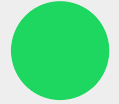
Lovingly known as “Spotify Green,” this specific shade represents the visual voice of the music streaming service. It’s consistently used throughout its UX design.
However, that doesn’t mean Spotify doesn’t play around with color.
The thumbnails of playlists often have a variety of colors to help distinguish them from each other. None of these colors are strictly part of the Spotify brand, but the bright colors resonate with a youthful, diverse audience:

Your users rely on your color cues to navigate an interface. The right colors can ensure smooth interactions. For example, many users have learned connotations with color. Red symbolizes stop, and green means go. But that doesn’t mean you have to use those colors for users to understand an interaction.
Take a look at Spotify’s page for closing an account. You might think red would signal a warning, but Spotify sticks with its signature green and uses large buttons and text to communicate the action:

Crafting a brand identity also means considering the emotional impact of colors. Specific feelings can help align a brand with its goal.
For example, wellness apps frequently use calming colors like blue and pastel hues. Banks and financial apps may use green to signify wealth. Tech companies may use slick and modern colors like silver and white.
Use this checklist to evaluate your color palette. It includes considerations like user demographics, industry norms, brand identity, and testing to help you align color choices with emotional triggers.
The first step is to set a goal.
How do you want to make your users feel? Excited? Calm?
Make a list of emotions you want to invoke. It helps to go back to your company objectives to ensure emotional cues align with the brand identity.
Take the time to consider if the colors match the brand’s personality and values.
You’ll want to ensure the colors align with the user demographics.
For example, an app designed for kids may struggle to resonate if it uses a minimal black-and-white color palette. Bright and fun colors may be more appealing to that age demographic.
Check the demographics of your target audience, including age, gender, and cultural background. Each demographic may view the same color differently, and it’s important to know that response.
Take extra caution with cultural color symbolism to avoid relaying the wrong message.
Take note of what colors your competitors are using for their brands and products. You may find some common colors used in your industry. A similar color palette can make it difficult to differentiate yourself visually, yet it’s possible.
One notable example is the meditation app Headspace. Many meditation apps use calming blues as the primary color of their logos, yet Headspace chose to use orange. It stands out from its competitors and signifies a youthful approach.
However, the color orange can be too energetic for a meditation app. That’s why Headspace wisely chose to use orange’s complementary color, blue, as the main color of the UX design.
Now that you have an idea of appropriate colors for your brand, it’s time to craft the color palette.
Color theory is an essential part of creating a cohesive palette. You need to select primary colors and accent colors that maintain harmony with each other.
Use tools like Adobe Color, Canva Color Wheel, and Colormind.io to create a color palette.
And don’t forget to ensure accessibility when choosing colors as well. Test the contrast to verify that text is legible.
Data-driven decisions need data. A/B tests give you that data to determine which colors convert better without the guesswork. You can alter CTA buttons, text, and other elements to see if it makes a difference in user engagement.
HubSpot, for example, conducted A/B testing to find the most engaging home page hero image. The results showed that a variant with more colorful images and text yielded the most engagement from users. One of the variants actually performed worse than the control.
Essentially, HubSpot avoided a UX design crisis!
Platforms like Lyssna (formerly UsabilityHub) are especially valuable tools for A/B testing. They also help conduct user research. Gathering user feedback provides data-driven insights into emotional responses to color schemes.
Beyond A/B testing, it’s essential to monitor the performance of your UX designs. You may come across additional issues that need to be addressed.
A quicker response means less friction with users.
Create clear guidelines for brand color usage. This will help ensure consistency throughout the brand, product, and marketing materials.
You may also want to share the reasons why specific colors were chosen. This can help cross-functional teams understand the importance of using the right colors.
Color symbolism can significantly influence user perceptions and interactions. Different colors evoke specific emotions. Additionally, cultural interpretations of color can vary widely across the globe. Designing for a global audience means designers need to be aware of these cultural nuances.
UX designers also need to choose colors that are harmonious with each other. It’s vital to test color choices early and often when selecting a color palette. A/B testing and user research are valuable tools to make color decisions that resonate with your audience.
Critical thinking about aesthetics and emotional appeal can help create compelling UX designs that provide a positive user experience.
LogRocket's Galileo AI watches sessions and understands user feedback for you, automating the most time-intensive parts of your job and giving you more time to focus on great design.
See how design choices, interactions, and issues affect your users — get a demo of LogRocket today.
As products evolve into ecosystems, navigation becomes a system-level challenge. This article explores how to align structure, context, and user journeys to create seamless movement across tools without confusion.
Figma’s AI features have exploded in 2026 — from text generation and image editing to full UI drafts and code handoff. But speed isn’t the same as quality. This guide breaks down every major feature, what it’s good at, and where human judgment still does the heavy lifting.
Zero UI works well for screenless, voice-first experiences, but most digital products still require visual interaction. Here’s why multimodal UX offers a more scalable foundation for the future of design.
Multimodal UX goes beyond designing for screens. Learn how context-aware systems, progressive modality, failover modes, and accessibility-first design create better digital product experiences.