Figma Dev Mode was released in June 2023, replacing the basic but useful Inspect Mode. Dev Mode came out of beta in 2024 and now requires paid seats, garnering much criticism recently about their pricing model.

Yes, their model is confusing, with some saying that Figma uses dark patterns in the payment area. One aspect that definitely confuses customers is that you can only use Dev Mode in teams, not in drafts.
Once you get past this, you may discover a useful and time-saving tool, especially if you have been happily working in Figma. I switched the design team from Sketch two years ago, and we haven’t looked back. I find the UI and layout easy to work with, and collaboration with other team members far easier than it ever was.
Hi, I’m Tom, Dave’s favorite developer. I have been working with him for a year, and we get along, but it was a rocky start. Dave’s design files were not always annotated or organized properly.
I am obviously the source of reason in this relationship, but I digress. Dave’s getting much better, especially with the help and support of Dev Mode.
Thanks Tom, that was so nice of you. As we see, Tom and I can now stay on the same page and make sure that all those fine details do not get lost or mistranslated in the handoff process.
The handoff process has always been difficult. Two different languages and cultures colliding. It can be like two tectonic plates crunching into one another. Things get lost, mistranslated, and explosive at times.
I get frustrated that my pixel-perfect vision gets lost, and Tom gets frustrated because he thinks I’m not giving him enough information and support. Really, we should always be the best of friends.
Dev Mode goes some way to bridging that gap, and recently we have been using it successfully. We are still learning the best ways of using it, but without it, we’d be sliding back into the bad old days:
Dev Mode is good in a lot of ways and should make Tom happier when entering the design realm. Tom can inspect elements to view attributes such as color, fonts, and margins. He can see what’s changed when last viewing a file and view annotations from the designers.
A big bonus is the streamlining of a team’s workflow with developer-focused integrations, such as Jira and GitHub. There is a lot to be happy about.
This all means improved efficiency for Tom with direct access to design details such as attributes and styles. It reduces errors and misinterpretations with good communication tools such as annotations.
Finally, Dev Mode contributes to all-round faster development cycles and smoother team collaboration.
The options have expanded, and recently, a few new features have been introduced that have really improved the design process. The main benefit of Dev Mode is that everything is in the design space, yet with tools that are familiar to the developers who are inspecting our files.
Easily measure any element by clicking on it and dragging. Quicker than creating objects specifically for the job.
This lets designers and developers directly add notes, comments, and even ask questions to developers about specific elements or frames in the design file. You can also tag individual developers or designers and send them relevant messages. It helps developers understand the design intent and solutions.
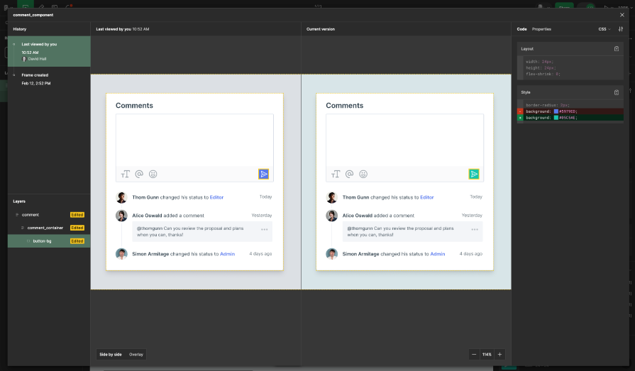
Comparing changes between frames was something I thought I didn’t need, but now find really useful. Determine changes between two frames by comparing them side by side.
This is more complex, but developers love the code editor. Review designs, receive notifications, and stay updated directly within Visual Studio Code with the Figma extension. It even autocompletes code based on your inspection.
Access design assets like CSS box model, colors, typography, spacing, and properties directly from Figma files. No more tedious searches through buried styles.
Being able to copy and export CSS code is a significant feature. Figma says it generates production-ready CSS, and it looks good, but I use it more for giving an example to developers.
Build custom plugins or integrate with common tools like Jira and GitHub. Figma for VS Code lets you navigate, inspect, collaborate, track changes, and speed up implementation all within your editor. Enhance developer productivity by eliminating context switching.
Maintain consistency across design files and code with Figma tokens. Access other developer resources directly within your design file.
Let’s look at an example of a design project that I am getting ready for handoff. I’ve lovingly crafted a task component. In design terms, it’s a simple design. So how do I get my design vision across to Tom?
To begin, I will set up the file ready for Tom. I access Dev Mode, click on the toggle, or use the shortcut Shift + D. The toggle turns green to show that we are now all guns blazing in Dev Mode. The UI and layout of Figma changes and both left and right panels look different:
We first see an Inspect and Plugins tab. We’ll concentrate on the Inspect tab for now. To view all the options properly, I select the frame:
Scanning down the Inspect Panel, we see the Dev resources section, where we can connect different resources to our projects, such as GitHub:
Further down, there is the Code section. The Code section lets anyone evaluate the paddings and margins for selected elements. There are options to select code language and unit settings.
We can select CSS and keep px as units, which are my default for most projects. It also gives us a handy view of generated CSS layout and styles that developers can use straight away:
Following this are the Color and Assets sections that display properties, such as color variables and visual assets. Last, there’s the Export section that allows me to export selected elements.
The Inspect panel shows the properties of a selected item. If I select a particular UI object, such as text or a UI element, I will see the properties of that object:
For Tom, the best thing is its real-time Inspect feature. You can inspect the sizing, paddings, and margins of any element in your design. However, the major downside of this feature is that you cannot change the objects in real time.
For instance, if I want to change the spacing for the text header, I need to move back to Design Mode and change it there. Then I return to Dev Mode to validate my design. This is not very convenient.
I start by making annotations for Tom to document design decisions. Select annotations option, shortcut Shift + T, in the top left corner:
The tool is useful for highlighting certain details that I think might be missed. When typing in the annotation, it allows me to select a specific property in the element:
Now I want to make sure that the paddings will be roomy and luxurious, so I show Tom the specific measurements of the design. I select the measurement tool in the top left, shortcut Shift + M and select the first elements in the design. Now I can showcase the padding around the container here:
Some user’s mileage will vary with the measurement tool. Tom knows Figma well, so can come in and click on the element and see at a glance the sizing and measurements through the Inspect Panel. But if it’s a developer’s first time in Figma, it can be used as a solid introduction to the Dev Mode process:
I used to add free-floating text and post-it notes around the design, but now everything looks more organized. Finally, my annotations and measurements don’t look like a kindergarten paint fight anymore, as Tom would kindly say.
We’re just on a call, and Tom is wondering why things have changed since he last saw it. Well, it’s a designer’s prerogative to change one’s mind, isn’t it? So I can show Tom more recent changes I have made with the Version Compare.
I can select our frame and click Version Compare in the Inspect Panel. I can hear Tom grinding his teeth until he sees the changes side by side. He then gasps. Not sure if it’s my design, or if he finds this really useful.
You see a side-by-side comparison of the design along with a history of changes. You can see all the changes you introduced in your design from the last version. I changed the color of the button to see what it looked like:
I can also show him the playground. This is a fancy word Figma uses for a preview. If we select a UI component, we will see a call to action to open in Playground.
If we click it, we will see a space where we can experiment with unique properties of the selected component without changing the actual design. The properties will be the same as we created in Design mode.
Tom here. I do like going into Figma, but I found you can bring Figma files directly into Visual Studio now. I downloaded the VS code plugin. I then connected to the Figma account. I found it quite useful. When you are connected, you can see the Figma design files directly in Visual Studio.
A criticism is that it can be laggy, and at times the preview didn’t render properly. It’s not a feature I will use all the time, but if there are a lot of assets such as SVGs and images, it’s very handy and I don’t have to bother Dave looking for exports. Back to you, Dave…
At last, we’re ready to build. One great feature is Ready for Development:
When screens are ready to hand off, we can highlight them so that the team can easily understand what is ready for implementation.
Instead of creating a separate page in a Figma file and copying frames like I used to do, we can simply mark frames with a Ready for Development. What’s also good about this view is that other pages are hidden, decluttering the left side panel, so Tom doesn’t accidentally stumble into working files:
Figma Dev Mode is a move in the right direction for designers and developers, but it’s not without its faults and doesn’t fix all UX designer’s troubles.
While Dev Mode improves handoff, it doesn’t eliminate clear communication entirely. Tom and I still need to clarify interactions, edge cases, and design intent that aren’t captured purely in code in person or on Slack.
Dev Mode focuses on handoff, but it doesn’t address broader collaboration needs. Designers might still need additional tools or processes for real-time feedback, version control, and multi-team collaboration.
The Measurement tool for one, although useful, isn’t something that would make you pay extra for this. The Annotations tools could also be seen as a slight tool that really does not justify upgrading to the Professional package and needing to buy a lot of design seats. It’s one of those features that really should be default once the company is signed up for an annual plan with one seat.
When in Dev Mode, there are things I can do when in Design Mode. For instance, if I want to change the spacing in the task component, I need to move back to the Design Mode and change it there. Then I return to Dev Mode to validate my design. Not very convenient.
As I mentioned at the beginning, the pricing model is a bit frustrating. First, if you were to add a developer outside your organization, it would cost you to add them. I have seen comments like, “This definitely adds some workflow efficiencies, but there’s still no way my company’s going to pay $25/seat for this, especially when we have 10 devs for every designer.”
The pricing model can be restrictive, especially for smaller companies and freelance designers who work with many developers. Now the company might not want to pay for this and then you are stuck. There are ways around it, but they mostly involve exporting files and no comments or annotations will appear.
What’s the verdict on Figma Dev Mode? It’s definitely not perfect, but hey, it’s off to a decent start. It has its rough edges, but it still does a few things that no other tool I’ve tried lately can pull off. Is it a must-have in my daily grind? Not yet, but I wouldn’t ditch it now, either. If Figma can sort out the pricing model for these extras, they might get rid of some of the negative press Figma has around their subscription model.
As head of design, I need to keep a tight rein on the spending and I have an annual review of Figma seats every year. Dev Mode is useful enough for me to justify paying for it, even with our growing design and dev team.
But next year, I’ll be taking another look to see if they’ve improved it. If not, maybe I’ll have to free up some design seats (don’t worry, Tom, your spot is safe with me 😉).
LogRocket's Galileo AI watches sessions and understands user feedback for you, automating the most time-intensive parts of your job and giving you more time to focus on great design.
See how design choices, interactions, and issues affect your users — get a demo of LogRocket today.
Design engineering has always lived between design and code. But with AI tools turning prompts into interfaces and code into editable canvases, that bridge is becoming a new way of building.
A three-week mobile banking project taught me that the “proper” UX process is not always realistic. Sometimes, the better approach is to work with what you know, identify what you still need to learn, and make the strongest decision possible under real constraints.
A/B testing compares two versions of a design to see which performs better with real users. Here’s how UX teams can use it to test hypotheses, measure outcomes, and make smarter product decisions.
This case study shows how one ad experience redesign increased total ad exposure while lowering perceived friction, proving that timing and context can matter more than raw interruption.