Just as painters can mix paints together to create a new color, blend modes allow digital artists to create different effects by blending layers in various ways. Each blend mode defines how the layers interact with each other by combining their colors, which affects their resulting appearance.
As an interface design tool, Figma offers a range of blend modes for designers to apply to their layers and fills. In this article, we’ll take a look at each of Figma’s different blend modes and how to use them in your designs.
A blend mode defines how two or more layers, such as images, colors, or text, will blend together by applying mathematical calculations to the pixels from each layer. Applying a blend mode to a layer will affect the layers behind it. With blend modes, you can apply overlays to images, seamlessly blend two layers seamlessly, or even change the colors of a layer.
In Figma, blend modes can be adjusted for a layer or an object’s fill. In the Layers settings, you can select a blend mode to apply to your layer. You can also apply a blend mode to a frame, group, or section, which will blend with the layers that are nested within it:
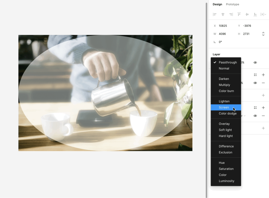
Similarly, to apply a blend mode to a fill layer, select the fill color and click on the Blend mode button in the color picker. This will open a dropdown menu with the available blend modes to choose from:
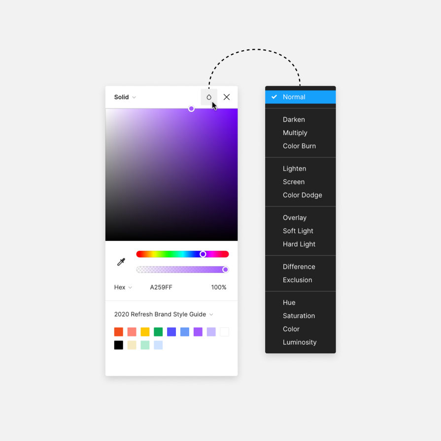
Usually, adjusting the opacity of your blend layer or fill is necessary to refine the blend effect. You can adjust those opacities in the settings under the Design panel:
Now that we’ve talked about how blend modes work, let’s explore the 19 different blend modes that Figma has to offer.
The default blend mode used in Figma for layers is Pass through, which behaves like its name suggests. It allows the layer behind it to pass through, allowing it to blend based on the top layer’s blend mode.
But how is Pass through different from the Normal blend mode?
Normal blend mode doesn’t allow the layer behind it to blend with the top layer. You can adjust the opacity of the Normal blend mode layer, which will somewhat blend the two layers together, but if the fill of the object in that layer has a different blend mode, it will not have any effect.
Similarly, if your top layer uses Normal blend mode but has objects grouped within it which have different blend modes, those will not have any effect either.
If you apply Pass through to your layer, then the background will be able to pass through and blend according to each object’s blend mode. In this example, each circle has a layer blend mode and a fill blend mode applied to it.
When the circles use Pass through as the layer blend mode, each circle will blend with the background based upon its fill blend mode. The circle with a Normal blend mode applied will appear normally, making it useful if you want a specific object to avoid blending with the background while other objects blend:
The next section of blend modes include Darken, Multiply, Plus darker, and Color burn. These blend modes are used to darken the layer behind the blend layer. Here’s how each of them work in comparison to Normal blend mode:
Darken mode compares the colors of the blend layer and the layer behind it, then produces the minimum of two values. In other words, it keeps the darker colors.
Multiply mode keeps the darker colors of the blend layer and makes lighter colors more transparent. This leads to darker colors, except in cases where the layer is pure white.
If you’re familiar with Adobe Photoshop’s Linear burn blend mode, Plus darker mode behaves the same way. It is similar to Darken, but has more emphasis on the mid-tones.
Finally, Color burn mode increases the contrast between the blend layer and the layer behind it.
Here’s another example of how these different darker blend modes work, this time with an image containing a person:
Next, we have the lighter blend modes, which include Lighten, Screen, Plus lighter, and Color dodge. As opposed to the darker blend modes, these lighter blend modes are used to lighten the layer behind the blend layer in Figma:
Like Darken mode, the Lighten mode compares the colors of the blend layer and the layer behind it, but instead it keeps the lighter colors.
Screen inverts the colors of each layer, multiplies them, and then inverts the result. This works as the opposite of Multiply and brightens the areas where either layer was darker than white.
Plus lighter mimics Photoshop’s Linear dodge blend mode, which adds the values of both layers together.
Color dodge lightens the bottom layer based on the brightness of the blend layer.
Below, you can see how the same image from before changes based on the different lighter blend modes you apply to it:
Next, we’ll move on to the contrast blend modes, which include Overlay, Soft light, and Hard light. These blend modes are effective at enhancing the contrast between layers for both lightening and darkening:
Overlay mode combines the effect of the Multiply and Screen blend modes. The blend layer becomes lighter or darker based on the base layer’s brightness.
With Soft light mode, the lightness or darkness of the blend layer will create lighter or darker colors. Where the base layer is white, the blend layer will also appear white.
Like Overlay, Hard light mode also combines the Multiply and Screen blend mode effects. However, the blend layer’s lightness or darkness determines the effect on the base layer, creating an inverse relationship between the two.
Take a look at how the image we used earlier looks with these contrast blend modes applied:
The comparative blend modes include Difference and Exclusion. We can use comparative blend modes to invert colors or exclude blending by canceling out colors based on the base layer. Here’s a quick preview:
Difference mode takes the difference between the blend layer and the base layer. Blending with white will invert the color, while blending with black results in no change.
Exclusion mode is similar to Difference, but lowers the contrast, making the resulting image lighter overall.
Take a look at how Difference and Exclusion affect the image we’ve been using:
Last but not least, we have composite blend modes, which include Hue, Saturation, Color, and Luminosity. These blend modes work to change the color quality of the blend layer. We can use them for color correction or image sharpening:
Each of these blend modes uses a different combination of the base layer and blend layer’s hue, saturation, and color values. They’re named based on which values they take from the blend layer.
Hue mode recolors the base layer with the hue of the blend layer while keeping the base layer’s brightness and saturation.
Saturation mode retains the base layer’s brightness and hue, but uses the blend layer’s saturation value.
Color mode uses the brightness of the base layer while blending in the hue and saturation of the blend layer.
Luminosity takes the base layer’s color and saturation of the base layer and adds the blend layer’s brightness.
If we apply these blend modes to our image from before, we’ll see something like this:
We’ve looked at how each of Figma’s blend modes can affect your designs, but how do you apply them practically? Let’s go through an example of using blend modes in Figma to create effects that will elevate your user interfaces.
When designing interfaces that require dynamic backgrounds, such as images, patterns, or motion, you may want your UI elements to blend in different ways to be visible and accessible at all times. For example, here we have a mobile interface of a music player that uses an image as the background:
Let’s darken the background layer to ensure that the song title and media controls stand out against the image. To achieve this effect, we’ll add a second fill to the image layer and set the fill color to grey:
We’re using grey because the darker blend modes compare colors between the blend layer and base layer and keep the darkest colors. Using pure black will result in a black layer once the blend mode is applied. You can adjust the shade of grey later to refine the effect.
Next, change the fill blend mode to one of the darker blend modes. For this example, Multiply seems to work the best, but you can hover over the different blend modes to preview the result in your designs:
Now, our image background is darker but still visible, and the song title and media controls stand out much more visibly. As mentioned before, you can adjust the shade of grey to match your desired darkness:
By applying this blend mode, we’re able to create enough contrast so that users can view important content while still enjoying the dynamic background.
Lastly, let’s add a layer blend mode to the group of media controls to give it a transparent effect. For this, the Luminosity blend mode can work effectively, as it allows us to retain the color and saturation of the background while adjusting the brightness based on the blend layer. As a result, the controls will have a glassmorphic effect:
As before, you can adjust the shade of grey to achieve your desired result.
In our hypothetical music player, the image will change depending on the song being played. So, make sure to test out your design with different background images to ensure that the blend modes work for all cases.
Since we are using grey to darken and lighten certain aspects of our design, the blended result should work for all images:
Blend modes are a powerful tool in Figma that can elevate your user interfaces. With 19 blend modes available, understanding the differences among them can help you apply them to your designs to create the desired effects.
There are endless outcomes you can achieve when combining different blend modes, including darkening, lightening, or increasing the contrast between layers. Figma’s blend modes provide a great way to adapt your design elements to dynamic backgrounds and add some visual interest to your designs.
It may take some experimenting to figure out which blend mode works the best for your use case, but that’s part of the fun in designing! With Figma’s ability to hover over each blend mode to preview it, it’s an easy way to turn your flat designs into something more impressive.
LogRocket's Galileo AI watches sessions and understands user feedback for you, automating the most time-intensive parts of your job and giving you more time to focus on great design.
See how design choices, interactions, and issues affect your users — get a demo of LogRocket today.
A three-week mobile banking project taught me that the “proper” UX process is not always realistic. Sometimes, the better approach is to work with what you know, identify what you still need to learn, and make the strongest decision possible under real constraints.
A/B testing compares two versions of a design to see which performs better with real users. Here’s how UX teams can use it to test hypotheses, measure outcomes, and make smarter product decisions.

This case study shows how one ad experience redesign increased total ad exposure while lowering perceived friction, proving that timing and context can matter more than raw interruption.

As products evolve into ecosystems, navigation becomes a system-level challenge. This article explores how to align structure, context, and user journeys to create seamless movement across tools without confusion.