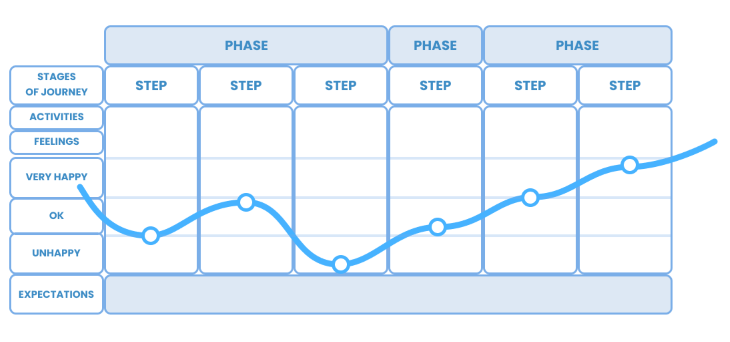
Although a user flow seems something self-explanatory, let’s set the standards and avoid some common mistakes, such as the confusion with the term user journey, which comprises a whole set of different issues. A user journey maps a different dimension of the relation of the customer (user) versus the axis of time.
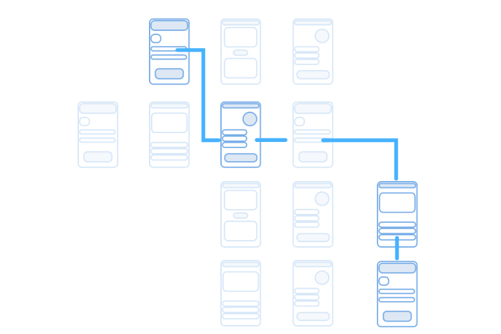
A user flow is a much stricter process. While user journeys cover the experience of users (usually in customers’ shoes) across several channels, not being restricted to the interfaces of a specific application, user flows are primarily concerned with the direction or the path users take in order to complete a specific process within one application, with the goal of providing frictionless flows.
Additionally, user flows are processes where interfaces can be defined and refined, providing less friction throughout the steps the user takes. These flows are not dealing with the more abstract concepts of brand-customer relations and must be goal-oriented. In these terms, a good user flow:
Therefore, user flows are strategic tools for designing the most pragmatic aspects of the user experience, refining interfaces, and helping direct the design of experience through tangible interfaces and their relations using clear and measurable goals and outcomes. Let’s see what that user flow does for UX teams.
In real life, we are often faced with demands for mapping user behavior within an application as if an “application” was something purely linear (syntagmatic). In fact, an application (be it a mobile app, a website, game, immersive technology, etc.) is a complex system with multiple different flows within it.
Thus, it is crucial to define the boundaries of a user flow so that the final map retains its measurability and adherence to real life.
The golden tip is this: no user flow covers the whole application, and you must define a theme early in the process to reflect this. In more philosophical terms, you can think of a theme as the “thing that generates movement,” the will or desire that translates into a specific set of actions within the application.
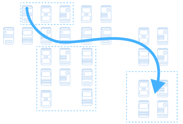
The theme is the scope of actions meant to be carried out by users within one specific flow. This flow must be distinguishable, have a title, and have specific goals attributed to it. Examples of common themes are:
Or, more business-oriented themes include:
There are all a certain set of interfaces that may be equally comprehended in multiple flows (e.g., a home or landing pages); however, the flow as a theme of action should retain its ability to be kept as a separately analyzable unit.
You’re likely familiar with this fundamental conundrum for a UX professional: Who is the ultimate owner of the experience? Should I design what the best design practices tell me to, or should I learn and imitate the behavior users tend to repeat, even if it is not the ideal?
To answer this, we must divide between what and how. In truth, most of the user flow is meant to map a flux of procedures that provide a plain and clear business goal (increasing profit, a boost of conversion rate, retention, etc.). This is what the user flow does; it designs a path for a strict and rigorous business purpose. Consequently, the UX team is in charge of tracing the general path towards a given target.
But users don’t always follow a designed path as expected — we will talk further on this aspect ahead — and this affects the user flow. It must be subject to tests (as well as interfaces, writing, and other aspects) and must be updated to conform to the results. A common mistake UX teams make is to design rigid flows only to validate preconceived interfaces, so remember to design it organically.
A user flow is considered a happy path when it comprises the minimum possible steps users might take to accomplish a certain goal. The simpler the flow, the happier we consider the flow to be.
A happy path tends to be clearly drawn in the project in order to serve as a utopia (the ideal scenario) and also to avoid excessive deviations (if there are several ways to get to the same ends). Use this terminology carefully, since it may not be considered the only possible or acceptable path.
As Atanasijevic puts it in her research: “In the context of software or information modeling, a happy path is a default scenario featuring no exceptional or error conditions.” Because it is constrained to a very narrow set of possibilities, it is crucial to keep in mind that the happy path serves more as a prototypical form of behavior than a real-life occurrence.
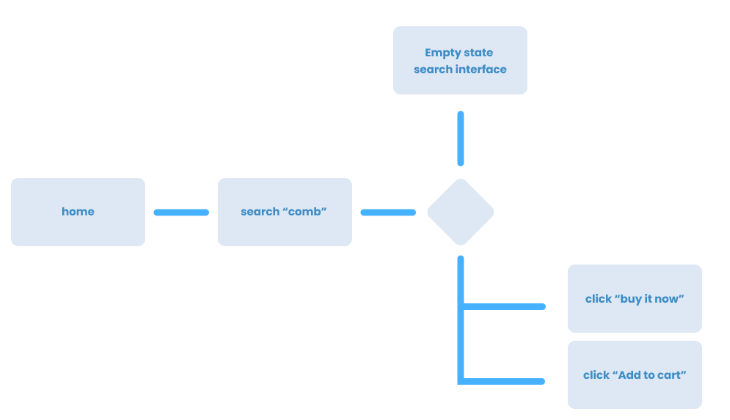
To demonstrate the complexity of a happy path once brought to real-life circumstances, consider the classic buying flow:
These kinds of naive paths are unrealistically constructed and become misleading to design teams, hiding key aspects of the human and technological behaviors in the real world that must be addressed and cared about. To demonstrate the depth of a real process, we could simply start by asking, where do I want to cover in my prototypical happy path? Where does it start? What are the possible combinatorial aspects related to its flow? For instance:
We can’t cover all possible aspects of turning a user flow into a happy path within the scope of this article, but just the first two steps already give a glimpse of the real level of complexity. That is why it is important that you consider the happy path and use it as a prototype for behavior instead of a real and unique user flow.
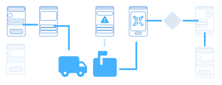
If a user flow does not focus on a specific (thematic) set of steps, it might fall into a general category of flow-mapping, such as a wireflow, which shows the array of possible connections between discrete interfaces without focusing on a main task. A user flow is only useful once it targets a specific flow. Therefore, limit and divide your projects by certain themes.
Another common dimension of mapping flows are the task flows: These are useful once they isolate the steps of a specific task from the other correlated interfaces of the system. However, it does not allow the curation of interfaces (a primary goal of user flows) and also does not cover touchpoints like a user journey map would.
A commonly overlooked aspect are the offline steps of the flow, but you must also take them under consideration and clearly show them in the project. For example, if your flow requires reading a QR code to unlock certain features or accessing a digital version of a physical book, you must show this step as an inherent part of the user flow.
The first step for creating a user flow is clearly mapping the main trajectory and its adjacencies in a wireflow. But as a flowchart, it can range from words pointing to other words all the way up to more complete wireframes of the pages.
I strongly recommend that the level of this flowchart be kept around more complete wireframes of the pages. As NNG points out, flowcharts based on basic titles of pages “lack the page context — an aspect which strongly impacts the user experience.”
Usually, we start user flows after the application has its information architecture defined between the UX, architecture, and product teams. That means that the distribution of the total information throughout the application is determined in IA, and it can be individually worked in each interface with a wireframe, elevating the level from content design to decisions of positioning, accessibility, organization, hierarchy, and functionality.
Now we work on the user flow. In these terms, instead of using architectural formats such as the first picture below, we build flow visualizations that contemplate mechanics and information structure within the pages (wireframes) like the second picture.
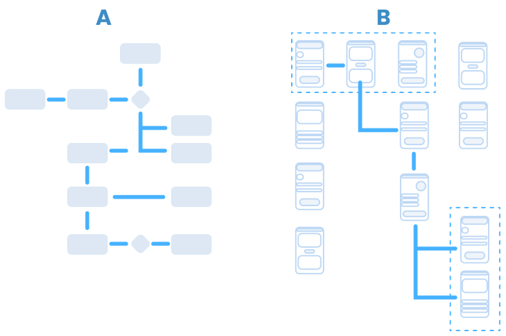
Note that user flow as a practice has its main strength as the capacity to design and refine individual interfaces holistically. In other words, you can adjust individual interfaces to benefit a whole process.
That means that a good user flow project accurately depicts a flow through realistic interfaces, with use of probable or real features. Through this process, the user flow must be capable of implementing new features or changing the flow with consistent and visual evidence.
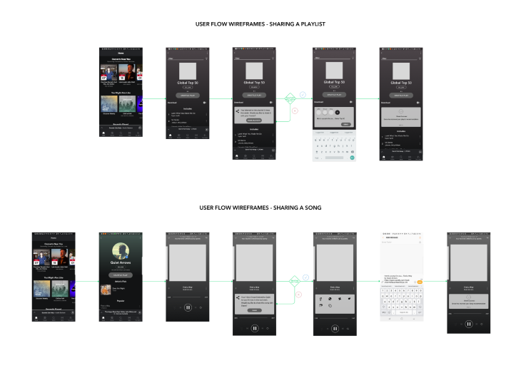
Naturally, the next step is submitting the curated wireflow to the test with real users. In this operation, you acquire further knowledge, now concerning the contextual, cultural, and communicational dimensions that tend to show up on assisted tests.
The project should be capable of testing in tools such as Maze and other prototype-based testing platforms. A user flow provides a holistic view to the product, so you must definitely contemplate natural use deviations only captured via testing with users.
Through testing, new paths may arise, as well as minor modifications that help guiding users through the expected steps for a positive outcome.
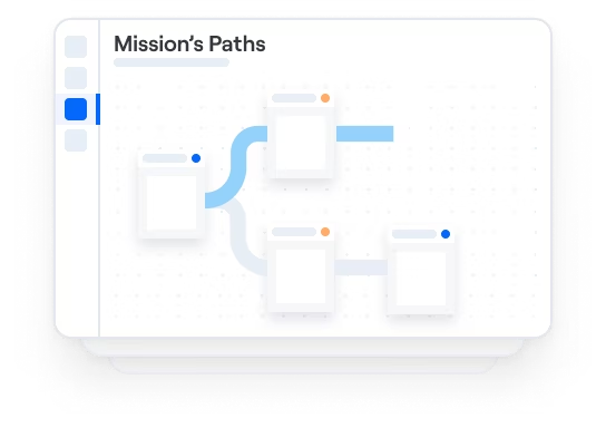
Any prototyping tool can be used to test a user flow, but there are tools better equipped for tracking behavior, such as Maze. In this case, consider the “missions” as the user flows. For these, you build the prototype considering a specific flow, and its adjacent paths, that can be considered as deviations from the “mission.”
A good practice is bringing the user flow project to the highest possible level of interface design, so that it could reach a systemic level of accuracy and management. In these terms, the ideal picture would be to construct the prototype for the user flow project using componentized elements from a mature design system.
This means that once specific changes are made to the interfaces benefiting the flow, be it curated in desk research or evidentiated through user research and behavior analysis, these changes are automatically reflected throughout the whole application through its design system components.
For example, if you diagnose that the behavior of a specific functionality (say a search engine) is not fluid enough,, the treatment of this componentized functionality in a design system represents an improvement for the whole system. In every step, this same mechanic comes up during the user flow.
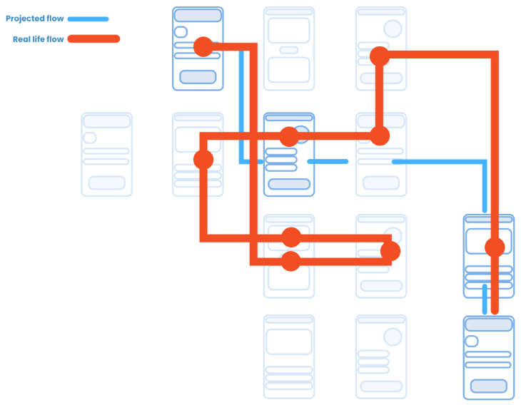
The concept of an interface applies to any system that interfaces humans and their social needs. Therefore, interfaces contemplate a whole set of complexities from an app, to website, game, immersive technologies etc. In all these cases, we are constantly faced with the fact that in many cases, the desired path is not the projected one.
A clear example of interfaces that suffer from a disagreement from design to reality are urban planning projects and the phenomenon of desire paths. These are paths marked over grassy parks that imprint the real and practical paths users desire in order to go from point A to B.
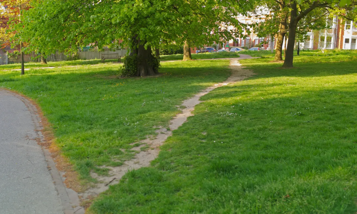
In urban planning as well as in User Experience designs, there is a plethora of elements that underlie users’ actions that range from practical or goal oriented decisions, to psychological and emotional, or more unconscious facts, up to cultural constraints and habitus. In both cases, the projected trajectory is often guided by technical or aesthetic decisions that may prove impractical in real life use. It is mandatory for designers to keep the proposed user flow under scrutiny, so that the user behavior could be analyzed for improvements, and in some cases, complete makeovers of the project.
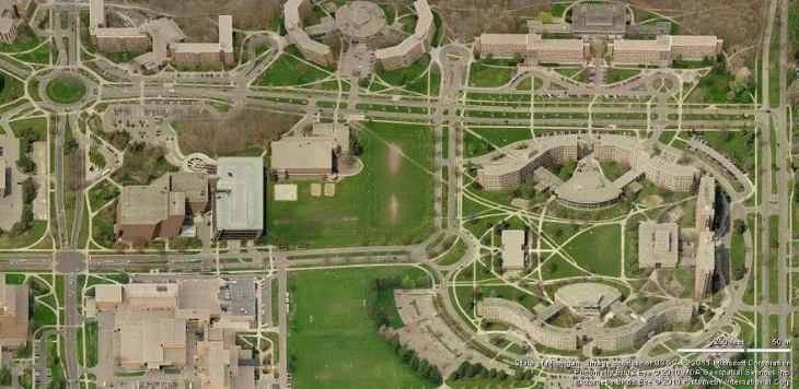
Urban planners have known about it for some time now; There are several examples in which projects that cover large open areas, mostly universities, do not have its paths determined in the original project. Instead, the urban architecture team covers the area with grass and lets the users organically create the trails. These desired paths are then paved, and a clear map of density of traffic for each connection between buildings (features) is naturally established.
User flows are primarily concerned with the path users take in order to complete a specific process within one application, with the goal of providing frictionless flows. It is important to bear in mind that user flows are a valuable system for designing the way multiple interfaces interact in order to provide a frictionless experience.
As a tool for designing, flows provide a clear view of smaller elements in each interface at the same time as it allows a broader view of the application as a whole. UX teams can use this method to track user behavior for certain paths, pinpointing on the map clear areas of friction, and operate improvements holistically; that is, in a specific interface and on the whole flow at once.
Keep in mind that the user flow you design may not represent the simplest way to solve a task, and to this extent, both urban planners and UX designers must learn users’ behavior in a real-world experiment. The most direct way to do this is to round up the flows until it reflects users’ desire paths.
Featured image source: IconScout
LogRocket's Galileo AI watches sessions and understands user feedback for you, automating the most time-intensive parts of your job and giving you more time to focus on great design.
See how design choices, interactions, and issues affect your users — get a demo of LogRocket today.

As products evolve into ecosystems, navigation becomes a system-level challenge. This article explores how to align structure, context, and user journeys to create seamless movement across tools without confusion.
Figma’s AI features have exploded in 2026 — from text generation and image editing to full UI drafts and code handoff. But speed isn’t the same as quality. This guide breaks down every major feature, what it’s good at, and where human judgment still does the heavy lifting.
Zero UI works well for screenless, voice-first experiences, but most digital products still require visual interaction. Here’s why multimodal UX offers a more scalable foundation for the future of design.

Multimodal UX goes beyond designing for screens. Learn how context-aware systems, progressive modality, failover modes, and accessibility-first design create better digital product experiences.