Quiz time — what’s one feature that every software, program, or app has in common? I’ll give you a clue: you may like to edit your details here. You guessed it, settings!

Whether lowering the brightness, changing your password, or modifying your preferences, the settings screen is always an interactive playground where users get to shape their adventures. It’s not just a mundane collection of toggles and sliders. Think of it as a canvas alive with microinteractions, intuitive navigation, and the power to craft a tailor-made experience.
Ever wondered why these seemingly mundane screens are so important? We’ve got the lowdown on that, plus all the details you need to consider when crafting them.
We’ll explore the various types of settings screens and dissect the oh-so-common blunders designers tend to make. We’ll even peek at what the bigwigs are up to and unveil why their users love their settings screens (and why your users will too!).
Settings screens hold the power to shape the entire user experience. Ever had a moment when an app or a website felt like it was reading your mind? Chances are, the magic happened in the settings.
As designers, we find ourselves crafting these digital command centers when users need a bit of customization or control. Whether it’s tweaking notification preferences, adjusting display settings, or choosing the perfect theme, settings screens are where we essentially hand over the reins to our users, saying, “It’s your turn now!” Users become their own designers.
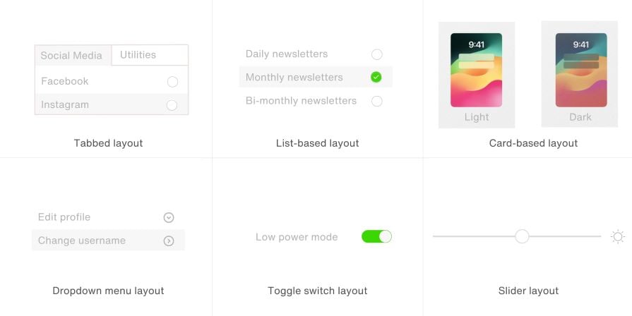
Life is like a box of chocolates, you never know what you’re gonna get — and like a box of chocolates, setting screens also come in various flavors, each with its unique layout and purpose:

Now, the question is when to use what? Tabbed layouts are perfect for comprehensive apps, while list-based ones shine when simplicity is key. Card-based layouts? Ideal for apps with diverse features. Dropdown menus? Stealthy elegance. Toggle switches? Streamlined simplicity. Sliders? Precision at your fingertips.
Remember, each layout has its own rhythm; find what resonates best with your users.
Now, let’s dissect the intricacies of settings screens, delving into the do’s and don’ts that can either elevate or undermine the user experience.
From prioritizing clarity to embracing accessibility, these principles are the keystones of user empowerment.
When it comes to settings, clarity is king. Label options with user-friendly language, avoiding jargon that might leave users scratching their heads. Think about your grandma using the app: if she gets it, you’re on the right track.
Group related settings together like you’re hosting a dinner party for old friends. It’s all about making it easy for users to find what they’re looking for. No one wants to play hide-and-seek in the settings.
Be the friendly guide. If a setting might be a tad confusing, throw in a brief explanation or a tooltip. Users will appreciate the extra effort, and frustration levels will plummet.
Accessibility is not an afterthought. Ensure your settings screen is navigable for all users, regardless of ability. Use color contrasts, legible fonts, and consider users with varying motor skills or vision impairments.
Keep it consistent with the overall design language of your app. A wild departure into uncharted design territory might leave users feeling like they’ve accidentally wandered into the Twilight Zone.
From avoiding overwhelming options to steering clear of reckless defaults, these are the pitfalls to sidestep for a smoother user journey.
A settings screen isn’t a dumping ground for every conceivable feature. Too many options can overwhelm users. Keep it focused on what’s truly essential.
Don’t make users squint or zoom in to read microscopic text. Ensure that your font size is friendly to all eyes, young and old.
Choose defaults wisely. They’re the first impression users get of your app. A poor default setting can lead to confusion or frustration.
Imagine deleting your meticulously curated playlist without an “Are you sure?” prompt. Always include confirmations for irreversible actions to prevent accidental user mishaps.
Responsive designs are key, and your settings screen is no different, it must be thumb-friendly. Don’t bury crucial options in a place that requires effort to reach.
We know what to do and what not to do, but did you know there are certain settings that every platform has? From your Tesla to Facebook profile, we’ve covered what should be the bread and butter of every settings menu:
Remember, the goal here is to empower users. A well-crafted settings screen isn’t just a checklist but a passport to a seamless and personalized user experience. Design settings screens that make users say, “Finally, someone gets me!”
Do you know who does a good job of resonating with their users? The tech giants of the world: Apple, Netflix, and Tesla. These companies have not only mastered the art of crafting intuitive and seamless settings screens but have elevated the entire user experience to an art form.
When delving into Apple’s settings screens, the brilliance lies in the art of simplicity blended with a meticulous hierarchical structure. The layout is like strolling through a well-organized library where each section feels like a carefully curated shelf of options.
Take the “Accessibility” settings, for example. Apple elegantly organizes features, ensuring users can navigate the landscape effortlessly. Want to tweak your display and text size for optimal readability? It’s a cinch.
Apple’s genius isn’t just in decluttering but in providing clarity. Labels are crystal clear, and brief descriptions offer just enough information without overwhelming the user. This hierarchical layout feels like a friendly guide, leading users through personalization options. The Apple experience is not just user friendly; it’s a masterclass in making the complex seem elegantly simple:
Netflix’s settings screen, particularly in the realm of profile management, is a testament to user empowerment. The tabbed layout is like having a personal concierge for your entertainment preferences.
The “Profile & Parental Controls” section, nestled within these tabs, is where the magic happens. Here, Netflix understands the sanctity of individual preferences. Creating personalized profiles for family members becomes an intuitive process.
What’s ingenious here is the use of clear affordances and progressive disclosure. Instead of bombarding users with an avalanche of options, Netflix guides them through the customization journey step by step. It’s like walking into a tailor shop where every stitch is an expression of personal taste. Netflix not only gives users control over their streaming experience but also transforms the settings screen into a hub of tailored content:
Tesla’s settings screen is a dynamic canvas where innovation meets UX magic. In the “Vehicle” settings, the interactive layout turns adjusting car preferences into an almost playful experience. Want to fine-tune your suspension height or steering mode? It’s not just a menu option but an interactive journey.
What sets Tesla apart is the incorporation of visual feedback. As you tweak settings, the car on the screen transforms in real-time, mirroring your choices. It’s like having a virtual garage where your every adjustment is reflected on your Tesla. The tactile and visual elements turn the settings screen into an interactive playground.
Tesla showcases that settings screens can be more than functional — they can be experiential. This visual finesse not only caters to car enthusiasts but also makes the customization process engaging and user friendly. Tesla’s settings screen is not just a control panel; it’s a canvas for users to paint their driving preferences:
These examples beckon us to consider not just functionality but the emotional journey of users. Apple, Netflix, and Tesla don’t just offer settings, they provide experiences, carefully crafted to make users feel in command, empowered, and delighted.
It’s easy to dismiss settings screens as mere technicalities, yet they are radiating empowerment! Whether it’s the familiar simplicity of Apple, the empowering choices on Netflix, or the dynamic playground of Tesla, these industry giants underscore that settings screens are not merely functional features but emotional touchpoints.
As designers, we should approach settings screens with the reverence they deserve, understanding that in crafting them, we are offering users more than just options, we are granting them control over their digital universe. Design wisely, for in the details of these often-overlooked settings, the user discovers the true essence of their digital autonomy.
Header image source: IconScout
LogRocket's Galileo AI watches sessions and understands user feedback for you, automating the most time-intensive parts of your job and giving you more time to focus on great design.
See how design choices, interactions, and issues affect your users — get a demo of LogRocket today.

A three-week mobile banking project taught me that the “proper” UX process is not always realistic. Sometimes, the better approach is to work with what you know, identify what you still need to learn, and make the strongest decision possible under real constraints.

A/B testing compares two versions of a design to see which performs better with real users. Here’s how UX teams can use it to test hypotheses, measure outcomes, and make smarter product decisions.

This case study shows how one ad experience redesign increased total ad exposure while lowering perceived friction, proving that timing and context can matter more than raw interruption.

As products evolve into ecosystems, navigation becomes a system-level challenge. This article explores how to align structure, context, and user journeys to create seamless movement across tools without confusion.