First impressions matter. They can have a lasting impact on how someone initially perceives you and affect your relationship going forward. What makes your first impression is your appearance, your greeting, and the way you make them feel. A good first impression can have a positive impact on people and make them want to see you again.
In the same way, first impressions also matter for mobile applications. When users first open a mobile app, their initial experience has a significant effect on their perception of the app. This is why it’s important to design an effective mobile app onboarding flow that leaves users feeling positive about your app and gets them using it quickly.
In this article, we’ll talk about why user onboarding matters, the differences between desktop and mobile app onboarding, the types of mobile app onboarding, and some best practices to follow when designing a mobile app onboarding flow. Finally, we’ll walk through an example mobile app onboarding flow to give you an idea of how to design one for your app. This will give you a good idea of how mobile onboarding differs from desktop onboarding.
As much as designers might like to think that their app is designed intuitively, users often need guidance when first starting. Consider the experience of checking into a hotel. The concierge is there to get you checked in and explain things to you.
User onboarding is like having a concierge for your users so that they don’t end up lost, confused, and uncertain about how to use your mobile app. Without an effective user onboarding flow, they might give up on learning how to use your app and quit it altogether.
A properly designed user onboarding flow highlights the value proposition of the app so that users understand its main purpose. This ensures that they understand what the app is best used for, and if it aligns with their needs and interests. It also might guide them through the app to assist with navigation and point out key features to help them get oriented around the app.
Overall, the benefits of having a well-designed mobile user onboarding flow can facilitate an engaging first-time user experience. It can also help get users quicker to value, which increases the chances of user retention.
Although general user onboarding principles apply to all applications, some unique challenges come with mobile app onboarding. Due to the nature of mobile devices, an onboarding flow may need to be adjusted from a desktop to a mobile experience to deliver an engaging experience. Here are some of the differences when it comes to mobile vs. desktop app onboarding.
Mobile screens are limited in space because they are much smaller than desktop screens. They require more concise blocks of text to not take up too much space. Text on mobile is also generally smaller and more difficult to read than on a large desktop screen.
The amount of available screen space can influence the type of onboarding techniques you use. Mobile gestures, such as swiping and tapping, allow users to easily navigate through an onboarding flow. The simple navigation allows for information to be broken up into multiple screens or steps and utilizes the screen space more efficiently.
On mobile apps, gestures give users multiple ways to interact with the screen. Common mobile gestures include swiping, tapping, or pinching. Gestures often require less precision — tapping anywhere on the screen may result in the onboarding flow moving forward. On the other hand, desktop apps can involve more precise pointing, hovering, and keyboard usage, which can be complicated for some less tech-savvy users.
User attention is difficult to gain and easy to lose. It’s quite common on mobile devices for notifications to pop up unexpectedly. This can cause interruptions while a user is in the midst of a mobile onboarding flow.
On desktop apps, interruptive notifications are less common, although users may have multiple windows or desktop screens open simultaneously, further adding to their distraction.
Mobile apps are not all made the same, so they may benefit from different onboarding techniques. Let’s get familiar with some of the most common types of mobile app onboarding techniques.
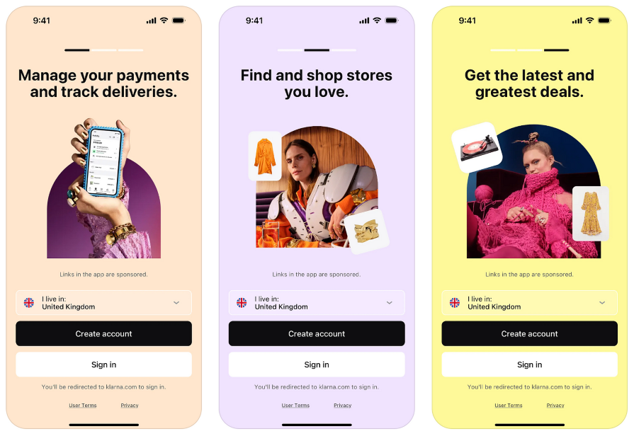
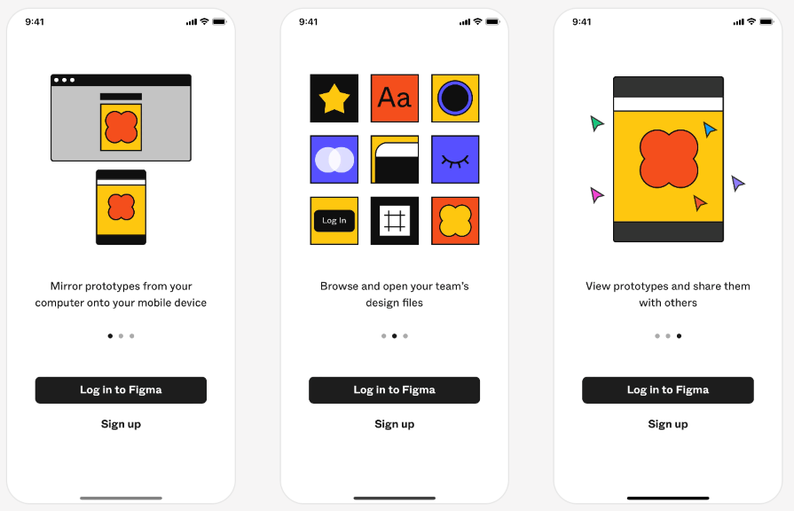
When you open a mobile app for the first time, you’re often greeted with three to five screens that you can swipe through. These welcome screens serve as an introduction to the app. They can be used to communicate the value proposition of the app, which explains to users the problems it can help them solve or how it can benefit them.
Welcome screens can also provide an overview of the app’s key features to build excitement and anticipation:
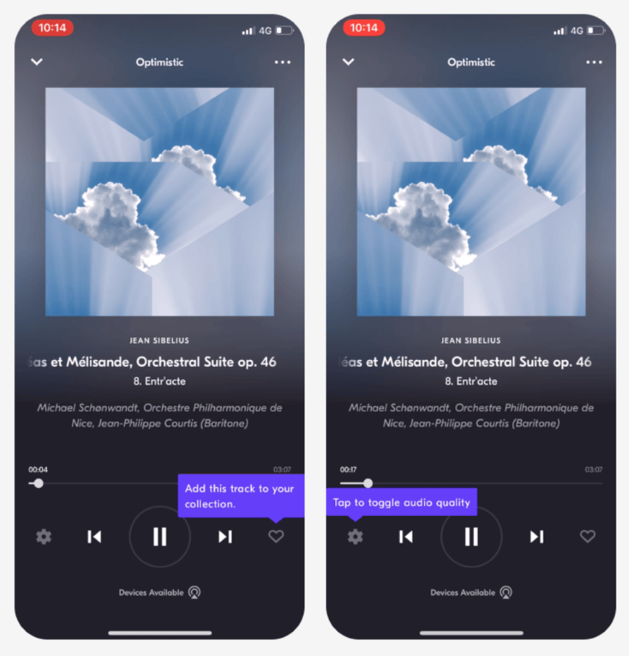
Another common technique used for mobile app onboarding is a tooltip walkthrough. These simple step-by-step tours can help users get oriented on the app’s home page.
By tapping on the sides of the screen, users can move back and forth through the walkthrough. Each step points to a key area of the screen, such as a toolbar, menu, or primary button, that will be useful for users to know about before getting started:
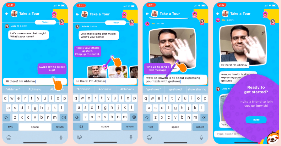
An interactive tutorial is common with apps that may require a steeper learning curve. This technique teaches users how to complete a task using a combination of tooltips, videos, and animations.
Tutorials can be especially helpful because they incorporate active learning, requiring the user to follow along, instead of simply explaining things in text that the user may not remember or understand without visuals. You can use them with checklists or gamification techniques to motivate the user to continue learning:
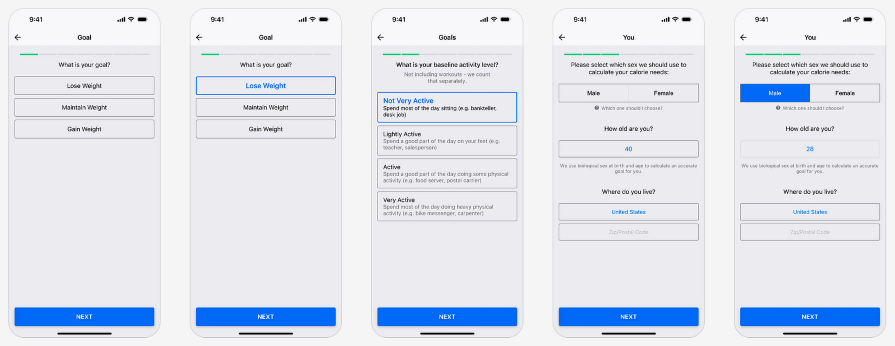
No one likes to be bombarded with information all at once. Progressive onboarding can ease a user into a mobile app, especially if there is a lot to know. This technique reveals information to the user at a time that’s relevant to them, making the experience more digestible and less overwhelming. It can split up forms into a wizard flow, making it easier for the user to fill it out:

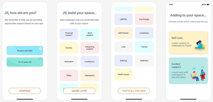
Who doesn’t love services catered to them? Personalization can be an effective way to get users invested in an app even before using it.
This technique is popular among platforms that ask users for their preferences upfront. By customizing their onboarding experience to their personal goals, needs, or interests, users can grow a sense of attachment to the app and a desire to continue using it:
When designing a mobile app onboarding flow, it can be tricky to get it right. Here are some best practices to follow to ensure that your users get the best experience when using your mobile app for the first time.
It’s no secret that people have trouble paying attention today, with the amount of stimulus and noise coming from our mobile devices. With an ever-shrinking attention span, keep your onboarding flow brief and focused.
A concise, focused snippet of text on each onboarding screen or step has a high likelihood of users staying engaged with the content without getting distracted.
After a user completes an onboarding task, like creating an account or verifying their information, provide them with feedback and confirmation to give them a sense of progress along the way.
This is crucial to making users feel like they are on the right path and that they know what they are doing. Even if they are unable to complete a task, giving feedback lets them know that their actions have been acknowledged and they are given guidance to help them succeed.
If your mobile app doesn’t convey the benefits early on during the onboarding flow, users might not understand why they should use it. Tell your users what makes your app stand out or what problems it can help them solve. Help your users realize its value sooner by guiding them through the onboarding flow and demonstrating how things work. The earlier a user can complete a key task within the app, the better chances there are that they will continue to use it.
Mobile gestures can be a limiting factor when it comes to usability. Users with low tech literacy or who are new to mobile apps may face challenges as they learn how to use gestures. Make actions as simple as possible to execute, using basic gestures like tapping or swiping. This lowers the barrier to entry for users to start using your app.
Now, let’s walk through an example of what a mobile app onboarding flow might look like. There is no one way to design an onboarding flow because the techniques you can use are highly dependent on the context of your app. Hopefully, this will give you an idea of how to approach the unique onboarding flow for your mobile app.
When users open your app for the first time, greet them with a few welcome screens that invite them in. These welcome screens offer an opportunity to display your brand through visually appealing graphics and a warm, friendly tone.
Use these screens to communicate the value proposition of your app and what problems it can help users solve. You can also mention a brief sentence or two about some of the key features of the app:
Next, the user might need to provide some personal information about their goals and preferences. Instead of forcing users to fill out a long form, consider using progressive disclosure. Present a form wizard that asks the user step-by-step about their goals and preferences, building off of their previous answers. This will make it easier for the user to input their information, turning a tedious process into an engaging one.
Then, use their inputted data to personalize their onboarding experience, guiding them toward a specific path that fits their personal needs and interests:
Once the user is signed up, help them get oriented on the home page by guiding them through a tooltip walkthrough. Provide onscreen instructions to tap on the left and right sides of the screen to navigate through the walkthrough. A simple visual or animation of the gesture can also help users understand how it works:
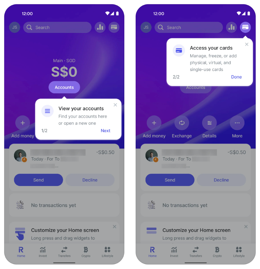
With each tooltip, highlight a key feature or main area, such as a menu, so that the user knows where things are located. Let the user know what they can accomplish as you highlight each feature.
Now that the user is more familiar with where to find things, start them on their first key task. This can be done by combining a guided tooltip tour with animations or videos that walk the user through a task. This approach helps onboard the user quicker than letting them figure things out on their own. It also helps with user retention, as they can attain value quicker through following the tutorial:
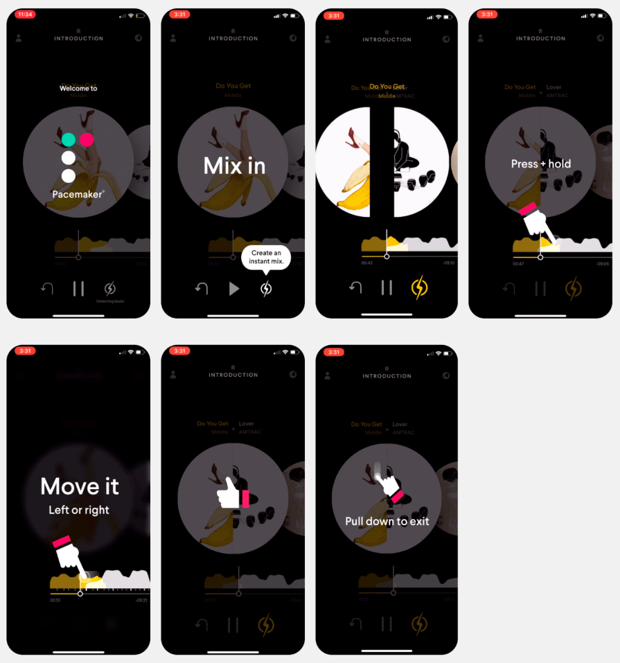
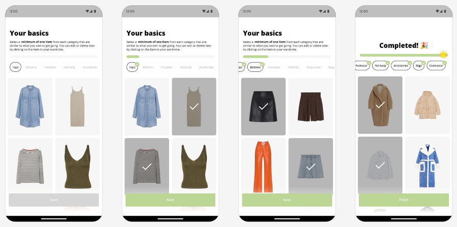
Throughout the tutorial, help users keep track of their progress. You can implement a progress bar on the screen to visualize how far they’ve gotten and have left to go.
Checklists are also a great way to indicate progress and give an overview of what’s required to complete the onboarding. After the user completes a step, the progress bar advances and a checklist item gets checked. This can gamify the process so that users feel engaged and motivated:
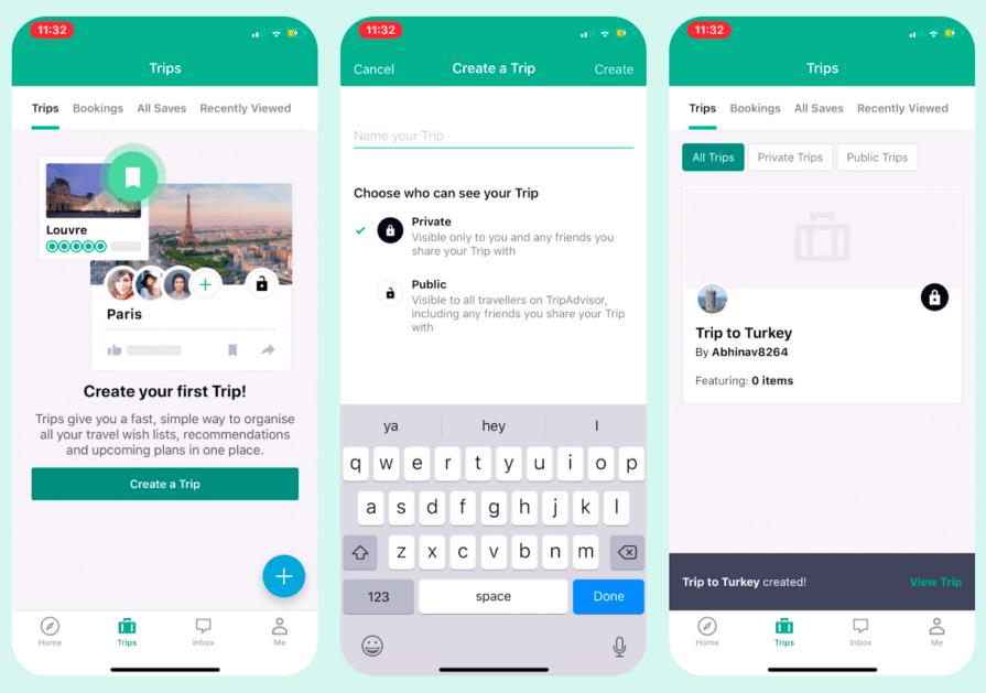
Positive reinforcement helps encourage users to continue using the app. It also lets them know when they’ve done something correctly, confirming their success. Feedback and confirmation also play a role when users are unable to complete an action. This helps them understand what went wrong and how to fix it, which effectively teaches them how to improve and use the app correctly:
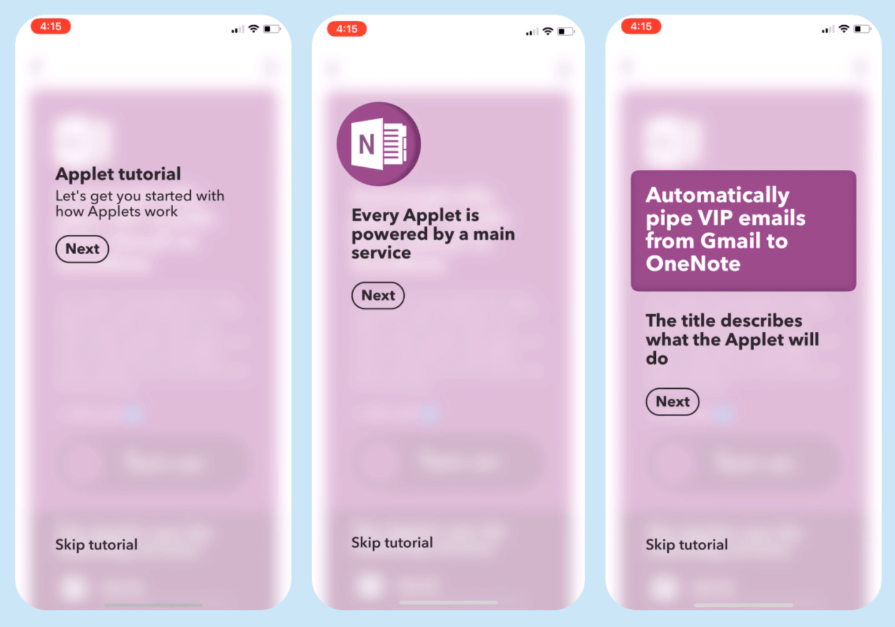
As helpful as it can be to go through the mobile app onboarding, some users prefer to learn by exploring on their own. Make sure to provide a way out so that users can skip a step or the entire onboarding process if they wish to do so. Some users may already be familiar with the app, so they may not need to go through the process:
A well-designed mobile app onboarding is the key to starting your users’ journey on the right note. First impressions play a big role in a user’s decision to continue using an app or delete it from their phone. That’s why it’s important to invest in designing an onboarding flow that follows best practices like keeping it brief and focused, giving feedback and confirmation, providing value early, and incorporating intuitive gestures.
Using a combination of techniques, such as welcome screens, tooltip walkthroughs, interactive tutorials, progressive onboarding, and personalization, you can create a unique experience that invites users into your app. Not only will it help get them started, but also unlock value for them quicker so that they continue using your app over and over again.
LogRocket's Galileo AI watches sessions and understands user feedback for you, automating the most time-intensive parts of your job and giving you more time to focus on great design.
See how design choices, interactions, and issues affect your users — get a demo of LogRocket today.
A three-week mobile banking project taught me that the “proper” UX process is not always realistic. Sometimes, the better approach is to work with what you know, identify what you still need to learn, and make the strongest decision possible under real constraints.
A/B testing compares two versions of a design to see which performs better with real users. Here’s how UX teams can use it to test hypotheses, measure outcomes, and make smarter product decisions.
This case study shows how one ad experience redesign increased total ad exposure while lowering perceived friction, proving that timing and context can matter more than raw interruption.

As products evolve into ecosystems, navigation becomes a system-level challenge. This article explores how to align structure, context, and user journeys to create seamless movement across tools without confusion.