In order to understand who your users are, what they want to accomplish, and what they think of your product, you need to conduct user research. User research is the first phase of a design process as it gives you the opportunity to know who you are designing for, one of these research methods being surveys.

Utilizing UX surveys is a quick and simple way to learn more about your users, which is why it’s one of the most commonly employed research methods in the UX profession. In this article, I’ll show you how to design a UX survey and walk you through the tools I use in my UX survey process so you can improve your own survey skills.
A UX survey is used to collect information about users for a specific product. It is designed specifically for user research and testing. Surveys are an excellent way for user researchers and other developers to determine the needs of the people for whom they are designing as well as collect feedback after the product has been launched.
To make a survey effective, you need to ask the right questions, because asking the wrong questions will lead you to design in the wrong direction, resulting in products that no one will use.
Survey questions are of two types: open and closed questions.
Closed questions typically evoke a “yes” or “no” response. They are usually questions with checkboxes. These questions are used to better understand quantitative data. It does not dig deeper into why the users checked those boxes.
Open questions are of a qualitative nature. They assist you in understanding the needs and behaviors of your users. It shows you how the user sees the problem. The answer type for these questions is typically large text boxes that allow users to elaborate further. “How does using this product make you feel?” is an example of such a question. Open-ended questions require a significant amount of time to analyze and synthesize.
As a user researcher, your goal is to learn more about your product’s users. Here are a few reasons why you should conduct a user survey to better understand your customers:
There are a few research types that use surveys. Determining which stage of research you’re conducting will help you formulate your survey:
You can see how the different types of research will influence your survey questions, methodology, and target audience. For example, a survey for continuous research would be implemented into a purchasing flow so users are always welcome to provide feedback on the purchasing process
In this case, the target audience would be customers of the products not prospective users. You ask questions like, “How often do you use this product?” and “How would you describe your emotion when you find this product is unavailable?” These types of questions show how often they use your product and if it satisfies their needs.
For generative research, the target audience is prospective users, people who we think would find this product useful, and the survey questions are designed to let us know if these people actually need the product. You ask questions like, “Would you like to use a product that helps you order all your meals in one tap?” and “What product do you currently use to perform this task?” These help you understand user needs and find out competitors.
UX research is an important part of the design process. But the research part must be done correctly; this means getting the right questions, setting the right goals, and using the right tools.
Here are tips for designing a good UX survey:
When sorting out your research data, identify how you want to sort the results. You can decide to group similar experiences, demographics, needs, etc. This can help you create a visual representation of the findings in a way that is manageable.
Use visuals to interpret your findings. You can create personas, affinity maps, or user flows. It is an excellent method for communicating research findings to your team and other nontechnical or design members of your organization, such as stakeholders.
Depending on the type and quantity of the data and also to avoid bias, it is important to share the data from the survey with your teams so you can all work on it. This gives room for innovation to spread through the diversity of the team. Everyone brings their unique problem-solving skills to the table. The team can decide what methods to use: a whiteboard, sticky notes, and so on.
SurveyMonkey is among the first survey platforms launched on the internet. Its ability to handle complex routing has made it a researcher favorite.
The inbuilt recruitment capability is an important feature of SurveyMonkey. It also allows data to be exported and accessed by tools granted access. A con of this platform is that the setup takes a little bit of time and the fee option has a lot of limitations.
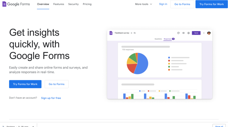
This is a beginner-friendly survey platform that can be accessed from your Google account. Google Forms allows for unlimited questions to be asked in a survey, but it is not a UX survey tool because there are some limitations to organizing and collecting data in comparison to other UX survey tools. It’s a great tool for gathering basic data.
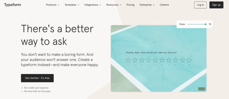
Typeform is one of the most commonly used platforms to design aesthetically pleasing long-form surveys. It allows creators to personalize their surveys by adding follow-ups on previous responses. A con of this is that it redirects participants away from the platform, which interrupts their user experience.
Typeform is said to have an intuitive interface that makes it welcoming to users. With Typeform, you can connect the gathered data to popular apps such as Slack, Google Sheets, and more.
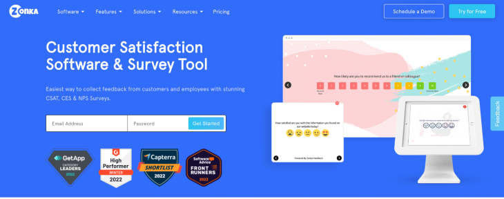
This is a great survey tool and UX management platform. It offers an array of templates that make setting up easy and real-time alerts to designers so they can respond to feedback in a timely manner and close the feedback loop effectively to improve the user experience. It is also available offline!
This is a UX case study showing how UX surveys are designed.
NextUp is a non-governmental organization that supports underrepresented countries with basic amenities to make life easier.
Over the years, NextUp has successfully gathered a donor membership of about 3,000. This year, they hope to make the donor experience more exciting and inviting. To do this, NextUp has decided to send out a survey to understand their users and how to make donations on their platform a more seamless process.
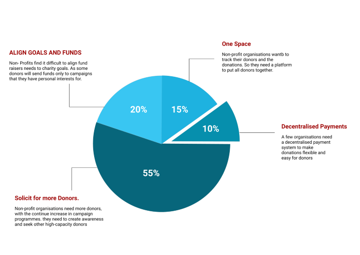
Here are a few questions I’ll be asking in a survey for the said problem: Remember to mix up your questions and put them in the right input field.
A user experience survey can be designed in a variety of ways. To achieve the best results, it must be tested and improved upon before being released, like other design-related items. These may seem overwhelming to a new UX designer, but with the aid of codeless UX survey websites and a clear understanding of the research question, you can connect with relevant users and gather the data you need to enhance your product. The most important thing is to use the appropriate tools and design the proper questions.
LogRocket's Galileo AI watches sessions and understands user feedback for you, automating the most time-intensive parts of your job and giving you more time to focus on great design.
See how design choices, interactions, and issues affect your users — get a demo of LogRocket today.

Multimodal UX goes beyond designing for screens. Learn how context-aware systems, progressive modality, failover modes, and accessibility-first design create better digital product experiences.

Learn how context-aware mode prioritization and seamless transitions improve multimodal UX and reduce mode confusion.

Research is becoming more democratized, product cycles are accelerating, and AI is transforming synthesis and ResearchOps. Here are the three trends shaping UX research in 2026.

Voice support is not the same as multimodal UX. Here’s how to design systems with true mode continuity and context-aware interactions.