Editor’s note: This article was updated on 27 November 2024 to provide clear, actionable advice, annotated visuals, modern examples, and more.
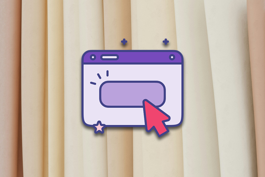
A call to action (CTA) is a button (or sometimes a link) that pushes users to take a specific action on an app or website. CTA buttons display clear, actionable verbiage such as “Buy,” “Sign up,” and “Subscribe” to drive users to convert. There are three types of CTAs:
Well-designed, actionable buttons improve UX by helping users to complete their tasks, and also help businesses meet their business objectives. They’re strategically placed within the UI and are a visually prominent part of online marketing campaigns too:
When CTA buttons are ineffective due to poor design, as indicated by their low click-through rate (CTR), users end up not taking the relevant action — and so the app or website fails to live out its purpose. In this article, you’ll learn what to do as a UX designer to ensure that that doesn’t happen.
Here are some best practices for designing CTA buttons:
Let’s dive into the details of each of these action items.
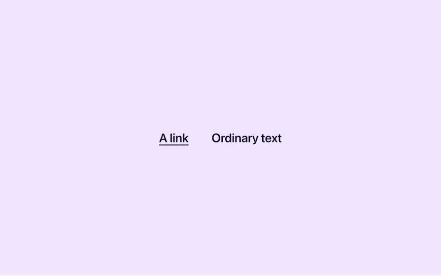
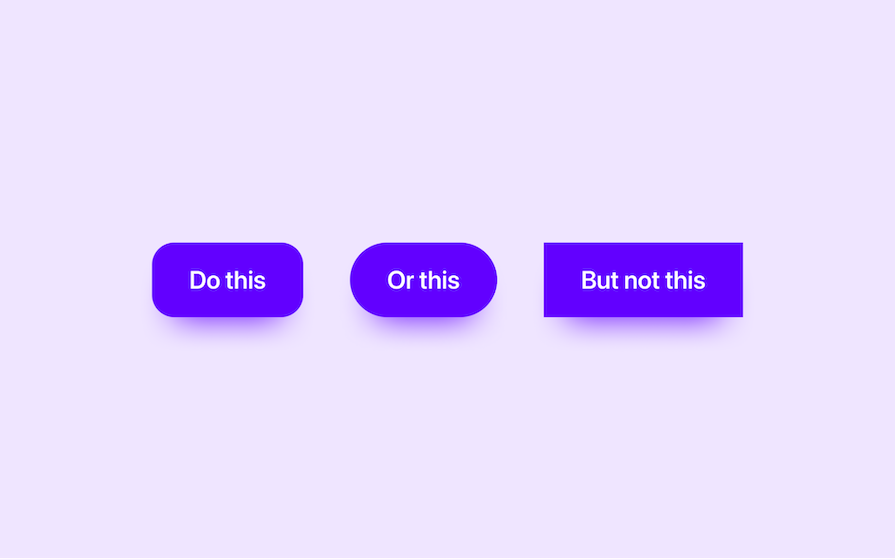
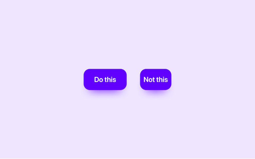
Great CTAs are affordant, meaning that it’s clear what they are and what they do. For example, you should underline links to help users tell them apart from text that isn’t clickable:
Similarly, CTA buttons should have backgrounds, since that’s what buttons look like in the real world — they’re tangible. This means no ghost buttons (i.e., border-only buttons) for important CTAs:
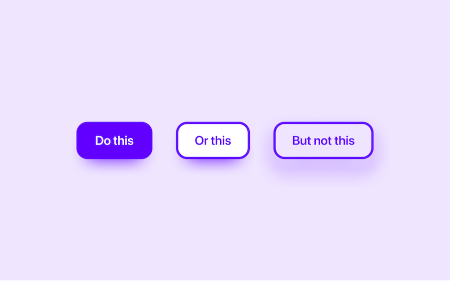
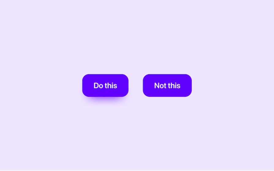
Also, to avoid making them look like non-interactive rectangles, use corner radii. For aesthetic reasons, I recommend a radius value of about 30 percent of the button’s height:
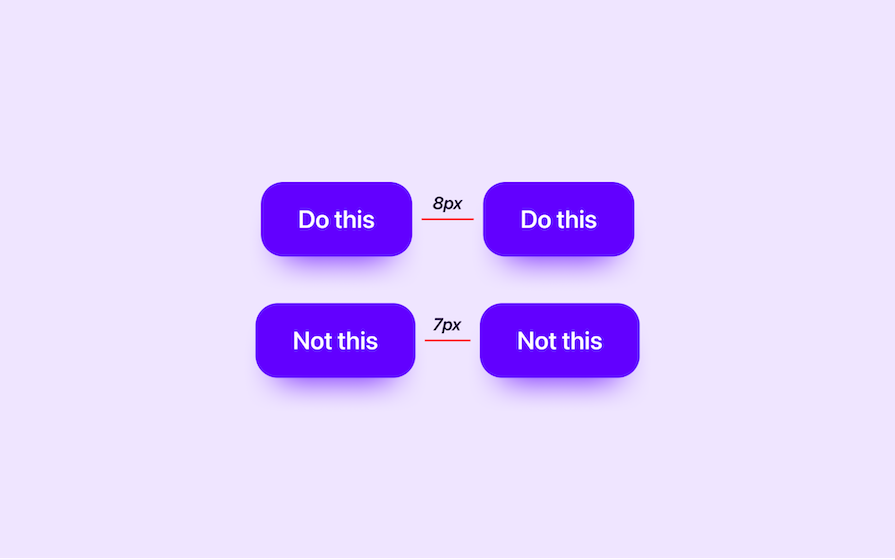
Use drop shadows for the same reason. For aesthetic reasons, I recommend the following values:
Take a look at how adding a simple drop shadow makes the CTA look interactive:
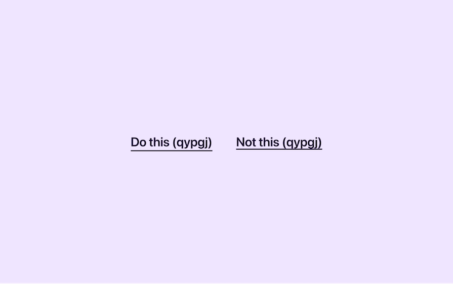
Buttons (and links that aren’t within a block of text) should be at least 44px wide and tall according to the WCAG (Web Content Accessibility Guidelines), which in most countries you must follow by law. That being said, Google asks for at least 48px, which you should probably adhere to to avoid possible SEO problems:

Similarly, the WCAG also specifies that if there are two targets next to each other (for example, a primary and secondary CTA next to each other), then they should be separated by at least 8px of inactive space to ensure that users don’t interact with the wrong target accidentally:
CTA copy should highly contrast in color with its background so that users can read it clearly:

You can read all about the technicalities of color contrast in our color contrast article, but for now, let’s just say that you should use a color contrast checker to check your color combinations. I recommend Stark because it covers a huge range of accessibility concerns and not just color contrast. It even includes a Color Vision Deficiency (CVD) simulator so that you can see what your CTA buttons look like for those with ‘color blindness.’
There’s something about ugly CTAs that just make us not want to interact with them, so it’s important that they’re aesthetically satisfying.
For links, offset the underline to ensure that it doesn’t cut through the font’s descenders, improving legibility and readability. While UI design tools don’t support this at all, the web does, so make a (handoff) note of it for developers:
For buttons, ensure that the horizontal padding is proportionate. I recommend 50 percent of the button’s height:
Your brand color should be the most captivating color on your app or website in every sense of the word, and by using color (overall) well throughout your app or website, you can make this brand color stand out. And once you’re able to leverage the power of your brand color in this way, you can use it to draw attention to your CTAs.
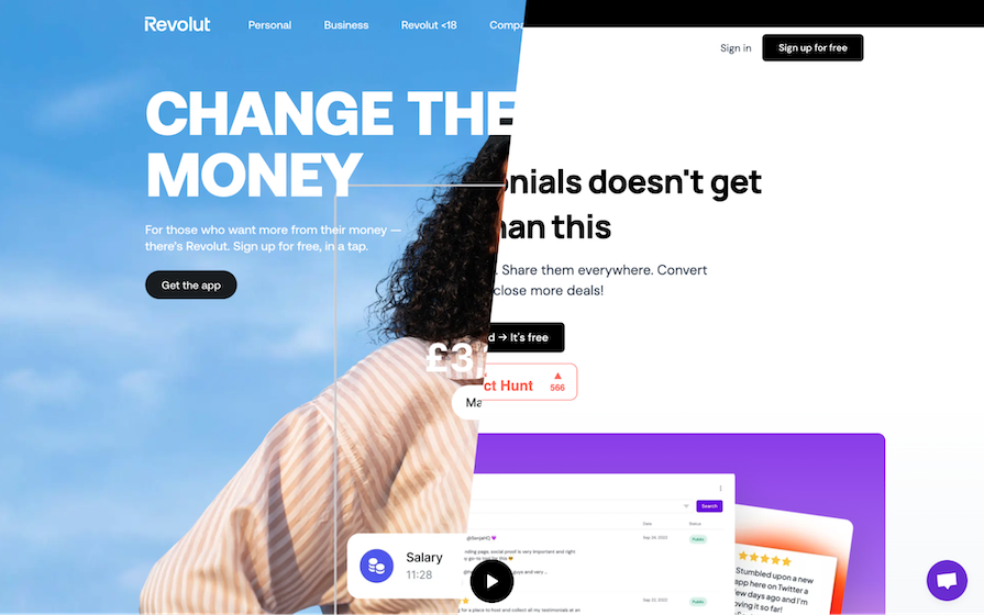
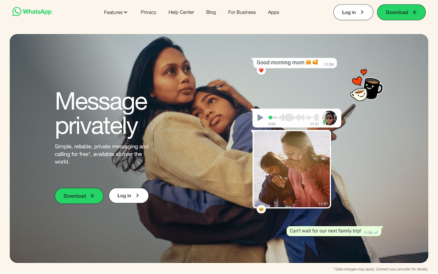
In the screenshot below, do you see how WhatsApp only using their brand color for their primary CTAs has such a powerful effect? Also, this is amplified by the rest of the page being quite modest in terms of color and in general. Plus, since your brand color represents your brand, using it for CTAs makes it seem as if you’re speaking to your users directly, which makes it even more powerful:
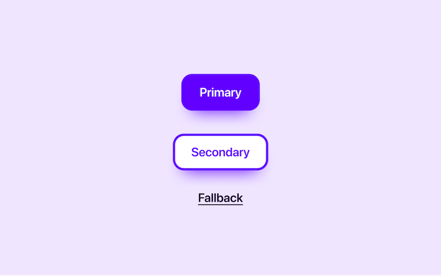
CTAs must stand out from the overall design as well as less important CTAs. This means that if you’re using secondary CTAs or fallback CTAs, they shouldn’t be more prominent than the primary CTAs, so you must establish a visual hierarchy where some CTAs demand more attention than others.
How you do this is up to you as long as you follow CTA best practices, but a fainter background (with a border, if needed) is never a bad approach. Using CTA links instead of CTA buttons is fine too, but ideally should be reserved for CTAs that aren’t that important:
Also, remember to maintain consistency in terms of visuals and CTA text so that users learn to instinctively recognize what the different CTAs do:
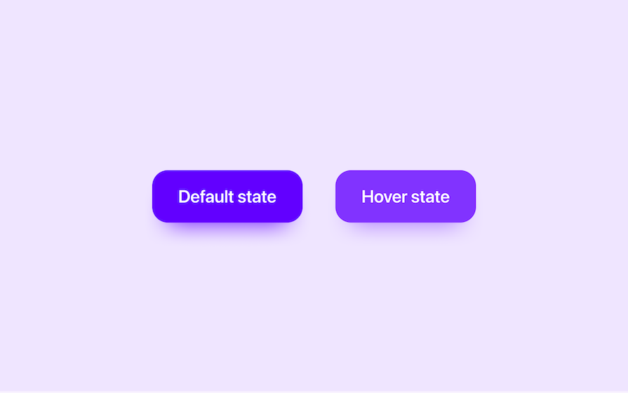
Creating hover states for CTAs makes them more satisfying to interact with. The best way to do this is to tweak the brightness slightly (by 10 percent, for example). It’s a one-size-fits-all approach that ensures complete visual consistency across all button and link variants (or, if you will, ensures a coherent ‘design language’):
When it comes to focus states, I advise sticking with what web browsers and operating systems display natively, which is a blue focus ring. If working on a design that’s blue-heavy, you could make an exception by changing the color of the focus ring, but it’s otherwise best to leave accessibility features as they are.
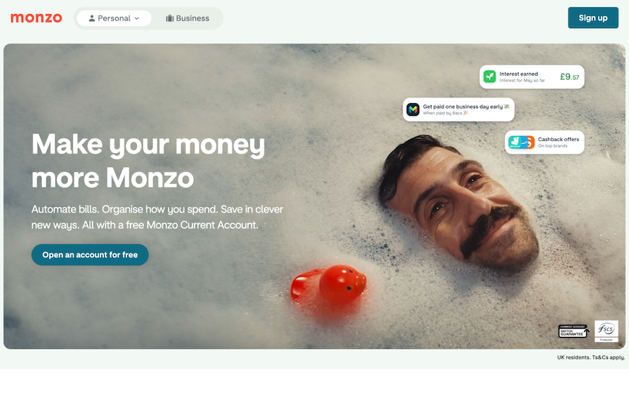
The most effective CTA text is text that literally commands users to take action. Take Monzo’s “Open an account for free” CTA button, for example — it’s assertive. To add to this, it clearly describes the outcome, which is that users will have opened an account. What’s even better is that a value proposition (i.e., that opening an account is free) is included to combat user doubt:
In addition, but only when it feels right:
It’s important that you place at least one primary CTA button above the fold (although not as important as it used to be), even if it’s just a lone button in the navigation. However, what’s even more important is that you otherwise work up to CTAs with the right information, compelling value propositions, and overall, a narrative that tells a story where the user is the main character.
You can’t just tell users to click on a button because they should, and BOOM…conversions — you need to succinctly encapsulate their need, explain how you’ll address it, and then tease a huge superhero ending where everything is awesome.
If there’s a lot of information to share and/or multiple value propositions, take your time — users love scrolling these days. This isn’t 8-mile — although you’ll want to start off with what’s essentially an elevator pitch followed by a primary CTA, you’ll have more than one shot/one opportunity to convert users over time.
In fact, if your secondary conversion funnel collects the user’s email address, converting them fully could take a matter of weeks. Every target audience is different.
When designing an app for a specific platform such as Android, Windows, iOS, or macOS, you can use their design language. Respectively, this is Material Design, Fluent, and for Apple devices, the Human Interface Guidelines.
These design languages follow the instructions for CTA (‘target’) design set out in the WCAG, but also include some minor enhancements (which I’ve already mentioned) and subjective design choices. You don’t have to use them, but they will make your app consistent with other apps on the same platform as well as the platform itself.
Using platform-specific design languages can provide a minor boost to UX, but at the same time may diminish your app’s visual identity. All-in-all, they don’t really provide any additional value — they’re essentially just UI kits that you can copy and paste into your design — but there are a couple of interesting things about them:
As I mentioned before, the key metric for measuring the efficacy of a single CTA button is the click-through rate (CTR), which is the percentage of users that clicked on it (clicks ÷ page impressions × 10 = percentage of users that clicked on the CTA button). This is not to be confused with conversion rate, which is the number of users that actually converted regardless of the route they took.
A low conversion rate should prompt you to do some UX research, whereas a low click-through rate of a specific CTA button should indicate which page or page template is the problem. The tricky part is finding out why — it could be the position, prominence, affordance, color, text, size, overall page narrative, overall user flow or user journey, or something else entirely.
If you already have an idea for improving the CTR, there’s no harm in setting up an A/B test and jumping right into a trial-and-error approach. A/B testing involves testing the current version (version A) against another version with just one minor change (version B). Then, if version B proves to have a higher CTR, then you know to implement that version permanently. You’ll need an A/B testing tool such as Optimizely or VWO.
In addition, UX research platforms such as Maze can help you to carry out this type of workflow very early on in the UX design process (at the prototyping stage). Also, these types of tools typically have heatmap and session replay features where you can literally see what users did and perhaps identify problems that way. Heatmaps can even identify rage clicks, which is when a target is completely unresponsive due to a software error (the problem could be anything, right?).
If you’re not sure what to change, set up an exit intent survey that asks users why they’re not converting today. If something’s wrong you’ll get responses like, “I can’t find [x],” “I don’t understand [x],” “I’m not convinced because [x],” “I just want to be able to [x],” or even, “The website’s taking too long to load,” “You don’t accept [x] payment option,” or some other user frustration:
You can then confirm these insights with an A/B test.
CTA stands for call-to-action, which is when an app or website nudges users or outright calls upon them to take a specific action, typically by clicking on a button or link.
A CTA button is an app or website button that calls upon users to take a specific action. When there are multiple CTAs on an app screen or web page, CTA buttons are typically primary CTAs and often secondary CTAs too. Fallback CTAs are more likely to be CTA links, although CTA buttons are sometimes used as well.
However, what’s more important than whether a CTA is a button or a link is how visually prominent it is, and after having captured the user’s attention, how persuasive it is in getting users to take action. Ultimately, good actionable buttons are key to meeting business objectives, and hopefully, users get positive outcomes from these actions as well.
Effective CTA buttons are ultimately those that help businesses meet their business objectives, determined by how actionable they are. Good examples of effective CTA buttons are those that:
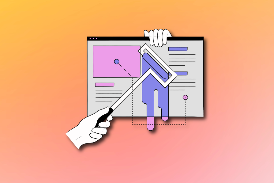
CTAs are your app or website’s most important design elements. Without well designed ones, people won’t benefit from your product and your product won’t meet business objectives. It’s a lose-lose situation for everybody. However, there are many things that UX designers can do to ensure that doesn’t happen:
Using these CTA design best practices, you’ll be able to increase the click-through rates of your CTAs, and in turn, conversion rates of your funnels. To nudge you in the right direction, you can use A/B testing, heatmaps, session replays, and exit intent surveys to see what (if anything) can be improved.
Conversion rate optimization is so much fun, especially if you enjoy sniffing out pain points, making incremental UX design improvements, and watching those conversion rates rise.
Thanks for reading!

LogRocket's Galileo AI watches sessions and understands user feedback for you, automating the most time-intensive parts of your job and giving you more time to focus on great design.
See how design choices, interactions, and issues affect your users — get a demo of LogRocket today.

Skeuomorphism helped define early digital interfaces by mimicking real-world objects to make technology more intuitive. Learn how it compares with flat design and neumorphism, why it declined, and where it still has a place in modern UX.
Memos don’t have to be complicated. Just keep them clear, concise, and focused on actionable items. More on that in this blog.

AI has made polished, confident content easy to generate, but that does not make it trustworthy. This article explains how UX teams can design stronger quality signals using source transparency, validation, confidence communication, and reputation.
Inclusive design is evolving beyond accessibility alone. This guide explains how UX designers can create more inclusive products through usability, accessibility, neurodiverse UX, adaptive personalization, multimodal design, and culturally aware product experiences.


