Throughout the design process, UX designers collaborate with user researchers, product managers, marketers, and sellers to better understand our users’ needs. All this collaboration informs our design decisions.
But when we build those designs and release them to customers, inevitably there will be some complaints. Perhaps a desired feature is missing or they’re not sure how to use a feature within the product. You may have thought a feature was intuitive but users approach it incorrectly. And the ones that deal with those unsatisfied and confused customers are the customer support team.
The role of a customer support agent isn’t that far from a UX designer. At their core, both want the user to succeed in using the product, either by teaching them how to use it or creating better ways to use it. In an ideal world, we should be collaborating more often to improve user experience.
In this article, we’ll look at the relationship between UX and customer support, how UX can improve support features to relieve strain from customer support and improve their efficiency, and how both roles can collaborate to share user insights.
We’ve all heard the saying “the customer is always right.” To keep customers happy, support teams are there to provide guidance and help troubleshoot when things go wrong. The customer support team serves as a liaison between the company and its customers, and they ultimately help foster a trusting, long-term relationship.
But when common issues arise, customer support teams aren’t scalable. There are only so many of them that can help a customer at a time, so it can be easy for the team to get overwhelmed with support tickets. And even with extensive training, customer support agents are only human, which can lead to inconsistent answers when solving problems.
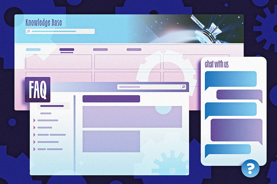
These days, we have support features for customers to find answers to common problems without having to contact a support agent, offloading some of that burden. Some of these features include frequently asked questions (FAQ), documentation, chatbot assistants, and other ways to contact support. Having these features available can save customer support agents hours in their day and also provide users with consistent responses that build their trust.
An example that illustrates the impact of effective support features is IBM’s watsonx assistant. The AI-powered chatbot assistant delivers self-service support, enabling users to ask common questions. Basic inquiries like resetting passwords or policy-related issues can be handled using a chatbot assistant, provided that the assistant is designed to properly navigate these types of conversations:
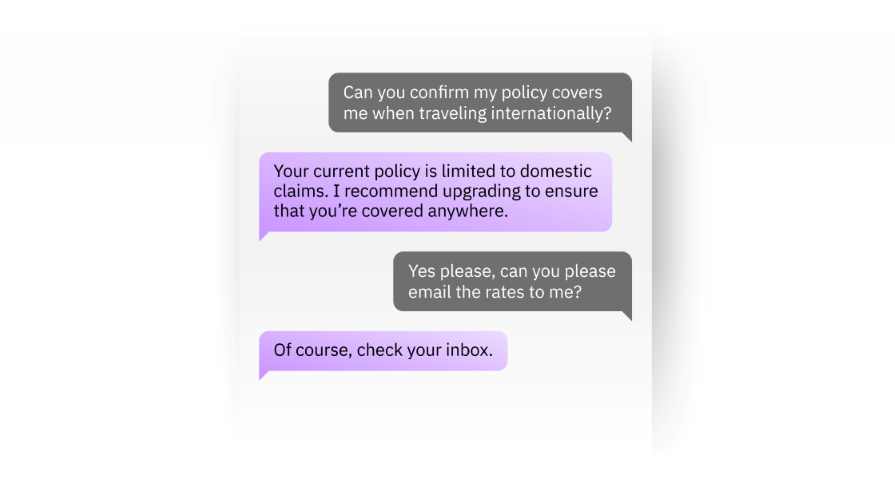
Based on a research study commissioned by IBM, customers using watsonx Assistant in their business saw $23 million in benefits over three years. Each customer conversation that was contained within the assistant translated to $6 of cost savings. Multiplied by thousands of customer conversations a year, that can result in a significant amount saved by an organization.
By successfully providing users with the answers that they’re looking for, each conversation saves the customer support team hours of their day, empowering them to focus on non-trivial customer issues while maintaining customer satisfaction. This is the impact of UX teams supporting CS.
Support features exist to get users answers quickly without having to contact customer support agents.
But if the experience of these features isn’t user friendly or intuitive, then users will end up contacting the support team anyway, which defeats the purpose of having those features. So, let’s look at some ways to improve the UX of these support features.
An FAQ page or section can contain a lot of content, depending on the number of questions and length of the answers. An effective way to enhance the usability of a content-heavy page or section is to ensure that it’s easily scannable and the navigation is intuitive.
Not every FAQ page will look the same because the design depends on your business needs. If your business has multiple sections that have their own FAQs, then you might consider having a multi-page FAQ experience, organized by topic. Include a search bar so that users can easily search keywords that will lead them to the most probable answers:
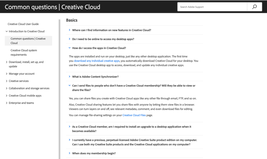
Some FAQ pages simply have a table of contents at the top of the page followed by blocks of text for each answer down below. With this format, ensure that each question uses an anchor link, or jump link, which jumps directly to the answer so that the user doesn’t have to scroll through the page.
The answers section should be easy to scan, so style your questions differently so that they stand out to the reader. Also, include a link to take the user back to the top of the page so that they can easily revisit the table of contents.
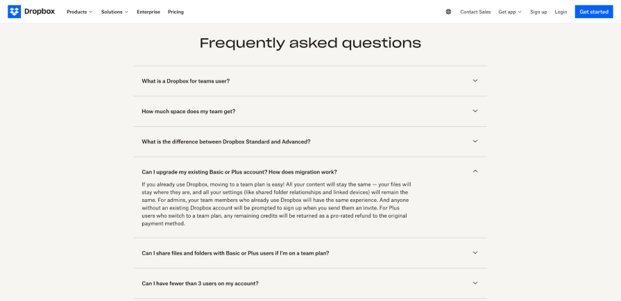
If you don’t have that many questions, then you might consider a smaller FAQ section within a landing page or webpage. It’s useful to have each question in a collapsible accordion, so that users can easily scan the list of questions and expand the one that is relevant to them. This avoids overloading the user with too much information at once:
With the rise of AI technology and custom GPTs, chatbots are being used everywhere, especially in the customer support world.
Chatbots are available to provide support 24/7, but not all of them are optimized to save customer support as much time as they can. Chatbots should be able to resolve as many different types of issues as possible without escalating to a support agent.
This is only possible if the chatbot is trained properly to handle all of these conversational flows using extensive rules or AI. The user must feel confident that the chatbot has adequately resolved their issue or they still might end up contacting customer support:
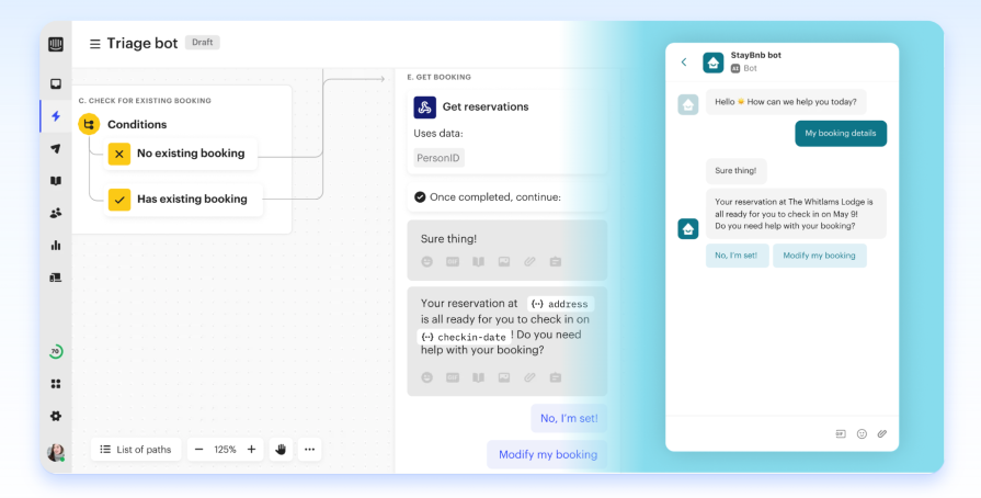
Now, in cases where the chatbot isn’t able to provide a relevant response, ensure that escalation options to customer support agents are easily accessible. Typically, a chatbot will suggest users to contact support if they have reached their limit in the conversation and cannot resolve the user’s inquiry. You might have the chatbot include contact info or forward the conversation to a live person.
Customer support agents should have a proper workflow in place for receiving, organizing, and responding to customer requests in their inbox. This ensures that they can help users in a timely manner and keep track of open issues.
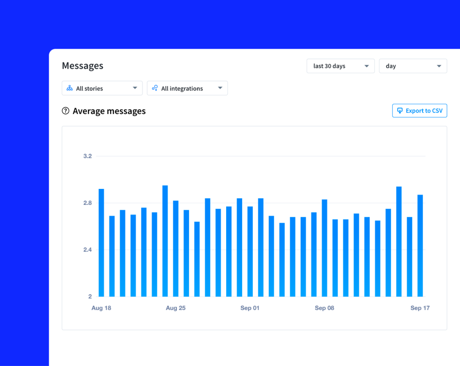
Being able to easily manage a large volume of support tickets can relieve a lot of strain on the customer support role. AI assistants can be used to leverage internal documentation so that agents can respond quickly and accurately. They can also provide insights into common patterns that arise from support tickets, or trends related to a rise in a certain request to help agents quickly adapt their strategy:
Empowering users to troubleshoot and solve problems independently can have a huge benefit to customer support agents. Providing easy access to a documentation website can quickly become a user’s first choice when faced with a product challenge before contacting support.
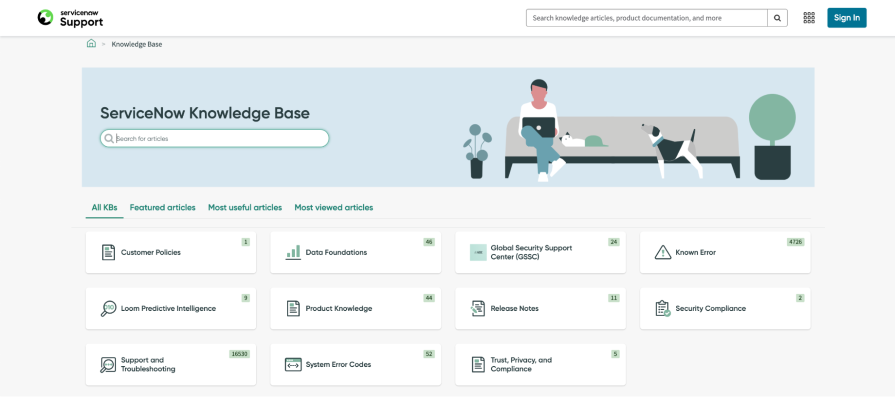
Documentation should be organized into sections, such as by feature or topic, so that users can narrow down their search. Similar to a multi-page FAQ experience, provide a search bar so that users can quickly find what they’re looking for:
Within each documentation topic, clear navigation is crucial so that users can always tell where they are on the site. If topics have a depth of documentation pages, use navigation elements such as a navigation tree in the side panel, or breadcrumbs along the top of the page, that indicates where the user is located and what other subtopics they can look into. This enables them to explore the documentation and self-educate themselves on how to properly use the product:
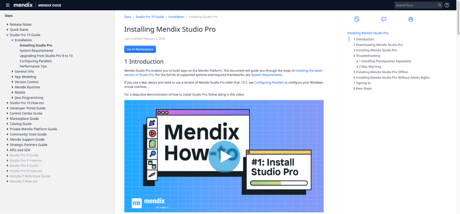
Some topics can be easier to explain with multimedia elements, such as videos or screenshots, where the user can follow steps throughout a process. A majority of users are visual learners, so the easier it is for them to understand concepts, the less likely they are to contact support.
At the end of each documentation page, consider including a quick feedback mechanism, such as asking the user if the article was helpful with a thumbs up or downvote button. This can be an easy way for support and UX teams to identify which pages need to be revised.
Both customer support and UX teams share a common goal of solving user problems. The way they go about understanding those problems is through exercising empathy, curiosity, and user context.
While the UX team is responsible for envisioning the future of the product and refining experiences based on anticipating users’ needs, the support team directly interfaces with customers on a regular basis and has a deep understanding of what’s currently working and what’s not for users.
UX designers need access to customer insights, but conducting user research and testing sessions can often be time-consuming and costly. Instead, they can tap into the wealth of qualitative and quantitative data that the customer support team collects.
By setting up regular communication channels, customer support can share insights through weekly calls or a Slack channel to bring these insights to the UX team. This can give the UX team an abundance of data and insights to base their design decisions on, and focus on areas that have been experiencing frequent customer issues.
For example, if there is a noticeable pattern around certain labeling or copy in the product being unclear, then customer support can note those concerns to UX to revise the copy or design. Perhaps the specific term being used isn’t what the user is familiar with. By gaining a better understanding of the user’s context and expectations, UX teams can apply those insights to improve designs based on customer feedback.
A real-life example of successful customer support and UX collaboration is Freshdesk, a helpdesk and ticketing software company. Their designers involve various teams for feedback and input when designing their product’s interfaces.
Since their customer support team is a user of their own product, the design and support teams conducted a card sorting exercise to rearrange tools and icons in a way that made sense based on their experience working in the tool:
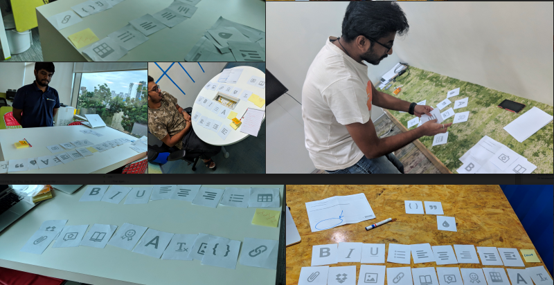
Usability research and testing is a great way to incorporate customer support into the design process, as they have extensive knowledge of real-life use cases and can evaluate the effectiveness of design changes. The role of customer support involves walking users through different features and providing alternative solutions when customers have specific needs that aren’t being met by the product. So, their perspectives can be helpful in knowing what needs to change in order for them to easily explain things to users.
Customer support can also work with UX designers and writers to ensure that FAQs and documentation communicate features effectively and consistently, including where the use of multimedia could help the most. The easier it is for users to find helpful answers through support features, the more time customer support can spend on helping users with complex problems, rather than basic tickets, such as how-to questions.
Customer support teams have an incredibly important role that can influence whether a customer stays with or leaves a product. They field and address customer inquiries, issues, or concerns by providing guidance, troubleshooting, and alternative solutions given the current product experience.
However, there needs to be features and processes in place so that the support team can elevate their role from low-value tasks to influencing the direction of the product. By designing useful support experiences through features like FAQs, chatbots, and documentation, customers have the tools to troubleshoot many common problems on their own.
This relieves much of the strain from the customer support team, so that they can focus their time on providing value to more complex problems and communicating their insights back to the UX team. It’s a collaborative effort between customer support and UX to continuously share insights and design improvements, as both work towards the same goal of enabling the user within their product and providing a seamless user experience.
Through regular communication channels and incorporating support in design, research, and testing stages, both teams can work together as partners to improve the efficiency of customer support and the outcomes driven by design. In the end, building customer loyalty is what helps a business continue to grow and it starts with the customer experience.
Header image source: IconScout
LogRocket's Galileo AI watches sessions and understands user feedback for you, automating the most time-intensive parts of your job and giving you more time to focus on great design.
See how design choices, interactions, and issues affect your users — get a demo of LogRocket today.
A three-week mobile banking project taught me that the “proper” UX process is not always realistic. Sometimes, the better approach is to work with what you know, identify what you still need to learn, and make the strongest decision possible under real constraints.
A/B testing compares two versions of a design to see which performs better with real users. Here’s how UX teams can use it to test hypotheses, measure outcomes, and make smarter product decisions.
This case study shows how one ad experience redesign increased total ad exposure while lowering perceived friction, proving that timing and context can matter more than raw interruption.

As products evolve into ecosystems, navigation becomes a system-level challenge. This article explores how to align structure, context, and user journeys to create seamless movement across tools without confusion.