When it comes to enhancing the user experience (UX) of a product or service, having a well-defined plan is crucial. This is where the concept of a UX roadmap comes into play. Think of a roadmap as a comprehensive blueprint that outlines the necessary improvements and priorities that need to be addressed. In a nutshell, a UX roadmap serves as a bible of the vision of what kind of experience your company wants to deliver to the users.

A more formal definition would be the following from Nielsen Norman: “A UX roadmap is a strategic, living artifact that aligns, prioritizes, and communicates a UX team’s future work and problems to solve. A UX roadmap should act as a single source of truth representing your UX team’s North Star. It helps your designers, researchers, developers, and stakeholders align around a single vision and set of priorities.”
In other words, a UX roadmap is a bible of a company’s vision of user experience. That’s why we’ll cover it today. But first, let’s go over its significance in company strategy.
The success of a project means bringing together different people, with different objectives, to design something.
The founders of a startup, the designers, and the developers don’t have the same objectives, and it would be naive to think otherwise. The founder will want a product that breaks into the market, that sells well. The designer will want innovative, user-centered design, and the developer will want code that is both easy to manage and robust in the face of change. Compromises often have to be made between optimal design, the difficulty of coding it, and the need to release new features quickly.
The UX roadmap will serve to ensure that the company’s vision, which topples that of individuals, is clearly understood and taken into account by all players. This vision needs to be defined and shared by all stakeholders, from designers to developers. Regrouping ideas, methodologies, and histories of UX evolution enables the evangelization of UX design within companies. Using a UX roadmap means maximizing both business and user experience.

Why is a roadmap essential from a business perspective? Creating a roadmap serves as a foundational step in setting clear objectives. Whether applied to individual projects or defining the overarching company’s philosophy, a roadmap empowers team leaders to articulate their vision for the final product in alignment with the roadmap’s definition.
Similar to a persona, a roadmap acts as a constraining tool, channeling and stimulating creativity. With a well-defined goal, the question shifts to “How do we achieve it?” This paves the way for identifying intermediary objectives between the Minimum Viable Product (MVP) and the ideal product. These intermediate steps serve as iterative phases within an agile cycle, ensuring regular updates to the product.
For the business-oriented stakeholders, the roadmap will serve to rationalize costs.
Determining both final and intermediate goals plays a crucial role in setting project boundaries, be it in terms of time or budget.
The UX roadmap stands as an invaluable tool for managers. Since the company defines a clear vision of the user experience it aims to provide, decision-making becomes more straightforward. When a suggestion arises during stakeholder meetings, we immediately know if it aligns with the roadmap and how to make this idea real based on the UX philosophy promoted. This initial design phase brings everyone on the same page, streamlines costs, and, most importantly, prioritizes actions for an optimal outcome. Users experience increased satisfaction as they witness tangible improvements in the product’s evolution. This, in turn, leads to user loyalty and consequently enhances credibility, reputation, and market influence.
The second advantage lies in customer retention. Having a UX roadmap is akin to having a signature style in the world of design. If a superior UX is consistently found across all the brand’s products, it can foster customer loyalty, akin to Apple’s pursuit of minimalism and optimized interactions. Having a signature kind of design is also great for marketing communication. It’s easier to promote products if a brand feels a certain way about its design.
A UX roadmap is, from the business perspective, a magnificent tool that ensures sales, quality of product, user satisfaction, credibility, and the company’s reputation through the efficient use of UX design. By having a clear path and vision, and ensuring user satisfaction, UX design can express its potential in product design.

Once stakeholders define the strategy and objectives, it’s crucial to gather a lot of information that the roadmap can leverage, both from a marketing standpoint (benchmarking, market analysis, etc.) and a user perspective.
At this point, the UX roadmap forces the company to do user research. Conducting thorough research, crafting user profiles, creating personas, and delving into sociological and cultural aspects to understand user expectations and needs are all integral.
The primary advantage of the UX roadmap lies in compelling companies to invest time and resources in user research, a phase that is often overlooked. The User-Centered Design (UCD) process limits ambiguities, facilitates clear decision-making, and ensures that UX research is a priority, guaranteeing effective engagement with the right audience.
To collect data the main techniques are
In summary, a UX roadmap enhances the user experience because it provides a clear, shared direction and vision for the design and development team. It ensures alignment and directs efforts towards common goals, effectively prioritizing tasks and resources to implement the most impactful improvements first.

Defining themes is the step that will enable us to start working concretely. Up to this point, the roadmap is a combination of the stakeholder’s vision of the products they want to deliver, mixed with data collected through UX research. The themes will represent concrete problems on which to work to achieve the set objectives.
The NN group suggests proceeding as follows: first, create a backlog of loose problems derived from the UX research and all the insights that may have been found. Then group the user problems into groups. An issue never comes alone, but this also means that the same solution can address several problems at once.
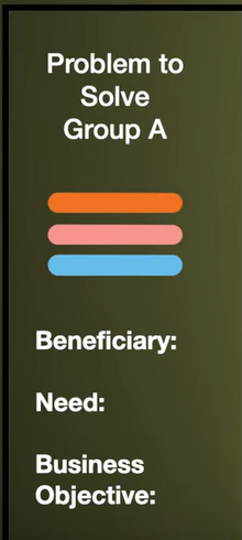
Once these problem groups have been created, you need to name them to create a theme. Finally, create a sheet for each theme, defining the name of the group, all the problems in the group, who will benefit from them, what the benefits are in responding to them, and what the added value is for the business.
This step is time-consuming but essential for prioritizing actions.
This stage will compare user needs with business objectives to decide which elements are most important for user-centered design, the experience offered, and ROI.
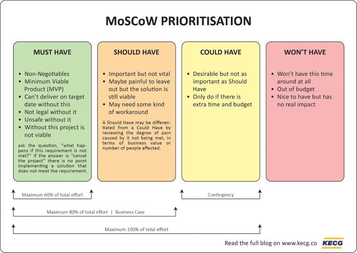
To prioritize user needs, goals, and improvements, you can use the MoSCoW method. MoSCoW stands for Must-Have, Should-Have, Could-Have, and Won’t-Have. This method helps in categorizing and prioritizing requirements by their importance.
Must-have requirements are essential and must be included in the project. Should-Have requirements are important but not critical and can be deferred if necessary. Could-Have requirements are desirable but not necessary for the current release or iteration. Won’t-Have requirements are those that will not be included in the current project. By using the MoSCoW method, you can effectively prioritize user needs and make informed decisions about resource allocation and planning for UX enhancements.
To give an example, a self-driving car must have a secure IA able to drive, should have high-quality seats and equipment to be seen as a luxury product, and could have an innovative shape to mark a difference from traditional cars. It won’t have (today at least) an option to transform the car into a living room when driving by itself.

A UX roadmap is a versatile tool that adapts to various contexts and audiences. UX designers use it to explain goals and philosophy of the company to anyone interested.
To do it, define the primary and secondary users of this roadmap, as this greatly influences its presentation and format. When presenting to an internal team of developers involved in crafting the roadmap, a simple Excel spreadsheet with pertinent data might suffice.
However, when it comes to external stakeholders such as investors, crafting the right visual representation becomes important. This might entail transforming the roadmap into an eye-catching poster, an engaging video presentation, or any other artifact that effectively conveys the company’s vision for its products and its step-by-step strategy for conquering new horizons.
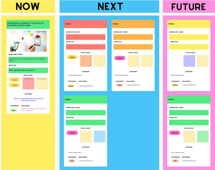
Writing the last upgrade of the roadmap is also a must, whatever form it takes. At the culmination of a project, reflection and adaptation are essential. A UX roadmap is not a static artifact to be created and then left to gather dust. Much like any UX artifact, it must evolve continually to become the best version of itself.
This evolution involves learning from past experiences, adjusting strategies based on real-world outcomes, and identifying new opportunities for enhancing user satisfaction. By embracing change and iteration, the UX roadmap transforms into a living document, steering the company towards perpetual improvement in its user-centric approach.
Finally, to decide when and why the roadmap evolves, the decision must be back by the actual date.
An often overlooked aspect in the earlier discourse is the incorporation of Key Performance Indicators (KPIs) during roadmap definition. These KPIs serve as the compass by which we navigate the roadmap’s effectiveness. Are the anticipated issues being resolved within the projected timeframes? Are resources being optimally allocated, and are users perceiving and embracing the introduced changes? These questions guide the ongoing evolution of the roadmap, ensuring it remains a dynamic and responsive blueprint for delivering exceptional user experiences.
As was stated, a UX roadmap can take multiple forms. One way to make one could be the following:
Apple’s philosophy would be minimalism before everything. Every product tries to limit the interactions needed to get outputs. Window’s philosophy would be “suited for beginner to expert,” every product can be used by absolute beginners, but hardcore functionalities are always usable if you know how to use them.
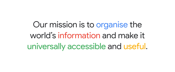
Define what you want your product to be associated with: accessibility, smoothness, maximalism, etc.
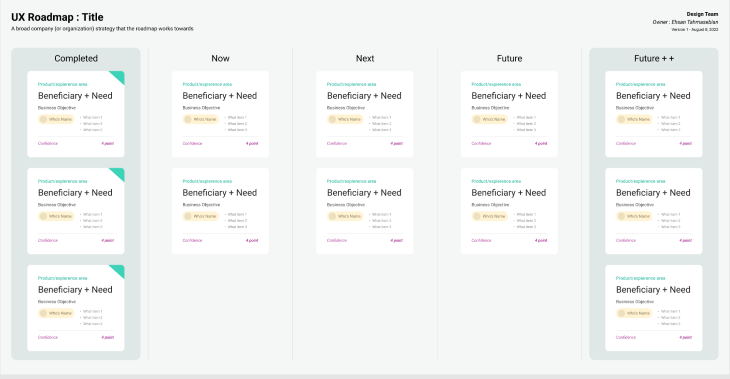
What is the current state, and what should be the product in the future? To establish goals, you can use the card made by NNgroup. This card should be used for every product that must match the company’s philosophy. A Figma file by Ehsan Tahmasebian reproduces this template:
Set up a UX research workshop and do anything that can help. The must-have would be personae and user journey maps. If benchmarking, user testing, and focus groups are doable, do these too.
Persona are detailed sheets about fictional characters that have all the characteristics of your ideal end user. Figma has a great free-to-use persona template, and learning in detail how to create a good persona takes six minutes:

To learn extensively about experience maps, mapping how users live in a typical day and how they interact with the different screens of an application, Tanzir Rahman writes a detailed experience map guide. Free templates for experience maps are available on Figma here.
Again, the NN Group provides a good theme template to use in their instructional video. By regrouping issues encountered by your user, it will be easier to come up with great solutions that can tackle multiple problems at once.
Decide which themes are more important than the others, and decide which problem will bring the most satisfaction to your end user. The MoSCoW technique is a good starting point: define what your next iteration must have, should have, could have, and won’t have. Based on that vision, it will be easier to plan your next move.
Find measurable variables to evaluate before and after working on your project and see how it can be improved for the next time. Classic key performance indicators in UX would be conversion rate for a landing page, user satisfaction measured through surveys, or efficiency observed during user testing.
These general KPIs can be used to evaluate the performance of a UX roadmap, but it should be analyzed as a product on its own with the UX team as end users. The goal of the UX roadmap is to simplify, accelerate, and improve the work of UX designers. More suitable KPIs for this kind of product would be:
UX roadmap KPIs can be diverse and should help measure if a UX team and a company has become more efficient.
In conclusion, a UX roadmap is more than a mere timeline; it’s a dynamic instrument with the power to guide, communicate, and evolve the user experience strategy. Its adaptability in different contexts, measurement through KPIs, and role as a catalyst for continuous improvement make it an indispensable asset in delivering outstanding user experiences and ensuring long-term success.
Header image source: IconScout
LogRocket's Galileo AI watches sessions and understands user feedback for you, automating the most time-intensive parts of your job and giving you more time to focus on great design.
See how design choices, interactions, and issues affect your users — get a demo of LogRocket today.
A three-week mobile banking project taught me that the “proper” UX process is not always realistic. Sometimes, the better approach is to work with what you know, identify what you still need to learn, and make the strongest decision possible under real constraints.
A/B testing compares two versions of a design to see which performs better with real users. Here’s how UX teams can use it to test hypotheses, measure outcomes, and make smarter product decisions.
This case study shows how one ad experience redesign increased total ad exposure while lowering perceived friction, proving that timing and context can matter more than raw interruption.

As products evolve into ecosystems, navigation becomes a system-level challenge. This article explores how to align structure, context, and user journeys to create seamless movement across tools without confusion.